Upgrade to Pro — share decks privately, control downloads, hide ads and more …

Accessibility in Design Systems (english)

Accessibility in Design Systems (english)

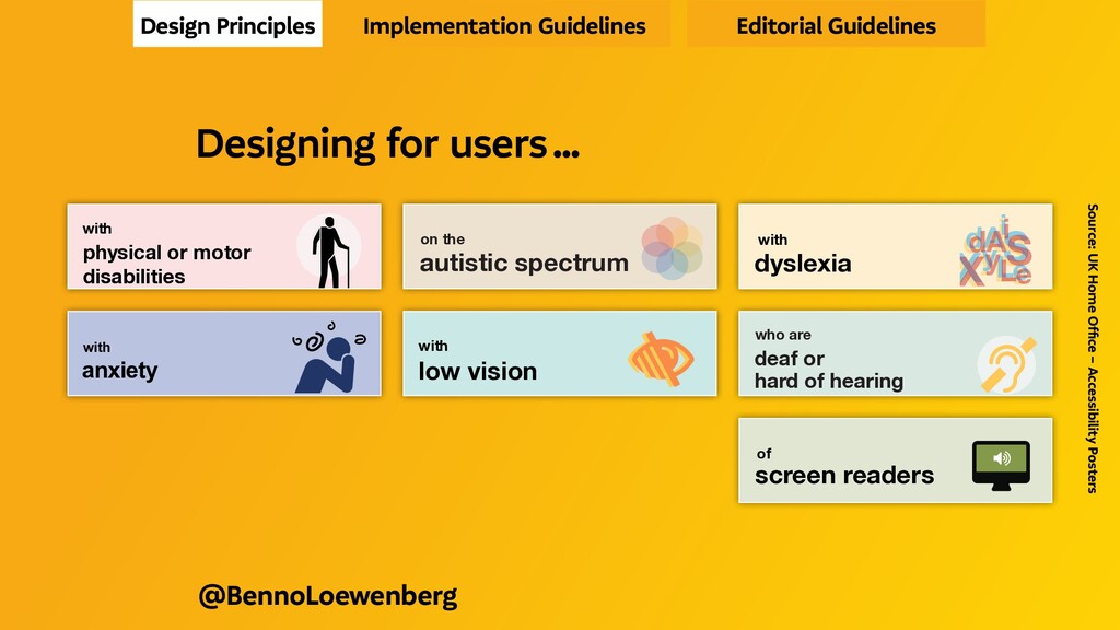
We all are only sometimes abled. Therefore accessible solutions benefit everybody. Treating accessibility not just as an afterthought to comply with regulations, but as an essential UX factor right from the start can lead to building better products and services.

This talk is about how to lay an accessible foundation within a design system to enable accessibility. It also covers what to start with, which aspects to take care of and the toolbox needed, using tangible examples (and cool graphics) to generate an instant understanding.

#Accessibility #A11y #Design System #Design Systems #UX #User Experience #UI #User Interface Design #SituationalDisabilities #CurbCut-Effect

Benno Loewenberg

March 25, 2021
Tweet

More Decks by Benno Loewenberg

Other Decks in Business

Transcript

  1.   ACCESSIBILITY IN DESIGN SYSTEMS 
    INTO DESIGN SYSTEMS
    MARCH 25. 2021
    @BENNOLOEWENBERG

    View Slide

  2. “We’re all just temporarily abled.”
    Source: Cindy Li
    @BennoLoewenberg

    View Slide

  3. Source: Burnsitoun Comedy Show – “Eleven” Scottish Elevator
    @BennoLoewenberg
      No buttons ? 
      Only voice 
        recognition ! 
      That doesn’t work 
       with scottish accent ! 

    View Slide

  4. @BennoLoewenberg
    “Disabilities are a mismatch between
    one’s ability and one’s environment.”
    Source: unknown

    View Slide

  5. We use a Persona Spectrum to understand related limitations
    across a spectrum of permanent, temporary, and situational
    disabilities. It’s a quick tool to help foster empathy and to
    show how a solution can scale to a broader audience.
    Support Card | The Persona Spectrum
    Permanent Temporary Situational
    Touch
    en temporary or situational.
    ck which limitations apply to
    e Can’t speak
    r Can’t touch
    @BennoLoewenberg
    Source: Microsoft Inclusive Design Toolkit
    Aye !
    Deaf Ear infection Bartender
    Speak
    Non-verbal Laryngitis Heavy accent

    View Slide

  6. Can’t see Can’t speak
    Can’t hear Can’t touch
    Blind Cataract Distracted driver
    Hear
    Deaf Ear infection Bartender
    Speak
    Non-verbal Laryngitis Heavy accent
    We use a Persona Spectrum to understand related limitations
    across a spectrum of permanent, temporary, and situational
    disabilities. It’s a quick tool to help foster empathy and to
    show how a solution can scale to a broader audience.
    Support Card | The Persona Spectrum
    Permanent Temporary Situational
    Touch
    @BennoLoewenberg
    Source: Microsoft Inclusive Design Toolkit

    View Slide

  7. One arm Arm injury New parent
    See
    Blind Cataract Distracted driver
    Hear
    Deaf Ear infection Bartender
    Disabilities are often temporary or situational.
    Use this card to pick which limitations apply to
    your scenario.
    Can’t see Can’t speak
    Can’t hear Can’t touch
    We use a Persona Spectrum to understand related limitations
    across a spectrum of permanent, temporary, and situational
    disabilities. It’s a quick tool to help foster empathy and to
    show how a solution can scale to a broader audience.
    Support Card | The Persona Spectrum
    Permanent Temporary Situational
    Touch
    @BennoLoewenberg
    Source: Microsoft Inclusive Design Toolkit
    traffic observant

    View Slide

  8. e Can’t speak
    r Can’t touch
    show how a solution can scale to a broader audience.
    Permanent Temporary Situational
    Touch
    One arm Arm injury New parent
    See
    Blind Cataract Distracted driver
    We use a Persona Spectrum to understand related limitations
    across a spectrum of permanent, temporary, and situational
    disabilities. It’s a quick tool to help foster empathy and to
    show how a solution can scale to a broader audience.
    Support Card | The Persona Spectrum
    Permanent Temporary Situational
    Touch
    Source: Microsoft Inclusive Design Toolkit
    @BennoLoewenberg

    View Slide

  9. “Approach accessibility as
    a customer experience imperative,
    not a compliance-driven initiave.”
    Source: Gina Bhalwalkar
    @BennoLoewenberg

    View Slide

  10. Source: Deque / Anna Cook
    @BennoLoewenberg
    Design system accessibility has significant impacts

    View Slide

  11. inaccessible eCommerce retailers
    loose out on
    — 6.9 billion US$
    annually in the US
    Source: Deque / Home Depot
    @BennoLoewenberg

    View Slide

  12.   KEY DRIVER AND BENEFIT 

    | A11y increases market share

    | aligns digital with brand promise

    | reduces complaints & support costs
    Source: Forrester
    @BennoLoewenberg

    View Slide

  13. Alps, Alta,
    Anatomy, Anvil, Archipelago,
    Argon, Apex, Asphalt, Astro, Aurora, Axiom,
    Backpack, Barista, Base, Binary, Bits, Blocks, Bloom, Bluemix,
    Blueprint, Boundless, Build, Bouy, Bolt, Canvas, Carbon, Cargo, Cedar
    Chameleon, Chrome, Cirrus, Clarity, Clay, Comet, Connect, Constellation
    Cosmos, DressCode, Duet, Edison, Eos, Epoxy, Evergreen, Fabric, Feather
    Feelix, Fiori, Fish Tank, Fleet, Float, Fluent, Foundation, Forma, Frontier, Fuse
    Fusion, Garden, Gel, Gestalt, Glu, Glue, Gravity, Grommet, Group, Harmony
    Hedwig, Helix, Honeycomb, Horizon, Indigo, Janus, Keirin, Klik, Kompas
    Kotti, Kyper, Latitude, Leonardo, Lexicon, Lightning, Lion, Liquid, Luci, Luna
    Material, Mayflower, Mercury, Miui, Mind, Mineral, Minutiae, Mixtape
    Momentum, Mosaic, Muesli, Nachos, Neo, Nicollet, Northstar, Nova, Odyssey
    One, Oneui, Opattern, Orbit, Origami, Otkit, Oxide, Pajamas, Paste
    Patternfly, Photon, Plasma, Polaris, Polestar, Poncho, Precise, Predix
    Primer, Protocol, Pulse, Purple, Quantum, Quartz, Quik, Radius, Ratio
    Recess, Rimble, Ring, Rivet, Rizzo, Sandcastle, Saphir, Scooter, Seeds, Skin
    Skyline, ShowCar, Snacks, Solar, Solid, SolidWork, Spark, Spectrum, Stacks
    Starling, Sticky, Stitch, Swarm, SynNeo, Tack, Tape, Terra, ThingWorx
    mbprint, Unicycle, Uniform, Unison, Unity, Ustyle, Vanilla
    Wonderblocks, X, Yarn, Yoga, Zui
      DESIGN SYSTEMS 
    @BennoLoewenberg

    View Slide

  14. Alps, Alta,
    Anatomy, Anvil, Archipelago,
    Argon, Apex, Asphalt, Astro, Aurora, Axiom,
    Backpack, Barista, Base, Binary, Bits, Blocks, Bloom, Bluemix,
    Blueprint, Boundless, Build, Bouy, Bolt, Canvas, Carbon, Cargo, Cedar
    Chameleon, Chrome, Cirrus, Clarity, Clay, Comet, Connect, Constellation
    Cosmos, DressCode, Duet, Edison, Eos, Epoxy, Evergreen, Fabric, Feather
    Feelix, Fiori, Fish Tank, Fleet, Float, Fluent, Foundation, Forma, Frontier, Fuse
    Fusion, Garden, Gel, Gestalt, Glu, Glue, Gravity, Grommet, Group, Harmony
    Hedwig, Helix, Honeycomb, Horizon, Indigo, Janus, Keirin, Klik, Kompas
    Kotti, Kyper, Latitude, Leonardo, Lexicon, Lightning, Lion, Liquid, Luci, Luna
    Material, Mayflower, Mercury, Miui, Mind, Mineral, Minutiae, Mixtape
    Momentum, Mosaic, Muesli, Nachos, Neo, Nicollet, Northstar, Nova, Odyssey
    One, Oneui, Opattern, Orbit, Origami, Otkit, Oxide, Pajamas, Paste
    Patternfly, Photon, Plasma, Polaris, Polestar, Poncho, Precise, Predix
    Primer, Protocol, Pulse, Purple, Quantum, Quartz, Quik, Radius, Ratio
    Recess, Rimble, Ring, Rivet, Rizzo, Sandcastle, Saphir, Scooter, Seeds, Skin
    Skyline, ShowCar, Snacks, Solar, Solid, SolidWork, Spark, Spectrum, Stacks
    Starling, Sticky, Stitch, Swarm, SynNeo, Tack, Tape, Terra, ThingWorx
    mbprint, Unicycle, Uniform, Unison, Unity, Ustyle, Vanilla
    Wonderblocks, X, Yarn, Yoga, Zui
      DESIGN SYSTEMS 
    @BennoLoewenberg
    Accessibility in

    View Slide

  15. “Limited access = broken experience.
    Accessilibity is the first step
    to a great user experience.”
    Source: Beatrriz Gonzalez
    @BennoLoewenberg

    View Slide

  16. Source: W3C WAI Web Accessibility Perspectives – Colors with Good Contrast
      e. g. WHEN CONTRAST COUNTS 
    @BennoLoewenberg

    View Slide

  17. Source: W3C WAI Web Accessibility Perspectives – Keyboard Compatibility
      e. g. WHEN A MOUSE CAN’T BE USED 
    @BennoLoewenberg

    View Slide

  18. “Auditing your design system
    for accessibility is about UX
    just as much as it is about UI”
    Sources: Anma Cook
    @BennoLoewenberg

    View Slide

  19. @BennoLoewenberg
    Building block or
    built-in blocker ?

    View Slide

  20. @BennoLoewenberg
    The users are NOT disabled,
    (design) systems are
    disabling them

    View Slide

  21. @BennoLoewenberg
    The curb-cut effect
    is beneficial for all
    Parents with strollers, Elderly, Cyclists,
    Delivery workers with push carts,
    Tourists with heavy luggage, …

    View Slide

  22. “You can have antiquated systems,
    but if you have an accessible
    interface, it can completely
    transform that experience”
    Source. Rachel Haot
    @BennoLoewenberg

    View Slide

  23. @BennoLoewenberg
    Implementing accessibility measures
    with curb-cut effect

    View Slide

  24. @BennoLoewenberg
    Cross-device scalability
    Typography
    BUS

    View Slide

  25. @BennoLoewenberg
    Ensuring navigation
    regardless of input method
    Communicating
    state changes
    Tactile AND visual

    View Slide

  26. @BennoLoewenberg
    Useful labels and messaging
    Semantic markup
    Paint as added layer
    of information

    View Slide

  27.   WHAT TO START WITH 
    @BennoLoewenberg

    View Slide

  28. @BennoLoewenberg
    Implementing accessible design & code
    Code :-)

    View Slide

  29. Source: James Sullivan
    Are you able
    to read this ?
    @BennoLoewenberg

    View Slide

  30. How about now ?
    Source: James Sullivan
    @BennoLoewenberg

    View Slide

  31. Can you stand
    reading this ?
    Source: James Sullivan
    @BennoLoewenberg

    View Slide

  32. @BennoLoewenberg
    Colour &
    Contrast
    Source: Accessible Color Matrix

    View Slide

  33. @BennoLoewenberg
    Colour &
    Contrast
    Source: Koopersmith & Miner

    View Slide

  34. @BennoLoewenberg
    Colour &
    Contrast
    Source: Koopersmith & Miner

    View Slide

  35. @BennoLoewenberg
    Colour &
    Contrast

    View Slide

  36. Label
    @BennoLoewenberg
    Contrast ?

    View Slide

  37. Label
    @BennoLoewenberg
    ContrAAAHst !

    View Slide

  38. Il1
    @BennoLoewenberg
    Guess the glyph ? 
    Font face: “Gill Sans”

    View Slide

  39. Il1
    @BennoLoewenberg
    Yes, that’s the glyph !  
    Font face: “Aestetico”

    View Slide

  40. Il1 db qp CO eo
    Il1 db qp CO eo
    Il1 db qp CO eo
    @BennoLoewenberg
    Font faces: “Helvetica / Arial” “Aestetico” “Franziska”
    !
    ! !
    +
    + +
    +
    +
    + +
    +
    + +
    +
    !
    !

    View Slide

  41. @BennoLoewenberg

    | decypherable by dyslexic

    | complies WCAG minimum settings

    | scalable by user settings (dynamic type)
      READABLE TYPE 

    View Slide

  42. Label
    font-size: 1 rem
    @BennoLoewenberg

    View Slide

  43. @BennoLoewenberg
    Focus Behaviour

    View Slide

  44. @BennoLoewenberg
    Label
    most important,
    but often forgotten

    View Slide

  45. Touch Target Sizes
    @BennoLoewenberg
    0.75 cun

    View Slide

  46. Label
    height: 3 rem
    @BennoLoewenberg

    View Slide

  47. Semantic
    markup
    Source: HTML5 Accessibility
    @BennoLoewenberg

    View Slide

  48. Name
    @BennoLoewenberg
    label for = "name"
    input id = "name"
    Labelled form elements
    added value:
    label becomes part
    of touch target too

    View Slide

  49. Name
    @BennoLoewenberg
    High contrast mode
    Semantic html
    automatically gets
    rendered accessibly

    View Slide

  50. Label
    That‘s an error !
    @BennoLoewenberg
    @BennoLoewenberg
    Normal vision

    View Slide

  51. @BennoLoewenberg
    @BennoLoewenberg
    Deuteranopia (simulated)
    Is that an error ?
    Label

    View Slide

  52. @BennoLoewenberg
    descriptive error message

    Don't rely on colour as sole information
    Label

    View Slide

  53. alt = "success"
    alt = "warning"
    alt = "information"
    alt = "error"
    Non-text
    elements

    !
    i

    View Slide

  54. “The first rule of ARIA is not to use it.
    But you should use it knowingly
    to support assistive technology”
    @BennoLoewenberg

    View Slide

  55. @BennoLoewenberg
    descriptive error message

    First name
    alt = "error"
    aria-describedby = "first-name-error-msg"
    label for = "firstname"

    View Slide

  56.   BEYOND COMPONENT STYLING 
    @BennoLoewenberg

    View Slide

  57. “Inherently inclusive design systems
    that contain accessible patterns
    don’t guarantee accessible products.”
    Source. Roy & Curtis
    @BennoLoewenberg

    View Slide

  58. Accessibility should be backed
    into the design system strategy
    Sources: Cook & Curtis
    IMPLEMENTING ACCESSBILITY
    Embedded in System Configured by Team Work identified by Audit
    + +
    @BennoLoewenberg

    View Slide

  59. most
    important
    HOW TO USE
    HOW TO USE HOW IT LOOKS
    & SOUNDS
    MADE TO USE
    @BennoLoewenberg

    View Slide

  60. most
    important
    HOW TO USE
    GUIDELINES STYLE &
    PATTERNS
    DES & DEV
    RESOURCES
    @BennoLoewenberg

    View Slide

  61. BUILDING BLOCKS (STYLE GUIDE)
    Color Pallettes Typographic Scales Grid Definitions Icons & Assets
    UI PATTERNS (LIBRARY)
    Elements Components Modules Templates
    RULES (GUIDELINES)
    Design Principles Implementation Guidelines Editorial Guidelines
    @BennoLoewenberg
    Source: UX Pin
    integrate accessibility here

    View Slide

  62. “Define what you mean,
    when you say, you are accessible.”
    Source: Verison Brand Guidelines
    @BennoLoewenberg
    Design Principles Implementation Guidelines Editorial Guidelines

    View Slide

  63. Designing for users who are
    deaf or
    hard of hearing

    Do...
    write in
    plain language
    use subtitles
    or provide
    transcripts for
    videos
    use a linear,
    logical layout
    !
    CC
    !
    Don’t...
    use complicated
    words or figures
    of speech
    !
    put content in
    audio or video
    only
    make complex
    layouts and
    menus
    !
    !
    Designing for users who are
    deaf or
    hard of hearing

    Do...
    write in
    plain language
    use subtitles
    or provide
    transcripts for
    videos
    use a linear,
    logical layout
    break up content
    with sub-headings,
    !
    CC
    !
    Don’t...
    use complicated
    words or figures
    of speech
    !
    put content in
    audio or video
    only
    make complex
    layouts and
    menus
    make users
    read long blocks
    !
    !
    Design Principles Implementation Guidelines Editorial Guidelines
    Source: UK Home Office – Accessibility Posters
    @BennoLoewenberg
    Designing for users …
    Designing for users with
    dyslexia XyL
    dAS
    e
    i
    XyL
    dAS
    e
    i
    XyL
    dAS
    e
    i
    Do...
    use images and
    diagrams to
    support text
    align text to the
    left and keep a
    consistent layout
    consider producing
    materials in other
    formats (for example
    audio or video)
    keep content
    short, clear
    and simple
    let users change the
    contrast between
    background and text
    !
    !
    Don’t...
    use large
    blocks of
    heavy text
    underline words,
    use italics or
    write in capitals
    force users to remember
    things from previous
    pages - give reminders
    and prompts
    rely on accurate
    spelling - use
    autocorrect or
    provide suggestions
    put too much
    information in
    one place
    !!
    DON’T
    DO THIS
    !
    !
    !
    dyslexia
    dsyle
    Designing for users with
    dyslexia XyL
    dAS
    e
    i
    XyL
    dAS
    e
    i
    XyL
    dAS
    e
    i
    Do...
    use images and
    diagrams to
    support text
    align text to the
    left and keep a
    consistent layout
    consider producing
    materials in other
    formats (for example
    audio or video)
    keep content
    short, clear
    and simple
    let users change the
    contrast between
    background and text
    !
    !
    !
    Don’t...
    use large
    blocks of
    heavy text
    underline words,
    use italics or
    write in capitals
    force users to remember
    things from previous
    pages - give reminders
    and prompts
    rely on accurate
    spelling - use
    autocorrect or
    provide suggestions
    put too much
    information in
    one place
    !!
    DON’T
    DO THIS
    !
    !
    !
    dyslexia
    dsyle
    !
    ukhomeoffice.github.io/accessibility-posters/
    posters/accessibility-posters.pdf
    Designing for users with
    physical or motor
    disabilities
    Do...
    make large
    clickable actions
    Yes
    give clickable
    elements space
    design for
    keyboard or
    speech only
    use
    design with mobile
    and touchscreen
    in mind
    provide shortcuts
    Tab
    !
    !"
    Find address
    Postcode
    Don’t...
    demand
    precision
    No
    bunch
    interactions
    together
    make dynamic
    content that
    requires a lot of
    mouse movement
    have short
    time out
    windows
    tire users
    with lots of
    typing and
    scrolling
    !
    !
    1
    2
    3
    2a
    2b
    2c
    ! Your session
    has timed out
    Address
    ng for users with
    al or motor
    ities
    Yes
    Tab
    !
    !"
    Find address
    Postcode
    Don’t...
    demand
    precision
    No
    bunch
    interactions
    together
    make dynamic
    content that
    requires a lot of
    mouse movement
    have short
    time out
    windows
    tire users
    with lots of
    typing and
    scrolling
    !
    !
    1
    2
    3
    2a
    2b
    2c
    ! Your session
    has timed out
    Address
    ukhomeoffice.github.io/accessibility-posters/
    posters/accessibility-posters.pdf
    Designing for users with
    anxiety
    Do...
    give users enough
    time to complete
    an action
    explain what
    will happen after
    completing a
    service
    make important
    information clear
    Don’t...
    rush users or set
    impractical time
    limits
    leave users
    confused about
    next steps or
    timeframes
    leave users
    uncertain about
    the consequences
    of their actions
    1
    3
    2
    4
    We have sent
    you an email
    ng for users with
    ty
    h
    Don’t...
    rush users or set
    impractical time
    limits
    leave users
    confused about
    next steps or
    timeframes
    leave users
    uncertain about
    the consequences
    of their actions
    1
    3
    2
    4
    make support
    or help hard to
    access
    We have sent
    you an email
    Designing for users on the
    autistic spectrum
    Do...
    write in
    plain language
    use simple
    colours
    use simple
    sentences and
    bullets
    make buttons
    descriptive
    build simple and
    consistent layouts
    !
    Don’t...
    use bright
    contrasting colours
    use figures of
    speech and idioms
    create a wall
    of text
    make buttons
    vague and
    unpredictable
    build complex and
    cluttered layouts
    !
    !!
    Designing for users on the
    autistic spectrum
    Do...
    write in
    plain language
    use simple
    colours
    use simple
    sentences and
    bullets
    make buttons
    descriptive
    build simple and
    consistent layouts
    !
    !
    Don’t...
    use bright
    contrasting colours
    use figures of
    speech and idioms
    create a wall
    of text
    make buttons
    vague and
    unpredictable
    build complex and
    cluttered layouts
    !
    !!
    !
    ukhomeoffice.github.io/accessibility-posters/
    posters/accessibility-posters.pdf
    Designing for users of
    screen readers
    !
    "
    Do...
    describe images
    and provide
    transcripts
    for video

    Don’t...
    only show
    information in an
    image or video
    Designing for users of
    screen readers
    !
    "
    Do...
    describe images
    and provide
    transcripts
    for video
    follow a linear

    Don’t...
    only show
    information in an
    image or video
    spread content
    Designing for users with
    low vision


    Do...
    use good colour
    contrasts and a
    readable font size
    publish all information
    on web pages
    use a combination
    of colour, shapes
    and text
    Aa
    !
    HTML
    Start
    Don’t...
    use low colour
    contrasts and small
    font size
    bury information
    in downloads
    only use colour to
    convey meaning
    Aa
    !
    Designing for users with
    low vision


    Do...
    use good colour
    contrasts and a
    readable font size
    publish all information
    on web pages
    use a combination
    of colour, shapes
    and text
    follow a linear,
    Aa
    !
    HTML
    Start
    200% magnification
    Don’t...
    use low colour
    contrasts and small
    font size
    bury information
    in downloads
    only use colour to
    convey meaning
    spread content all
    Aa
    !
    200% magnification

    View Slide

  64. Accessible implementation
    & contents
    Design Principles Implementation Guidelines Editorial Guidelines
    @BennoLoewenberg

    View Slide

  65. @BennoLoewenberg
    Informative
    headings and
    page titles
    Source: A11y Annotation Kit
    optimal for
    quick reading
    & SEO too

    View Slide

  66. @BennoLoewenberg
    Meaningful
    link texts and
    button labels
    Source: unknown

    View Slide

  67. Text alternatives for images
    @BennoLoewenberg
    alt = "description"

    View Slide

  68. Text alternatives for media
    @BennoLoewenberg
     Link to Caption & Transcript 

    View Slide

  69. @BennoLoewenberg
    Form Design
    First name
    eMail address
    in large zoom levels
    a second column vanishes
    (e. 
    g. for last name)

    View Slide

  70. @BennoLoewenberg
    Feedback and Notifications
    • Last name is required
    • Street name is required
    • Passwords don’t match

    View Slide

  71. @BennoLoewenberg
    Implementing cognitive accessibility

    View Slide

  72. “Disabled buttons
    disable disabled users”
    Source. Hampus Sethfors
    @BennoLoewenberg

    View Slide

  73. @BennoLoewenberg
    Submit
    Clear form

    View Slide

  74. @BennoLoewenberg
    Reduced motion
    Parallax Scroll Effect
    Parallax Scroll Effect
    Parallax Scroll Effect
     preferes-reduced-motion 

    View Slide

  75. Data Visualization
    Source: unknown
    @BennoLoewenberg
    Data set 1
    Data set 2
    important for dyslexic too

    View Slide

  76. Souce: Accessibility statement for the GOV.UK Design System website

    | change colours, contrast levels and fonts

    | zoom in up to 300%
    without the text spilling off the screen

    | navigate website using just a keyboard

    | navigate using speech recognition

    | listen to the website with a screen reader
    @BennoLoewenberg

    View Slide

  77. @BennoLoewenberg
    Keyboard Navigation

    View Slide

  78. @BennoLoewenberg
    Tab Order (DOM)
    Source: Accessibility Bluelines

    View Slide

  79. @BennoLoewenberg
    Focus Order (Landmarks)
    Source: Accessibility Bluelines

    View Slide

  80. @BennoLoewenberg
    Skip Links
    Sources: A11y Annotation Kit & Accessibility Bluelines

    View Slide

  81.   KICK STARTER TOOLBOX 
    @BennoLoewenberg

    View Slide

  82. Source: W3C WAI WCAG
    @BennoLoewenberg
    Web Content Accessibility Guidelines 

    View Slide

  83. Source: Microsoft Inclusive Design
    @BennoLoewenberg
    Inclusive Design Toolkit 

    View Slide

  84. @BennoLoewenberg
    Online Accessibility Toolkit 
    Source: Government of South Australia

    View Slide

  85. @BennoLoewenberg
    Equal Access Toolkit 
    Source: IBM Accessibility

    View Slide

  86. @BennoLoewenberg
    Source: A Book Apart
    Accessibility
    for Everyone 

    View Slide

  87. @BennoLoewenberg
    Source: Smashing Magazine
    Inclusive
    Components

    View Slide

  88.   TAKE HOME THOUGHTS 
    @BennoLoewenberg

    View Slide

  89. “When we design for disability first,
    you often stumble upon solutions
    that are better than those
    when we design for the norm.”
    Source. Elise Roy
    @BennoLoewenberg

    View Slide

  90. @BennoLoewenberg

    View Slide

  91. “When we treat accessibility
    as a requirement box to check,
    we can miss opportunities to design
    better products and services, period.”
    Source: Mason Magyar
    @BennoLoewenberg

    View Slide

  92. http://
    Talks & Workshops

    View Slide

  93.   @BENNOLOEWENBERG 
     LINKEDIN / TWITTER

    View Slide