Upgrade to Pro — share decks privately, control downloads, hide ads and more …

FISH 6002: Week 9 - Data display 3

FISH 6002: Week 9 - Data display 3

Week 9 fish 6002

MI Fisheries Science

October 30, 2017
Tweet

More Decks by MI Fisheries Science

Other Decks in Science

Transcript

  1. Week 9: Displaying Data Visually 3 FISH 6000: Science Communication

    for Fisheries Brett Favaro 2017 This work is licensed under a Creative Commons Attribution 4.0 International License
  2. Week 9: •Colour basics •Increasing data density with colours •Increasing

    data density with symbols and annotation •Multipanel plots, and emphasizing contrasts • Messing with margins
  3. # name: colors() plot(log10(weight) ~ log10(length), data=perch,xlim=c(1.4,2.5), pch=16, col="red") #

    col changes the fill colour of points # https://www.rapidtables.com/web/color/RGB_Color.html
  4. # name: colors() plot(log10(weight) ~ log10(length), data=perch,xlim=c(1.4,2.5), pch=16, col="red") #

    col changes the fill colour of points # number … col=2) # hex … col="#FF0000") # https://www.rapidtables.com/web/color/RGB_Color.html
  5. Changing other colours par(col.axis = "darkgreen", col.lab = "purple", bg

    = "cyan") plot(log10(weight) ~ log10(length), data=perch,xlim=c(1.4,2.5), pch=24, col="red", bg="black") Use the par() command Every plot thereafter will have these settings… old_par <- par() # Always put this at the start of your code, if you’re messing with base plots… par(old_par) #... So you can put this line after to reset them
  6. https://www.edwardtufte.com/tufte/ Data ink -------------------------- Total ink used in graphic Data

    ink ratio = Fill up the plot with meaningful ink – not decorative ink # of pieces of data -------------------------- Area of graphic Data density = Edward Tufte But… colours are not for decoration
  7. Colours can be used to group variables Continuous Continuous 3rd

    axis: Discrete (here: gear type) Switch to ggplot
  8. a <- ggplot(data = perch, aes(x = length, y =

    weight)) + geom_point(shape=1) + scale_y_log10() + scale_x_log10(limits = c(25, 300), breaks= seq(from=25, to=300, by=75)) + labs(x = "Length (mm)", y = "Weight (g)") + theme_bw() + theme(axis.text = element_text(size=16), axis.title = element_text(size=18)) print(a) Recall
  9. a <- ggplot(data = perch, aes(x = length, y =

    weight, col=combinedgear)) + geom_point(shape=1) + scale_y_log10() + scale_x_log10(limits = c(25, 300), breaks= seq(from=25, to=300, by=75)) + labs(x = "Length (mm)", y = "Weight (g)") + theme_bw() + theme(axis.text = element_text(size=16), axis.title = element_text(size=18)) print(a) Specify your third variable as an aesthetic
  10. Consider: Vs. All additions must have meaning, and be clear

    Here, both cases suffer from overplotting. Park that thought for a minute – we’ll talk about a solution later.
  11. Fix the legend a + scale_colour_manual(name="Gear type", labels=c("Beach seine", "Crayfish

    trap", "Electrofishing", "Fyke net", "Minnow trap", "Trammel net", "Vertical gillnet"), values=c(1:7))
  12. Colour palettes http://colorbrewer2.org Single hue Multi-hue Divergent Sequential - Negative

    and positive values Temperature (cold to hot) Opinion: Disagree – Agree - Value bound at zero Temperature (K) Size Qualitative - Categorical, unordered values Country Species
  13. display.brewer.pal("Set1", n=7) # Show the palette mypal <- brewer.pal("Set1", n=7)

    mypal "#E41A1C" "#377EB8" "#4DAF4A" "#984EA3" "#FF7F00" "#FFFF33" "#A65628"
  14. Recall Apply a colour ramp: Heavier fish are red, lighter

    = green Quiz: * Is this sequential, diverging, or qualitative? * Have I used an appropriate scale here? b <- ggplot(pallid, aes(x = tl, y = sl)) + geom_point(aes(colour=w), size=4) + scale_colour_gradient(high="red", low="green") + theme_bw() + xlab("Total length (mm)") + ylab("Standard length (mm)") + theme(axis.text=element_text(size=12), axis.title = element_text(size=14) ) Normally I wouldn’t use diverging for this. I’m about to illustrate something…
  15. d <- ggplot(pallid, aes(x = tl, y = sl)) +

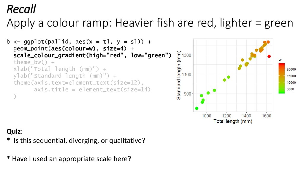
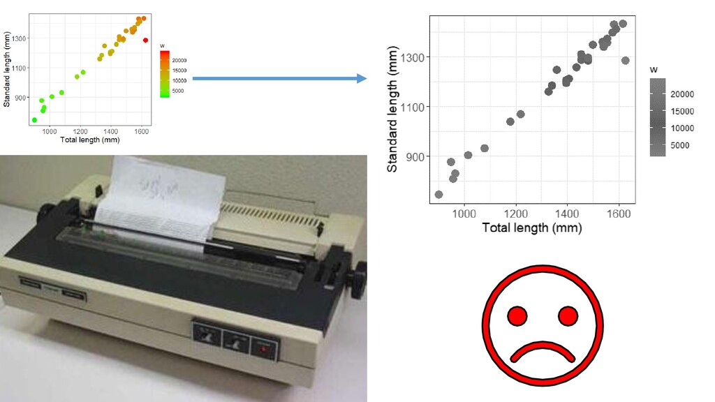
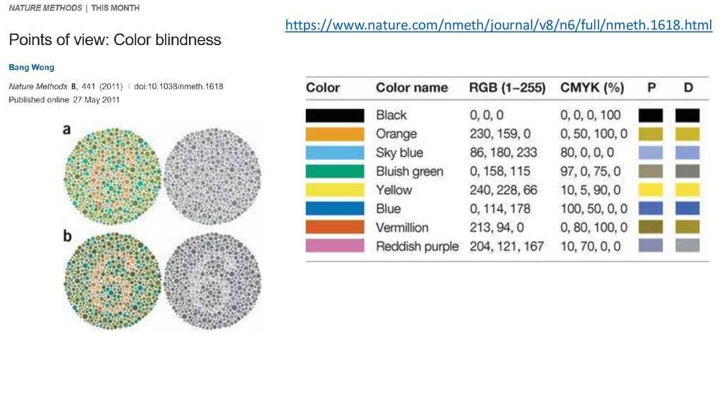
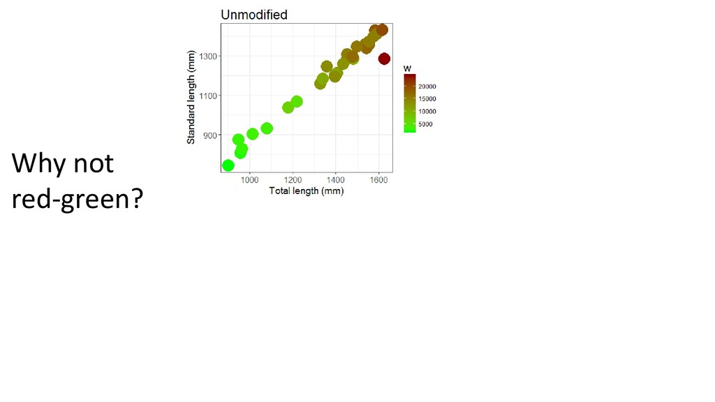
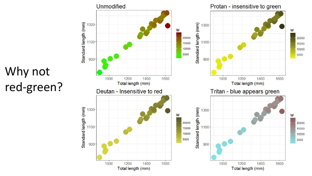
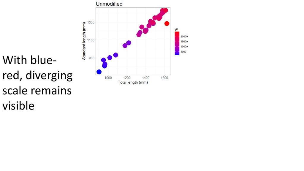
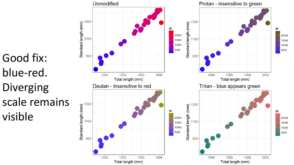
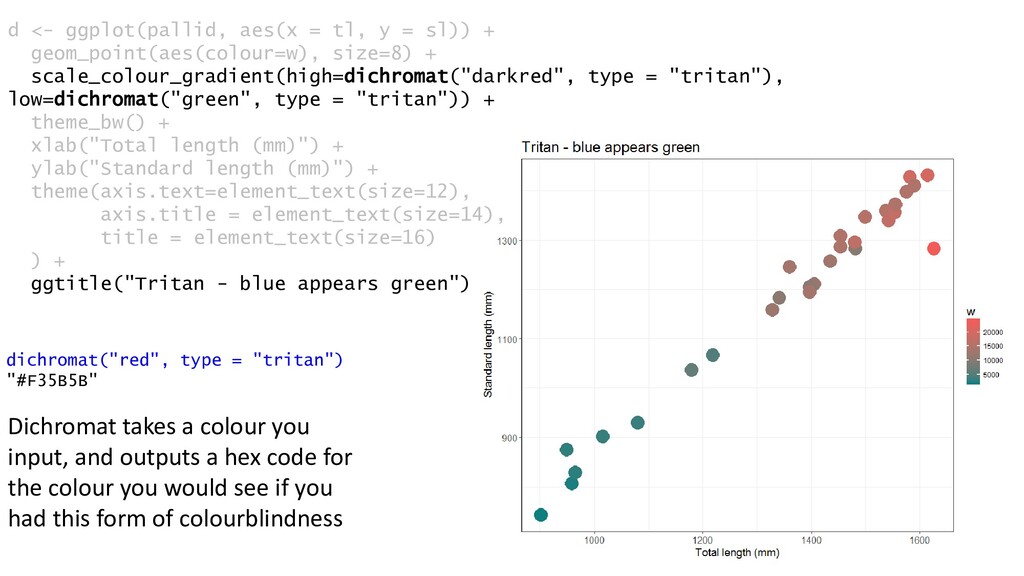
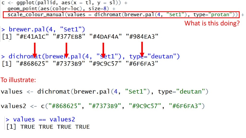
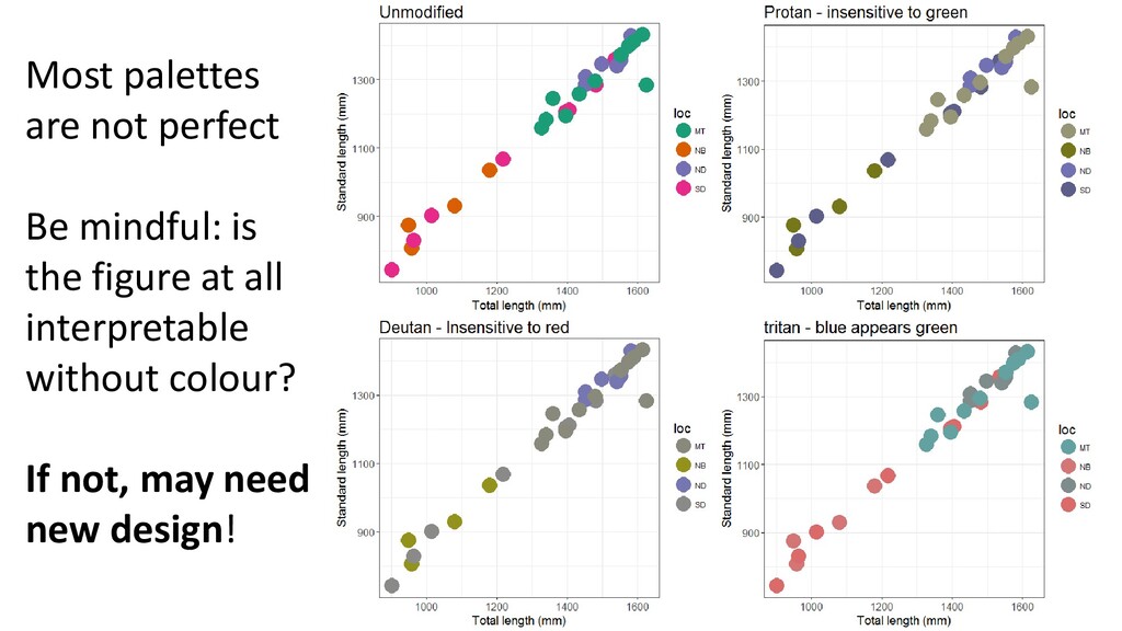
    geom_point(aes(colour=w), size=8) + scale_colour_gradient(high=dichromat("darkred", type = "tritan"), low=dichromat("green", type = "tritan")) + theme_bw() + xlab("Total length (mm)") + ylab("Standard length (mm)") + theme(axis.text=element_text(size=12), axis.title = element_text(size=14), title = element_text(size=16) ) + ggtitle("Tritan - blue appears green") dichromat("red", type = "tritan") "#F35B5B" Dichromat takes a colour you input, and outputs a hex code for the colour you would see if you had this form of colourblindness
  16. Colour by location * Is this sequential, diverging, or qualitative?

    * Have I used an appropriate scale here? This time, we learned something new. Location and fish size are related
  17. Most palettes are not perfect Be mindful: is the figure

    at all interpretable without colour? If not, may need new design!
  18. Let’s pack in even MORE information geom_point(aes(color=loc, size=w, shape=status)) #

    of pieces of data -------------------------- Area of graphic As high as possible, without becoming confusing. How are we doing here? Recall data density:
  19. Let’s pack in even MORE information Adding text or shapes

    to plots Two types of annotation: - Manual label or shape - From data a + annotate("text", x = 900, y = 1400, label="A", size=14)
  20. a + annotate("text", x = c(900,1000), y = c(1400, 1300),

    label=c("A", “B”), size=14) Add multiple bits of text
  21. a + annotate("segment", x = 1200, xend = 1400, y

    = 900, yend = 1000, colour = "red", size=3, alpha=0.6) Add a line
  22. a + annotate("segment", x = 1200, xend = 1400, y

    = 900, yend = 1000, colour = "red", size=3, alpha=0.6, arrow=arrow()) Add an arrow
  23. a + annotate("rect", xmin = 1200, xmax = 1400, ymin

    = 900, ymax = 1000, colour = "red", size=3, alpha=0) + annotate("rect", xmin = 1200, xmax = 1400, ymin = 750, ymax = 800, colour = "blue", size=3, alpha=1, fill="black”) Add shapes!
  24. Adding text or shapes to plots Two types of annotation:

    - Manual label or shape - From data Sometimes you may want to add text to every label E.g. plot names of species on a scatterplot Let’s add the year to each dot in this plot
  25. Recap This plot shows: - Total length - Standard length

    - Year of capture - Death status - Weight - Location captured Purpose: Demonstrate how to add each of these features. This plot is probably too confusing.
  26. 2. Multipanel plots Sometimes you want to break up one

    plot into multiple panels Use to emphasize contrasts Use to reduce overplotting
  27. https://www.nature.com/article s/s41598-017-09084-6 Facets can make graphs easier to interpret Note

    different scales across each group of species Troudet et al. (2017)
  28. multiplot is a function A function is a piece of

    code that contains a series of instructions that you can call repeatedly throughout your script From: http://www.cookbook- r.com/Graphs/Multiple_graphs_on_one_page_(ggplot2)/ By running it at the top of the script, we can call it repeatedly throughout
  29. 3. Model Output Returning to the pallid dataset, plot: y

    = standard length (sl) x = total length (tl)
  30. CI = 50% CI = 95% CI = 99% CI

    = 100% More info: http://ggplot2.tidyverse.org/reference/geom_smooth.html
  31. Key: ggplot2 has functions to plot common models. In base

    plot, you run the model separately, and plot it manually
  32. Go to: http://motioninsocial.com/tufte/ Self-study • Work through entire website •

    Note differences between ggplot and base plot examples • Try recreating some of these plots with your own data, or with data from somewhere else
  33. MINOR ASSIGNMENT 3 • Make a publication-quality plot from these

    data • This should be a two-variable (minimum) plot, made in either ggplot or base ❑ Select an appropriate type of plot for the data ❑Format the axes and any legends used with high-quality, descriptive labels ❑Modify at least one colour, or apply a colour gradient; and/or; ❑Use faceting or multipanel plotting ❑ have a reasonable data:ink ratio, and data density • All elements necessary for publication should be present (Panels should be counted off with A, B, C, etc)
  34. SAVE this plot as a TIFF, with lzw compression, at

    300-600 dpi (i.e. make it suitable for publication in Plos One) Deliverables: - One PDF, outputted from the PACE system (https://pacev2.apexcovantage.com/), containing your plot - A .txt file with a figure caption enclosed
  35. • Assessment: • Did you submit a graph that meets

    minimal graphical parameters? (Answer is yes, if PACE outputs a PDF) /4 – Did you include a figure caption /1? • Scientific basics: /5 • Appropriate choice of plot type? • Sensible variables on X and Y? • Graphical elements /5 • Informative axes? (Good titles, large font?) • Graphical elements worked to enhance, not just decorate the plot