Share
Embed
Layout, Style, and Rendering - When Things Go Wrong
This presentation examines how rendering, styling, and layout influence what crawlers and AI bots perceive. It includes a walkthrough of debugging automated rendering behaviours—such as Googlebot’s viewport expansion—to better simulate user experiences and ensure critical elements are discoverable. It also addresses edge cases in which implementation errors create mismatches that conceal content or alter its perceived importance.
Giacomo Zecchini
December 05, 2025
Transcript
99 slides
-
@giacomozecchini ABOUT ME • Giacomo Zecchini • R&D Director at
Merj • Based in Tuscany, operates globally -
@giacomozecchini MERJ IN A NUTSHELL We are a technical SEO,
AEO and data engineering partner. We shape resilient, discoverable platforms designed for good bots, search engines, and customers alike. -
• How rendering, style, and layout shape what search engine
crawlers and AI crawlers actually see • A few edge cases where implementation mistakes can cause content mismatches, leading crawlers to hide important elements or misjudge their relevance IN THE NEXT 30 MINUTES, WE’LL EXPLORE @giacomozecchini -
@giacomozecchini DISCLAIMER - EXPERIMENTAL CONTENT When this badge appears on
a slide, the content is based on testing, personal assumption, or non-official sources. Implementation details may change without notice at any time. -
In an ideal world, information would be easily retrievable, text-based,
well-structured, and semantic. @giacomozecchini THE IDEAL WORLD -
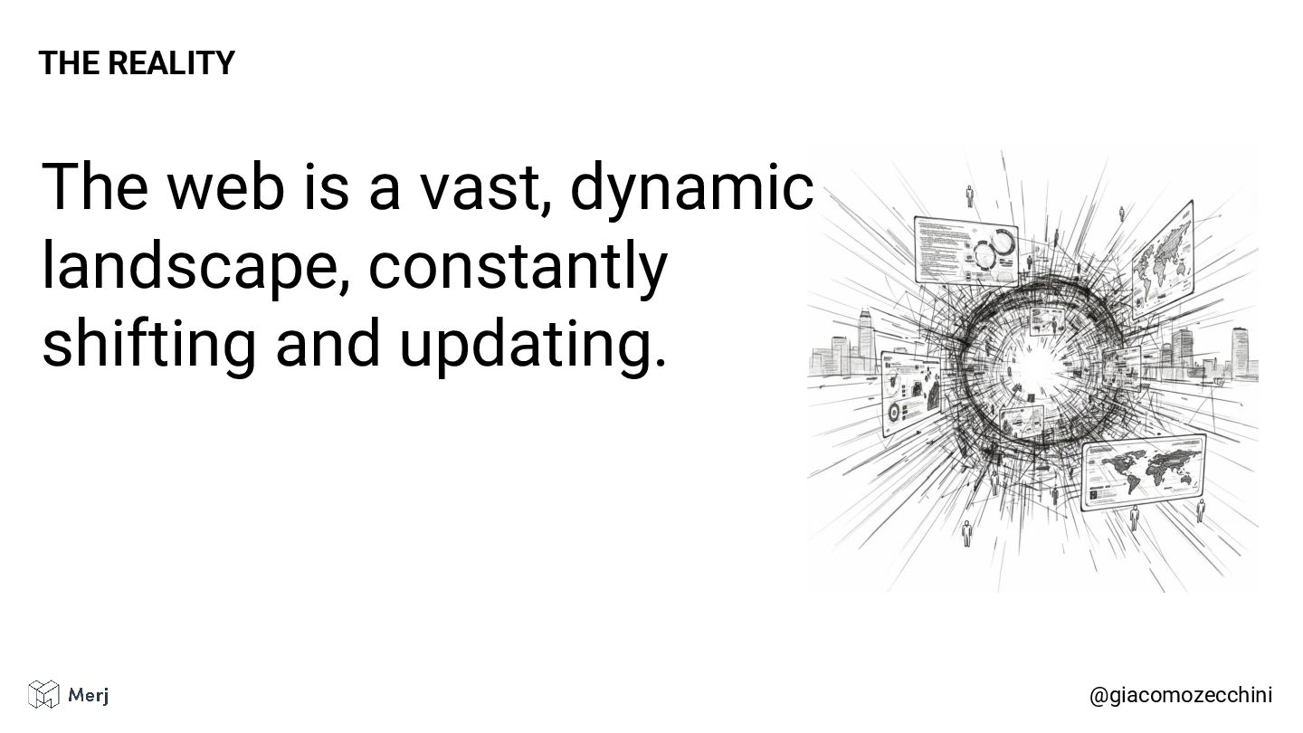
The web is a vast, dynamic landscape, constantly shifting and
updating. @giacomozecchini THE REALITY -
Information exists in many formats, websites employ numerous rendering patterns,
and must support a vast array of features, and the list goes on. @giacomozecchini THE REALITY -
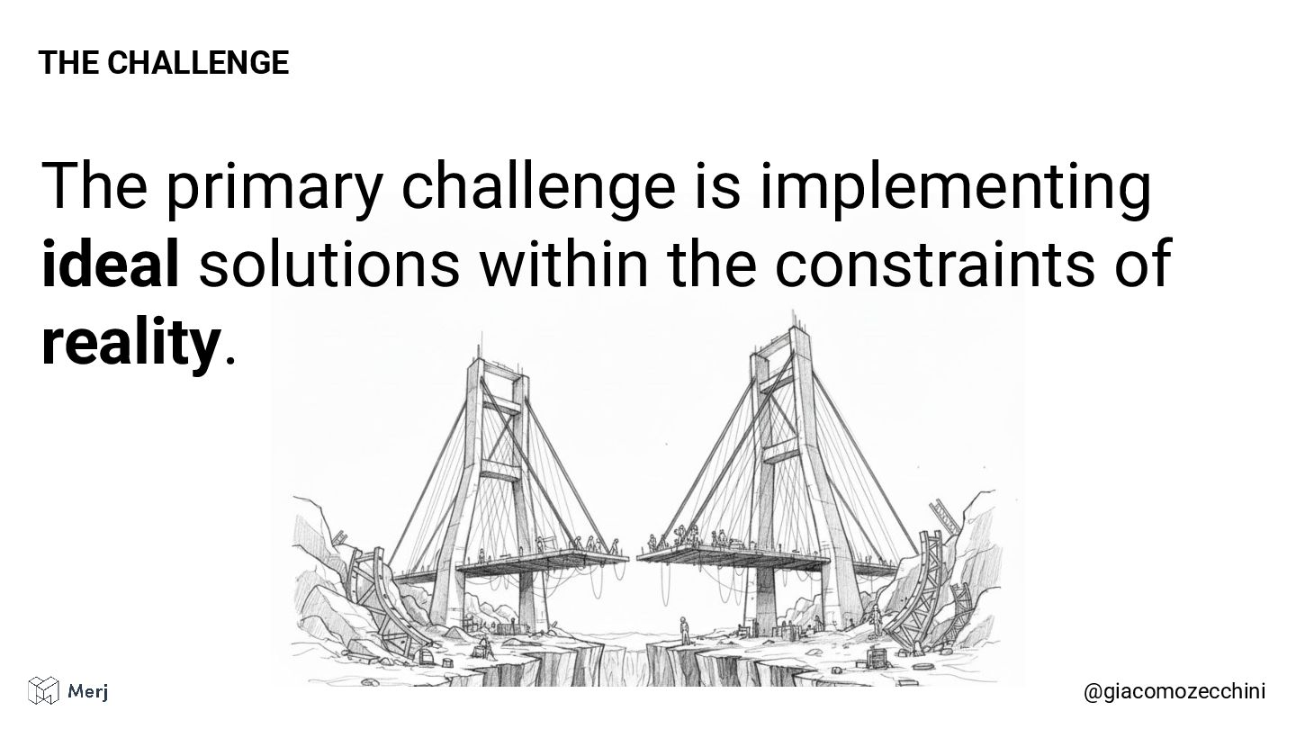
The primary challenge is implementing ideal solutions within the constraints
of reality. @giacomozecchini THE CHALLENGE -
Search engines have addressed some of the problems of the
modern web by rendering web pages. @giacomozecchini ALL MAJOR SEARCH ENGINES RENDER WEB PAGES -
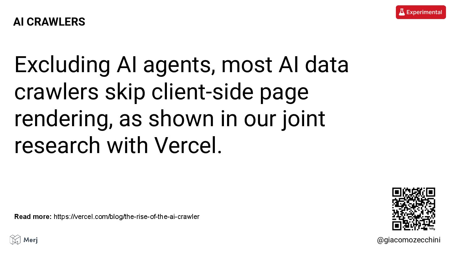
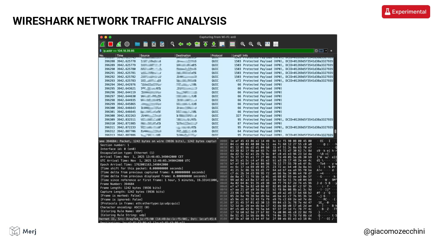
Excluding AI agents, most AI data crawlers skip client-side page
rendering, as shown in our joint research with Vercel. @giacomozecchini AI CRAWLERS Read more: https://vercel.com/blog/the-rise-of-the-ai-crawler -
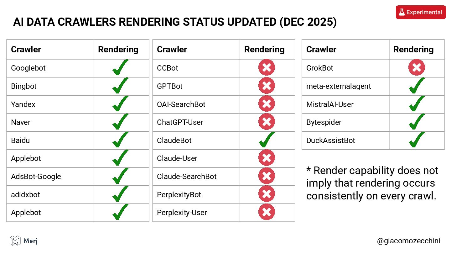
@giacomozecchini AI DATA CRAWLERS RENDERING STATUS UPDATED (DEC 2025) Crawler
Rendering Googlebot Bingbot Yandex Naver Baidu Applebot AdsBot-Google adidxbot Applebot Crawler Rendering CCBot GPTBot OAI-SearchBot ChatGPT-User ClaudeBot Claude-User Claude-SearchBot PerplexityBot Perplexity-User Crawler Rendering GrokBot meta-externalagent MistralAI-User Bytespider DuckAssistBot * Render capability does not imply that rendering occurs consistently on every crawl. -
The rise of AI has forced a re-evaluation of content
serving, mirroring the industry shift previously seen with Search Engines. @giacomozecchini CONTENT DELIVERY -
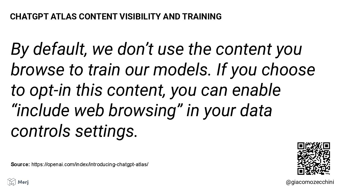
By default, we don’t use the content you browse to
train our models. If you choose to opt-in this content, you can enable “include web browsing” in your data controls settings. @giacomozecchini CHATGPT ATLAS CONTENT VISIBILITY AND TRAINING Source: https://openai.com/index/introducing-chatgpt-atlas/ -
However, it’s good to remember that direct crawling is not
the only source of data for AI tools. @giacomozecchini SOURCE OF DATA FOR AI CRAWLERS -
@giacomozecchini SEARCH ENGINE RENDERING Read more: https://developers.google.com/search/docs/crawling-indexing/javascript/javascript-seo-basics Search engine rendering
has long been a known challenge, yet we continue to uncover interesting edge cases and poor implementations. -
The key differences between automated and user rendering stem from
the lack of user interaction, the use of internal asset-caching heuristics, and the way each handles certain edge cases. @giacomozecchini SEARCH ENGINE RENDERING VS USER RENDERING -
As an output of the rendering process, we have access
to the DOM Tree, the Computed Styles, and the Layout Tree. @giacomozecchini OUTPUT OF RENDERING PROCESS -
The Computed Styles contains the style of elements of the
page. @giacomozecchini COMPUTED STYLES -
The Layout Tree contains the dimensions and positions of each
element on the page. @giacomozecchini LAYOUT TREE -
One thing that really bugs me is how little our
industry leverages the Computed Style and Layout Tree information. @giacomozecchini WHY ARE YOU NOT USING IT? -
We’ve been discussing content “above the fold” and similar stuff
for years, but very little has actually been done about it during this time (publicly, at least). @giacomozecchini ABOVE THE FOLD?! -
I get it, there are new shiny and more interesting
things around 👀 👀 👀 @giacomozecchini SHINY STUFF -
But this is a cumulative game, and in competitive markets,
every detail matters. A good platform can only be built on strong foundations. @giacomozecchini THIS IS A CUMULATIVE GAME -
@giacomozecchini VIEWPORT DIMENSIONS During page rendering, search engines and AI
crawlers execute automated browser instances to emulate real user behavior, including specific parameters like viewport dimensions. -
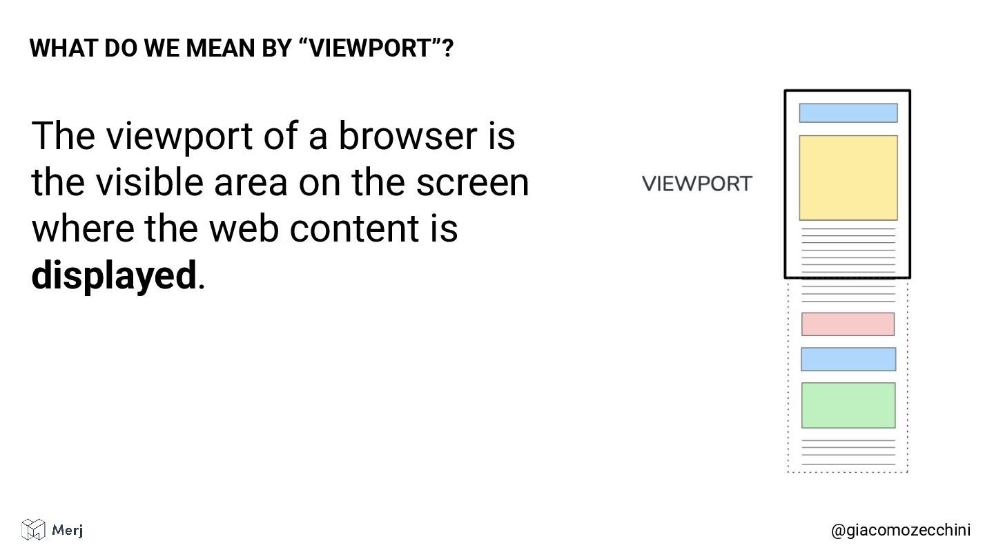
The viewport of a browser is the visible area on
the screen where the web content is displayed. @giacomozecchini WHAT DO WE MEAN BY “VIEWPORT”? -
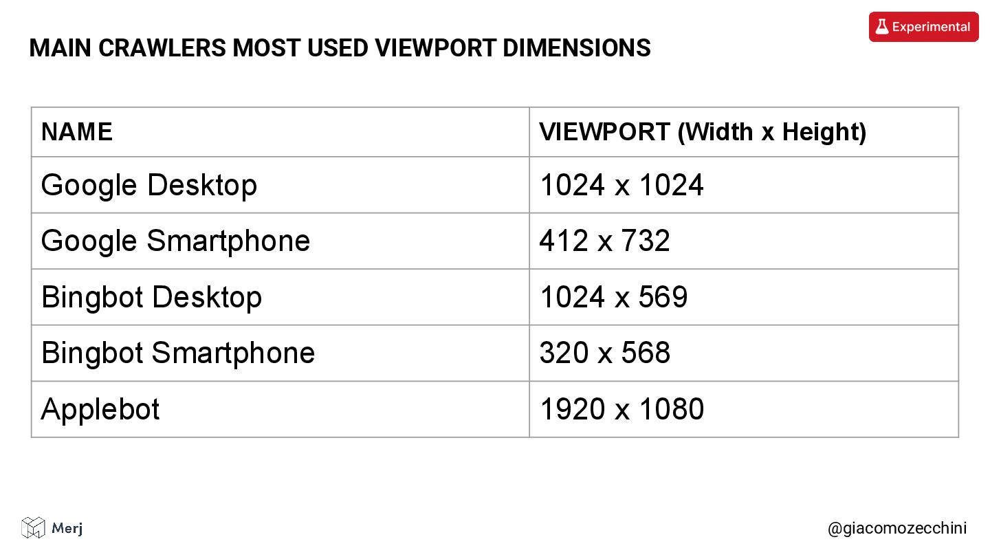
@giacomozecchini MAIN CRAWLERS MOST USED VIEWPORT DIMENSIONS NAME VIEWPORT (Width

x Height) Google Desktop 1024 x 1024 Google Smartphone 412 x 732 Bingbot Desktop 1024 x 569 Bingbot Smartphone 320 x 568 Applebot 1920 x 1080 -
The “viewport expansion” is a technique used by Google to
ensure it gets the most content possible from a page by changing the height of the viewport. @giacomozecchini GOOGLE’S VIEWPORT EXPANSION -
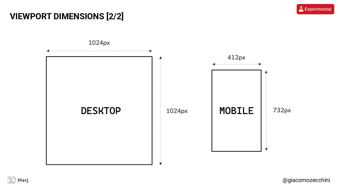
When rendering a web page, Google generally initiates the browser
instance with one of two specific sets of viewports, depending on the origin crawler format. @giacomozecchini VIEWPORT DIMENSIONS [1/2] -

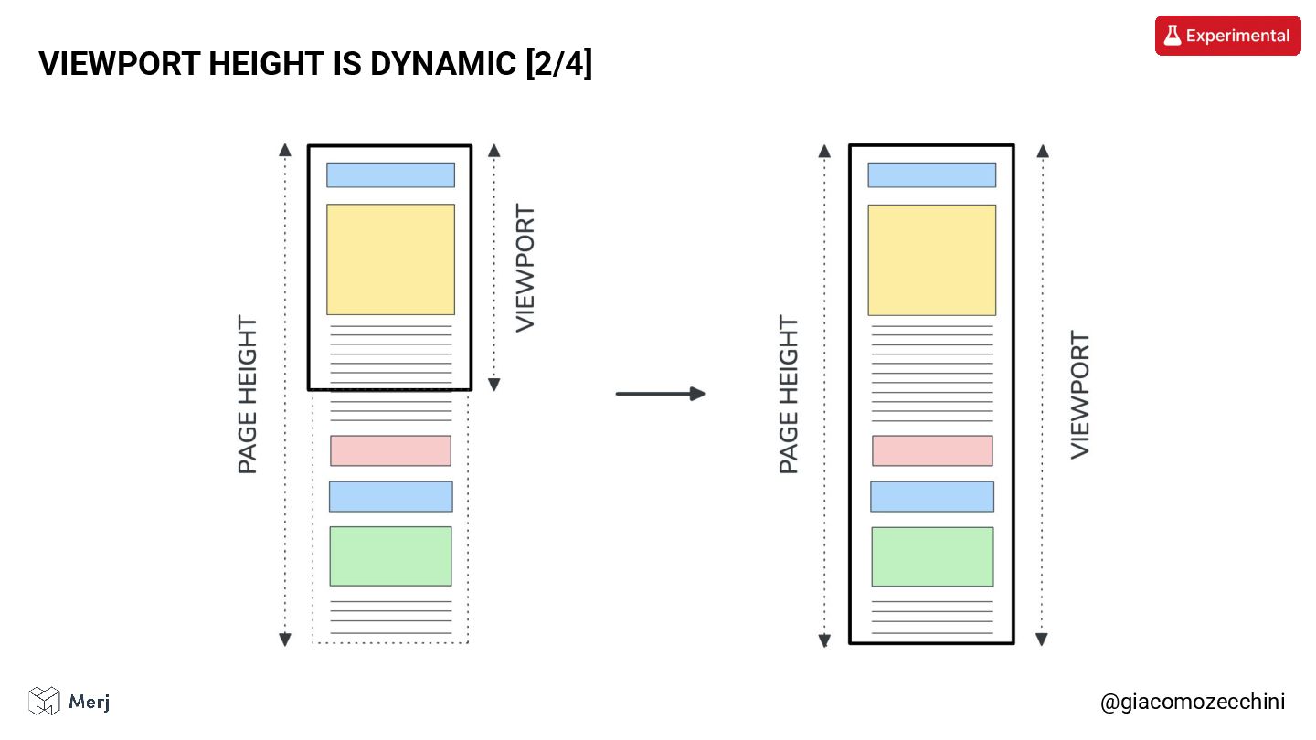
After the initial page load, the page height is checked.
If the page is taller than the initial viewport, the viewport height is updated to match the height of the page (note: this is not a scroll event!). @giacomozecchini VIEWPORT HEIGHT IS DYNAMIC [1/4] -
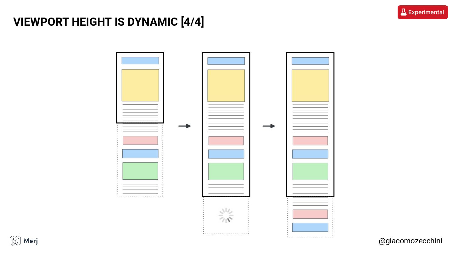
With these new viewport dimensions, lazy-loaded content (when implemented correctly)
is triggered and may add additional elements to the page. @giacomozecchini VIEWPORT HEIGHT IS DYNAMIC [3/4] -
If the page is not taller than the initial viewport,
the viewport height is not updated. The viewport height is resized only once. @giacomozecchini ADDITIONAL NOTES -
Let’s remember that changing the viewport during rendering is not
a common thing on the internet, that is why we have some edge cases. @giacomozecchini CHANGING VIEWPORT IS NOT A COMMON THING -
We can group rendering and layout issues into two main
categories: • Content mismatches • Value mismatches @giacomozecchini WHEN THINGS GO WRONG -
The crawler sees more or less content than you intended.
@giacomozecchini CONTENT MISMATCHES -
The crawler sees the content but misunderstands its position or
value. @giacomozecchini VALUE MISMATCHES -
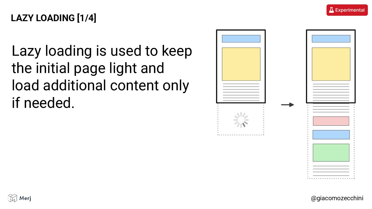
@giacomozecchini LAZY LOADING [1/4] Lazy loading is used to keep
the initial page light and load additional content only if needed. -
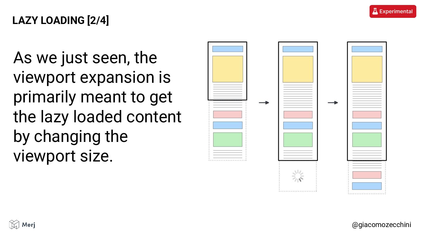
@giacomozecchini LAZY LOADING [2/4] As we just seen, the viewport
expansion is primarily meant to get the lazy loaded content by changing the viewport size. -
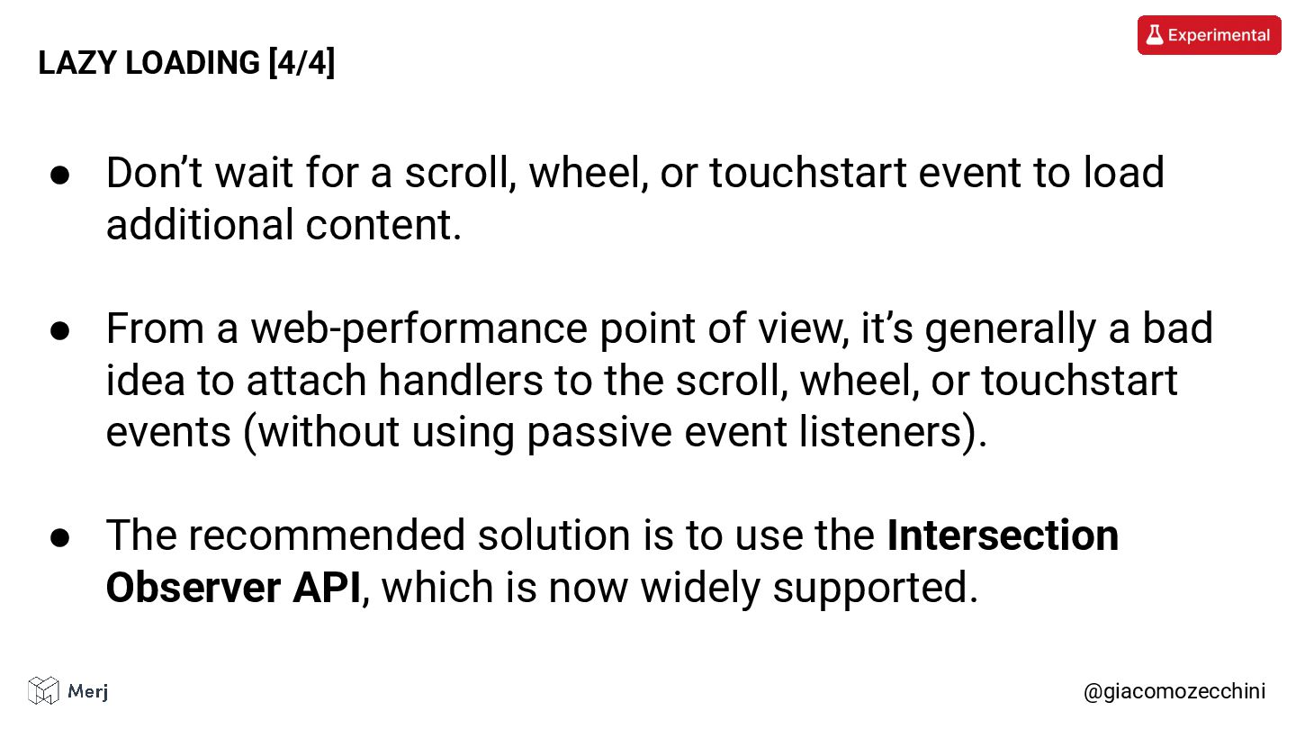
@giacomozecchini LAZY LOADING [3/4] Bots generally don’t perform actions on
a web site. If your website waits for a scroll, wheel, or touchstart event to load additional content, that event may never occur. -
@giacomozecchini LAZY LOADING [4/4] • Don’t wait for a scroll,
wheel, or touchstart event to load additional content. • From a web-performance point of view, it’s generally a bad idea to attach handlers to the scroll, wheel, or touchstart events (without using passive event listeners). • The recommended solution is to use the Intersection Observer API, which is now widely supported. -
The CSS ::before and ::after pseudo element can be used
to add “cosmetic” content to an element. @giacomozecchini ::before AND ::after PSEUDO ELEMENTS [1/4] Read more: https://css-tricks.com/7-practical-uses-for-the-before-and-after-pseudo-elements-in-css/ -
This content is not part of the DOM Tree and
is not indexed by the crawler. @giacomozecchini ::before AND ::after PSEUDO ELEMENTS [2/4] -
On some websites, the content placed in those pseudo elements
changes the semantic meaning of the text or hides important information. @giacomozecchini ::before AND ::after PSEUDO ELEMENTS [3/4] -
Do not use the ::before and ::after pseudo element to
include important information. @giacomozecchini ::before AND ::after PSEUDO ELEMENTS [4/4] -
The Computed Style of HTML heading tags (H1, H2, H3,
etc) are used to determine the relative importance of the heading tags compared to each other. @giacomozecchini HTML HEADING STYLE [1/3] Mentioned: https://www.youtube.com/watch?v=65rE4mvzCX0 -
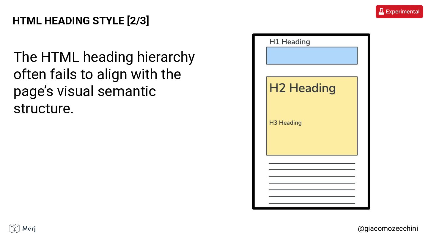
@giacomozecchini HTML HEADING STYLE [2/3] The HTML heading hierarchy often
fails to align with the page’s visual semantic structure. -
• Where possible, respect the “visual semantic” of the elements.
• If you can’t do that, just remember that the most relevant heading isn’t always your H1 (especially if it’s just that small, keyword-stuffed line at the top of the page). @giacomozecchini HTML HEADING STYLE [3/3] -
When you use display: none on an element it is
omitted from the Render Tree even if the content is still present in the DOM Tree. @giacomozecchini DISPLAY: NONE [1/4] -
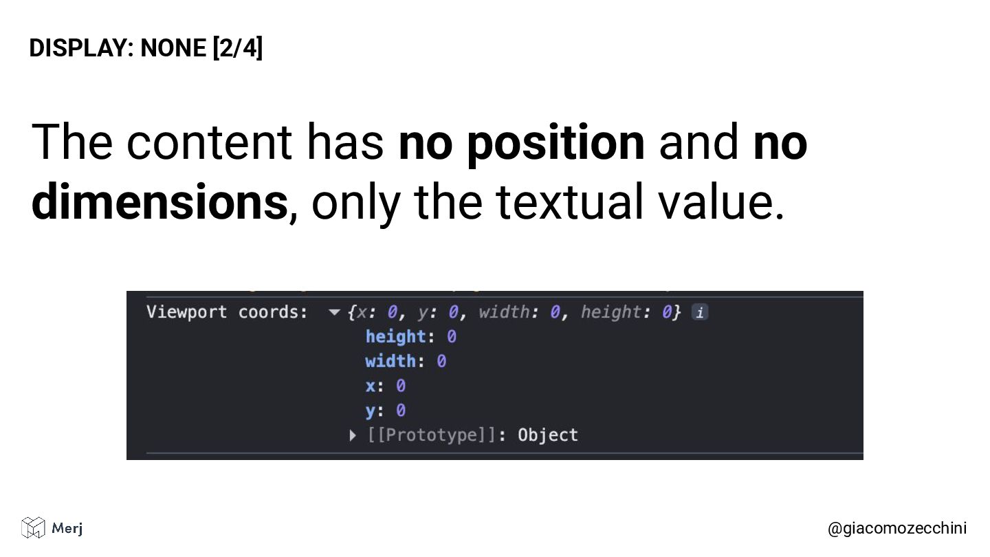
The content has no position and no dimensions, only the
textual value. @giacomozecchini DISPLAY: NONE [2/4] -
If search engines or AI crawlers factor element position into
their scoring, any element rendered without coordinates or dimensions may receive a lower relevance score. @giacomozecchini DISPLAY: NONE [3/4] -
• Display: none elements had no position and dimensions. •
Element with no position might be treated as less “important”. • Using instead visibility: hidden, an element retains its dimensions and position but is simply not rendered visibly. @giacomozecchini DISPLAY: NONE [4/4] -
@giacomozecchini INFINITE SCROLLING [1/8] Many websites implement infinite scrolling to
dynamically append new content as the user reaches the end of the page. Mentioned: https://www.youtube.com/watch?v=XgkhNF1gDKA -
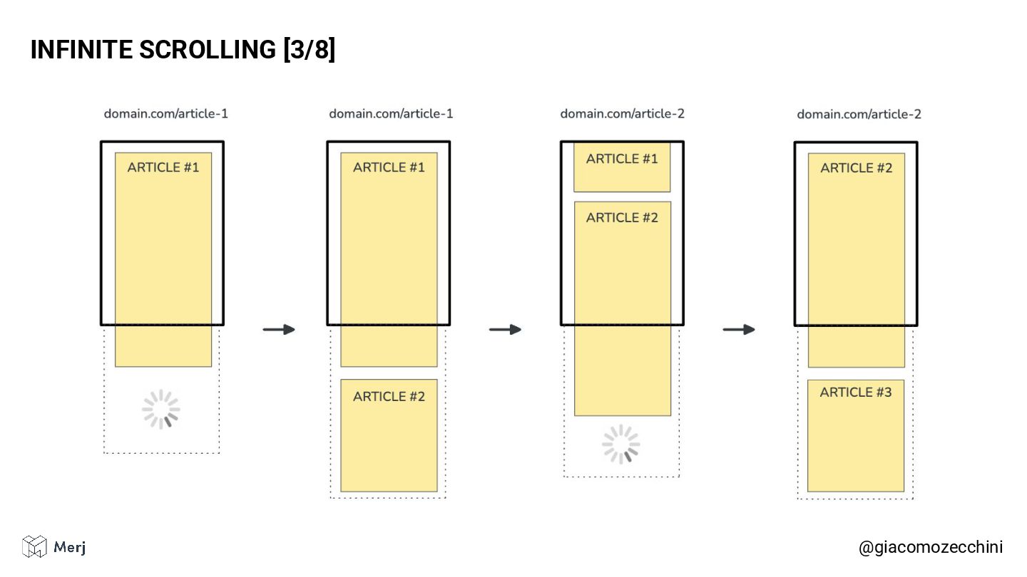
@giacomozecchini INFINITE SCROLLING [2/8] Websites that use infinite scrolling for
textual content often rely on the History API to update the URL when new content becomes fully visible. -
@giacomozecchini INFINITE SCROLLING [4/8] The issue is that even if
you change the URL using the History API during rendering, Google will still use the first URL, the one it started rendering. -
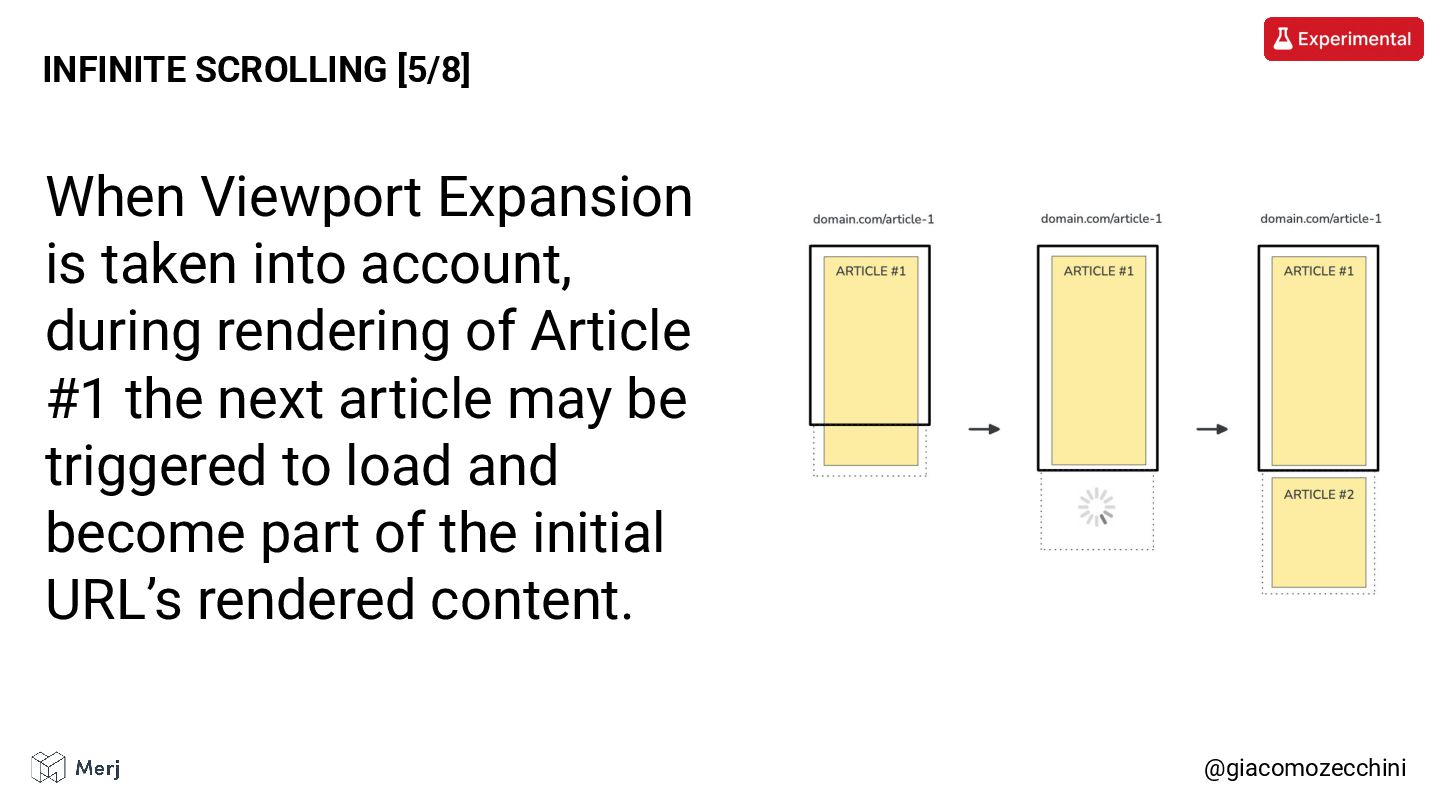
@giacomozecchini INFINITE SCROLLING [5/8] When Viewport Expansion is taken into
account, during rendering of Article #1 the next article may be triggered to load and become part of the initial URL’s rendered content. -
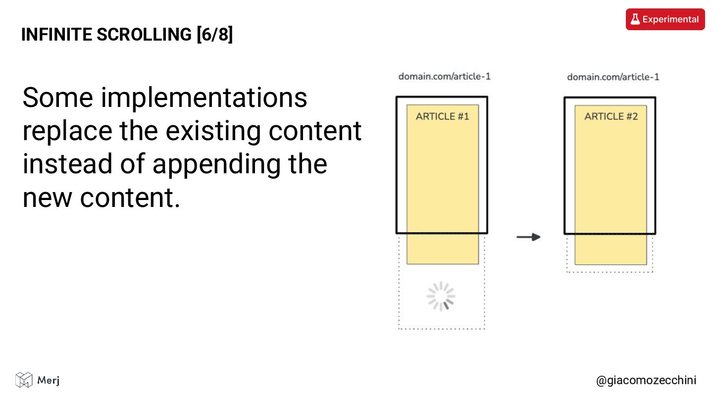
@giacomozecchini INFINITE SCROLLING [6/8] Some implementations replace the existing content
instead of appending the new content. -
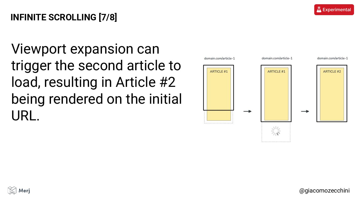
@giacomozecchini INFINITE SCROLLING [7/8] Viewport expansion can trigger the second
article to load, resulting in Article #2 being rendered on the initial URL. -
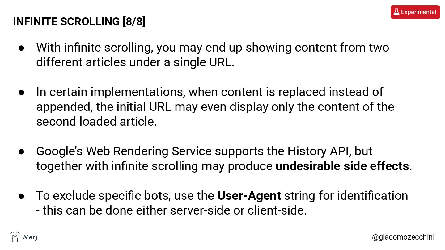
• With infinite scrolling, you may end up showing content
from two different articles under a single URL. • In certain implementations, when content is replaced instead of appended, the initial URL may even display only the content of the second loaded article. • Google’s Web Rendering Service supports the History API, but together with infinite scrolling may produce undesirable side effects. • To exclude specific bots, use the User-Agent string for identification - this can be done either server-side or client-side. @giacomozecchini INFINITE SCROLLING [8/8] -
@giacomozecchini THE VIEWPORT HEIGHT TRAP [1/6] Numerous websites render the
primary image at 100% of the viewport width and height. While typical of fullscreen layouts, this approach is not limited to them. -
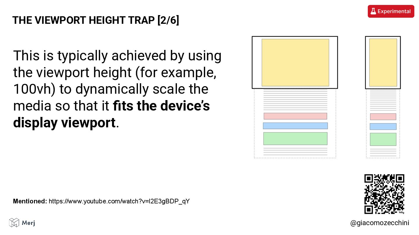
@giacomozecchini THE VIEWPORT HEIGHT TRAP [2/6] This is typically achieved
by using the viewport height (for example, 100vh) to dynamically scale the media so that it fits the device’s display viewport. Mentioned: https://www.youtube.com/watch?v=l2E3gBDP_qY -
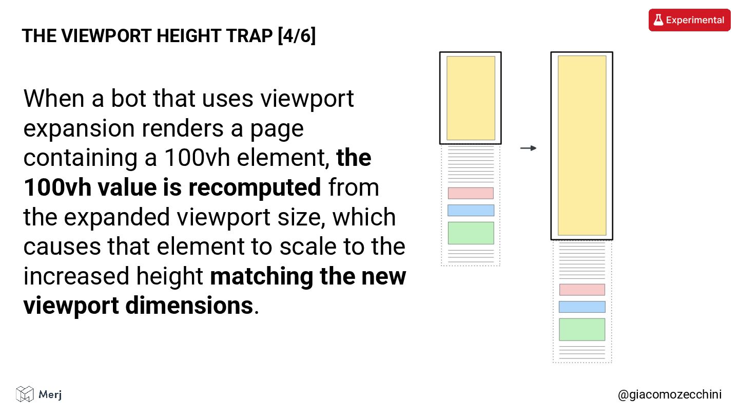
@giacomozecchini THE VIEWPORT HEIGHT TRAP [4/6] When a bot that
uses viewport expansion renders a page containing a 100vh element, the 100vh value is recomputed from the expanded viewport size, which causes that element to scale to the increased height matching the new viewport dimensions. -
If search engines or AI crawlers use above the fold
positioning into their ranking models, a 100vh hero image that pushes the primary content down the page introduces a potential problem. @giacomozecchini THE VIEWPORT HEIGHT TRAP [5/6] -
• Using 100vh for the main image of the page
means that when the viewport is resized, the element expands to match the new viewport height, which can push the main content further down the page. • Specifying a max-height preserves the fullscreen aesthetic while preventing issues with the positioning of the page’s main content. @giacomozecchini THE VIEWPORT HEIGHT TRAP [6/6] -
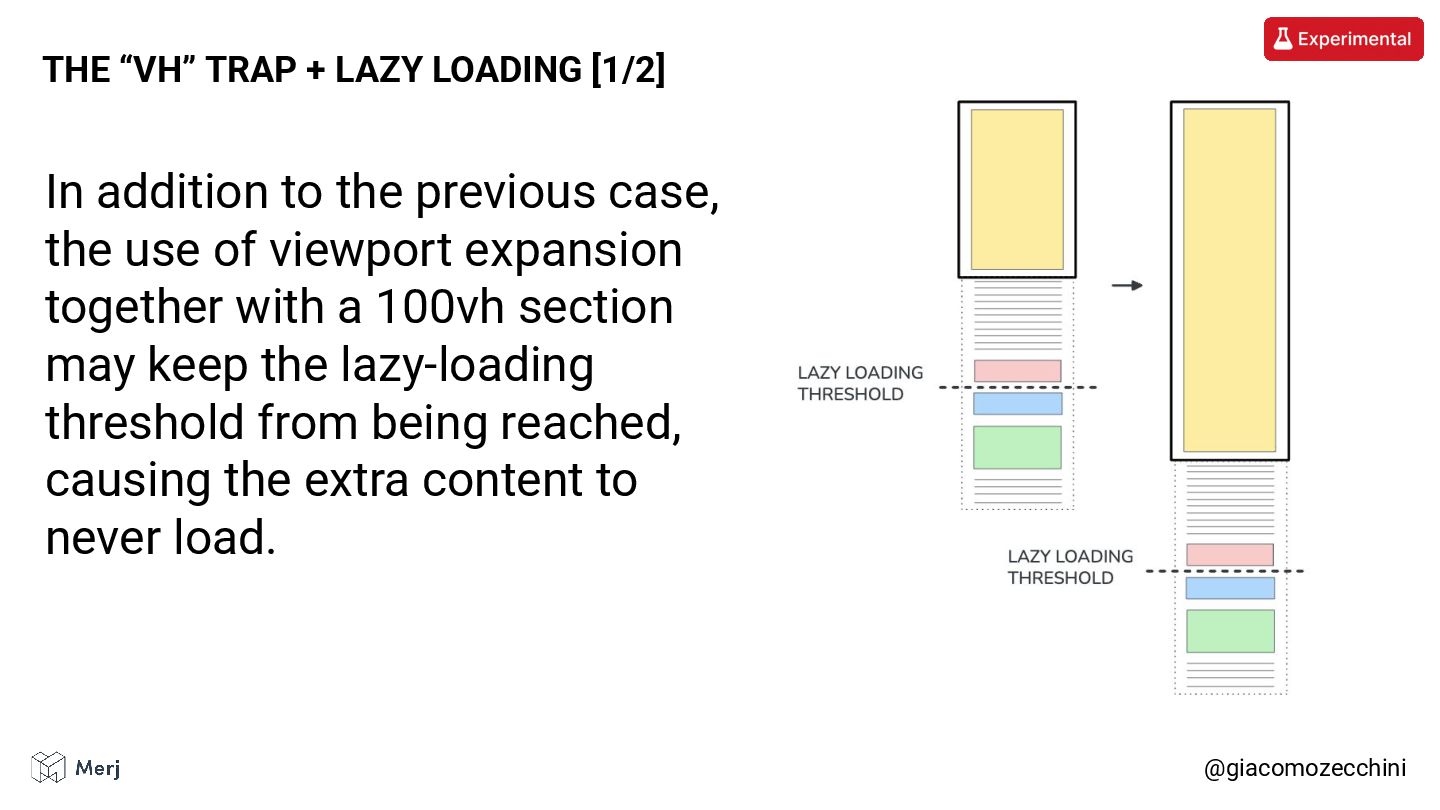
@giacomozecchini THE “VH” TRAP + LAZY LOADING [1/2] In addition
to the previous case, the use of viewport expansion together with a 100vh section may keep the lazy-loading threshold from being reached, causing the extra content to never load. -
Specifying a max-height preserves the fullscreen aesthetic while preventing issues
with the positioning of the page’s main content and lazy loaded elements. @giacomozecchini THE “VH” TRAP + LAZY LOADING [2/2] -
Even AI agents with full rendering capabilities can miss portions
of a page’s content when that content is revealed only through user-initiated events, such as “scroll” based lazy loading. @giacomozecchini AI AGENT -
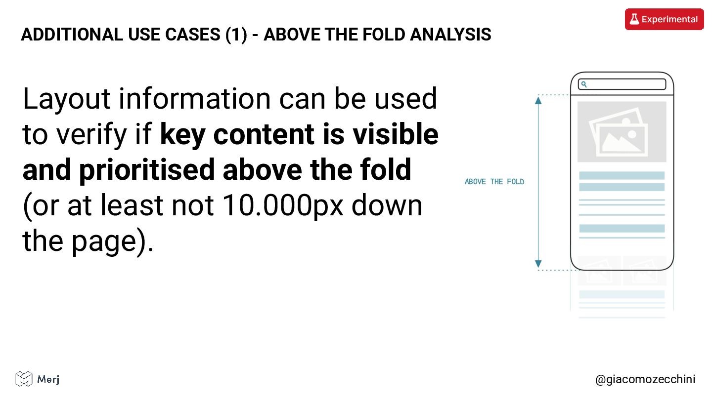
Layout information can be used to verify if key content
is visible and prioritised above the fold (or at least not 10.000px down the page). @giacomozecchini ADDITIONAL USE CASES (1) - ABOVE THE FOLD ANALYSIS -
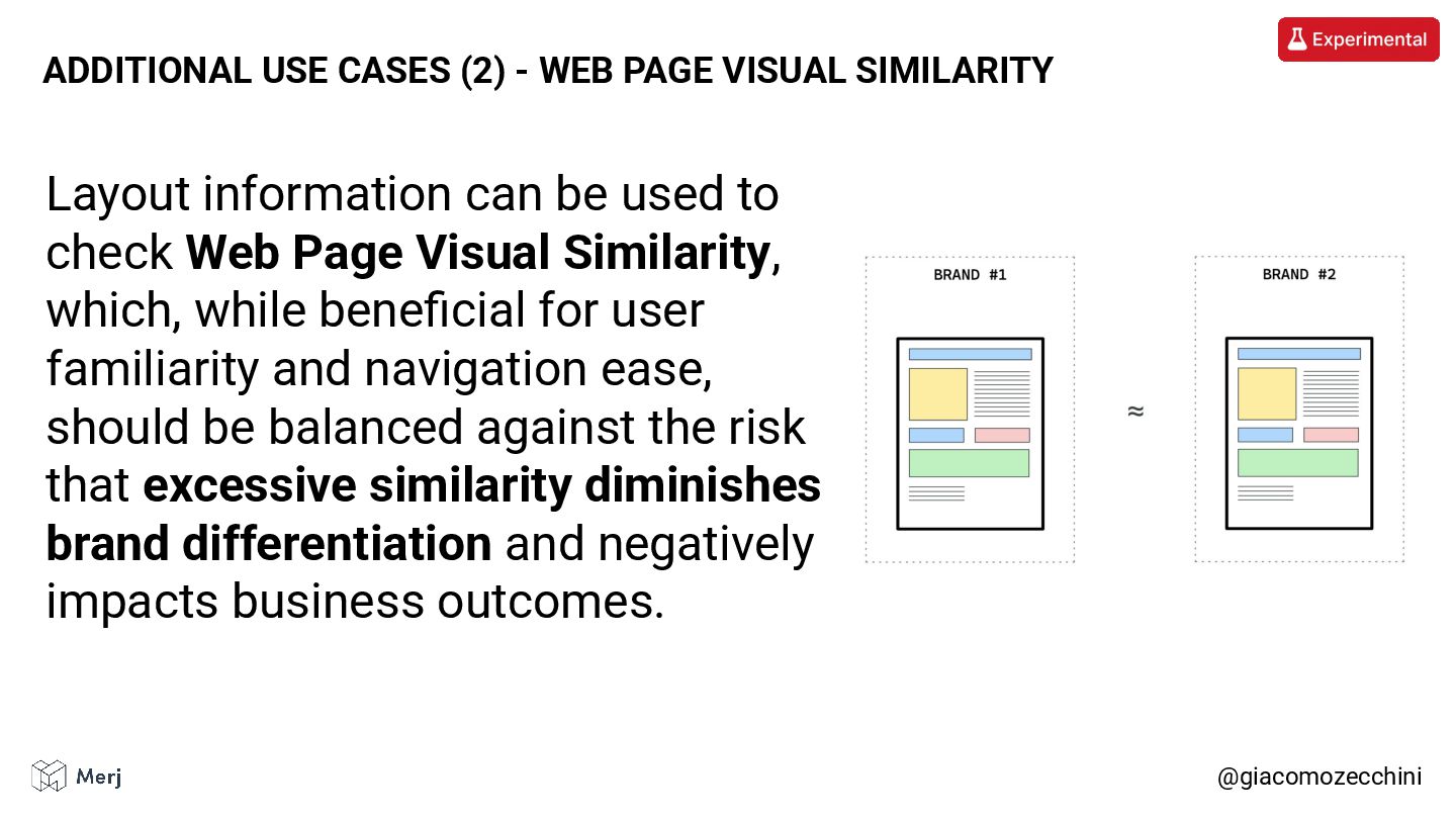
Layout information can be used to check Web Page Visual
Similarity, which, while beneficial for user familiarity and navigation ease, should be balanced against the risk that excessive similarity diminishes brand differentiation and negatively impacts business outcomes. @giacomozecchini ADDITIONAL USE CASES (2) - WEB PAGE VISUAL SIMILARITY -
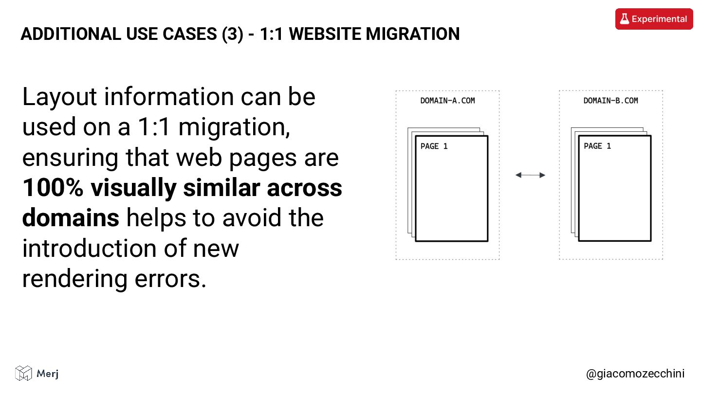
Layout information can be used on a 1:1 migration, ensuring
that web pages are 100% visually similar across domains helps to avoid the introduction of new rendering errors. @giacomozecchini ADDITIONAL USE CASES (3) - 1:1 WEBSITE MIGRATION -
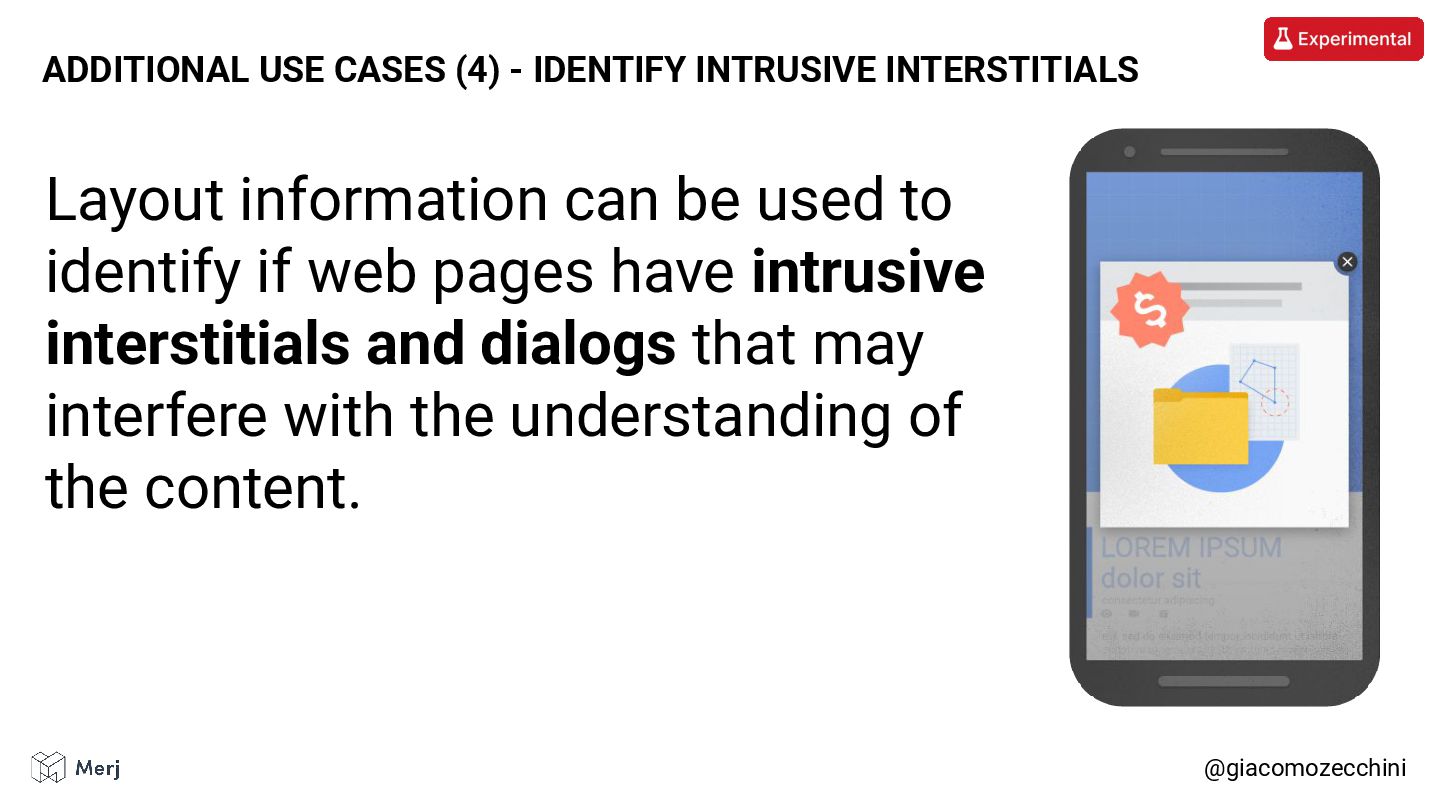
@giacomozecchini ADDITIONAL USE CASES (4) - IDENTIFY INTRUSIVE INTERSTITIALS Layout
information can be used to identify if web pages have intrusive interstitials and dialogs that may interfere with the understanding of the content. -
• Not all crawlers render web pages. • Even when
a crawler can render a page, it doesn’t always do so and it may still miss parts of the content. • Google’s viewport expansion isn’t a standard technique and can break web pages. • Layout information and computed styles are often underestimated. @giacomozecchini CLOSING REMARKS