Upgrade to Pro — share decks privately, control downloads, hide ads and more …

2017 The Impact of Typography in UX/UI

2017 The Impact of Typography in UX/UI

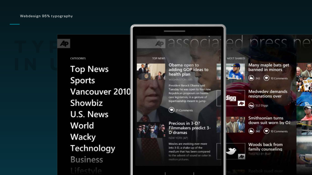
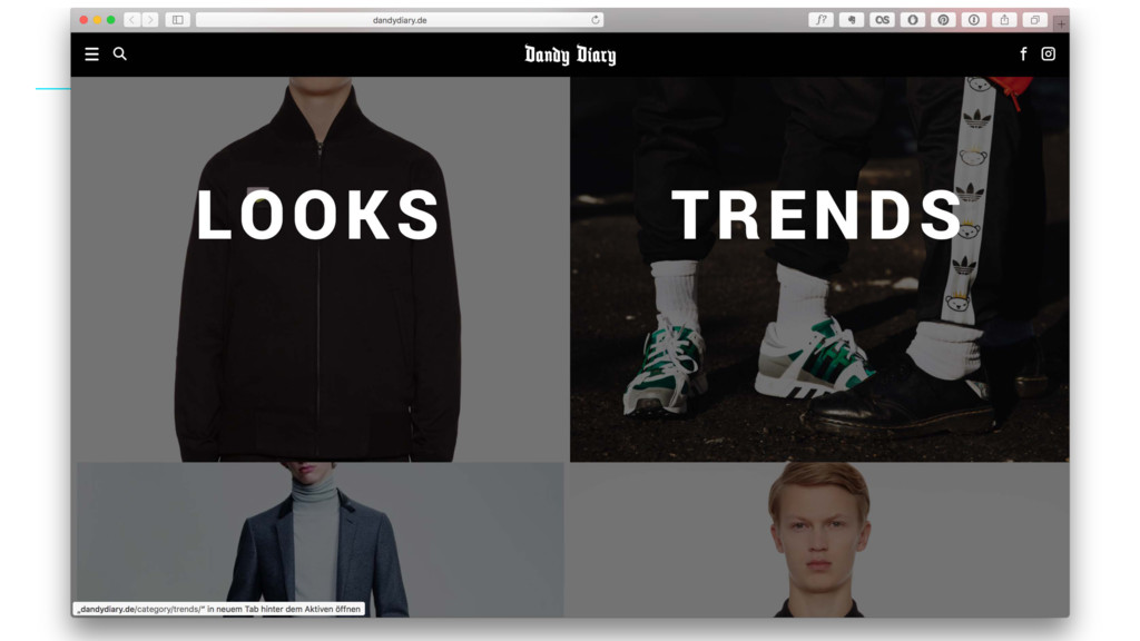
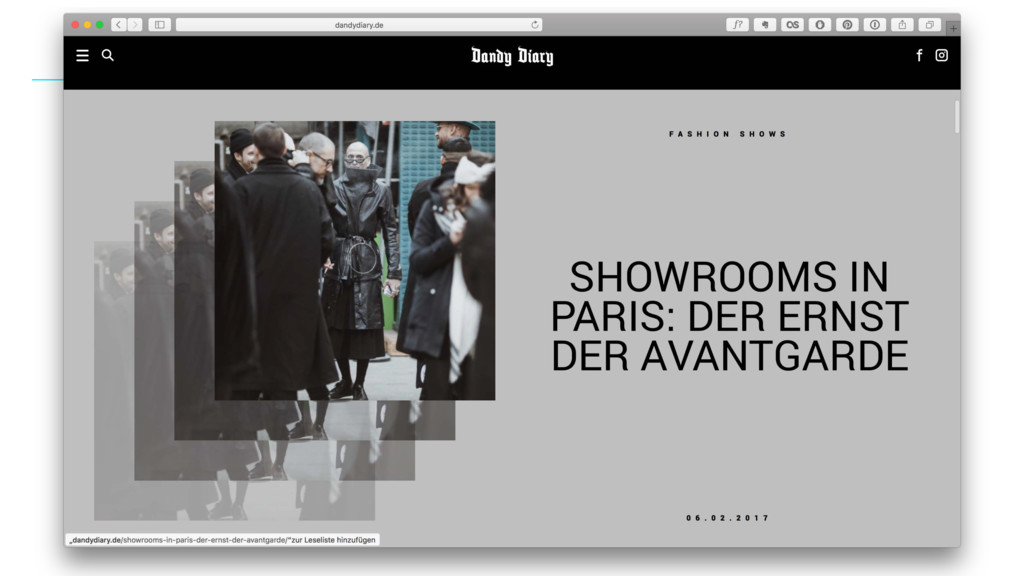
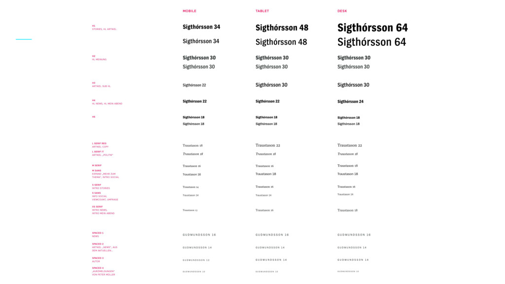
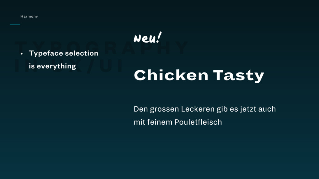
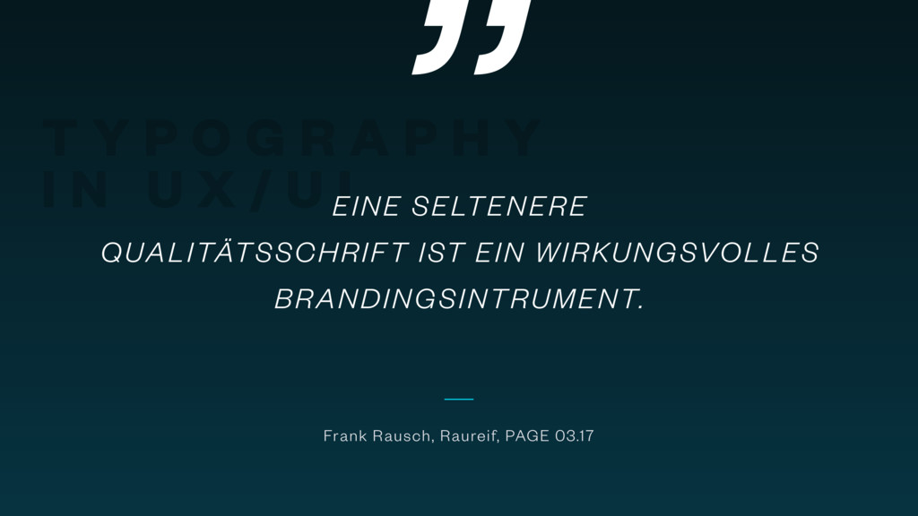
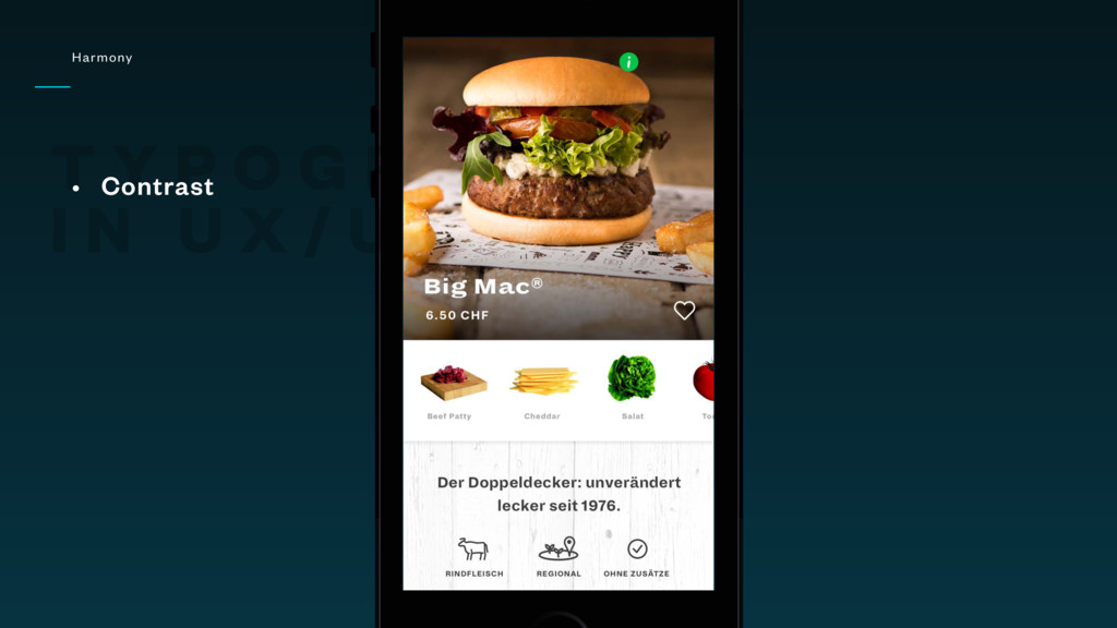
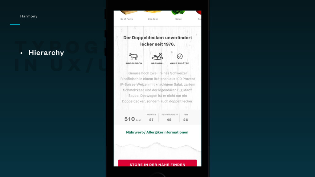
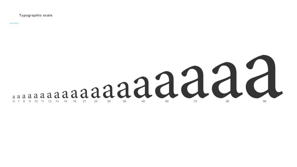
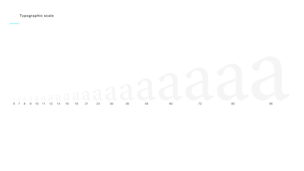
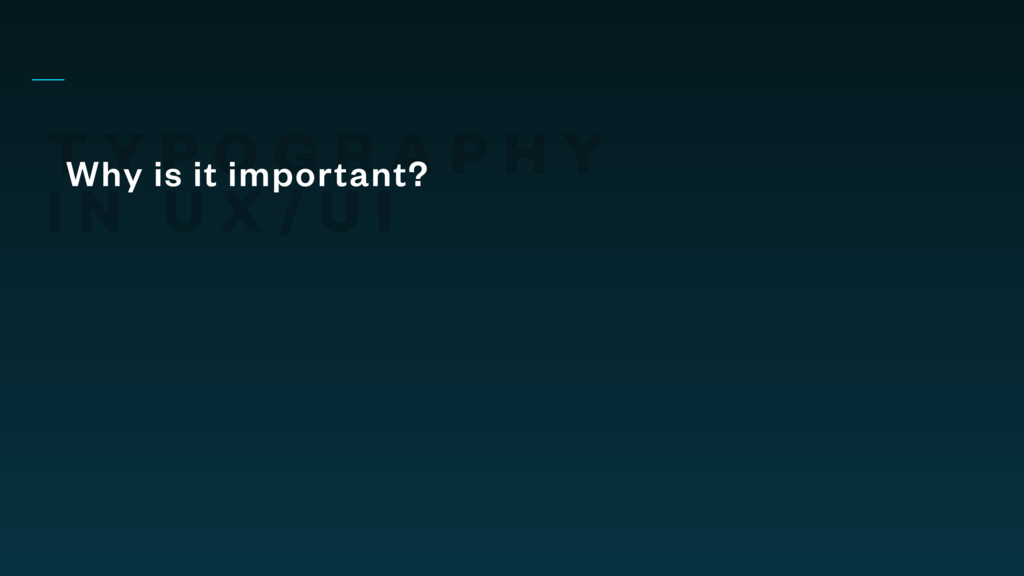
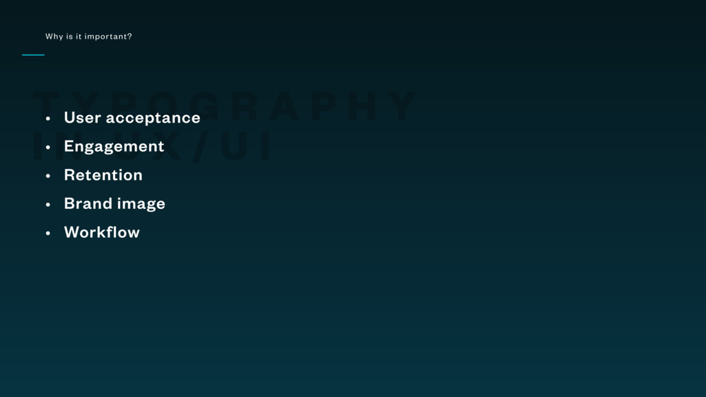
Modern interaction design - see Flat Design - is more than ever based on letters.

This talk highlights strong examples and explains how to achieve an aesthetic and powerful set of typography for any project, and how to handle it in the digital workflow.

Alexander Meinhardt

February 02, 2017
Tweet

More Decks by Alexander Meinhardt

Other Decks in Design

Transcript

  1. T Y P O G R A P H Y

    I N U X / U I K R U N C H T I M E I NT E RACT IV E
  2. „ T Y P O G R A P H

    Y I N U X / U I WEBDESIGN IS 95% TYPOGRAPHY Oliver Reichenstein, iA Labs (2006)
  3. T Y P O G R A P H Y

    I N U X / U I Webdesign 95% typography
  4. T Y P O G R A P H Y

    I N U X / U I How to achieve
  5. T Y P O G R A P H Y

    I N U X / U I Key criteria • Harmony • Aesthetics • Readability • Orientation • Brand identity
  6. T Y P O G R A P H Y

    I N U X / U I Key criteria • Harmony (or not) • Aesthetics (or not) • Readability (or not) • Orientation (or not) • Brand identity (or not)
  7. T Y P O G R A P H Y

    I N U X / U I Harmony • Typeface selection is everything Chicken Tasty Den grossen Leckeren gib es jetzt auch mit feinem Pouletfleisch Neu!
  8. „ T Y P O G R A P H

    Y I N U X / U I EINE SELTENERE QUALITÄTSSCHRIFT IST EIN WIRKUNGSVOLLES BRANDINGSINTRUMENT. Frank Rausch, Raureif, PAGE 03.17
  9. T Y P O G R A P H Y

    I N U X / U I Harmony • Contrast
  10. T Y P O G R A P H Y

    I N U X / U I Harmony • Hierarchy
  11. T Y P O G R A P H Y

    I N U X / U I Harmony • Secondary fonts
  12. T Y P O G R A P H Y

    I N U X / U I Aesthetics • Current looks
  13. T Y P O G R A P H Y

    I N U X / U I Aesthetics • Space to breathe
  14. T Y P O G R A P H Y

    I N U X / U I Aesthetics • Space to breathe
  15. T Y P O G R A P H Y

    I N U X / U I Aesthetics • Coherent line-heights
  16. T Y P O G R A P H Y

    I N U X / U I Readability • 30-40 characters per line
  17. T Y P O G R A P H Y

    I N U X / U I Readability • Smoothness
  18. T Y P O G R A P H Y

    I N U X / U I Readability • „Floor fades“
  19. T Y P O G R A P H Y

    I N U X / U I Readability • Again, space to breathe
  20. T Y P O G R A P H Y

    I N U X / U I Orientation • Guide the eyes across the page
  21. T Y P O G R A P H Y

    I N U X / U I Brand identity • Strong character
  22. T Y P O G R A P H Y

    I N U X / U I Brand identity • Strong character
  23. T Y P O G R A P H Y

    I N U X / U I Brand identity • Strong character
  24. „ T Y P O G R A P H

    Y I N U X / U I THE SMALLER THE SCREEN THE MORE IMPORTANT THE CHOSEN FONT. Bas Jacobs, Underware Type Foundry
  25. T Y P O G R A P H Y

    I N U X / U I Brand identity • Strong character
  26. T Y P O G R A P H Y

    I N U X / U I Brand identity • Strong character
  27. T Y P O G R A P H Y

    I N U X / U I Brand identity • Strong character
  28. T Y P O G R A P H Y

    I N U X / U I Brand identity • Strong character
  29. T Y P O G R A P H Y

    I N U X / U I Brand identity • Strong character
  30. T Y P O G R A P H Y

    I N U X / U I Why is it important?
  31. T Y P O G R A P H Y

    I N U X / U I Why is it important? • User acceptance • Engagement • Retention • Brand image • Workflow