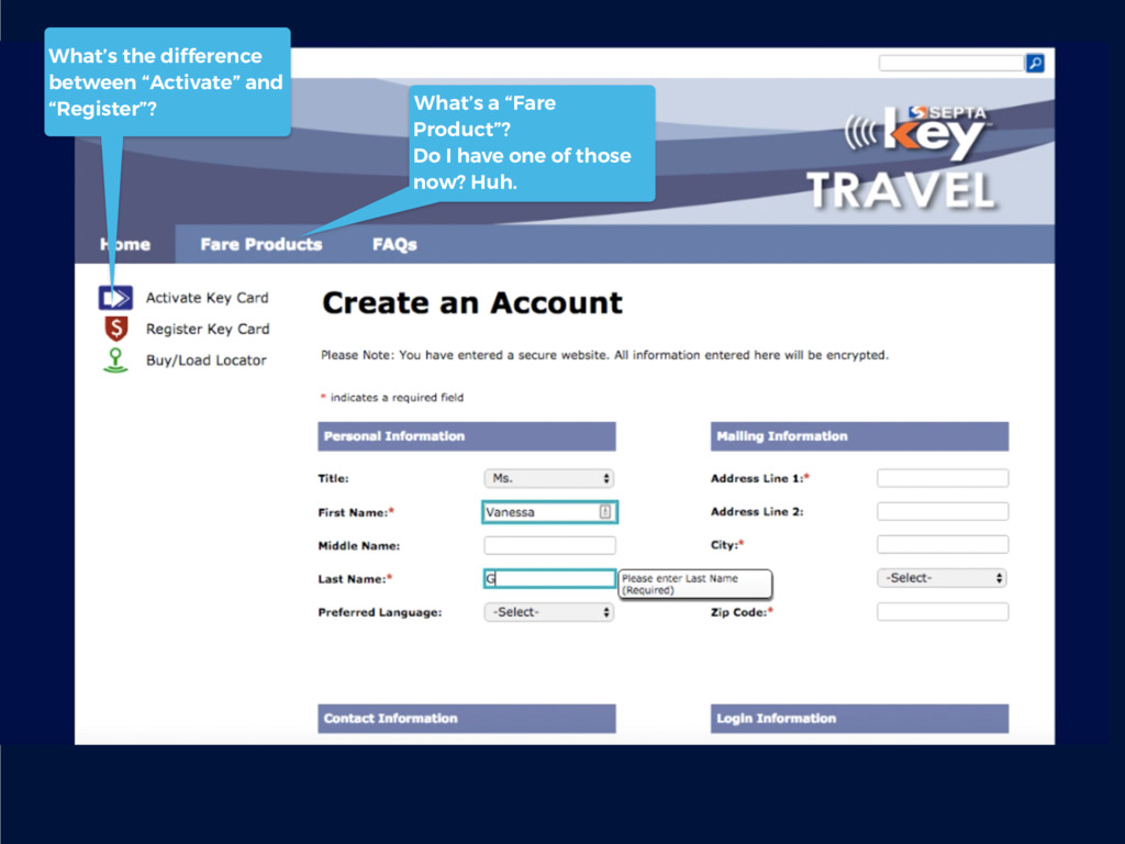
that’s a really similar term to “Activate” and “Register”… A progress bar would be great here—I’m nervous I’m doing this wrong. Friendlier copy here (e.g. “Hold on, let’s validate your account first”) would go a long way, as would helping me understand what I’m going to do next…
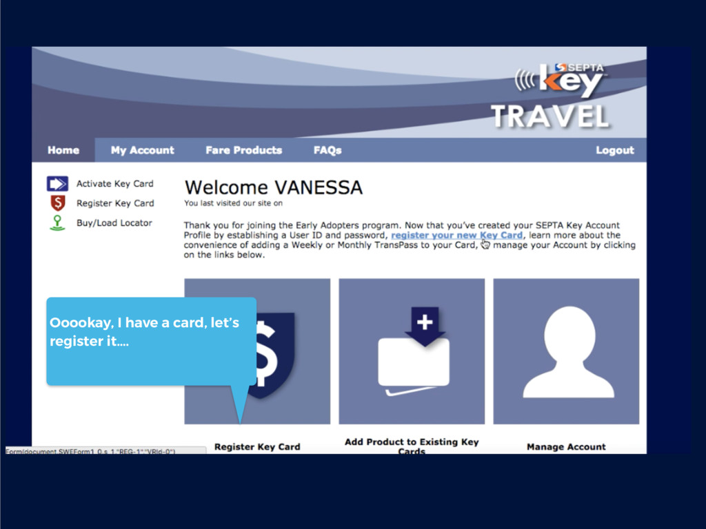
register my Key Card next… “Add Product” is awkward— and how is that different than, say, Managing Your Account? I love it when I’m the silhouette of a generic “user” and a creepy outline to boot!
is taking up real estate here…. And since I’ve only been here once, now it’s oddly blank… Let’s get some visual orientation up in this piece.. We still have no idea what this Key Card looks like…