$30 off During Our Annual Pro Sale. View Details »

Type on Maps: All the Little Things that Actually Matter

Type on Maps: All the Little Things that Actually Matter

Elaine Guidero
Penn State University
#nacis2015

Nathaniel V. KELSO

October 15, 2015
Tweet

More Decks by Nathaniel V. KELSO

Other Decks in Education

Transcript

  1. Six
    All the little things
    that actually matter
    Type on maps
    Elaine Guidero
    NACIS 2015
    Minneapolis, MN

    View Slide

  2. Six
    So...we’re mapping Prince

    View Slide

  3. Six

    View Slide

  4. Six

    View Slide

  5. Six

    View Slide

  6. Six

    View Slide

  7. Six
    Typeface tones—different semantic effects
    The lazy dog and quick 
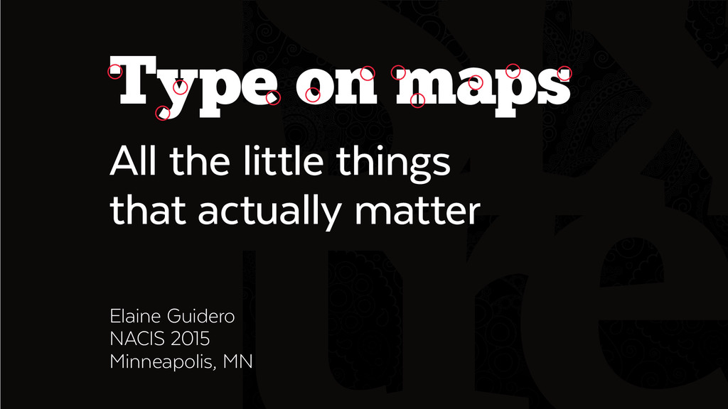
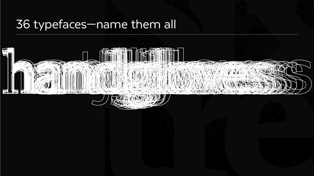
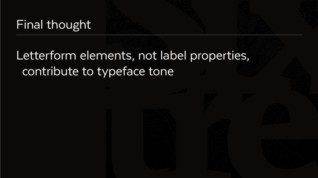
fox both took a nap.
    The lazy dog and quick fox both took a nap.
    The lazy dog and quick fox both took a nap.
    The lazy dog and quick fox both took a nap.
    The lazy dog and quick fox both took a nap.

    View Slide

  8. Six
    A font anatomy lesson

    View Slide

  9. Six
    Microaesthetics
    Univers Baskerville Adobe Jenson Pro

    View Slide

  10. Six
    Microaesthetics terminal
    Univers Baskerville Adobe Jenson Pro

    View Slide

  11. Six
    Microaesthetics
    Univers Baskerville Adobe Jenson Pro
    spur

    View Slide

  12. Six
    Microaesthetics
    Univers Baskerville Adobe Jenson Pro

    View Slide

  13. Six
    Microaesthetics serif
    Univers Baskerville Adobe Jenson Pro

    View Slide

  14. Six
    Microaesthetics stroke contrast
    Univers Baskerville Adobe Jenson Pro

    View Slide

  15. Six
    Microaesthetics
    Univers Baskerville Adobe Jenson Pro

    View Slide

  16. Six
    Microaesthetics ear
    Univers Baskerville Adobe Jenson Pro

    View Slide

  17. Six
    Microaesthetics story
    1 2 2
    Univers Baskerville Adobe Jenson Pro

    View Slide

  18. Six
    Looking for microaesthetics
    Uppercase letters: Q, &, J, G, 
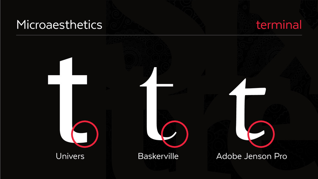
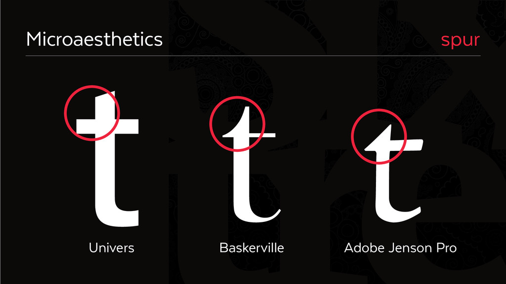
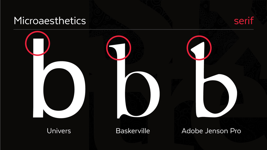
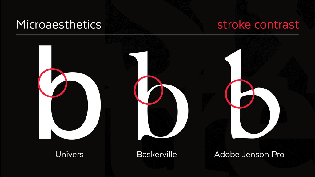
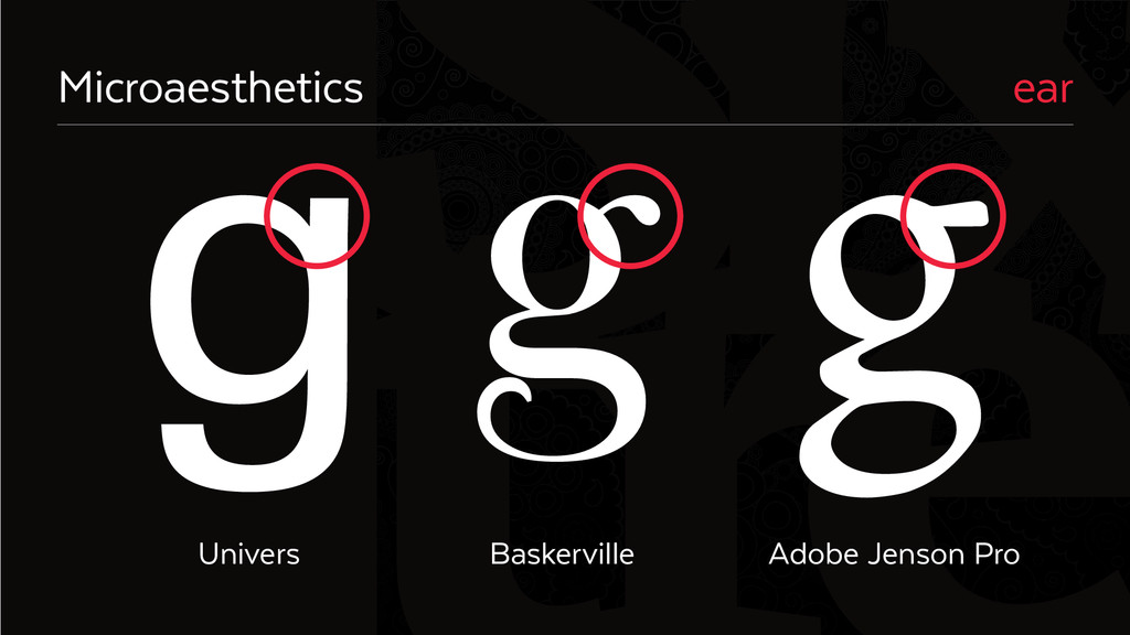
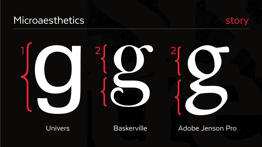
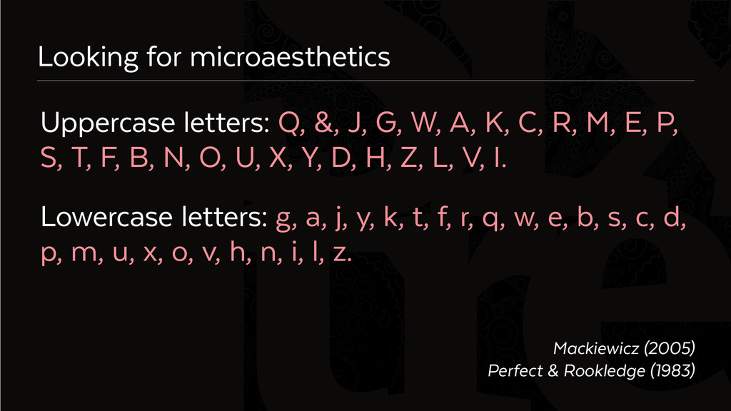
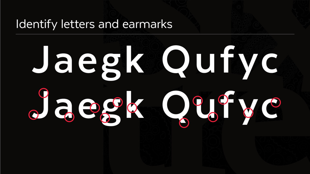
W, A, K, C, R, M, E, P,
    S, T, F, B, N, O, U, X, Y, D, H, Z, L, V, I.
    Lowercase letters: g, a, j, y, k, t, f, r, q, w, e, b, s, c, d,
    p, m, u, x, o, v, h, n, i, l, z.
    Mackiewicz (2005)
    Perfect & Rookledge (1983)

    View Slide

  19. Six
    Cartographic research on type aesthetics is inaccurate

    View Slide

  20. Six
    Why? Label properties ≠ typeface attributes
    Labels: describe features
    have properties external to the typeface
    Typefaces: have a coherent design
    have inherent properties that drive
    perception of personality

    View Slide

  21. Six
    Label properties (macroaesthetics)
    1. spline or tilt
    2. kerning/tracking
    3. point size
    (not x-height)
    Deeb et al. 2012
    Caroga Lake Caroga Lake
    I t h a c a Ithaca
    Paisley Park Paisley Park

    View Slide

  22. Six
    Typeface attributes (microaesthetics)
    1. serif style
    2. terminal style
    3. x-height
    Caroga Lake
    Ithaca Ithaca
    Paisley Park Paisley Park
    Childers & Jass 2002; Koch 2012
    Caroga Lake

    View Slide

  23. Six
    So how do you choose a typeface?
    Use microaesthetics, not macroaesthetics, to
    identify semantic effect & determine tone
    Inductive research to establish guidelines

    View Slide

  24. Six
    User study
    1. Expert cartographers (you) chose typefaces
    2. Expert users (typographers) evaluate designs
    on their semantic effect
    3. Context of national mapping

    View Slide

  25. Six
    8 semantic effects
    bland modern
    cheap neutral
    corporate serious
    friendly whimsical

    View Slide

  26. Six
    36 typefaces—name them all

    View Slide

  27. Six
    Arial
    Linotype Avenir
    FF Bau
    Cabin
    Camphor Std
    Adobe 
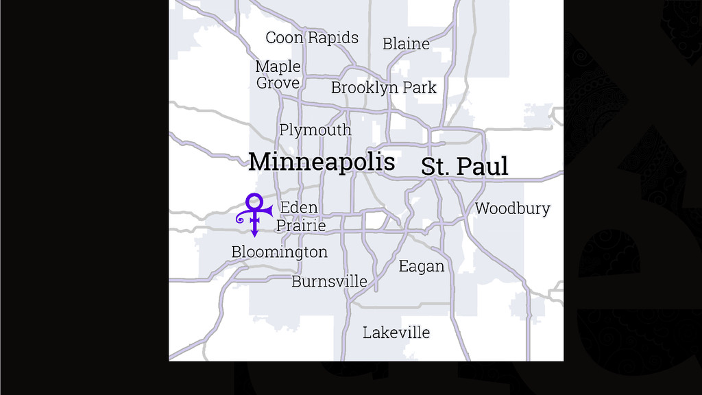
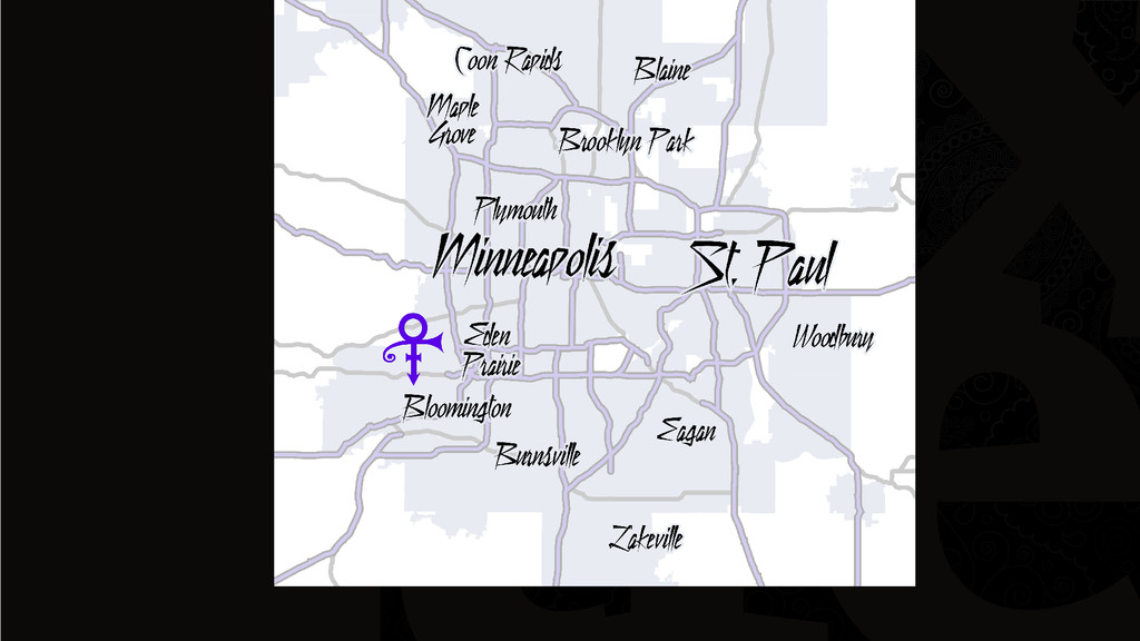
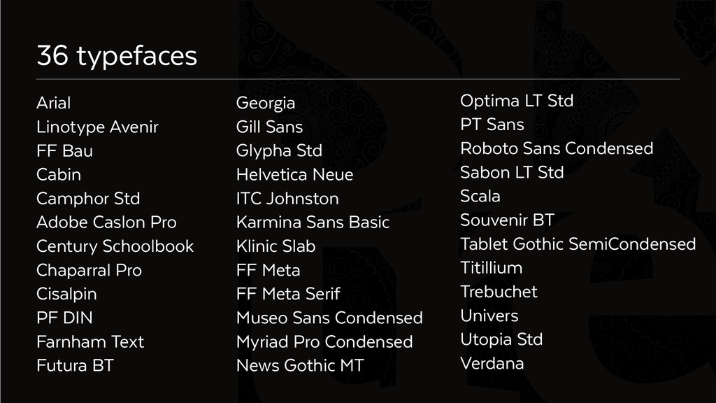
Caslon Pro
    Century Schoolbook
    Chaparral Pro
    Cisalpin
    PF DIN
    Farnham Text
    Futura BT
    Georgia
    Gill Sans
    Glypha Std
    Helvetica Neue
    ITC Johnston
    Karmina Sans Basic
    Klinic Slab
    FF Meta
    FF Meta Serif
    Museo Sans Condensed
    Myriad Pro Condensed
    News Gothic MT
    36 typefaces
    Optima LT Std
    PT Sans
    Roboto Sans Condensed
    Sabon LT Std
    Scala
    Souvenir BT
    Tablet Gothic SemiCondensed
    Titillium
    Trebuchet
    Univers
    Utopia Std
    Verdana

    View Slide

  28. Six
    Preliminary results (n=5)
    most bland
    most cheap
    most corporate
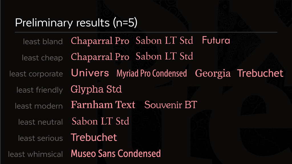
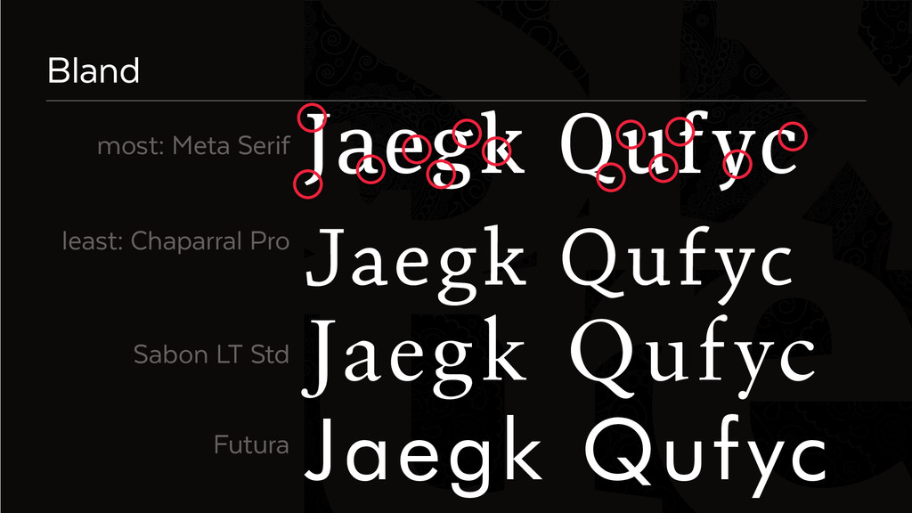
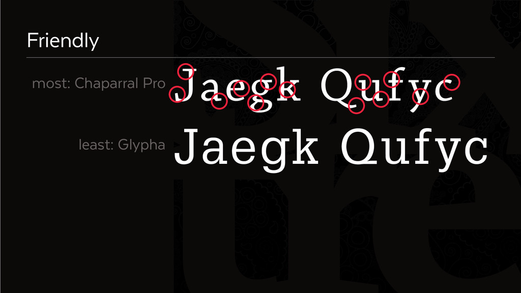
    most friendly
    most modern
    most neutral
    most serious
    most whimsical
    Meta Serif
    Chaparral Pro
    Futura
    Arial
    Sabon LT Std
    Trebuchet
    Titillium
    Tablet Gothic SemiCondensed

    View Slide

  29. Six
    Preliminary results (n=5)
    Sabon LT Std
    Sabon LT Std
    Sabon LT Std
    Souvenir BT
    Glypha Std
    least bland
    least cheap
    least corporate
    least friendly
    least modern
    least neutral
    least serious
    least whimsical

    View Slide

  30. Six
    Identify letters and earmarks
    Jaegk Qufyc
    Jaegk Qufyc

    View Slide

  31. Six
    Bland
    Jaegk Qufyc
    most: Meta Serif
    least: Chaparral Pro
    Sabon LT Std
    Futura
    Jaegk Qufyc
    Jaegk Qufyc
    Jaegk Qufyc

    View Slide

  32. Six
    Jaegk Qufyc
    Jaegk Qufyc
    Friendly
    most: Chaparral Pro
    least: Glypha

    View Slide

  33. Six
    Final thought
    Letterform elements, not label properties,
    contribute to typeface tone

    View Slide

  34. Six
    xkcd.com

    View Slide

  35. Six
    References & resources
    Childers, T. L., and J. Jass. 
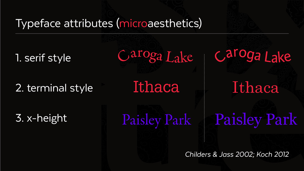
2002. All dressed up with something to say: effects of typeface semantic
    associations on brand perceptions and consumer memory. Journal of Consumer Psychology 12 (2): 93–106.
    Deeb, R., K. Ooms, and P. De Maeyer. 2012. Typography in the Eyes of Bertin, Gender and Expertise Variation.
    The Cartographic Journal 49 (2): 176–185.
    Koch, B. E. 2012. Emotion in typographic design: an empirical examination. Visible Language 46 (3): 206–227.
    Mackiewicz, J. O. 2005. How to use five letterforms to gauge a typeface’s personality: a resarch-driven method.
    Journal of Technical Writing and Communication 35 (3): 291–315.
    Perfect, C., and G. Rookledge. 1983. Rookledge’s International Type-Finder. London, UK: Sarema Press.
    Raisz, E. 1962. Principles of Cartography. New York: McGraw-Hill.
    http://thetypestudio.com/type-talk/the-anatomy-of-a-character/

    View Slide

  36. Six
    Palette
    Texta Regular
    Texta Light
    R255 G255 B255
    R245 G144 B152
    R238 G36 B60
    R90 G0 B231
    R102 G97 B97
    R12 G10 B10

    View Slide