$30 off During Our Annual Pro Sale. View Details »

[That Conference 2018] Lost in the Woods: Tackling Usability as a Non-UXer

Rachel Krause
August 06, 2018

[That Conference 2018] Lost in the Woods: Tackling Usability as a Non-UXer

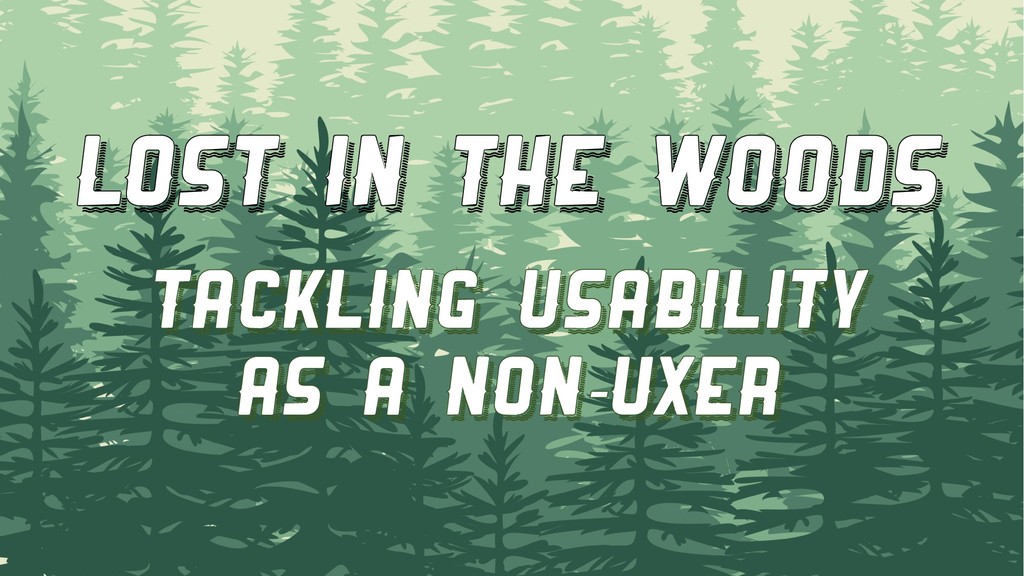
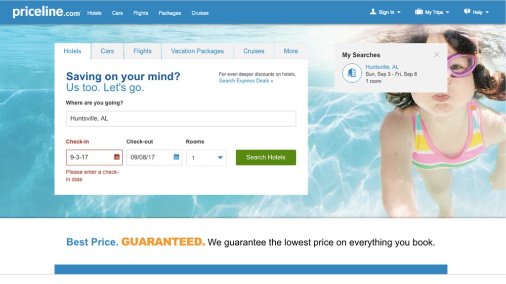
Users are expecting more from our applications than ever before. With the variety of technology at our fingertips, we're able to create robust interfaces that satisfy multiple business needs. But in our rush to cram all of our work into a release, are we sacrificing usability?

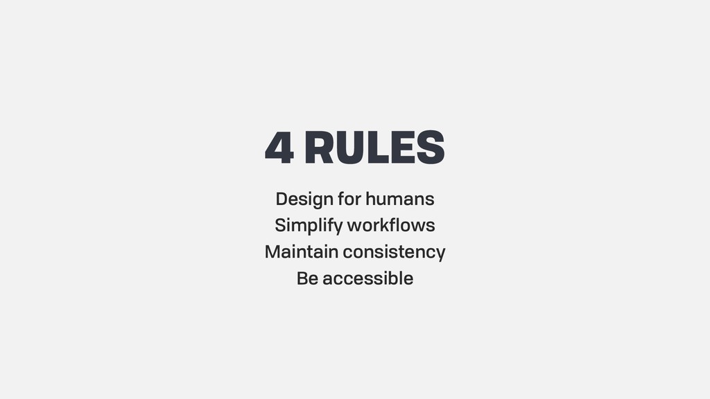
In this session, we'll discuss UX principles that will make your applications more user-friendly. In my years as a UX professional, I've run into the same problems over and over that have relatively easy fixes. We'll talk through real-life examples and you'll leave with a UX checklist covering multiple topics, including:

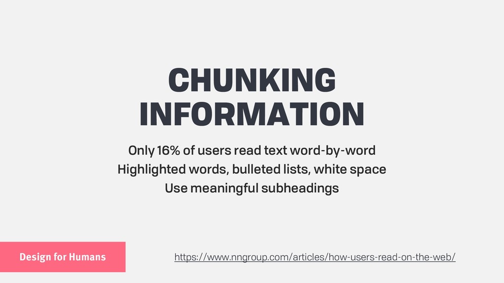
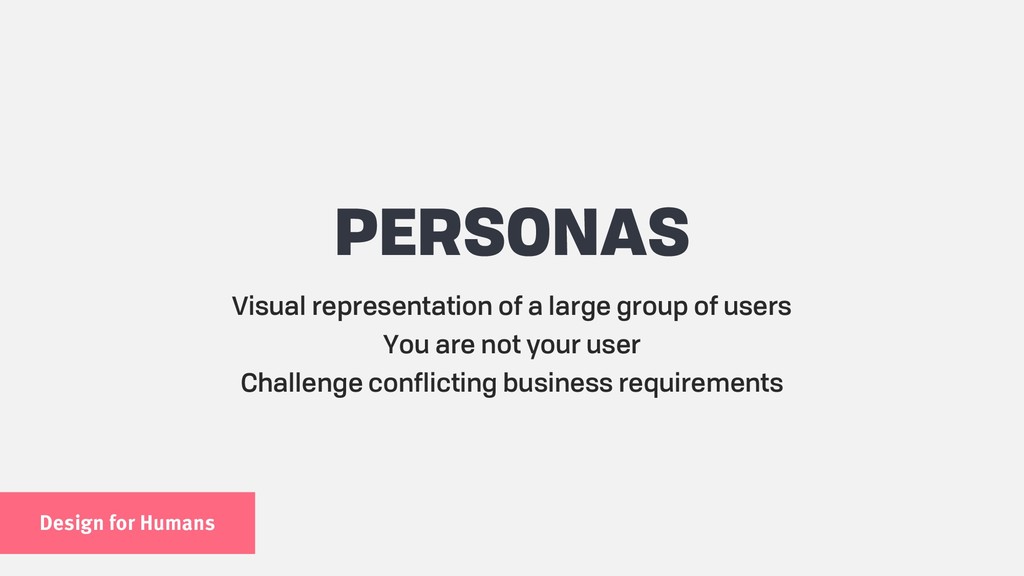
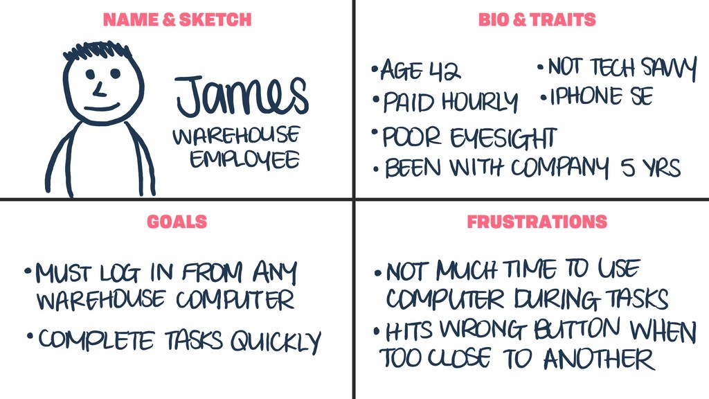
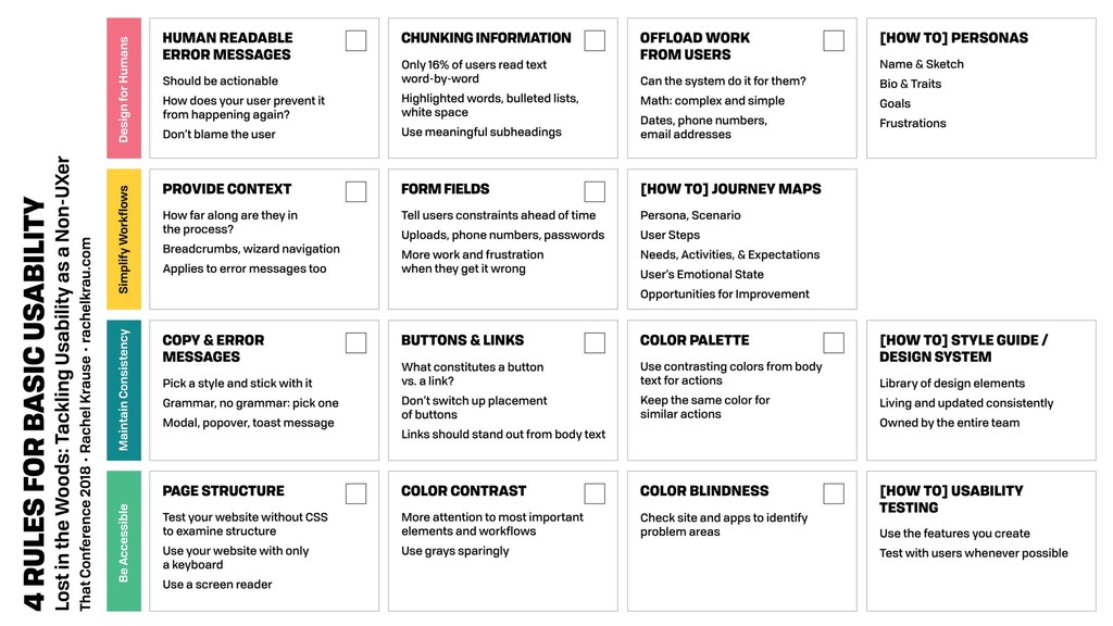
Designing for humans
Complex workflows
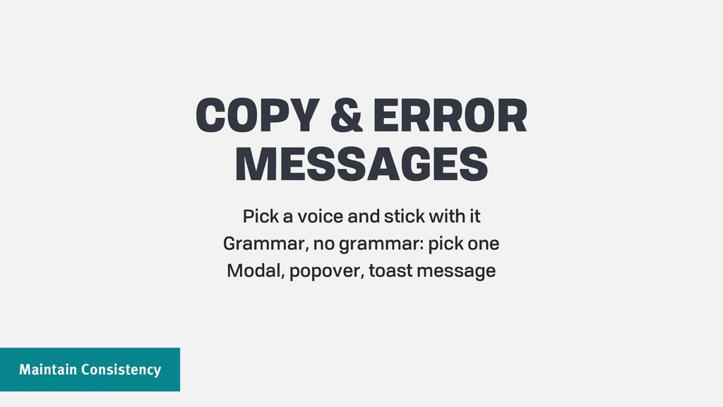
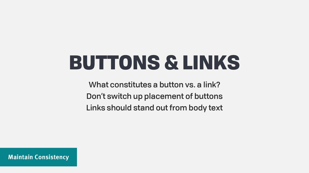
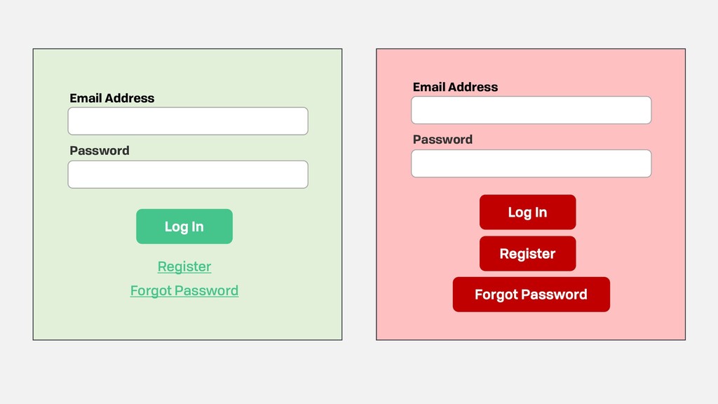
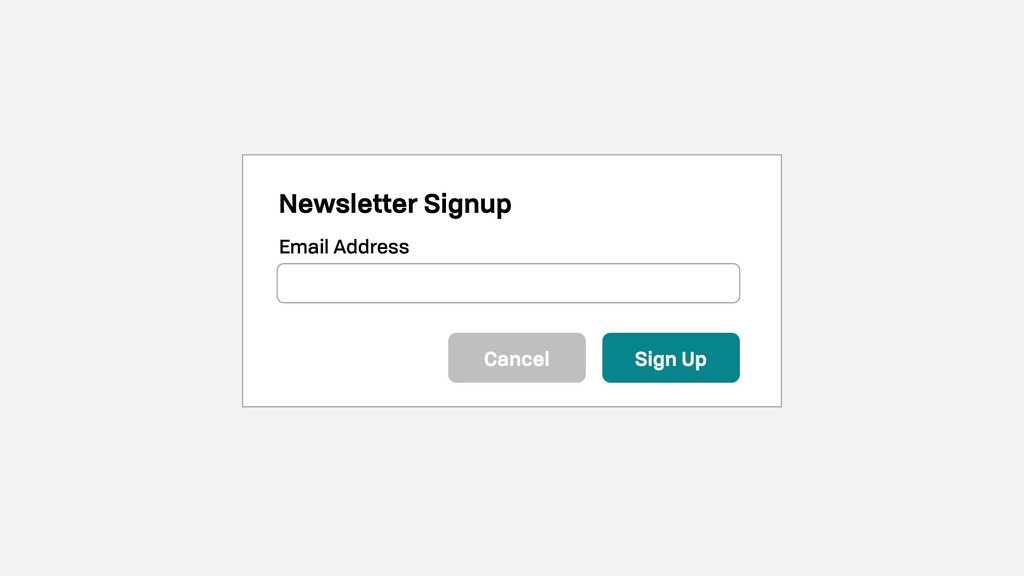
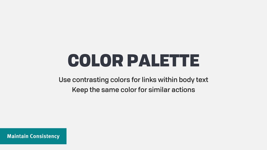
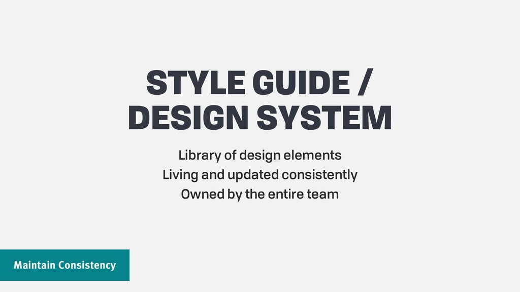
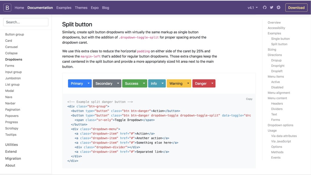
Maintaining consistency
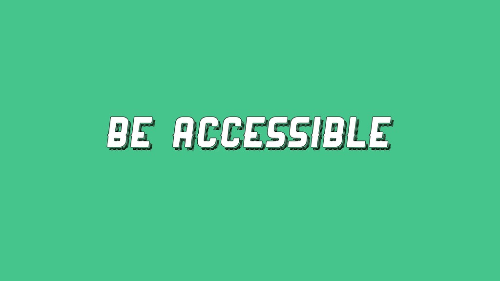
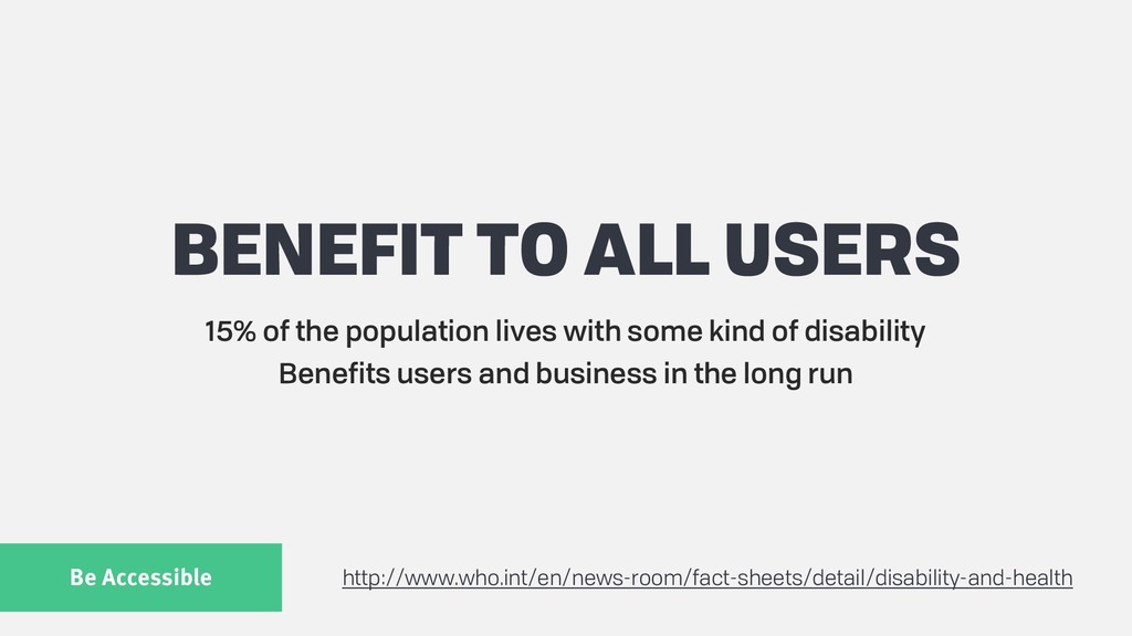
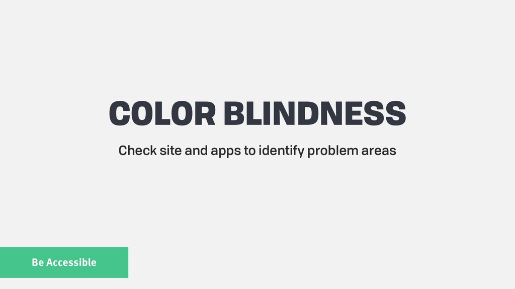
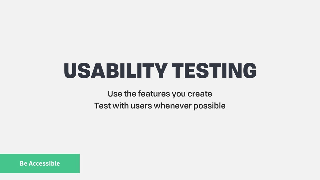
Accessibility

And more!

Whether you're on a development team with little to no UX guidance, flying solo, or just want to develop a more user-centered mindset, you'll learn how easy it can be to create usable products.
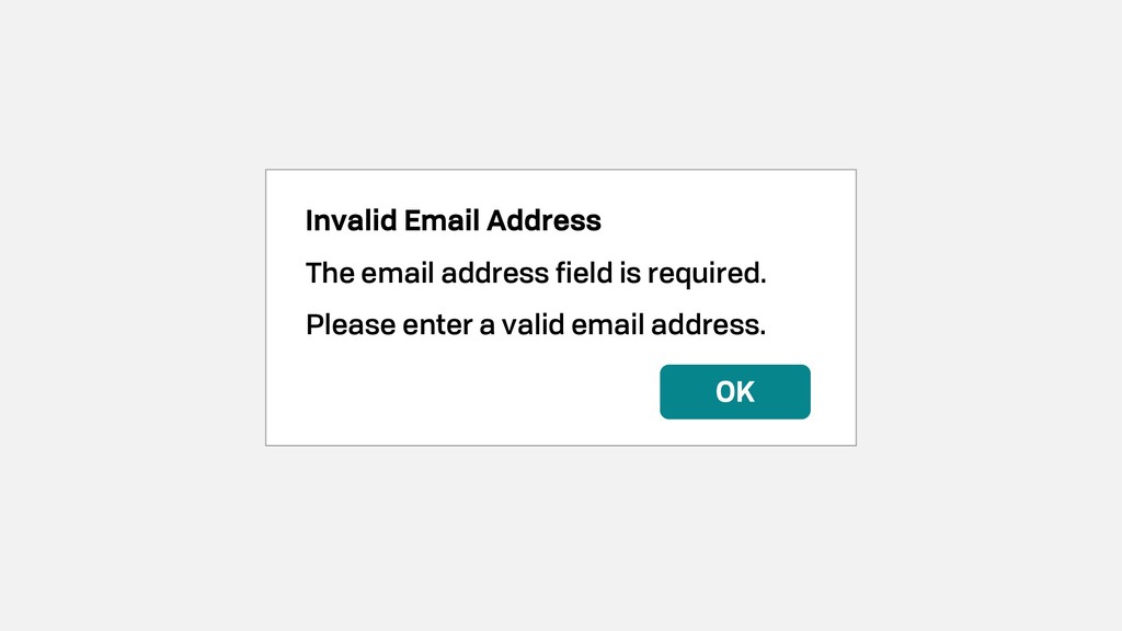
Rachel Krause

August 06, 2018
Tweet

More Decks by Rachel Krause

Other Decks in Design

Transcript

  1. View Slide

  2. View Slide

  3. View Slide

  4. View Slide

  5. Hey!
    I’m Rachel
    @rachelkrau | #thatconference
    rachelkrau.com/speaking

    View Slide

  6. View Slide

  7. View Slide

  8. View Slide

  9. View Slide

  10. View Slide

  11. Usability goes
    beyond UI design

    View Slide

  12. JAKOB NIELSEN’S
    USABILITY COMPONENTS
    Learnability
    Efficiency
    Memorability
    Errors
    Satisfaction
    https://www.nngroup.com/articles/usability-101-introduction-to-usability/

    View Slide

  13. LEARNABILITY
    How easy is it for users to accomplish basic tasks the first
    time they encounter the design?

    View Slide

  14. EFFICIENCY
    Once users have learned the design, how quickly can
    they perform the tasks?

    View Slide

  15. MEMORABILITY
    When users return to the design after a period of not using it,
    how easily can they reestablish proficiency?

    View Slide

  16. ERRORS
    How many errors do users make, how severe are these errors,
    and how easily can they recover from these errors?

    View Slide

  17. SATISFACTION
    How pleasant is it to use the design?

    View Slide

  18. JAKOB NIELSEN’S
    USABILITY COMPONENTS
    Learnability
    Efficiency
    Memorability
    Errors
    Satisfaction

    View Slide

  19. 4 RULES
    Design for humans
    Simplify workflows
    Maintain consistency
    Be accessible

    View Slide

  20. View Slide

  21. Design for Humans
    HUMAN-READABLE
    ERROR MESSAGES
    Should be actionable
    How does your user prevent it from happening again?
    Don’t blame the user

    View Slide

  22. https://uxplanet.org/how-to-write-good-error-messages-858e4551cd4

    View Slide

  23. View Slide

  24. Cannot Rename
    A file with that name already
    exists. Please specify a unique
    name.
    OK
    Cannot Rename
    Specify another name.
    OK
    https://uxplanet.org/how-to-write-good-error-messages-858e4551cd4

    View Slide

  25. Design for Humans
    CHUNKING
    INFORMATION
    Only 16% of users read text word-by-word
    Highlighted words, bulleted lists, white space
    Use meaningful subheadings
    https://www.nngroup.com/articles/how-users-read-on-the-web/

    View Slide

  26. Applications in Design
    The influential writer Steve Krug is the one
    who popularized the application of cognitive
    load theory to web design.
    Among the many valuable lessons in the
    book, here are some of our favorites:
    • Every page should be self-explanatory.
    • Users tend to “satisfice” — that is, take the
    first or easiest solution to their problem,
    instead of the best.
    Working Memory
    What if every time you wanted to open the
    fridge, you had to answer a Sphinxian riddle.
    The influential writer Steve Krug is the one
    who popularized the application of cognitive
    load theory to web design.
    Among the many valuable lessons in the
    book, here are some of our favorites: Every
    page should be self-explanatory. Users tend
    to “satisfice” — that is, take the first or easiest
    solution to their problem, instead of the best.
    What if every time you wanted to open the
    fridge, you had to answer a Sphinxian riddle.
    It would get old after a while, right? But
    according to cognitive load theory, that’s the
    same kind of frustration users feel with poor
    UX design.
    https://www.smashingmagazine.com/2016/09/reducing-cognitive-overload-for-a-better-user-experience/

    View Slide

  27. Design for Humans
    OFFLOAD WORK
    FROM USERS
    Can the system do it for them?
    Math: complex and simple
    Dates, phone numbers, email addresses
    https://www.smashingmagazine.com/2018/03/ux-contact-forms-
    essentials-conversions/

    View Slide

  28. View Slide

  29. View Slide

  30. Design for Humans
    PERSONAS
    Visual representation of a large group of users
    You are not your user
    Challenge conflicting business requirements

    View Slide

  31. NAME & SKETCH BIO & TRAITS
    GOALS FRUSTRATIONS

    View Slide

  32. Simplify Workflows

    View Slide

  33. Simplify Workflows
    PROVIDE CONTEXT
    How far along are they in the process?
    Breadcrumbs, wizard navigation
    Applies to error messages too

    View Slide

  34. Name
    Company
    City
    State
    ZIP Code
    Rachel Krause
    Nielsen Norman Group
    Milwaukee
    WI
    531277
    Please enter a valid ZIP code.
    Name
    Company
    City
    State
    ZIP Code
    Rachel Krause
    Nielsen Norman Group
    Milwaukee
    WI
    531277
    Please correct the errors.

    View Slide

  35. Simplify Workflows
    FORM FIELDS
    Tell users constraints ahead of time
    Uploads, phone numbers, passwords
    More work and frustration when they get it wrong

    View Slide

  36. View Slide

  37. Simplify Workflows
    JOURNEY MAPS
    Understand workflows
    Identify pain points and opportunities for improvement

    View Slide

  38. PERSONA &
    SCENARIO
    USER STEPS
    NEEDS, ACTIVITIES,
    & EXPECTATIONS
    USER’S EMOTIONAL
    STATE
    OPPORTUNITIES FOR
    IMPROVEMENT

    View Slide

  39. View Slide

  40. Maintain Consistency
    COPY & ERROR
    MESSAGES
    Pick a voice and stick with it
    Grammar, no grammar: pick one
    Modal, popover, toast message

    View Slide

  41. [Message Title]
    [What happened.]
    [How to fix it.]
    OK

    View Slide

  42. Invalid Email Address
    The email address field is required.
    Please enter a valid email address.
    OK

    View Slide

  43. Maintain Consistency
    BUTTONS & LINKS
    What constitutes a button vs. a link?
    Don’t switch up placement of buttons
    Links should stand out from body text

    View Slide

  44. Email Address
    Password
    Log In
    Register
    Forgot Password
    Email Address
    Password
    Log In
    Register
    Forgot Password

    View Slide

  45. Newsletter Signup
    Email Address
    Sign Up
    Cancel

    View Slide

  46. Maintain Consistency
    COLOR PALETTE
    Use contrasting colors for links within body text
    Keep the same color for similar actions

    View Slide

  47. Applications in Design
    The influential writer Steve Krug is the one
    who popularized the application of cognitive
    load theory to web design.
    Among the many valuable lessons in the
    book, here are some of our favorites:
    • Every page should be self-explanatory.
    • Users tend to “satisfice” — that is, take the
    first or easiest solution to their problem,
    instead of the best.
    Working Memory
    What if every time you wanted to open the
    fridge, you had to answer a Sphinxian riddle.

    View Slide

  48. Maintain Consistency
    STYLE GUIDE /
    DESIGN SYSTEM
    Library of design elements
    Living and updated consistently
    Owned by the entire team

    View Slide

  49. View Slide

  50. View Slide

  51. Be Accessible
    BENEFIT TO ALL USERS
    15% of the population lives with some kind of disability
    Benefits users and business in the long run
    http://www.who.int/en/news-room/fact-sheets/detail/disability-and-health

    View Slide

  52. Be Accessible
    PAGE STRUCTURE
    Test your website without CSS to examine structure
    Use your website with only a keyboard
    Use a screen reader
    https://blog.prototypr.io/developers-get-started-with-web-accessibility-
    91bd67dea777

    View Slide

  53. View Slide

  54. View Slide

  55. View Slide

  56. View Slide

  57. View Slide

  58. Be Accessible
    COLOR CONTRAST
    More attention to most important elements and workflows
    Use grays sparingly

    View Slide

  59. View Slide

  60. Be Accessible
    COLOR BLINDNESS
    Check site and apps to identify problem areas

    View Slide

  61. https://www.color-
    blindness.com/coblis-color-
    blindness-simulator/

    View Slide

  62. CV Simulator
    https://itunes.apple.com/us/a
    pp/chromatic-vision-
    simulator/id389310222?mt=8

    View Slide

  63. Be Accessible
    USABILITY TESTING
    Use the features you create
    Test with users whenever possible

    View Slide

  64. 4 RULES
    Design for humans
    Simplify workflows
    Maintain consistency
    Be accessible

    View Slide

  65. View Slide

  66. WORKING WITH UX
    Communicate early and often
    Contribute to the design process
    Know who your users are

    View Slide

  67. WORKING WITHOUT UX
    Sketch out ideas
    Proofread and peer review
    Use your software like your users would

    View Slide

  68. WRAPPING UP
    Usability is the responsibility of everyone
    Lean on UX professionals for help
    Create a better web for everyone

    View Slide

  69. View Slide

  70. THANK YOU!
    @rachelkrau | #thatconference
    rachelkrau.com/speaking

    View Slide