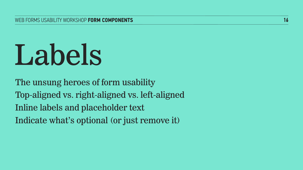
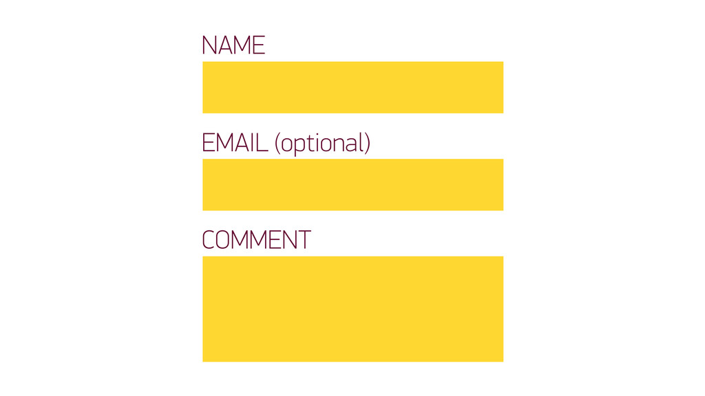
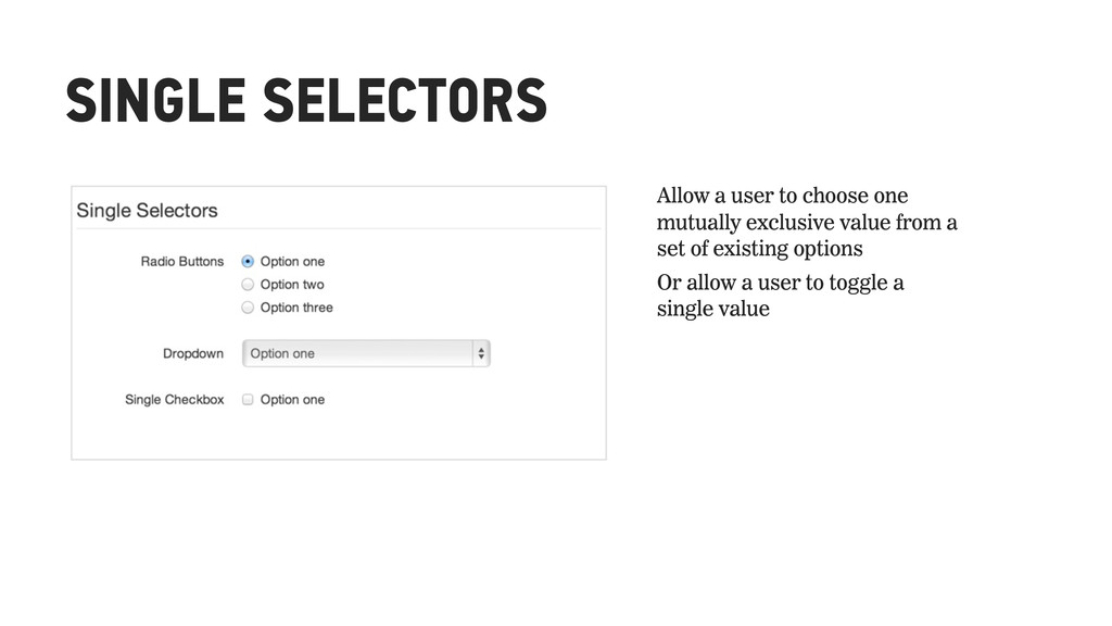
heroes of form usability Top-aligned vs. right-aligned vs. left-aligned Inline labels and placeholder text Indicate what’s optional (or just remove it)
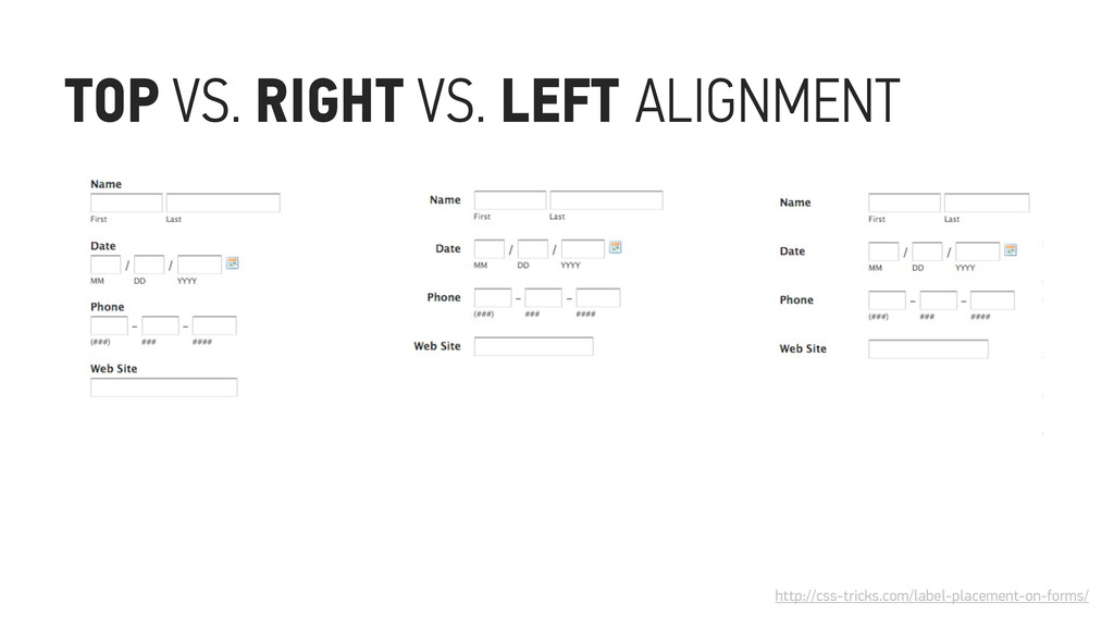
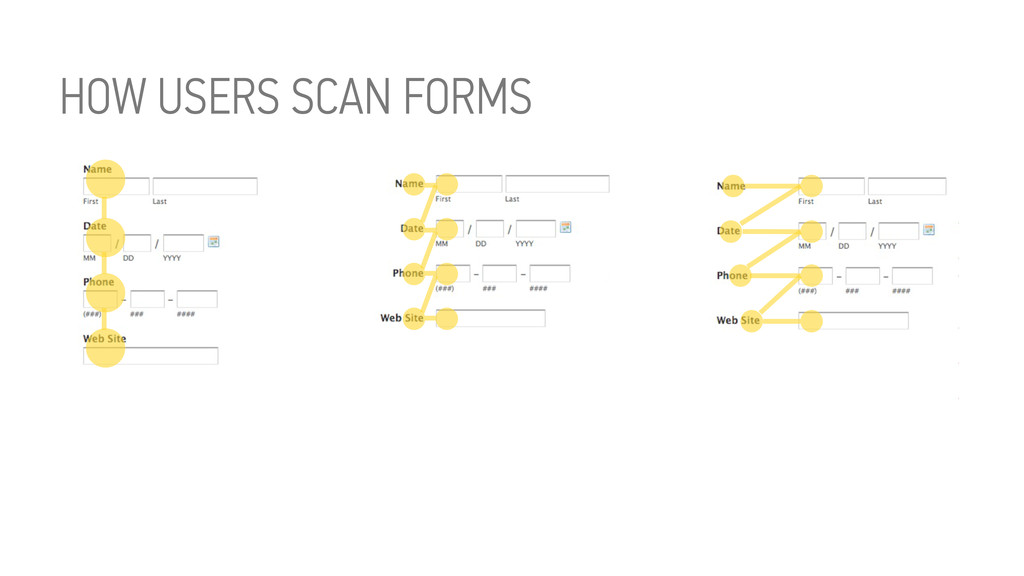
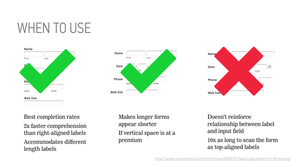
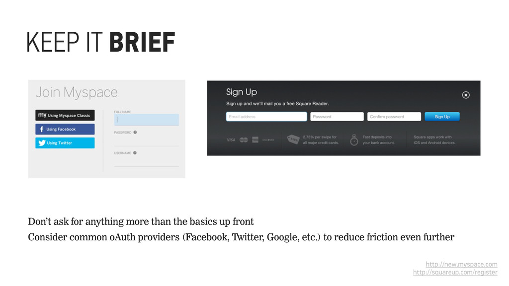
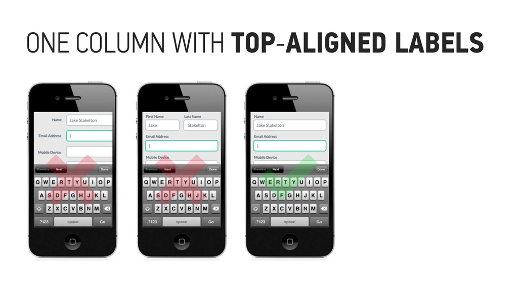
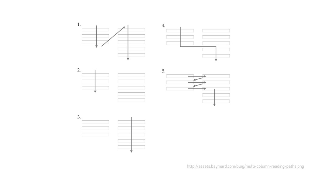
field 10x as long to scan the form as top-aligned labels Best completion rates 2x faster comprehension than right-aligned labels Accommodates different length labels Makes longer forms appear shorter If vertical space is at a premium http://www.uxmatters.com/mt/archives/2006/07/label-placement-in-forms.php WHEN TO USE
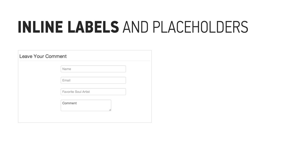
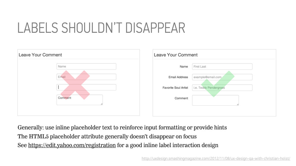
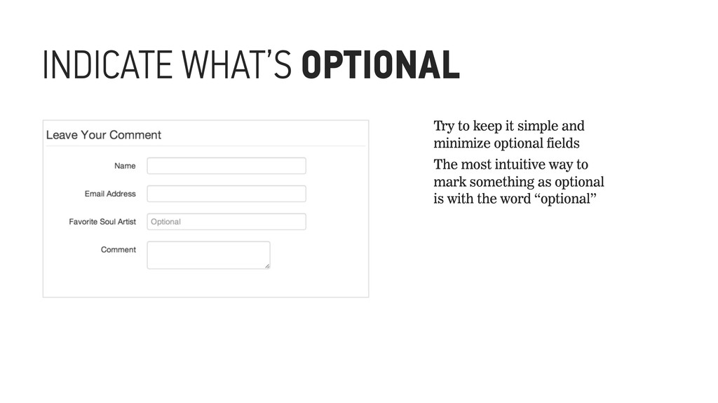
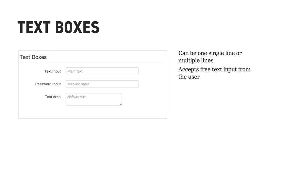
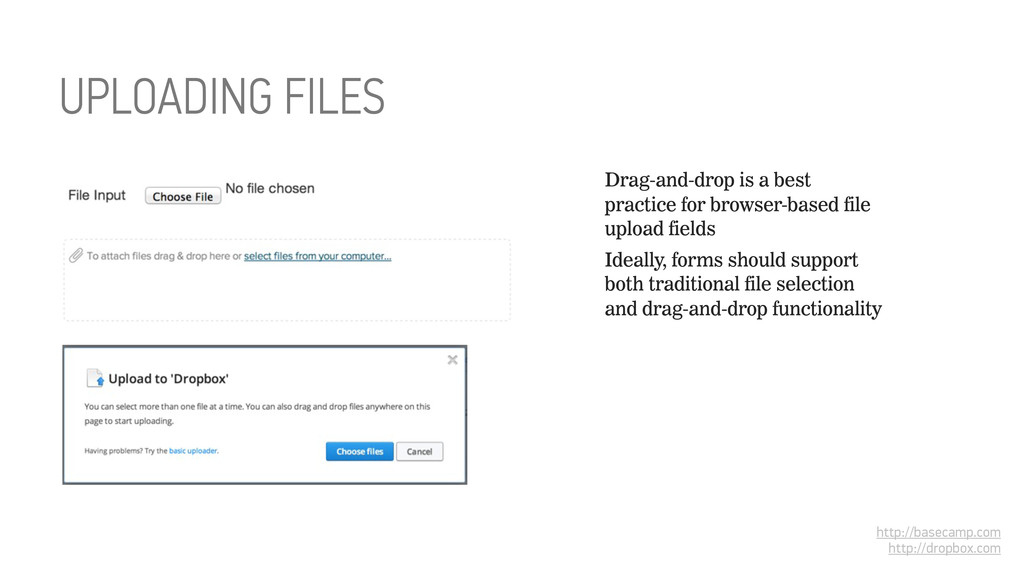
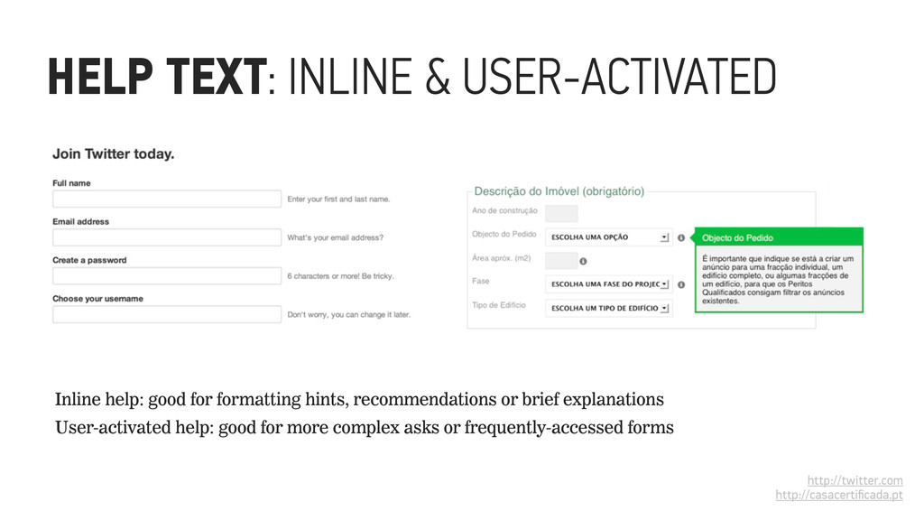
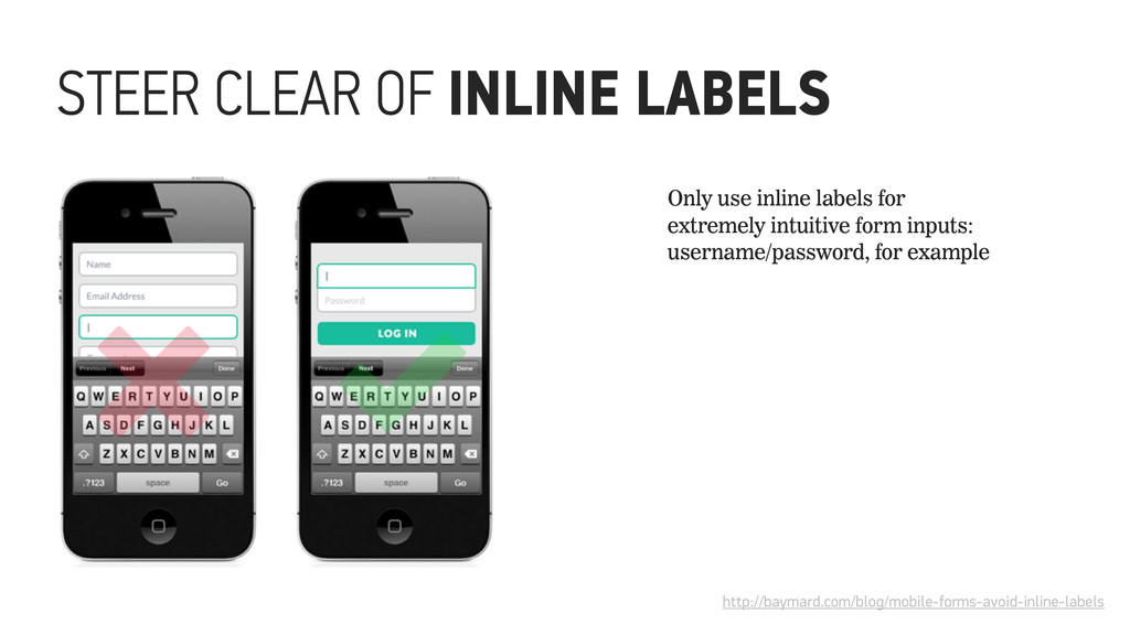
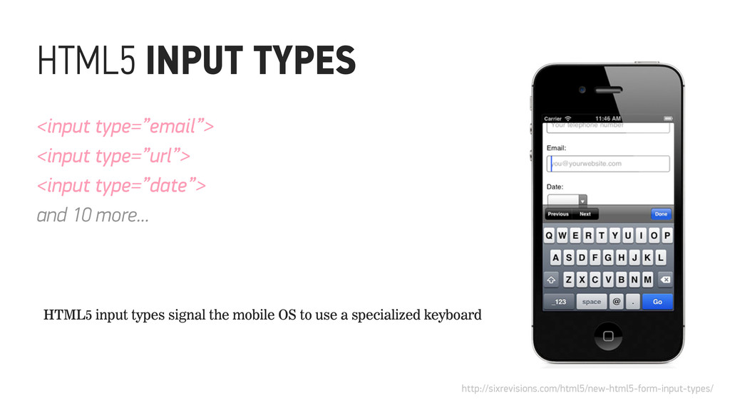
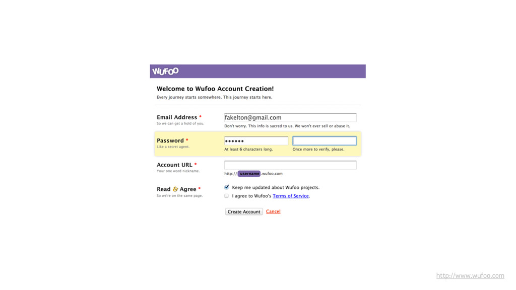
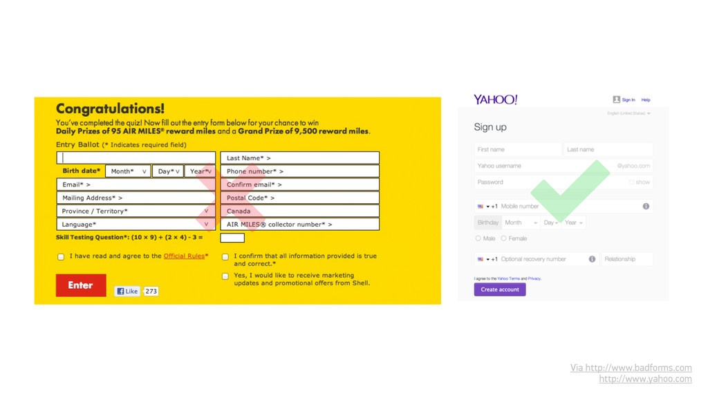
to reinforce input formatting or provide hints The HTML5 placeholder attribute generally doesn’t disappear on focus See https://edit.yahoo.com/registration for a good inline label interaction design ✓
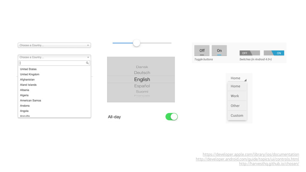
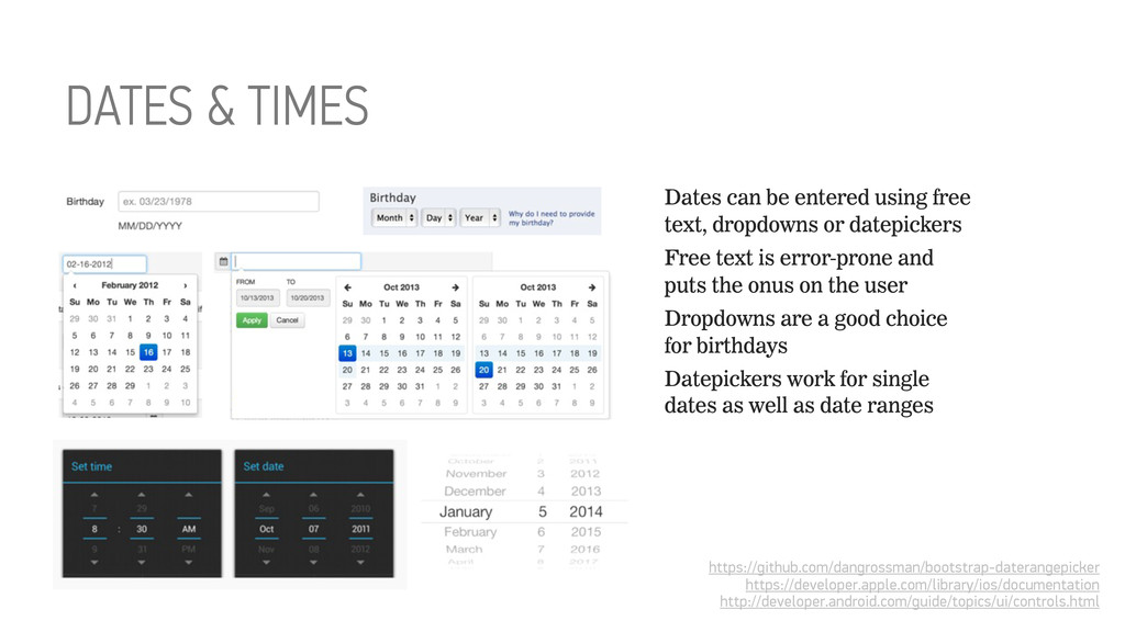
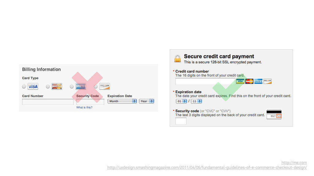
using free text, dropdowns or datepickers Free text is error-prone and puts the onus on the user Dropdowns are a good choice for birthdays Datepickers work for single dates as well as date ranges
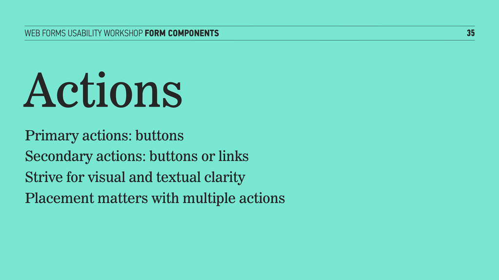
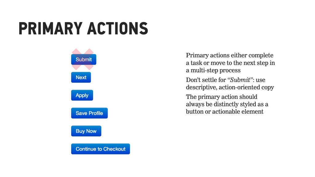
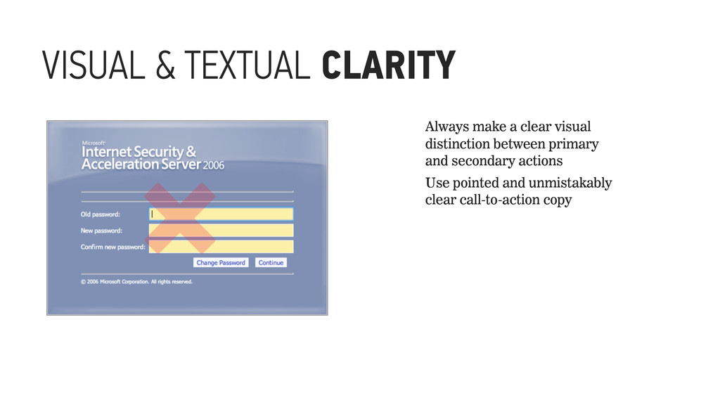
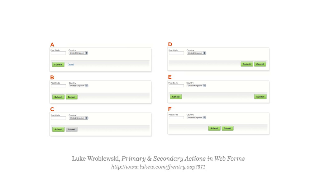
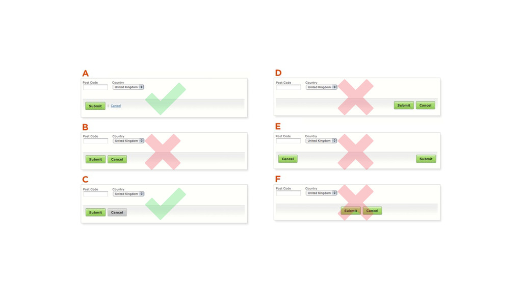
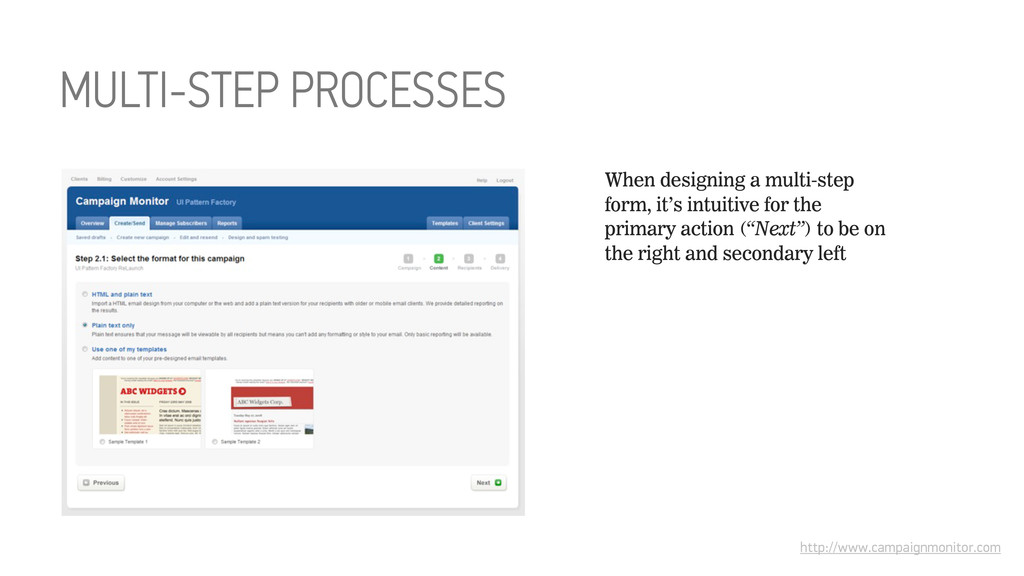
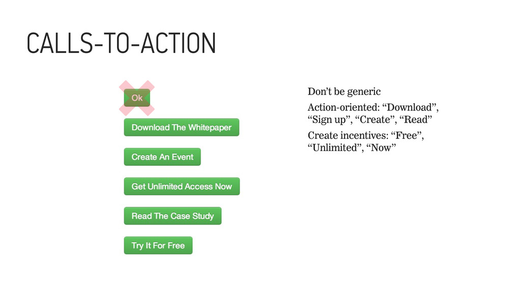
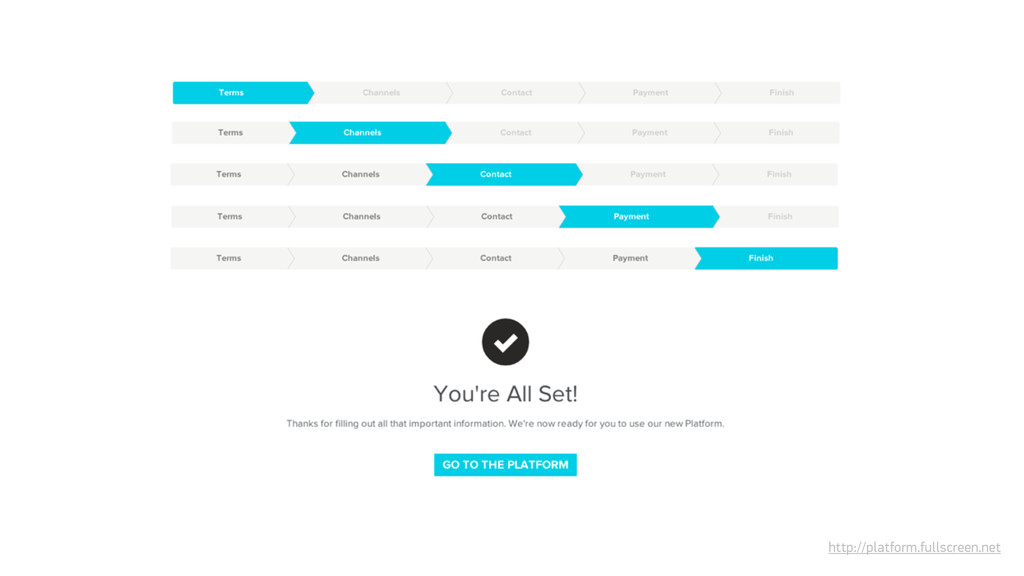
to the next step in a multi-step process Don’t settle for “Submit”: use descriptive, action-oriented copy The primary action should always be distinctly styled as a button or actionable element ␡
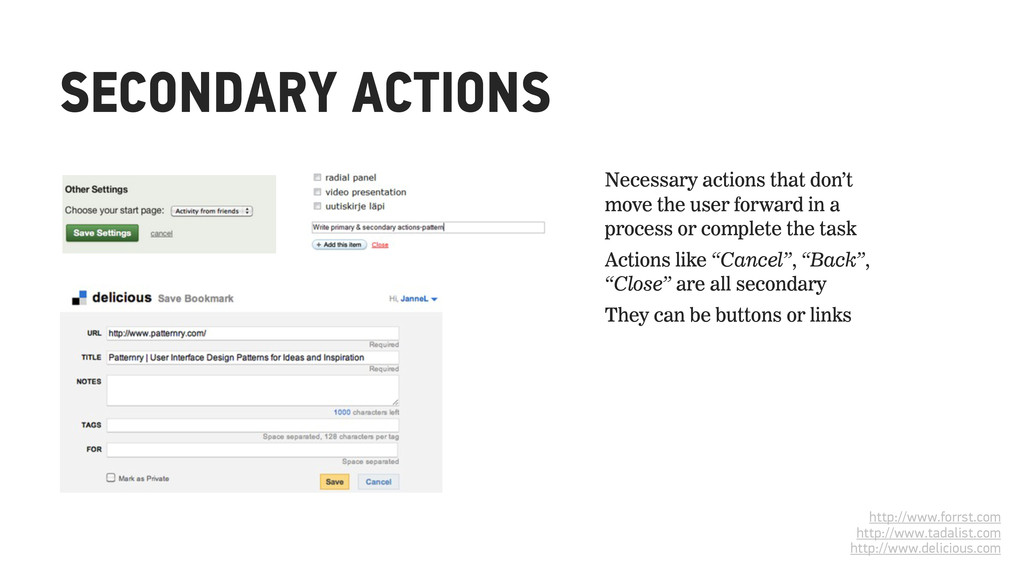
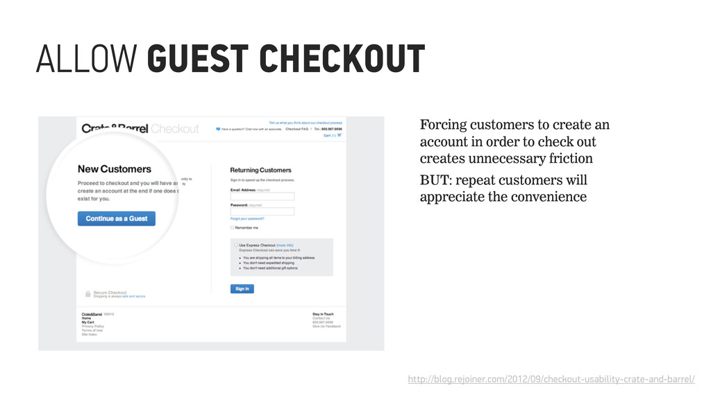
in a process or complete the task Actions like “Cancel”, “Back”, “Close” are all secondary They can be buttons or links http://www.forrst.com http://www.tadalist.com http://www.delicious.com
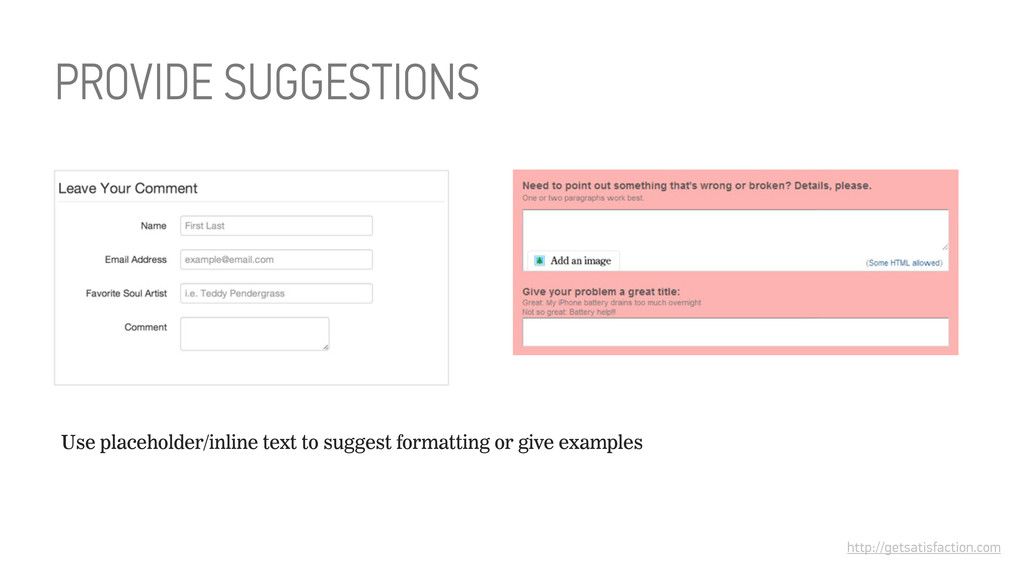
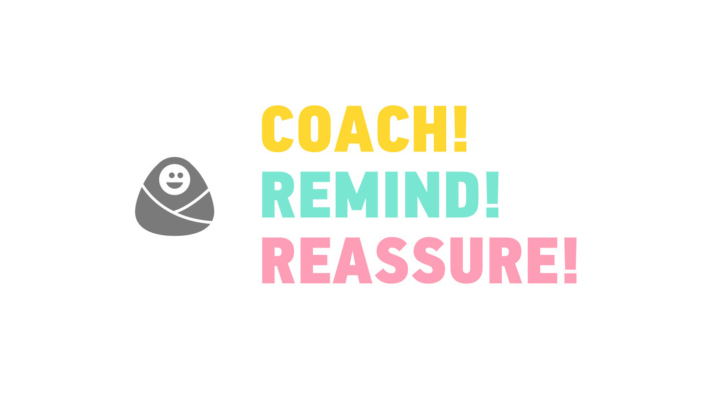
Inline help and user-activated help Provide suggestions and coach the user Use groupings and legends for context Be communicative about the system’s state
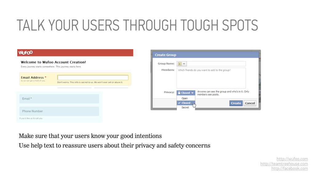
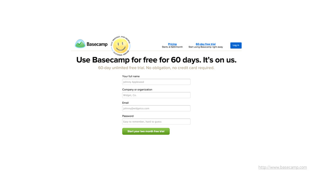
help text to reassure users about their privacy and safety concerns http://wufoo.com http://teamtreehouse.com http://facebook.com TALK YOUR USERS THROUGH TOUGH SPOTS
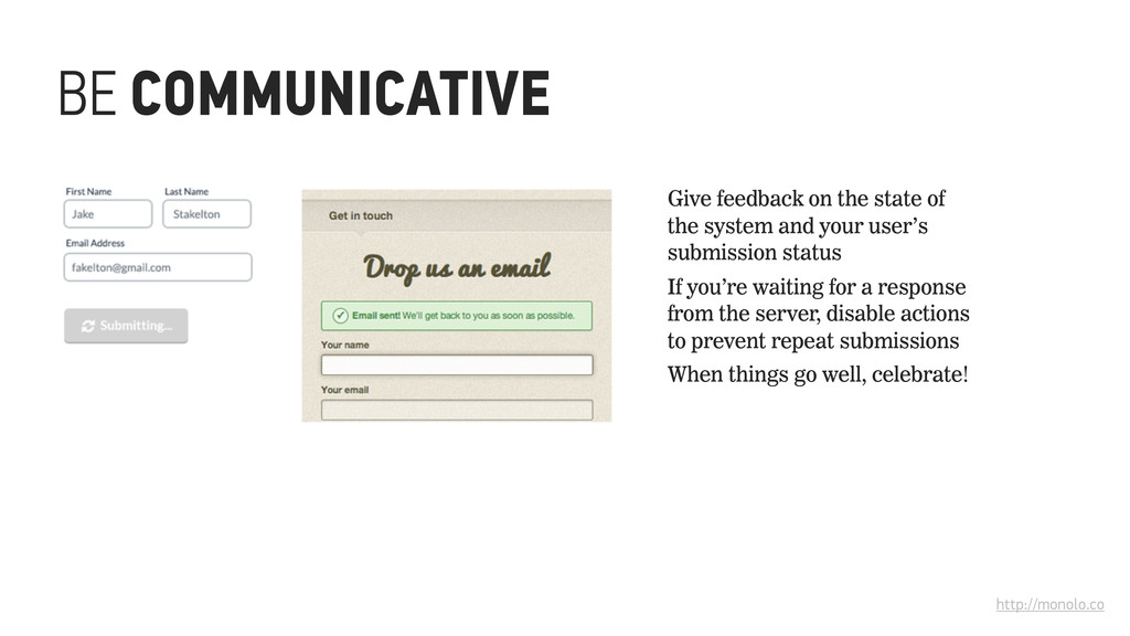
system and your user’s submission status If you’re waiting for a response from the server, disable actions to prevent repeat submissions When things go well, celebrate!
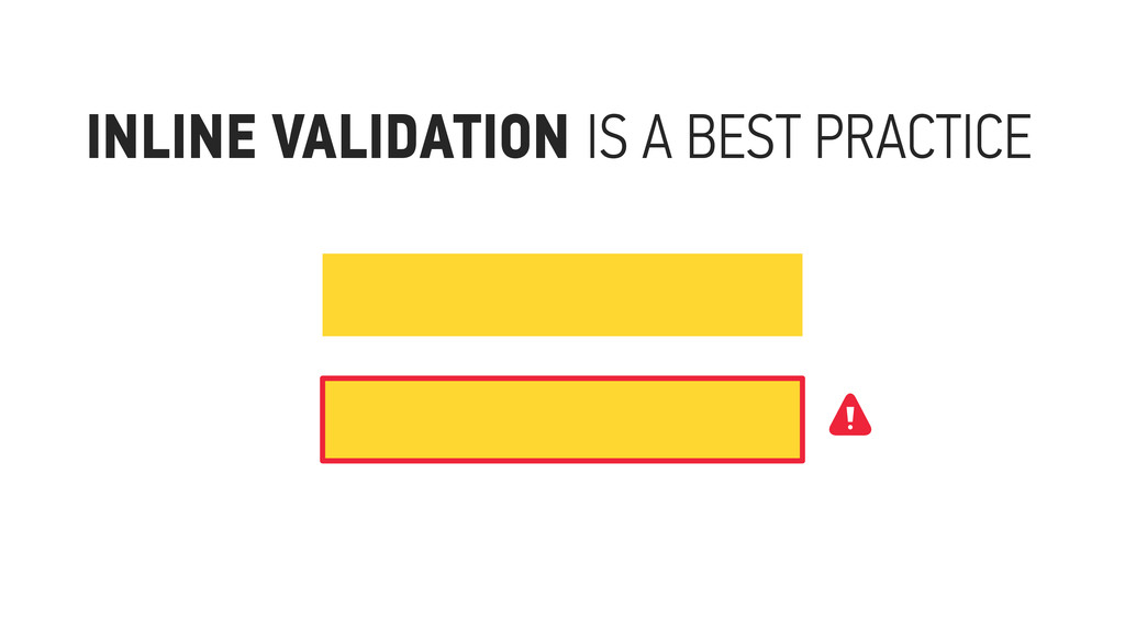
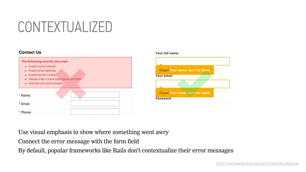
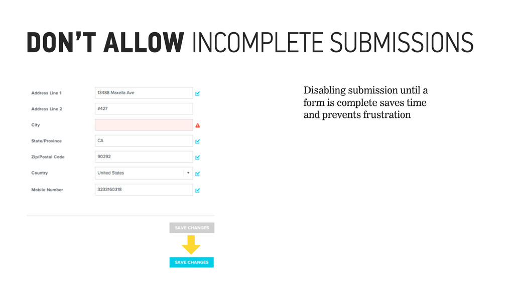
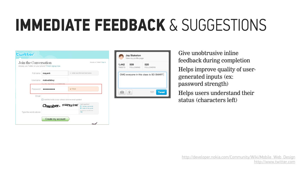
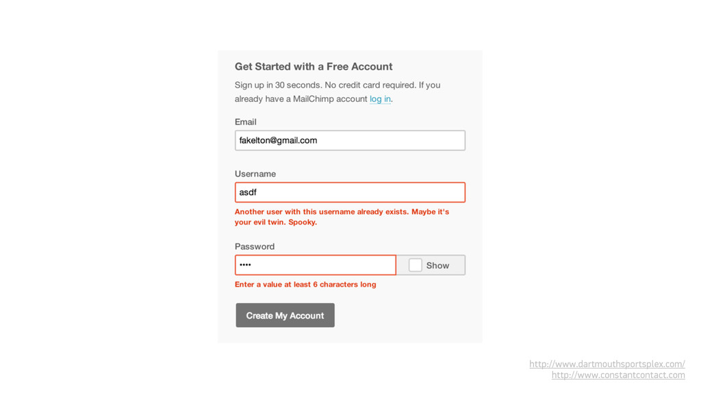
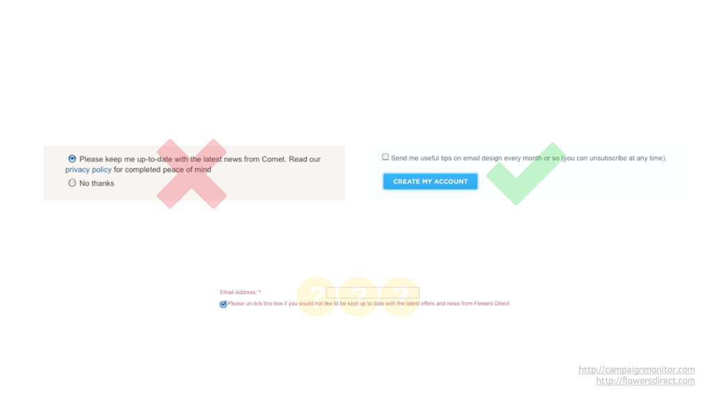
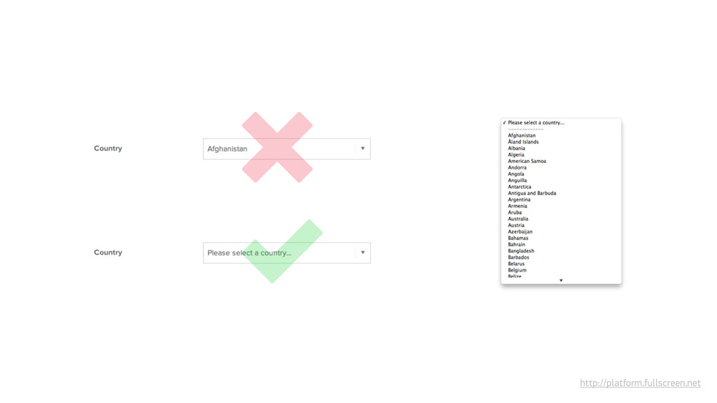
vs. validating on submission The 3 C’s of error messaging: contextualized, clear and concise Don’t allow users to submit incomplete forms Give feedback and make suggestions
Validate availability inline: usernames, domains Wait for the user to submit to check for required inputs (or even better, don’t allow submission without them) Generally, wait for the user to submit if data needs server-side verification: logins, purchases WHEN TO USE INLINE VALIDATION
TIME 3 minutes RESOURCES http://patterntap.com/pattern/ post-good GOAL Partner up and select one form of decent heft from the examples that both of you brought to the workshop. If you didn’t bring any, feel bad for a moment, then use the example to the right. Go through the form field-by-field and component-by-component, and identify each element, input and component by type.
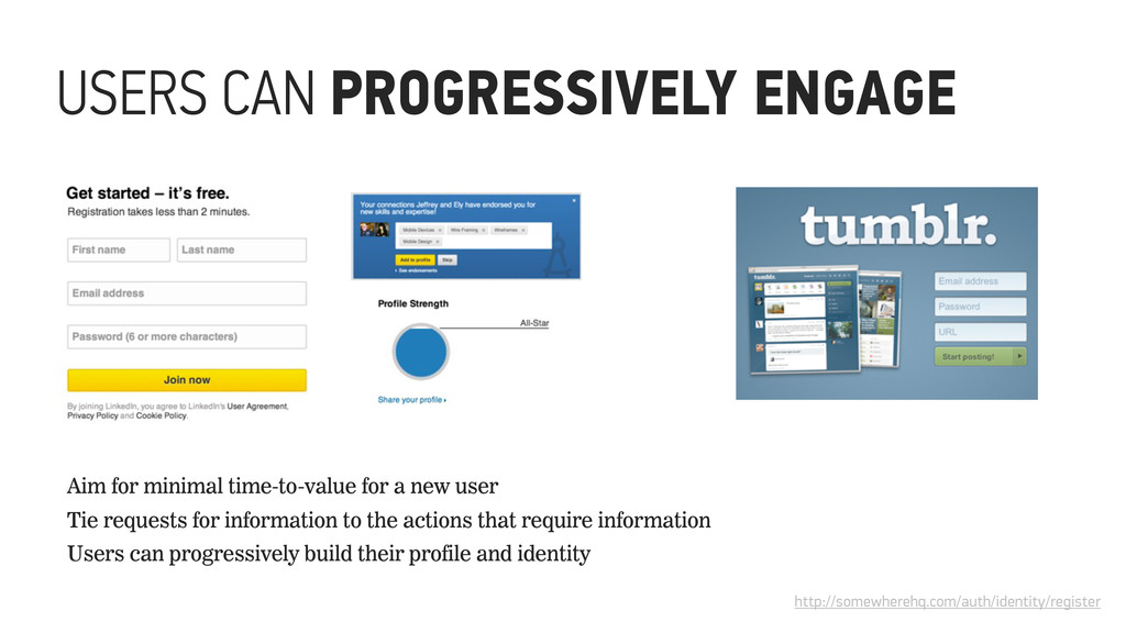
new user Tie requests for information to the actions that require information Users can progressively build their profile and identity http://somewherehq.com/auth/identity/register
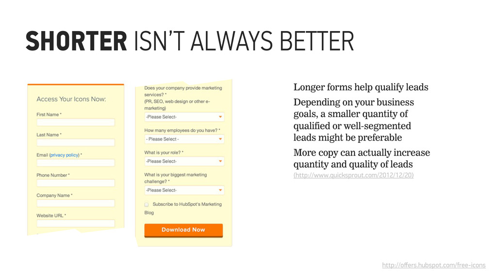
Depending on your business goals, a smaller quantity of qualified or well-segmented leads might be preferable More copy can actually increase quantity and quality of leads (http://www.quicksprout.com/2012/12/20)
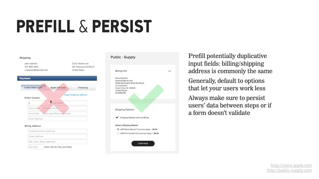
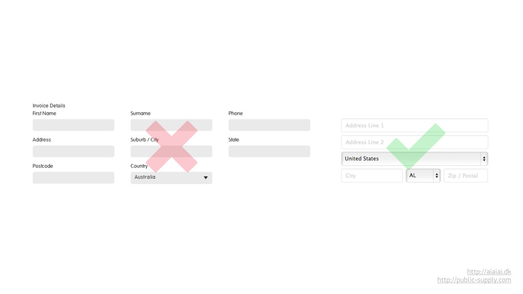
input fields: billing/shipping address is commonly the same Generally, default to options that let your users work less Always make sure to persist users’ data between steps or if a form doesn’t validate
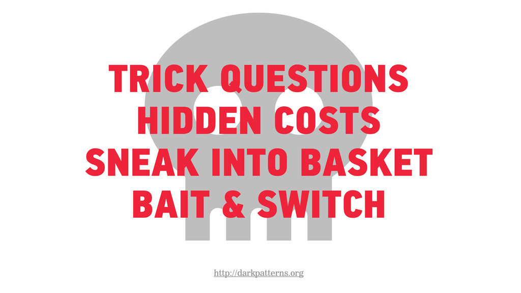
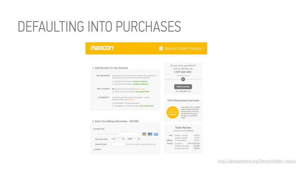
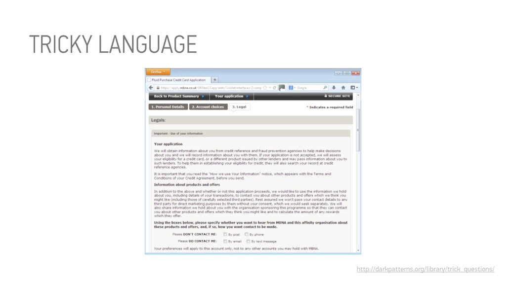
designed to mislead users Defaulting into unintended consequences Tricky language and messaging Optimized for short-term conversion vs. long-term gains
multivariate tests simply because a design that tricks users into doing something is likely to achieve more conversions than one that allows users to make an informed decision.” Harry Brignull, Dark Patterns: Deception vs. Honesty in UI Design http://alistapart.com/article/dark-patterns-deception-vs.-honesty-in-ui-design
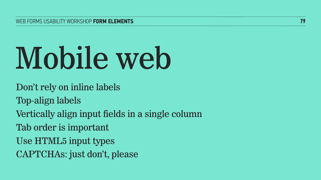
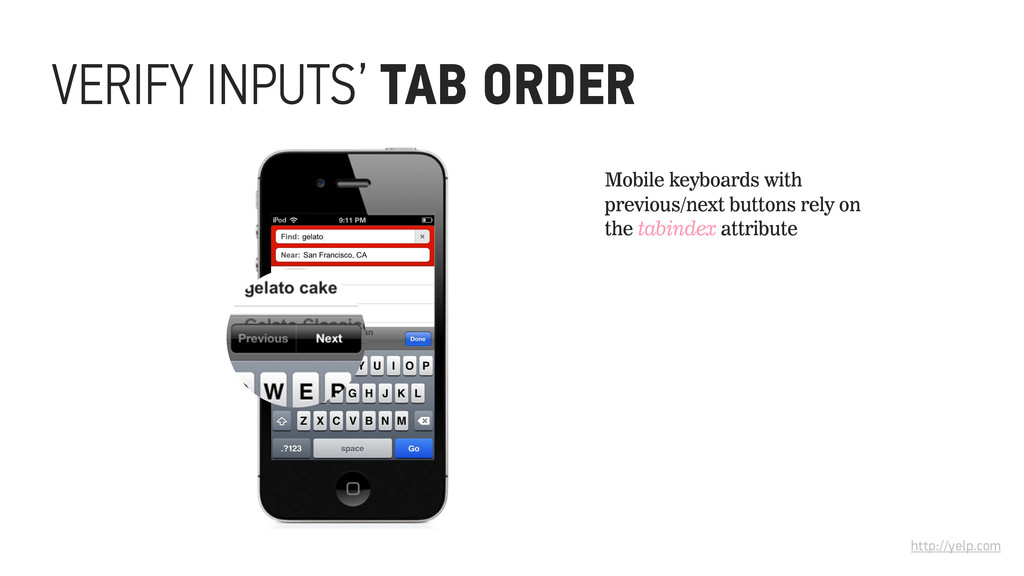
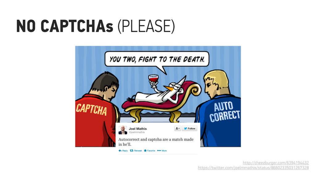
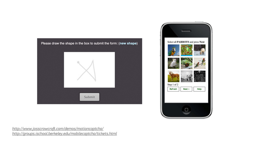
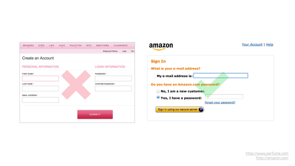
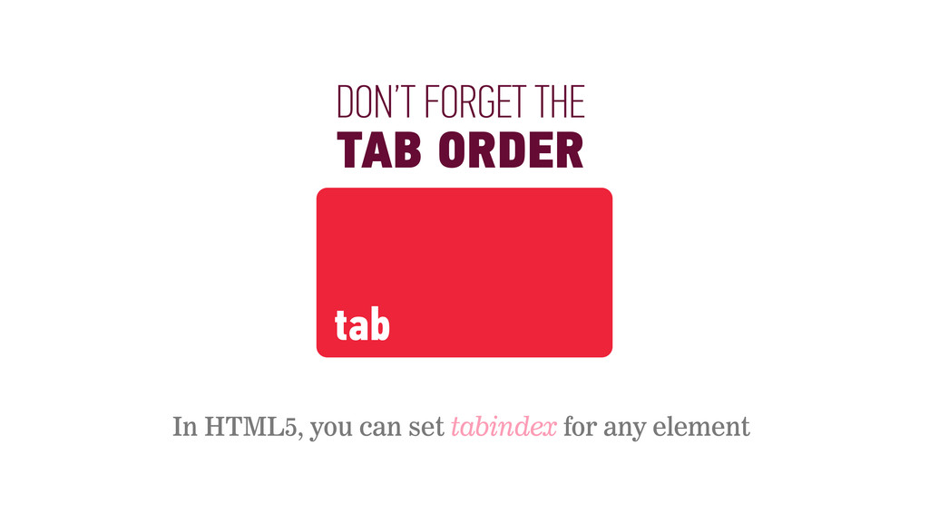
rely on inline labels Top-align labels Vertically align input fields in a single column Tab order is important Use HTML5 input types CAPTCHAs: just don’t, please
NOT, THE WEB FORMS EDITION TIME 5 minutes RESOURCES http://patterntap.com http://www.wufoo.com/gallery http://www.formstack.com/ examples GOAL With a partner, review the form examples that you both brought with you to the workshop today. Using the best practices we’ve discussed for different use cases, pick one that you agree is “hot” and another that’s “not.” Make a list of why you think they work or don’t work for their use case. Suggest improvements! Be ready to share your thoughts with the rest of the group.
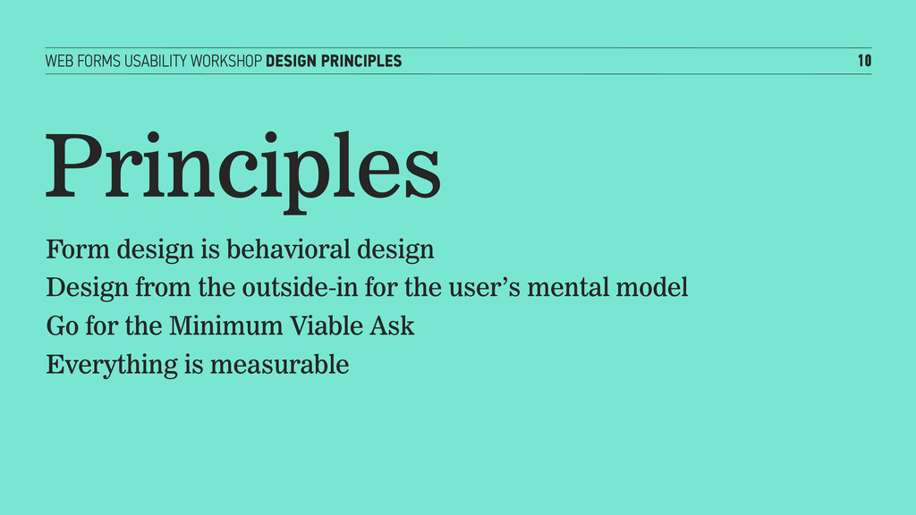
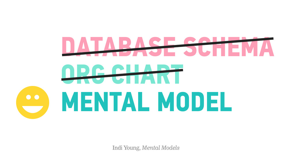
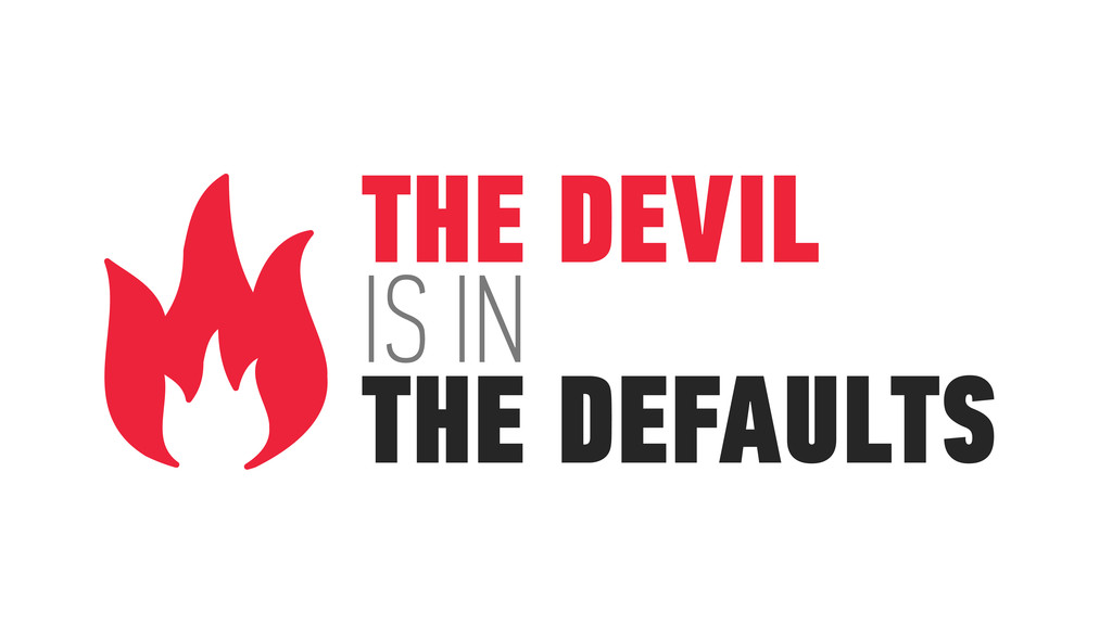
as possible of your user Conversation, not interrogation Coach, remind and reassure Provide a clear path to completion Orient the user Group tasks based on the user’s mental model The devil is in the defaults Give users something to do next Measure, then iterate
FORM! TIME 20 minutes RESOURCES http://patterntap.com http://www.wufoo.com/gallery http://www.formstack.com/examples GOAL Start with one of your example forms or find an form that needs improvement from anywhere on the internet or from Patterntap, Wufoo’s gallery or Formstack’s examples. With your partner, use what you’ve learned and redesign it in a whiteboard session!
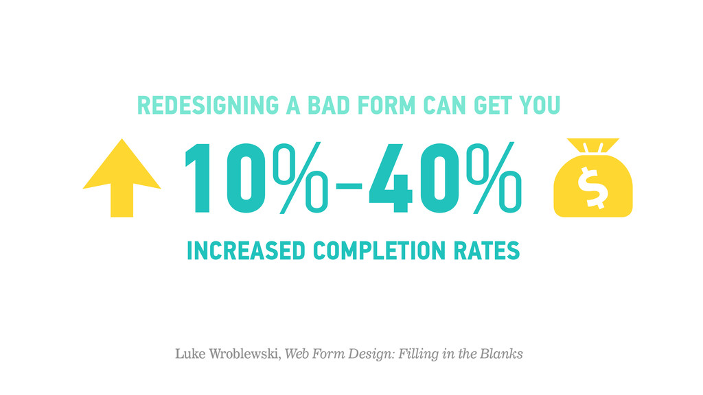
In The Blanks http://rosenfeldmedia.com/books/web-form-design/ Steve Krug, Don’t Make Me Think http://www.sensible.com/dmmt.html http://baymard.com/blog http://alistapart.com/article/sensibleforms http://www.usertesting.com/blog/2013/04/04/42-form-usability-resources/ http://uxdesign.smashingmagazine.com/2011/11/08/extensive-guide-web-form-usability/ http://www.nngroup.com/articles/ten-usability-heuristics/