Upgrade to Pro — share decks privately, control downloads, hide ads and more …

Responsive Design Panel: Where, Why, and How

Responsive Design Panel: Where, Why, and How

Devices are everywhere these days. Doing good business on all of them is so complex you don’t know where to begin. Take a deep breath. I’ll show you how I’ve helped companies form a plan, budget their resources, and invest in a future-friendly, multi-device strategy with sensational ROI.

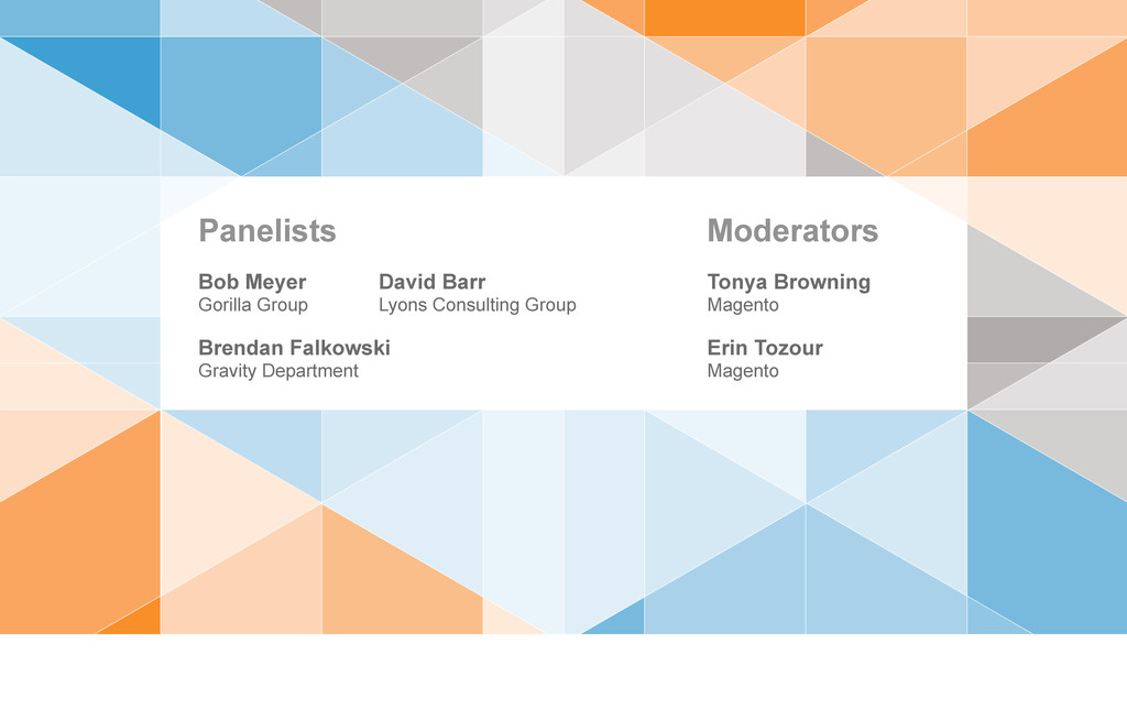
This is a panel discussion between Gravity Department, Gorilla Group, and Lyons Consulting Group.

More info: http://gravitydept.com/blog/magento-imagine-2013-responsive-design-panel/

Conference: Magento Imagine 2013
Speaker: Brendan Falkowski @ http://gravitydept.com
Location: Las Vegas, USA
Date: April 9, 2013

Brendan Falkowski

April 09, 2013
Tweet

More Decks by Brendan Falkowski

Other Decks in Business

Transcript

  1. Responsive Design Panel
    Where, Why, and How
    Las Vegas, Nevada
    April 9, 2013
    Magento Imagine Conference
    Strategic Marketing Track

    View Slide

  2. Erin Tozour
    Magento
    Tonya Browning
    Magento
    Moderators
    David Barr
    Lyons Consulting Group
    Brendan Falkowski
    Gravity Department
    Bob Meyer
    Gorilla Group
    Panelists

    View Slide

  3. Brendan Falkowski
    Founder
    Gravity Department
    Falkowski
    Good morning. I’m Brendan
    Falkowski.

    View Slide

  4. GravityDept.com
    I founded a small web strategy and design studio called Gravity
    Department.

    View Slide

  5. Design Consulting For
    My work is split 50/50 between client services for companies like Skinny Ties and Angry
    Birds.

    View Slide

  6. Acumen Theme
    • Used by 1200+ stores
    • 3 years of updates
    • Ready-to-launch frontend
    • Made for customization
    http://gravitydept.com/to/acumen-magento
    And product development like Acumen, a best-selling ready-to-launch Magento
    theme.

    View Slide

  7. And MageFrontend: a responsive design toolkit for Magento
    Enterprise.

    View Slide

  8. Magento Certification
    Advisory Board Member
    I’m also a member of Magento’s Advisory Board for certifying
    developers.

    View Slide

  9. A day in the life
    Everything I do these days is multi-device in
    nature.

    View Slide

  10. How much does
    responsive design cost?
    This is something almost everyone who contacts me wants to know. There are two
    answers.

    View Slide

  11. $5,000?
    $20,000?
    $100,000?
    One answer is a number, and I’m guilty of this. Some clients want quotes or “just a
    ballpark”.

    View Slide

  12. Design is not a commodity.
    Design is a process.
    But design is not service you buy off a commodities list. Good design — valuable design is a process. It’s an interest in gripping all the fragments, and synthesizing one outcome from many
    possibilities.

    View Slide

  13. “I don’t know...yet.”
    The other answer is — and this is what I say now — “I don’t know...yet”. You and I need to explore this. Together we’ll answer the cost question, but it takes time. Let’s not believe we can
    scope out responsive design in a kickoff call.

    View Slide

  14. Forming A Budget
    So what’s your budget? I will turn right around ask you this.
    For $10,000 we can’t work together for six months. Neither of us needs to be shooting in the dark.
    A good consultant can help you develop a needs assessment for responsive design by asking the right questions:

    View Slide

  15. 1. Evaluate Your Position
    2.
    3.
    Are you catching up, consolidating, or future-
    proofing?

    View Slide

  16. 1. Evaluate Your Position
    2. Set Goals and Ideals
    3.
    What’s your minimum acceptable outcome? What’s your dream
    scenario?

    View Slide

  17. 1. Evaluate Your Position
    2. Set Goals and Ideals
    3. Make the Business Case
    What happens if you succeed or fail? What if you do nothing? Can you afford
    that?

    View Slide

  18. Needs assessments help
    you budget realistically.
    If you can answer those questions, your budget situation will improve. Your company does not miraculously become richer, but it grounds you in reality. It sets a standard for your needs, and
    provides motivation to fulfill them.

    View Slide

  19. What is responsive
    design’s value?
    But clients hate being told “it depends” and asked for their budget, so I invite them to ask a different question:
    What is responsive design’s value?
    And this is a lot more interesting to them because it flips the proposition.

    View Slide

  20. Creating value beats
    avoiding cost.
    Value beats cost. We can talk about value immediately by comparing
    outcomes.

    View Slide

  21. Device Spectrum
    3″ 5″ 7″ 10″ 13″ 15″ 24″ 30″
    Smartphone Tablet Laptop Desktop
    Let’s plot the spectrum of screens we worry about
    today.

    View Slide

  22. Resource Requirements
    Expensive
    Fixed
    Width
    Site
    Responsive Site
    And we’ll pick a frame of reference: the fixed-width site. We’ve been making them for years. A responsive site might require twice the
    resources.

    View Slide

  23. 3″ 5″ 7″ 10″ 13″ 15″ 24″ 30″
    Smartphone Tablet Laptop Desktop
    Responsive Site
    Fixed Width Site
    Within the realm of fixed-width sites, which is here, the responsive site has 50% efficiency. That’s expensive. But we’re discounting the intangibles responsive design also
    serves.

    View Slide

  24. Economical
    Mobile
    Site
    Fixed
    Width
    Site
    Responsive Site
    Resource Requirements
    How about this: (desktop site + mobile app) vs (responsive
    site).

    View Slide

  25. 3″ 5″ 7″ 10″ 13″ 15″ 24″ 30″
    Smartphone Tablet Laptop Desktop
    Responsive Site
    Fixed Width Site
    Mobile Site
    Nearly the same resources now, but again see the intangibles. That’s looking rather
    economical.

    View Slide

  26. High Value
    Mobile
    Site
    iPhone
    App
    Android
    App
    iPad
    App
    Fixed
    Width
    Site
    Responsive Site
    Resource Requirements
    Here’s the crazy example: (desktop site + mobile site + 2 mobile apps + tablet app) vs (responsive design). If you’re not Facebook, you’re in a lot of trouble. The devices served have nearly
    evened out,

    View Slide

  27. 3″ 5″ 7″ 10″ 13″ 15″ 24″ 30″
    Smartphone Tablet Laptop Desktop
    Responsive Site
    Fixed Width Site
    Mobile Site
    iPhone App
    Android App
    iPad App
    But your resources are extremely disproportionate. Responsive design moves into high-value territory.
    For a small company or startup, this illustrates why responsive design is a viable strategy, and why more established retailers are looking to downsize their footprint.

    View Slide

  28. Should capabilities
    vary by context?
    For eCommerce applications, I think you should strive for continuity. That’s why responsive design is so well suited to
    eCommerce.

    View Slide

  29. Content Parity:
    Access to the same information
    regardless of device.
    Two principles at work:
    Content Parity — Access to the same information regardless of device.

    View Slide

  30. Functional Parity:
    Access to the same features
    regardless of device.
    Functional Parity — Access to the same features regardless of
    device.

    View Slide

  31. Don’t limit access
    based on screen size.
    Neither should be limited for an arbitrary reason like screen size. If users can filter their search, write reviews, and track an order from their laptop you can bet they’ll do those things on their
    phone too.
    You can’t generalize behavior from device type. People use whatever is accessible. That means laptops on planes and phones on couches.

    View Slide

  32. Resource Allocation
    Getting off the ground is tough though. I can’t off-hand quote you figures, but I can tell you what factors will change your resource allocation
    dramatically.

    View Slide

  33. When should you invest in
    a multi-device frontend?
    If you have to ask, you’re already behind. I get the lion’s share of inquiries about responsive
    commerce.

    View Slide

  34. 10% – 40%
    range of mobile visitors
    So I started pooling data from retailers I talked with and everyone had 10% to 40% of visits coming from
    mobile.

    View Slide

  35. 20% – 25%
    average mobile visitors
    20-25% is normal. B2B is a little lower. Fashion and entertainment are higher.
    But it’s not ignorable for anyone because it’s cannibalizing traditional devices.

    View Slide

  36. Which browsers / devices
    should you support?
    Let’s define
    support.

    View Slide

  37. Support:
    Dedicating resources
    to a platform.
    Support means you dedicate resources to a
    platform.

    View Slide

  38. Support is not:
    • Blocking unsupported platforms
    • Every platform is identical
    It doesn’t mean unsupported platforms are broken or blocked, and not everything has to look and work
    identically.

    View Slide

  39. IE8 and Opera
    Not supported, still functional
    Skinny Ties is usable in browsers we don’t support like IE8 or Opera. We built the site with progressive enhancement for that reason, but we don’t chase down bugs if they
    exist.

    View Slide

  40. Data ≠ Analysis
    Somebody usually points out that’s 10% of their users and faints dramatically.
    You can find that in Google Analytics, but having data is not the same as having done analysis. Compare these two segments:

    View Slide

  41. Good + Widespread
    Browsers
    • Revenue majority
    • Expanding segment
    • High growth potential
    90%
    Good Browsers
    - Revenue majority
    - Expanding segment
    - High growth potential

    View Slide

  42. Good + Widespread
    Browsers
    • Revenue majority
    • Expanding segment
    • High growth potential
    • Revenue minority
    • Shrinking segment
    • Low growth potential
    Bad + Underused
    Browsers
    90% 10%
    Bad Browsers
    - Revenue minority
    - Shrinking segment
    - Low growth potential

    View Slide

  43. ROI from
    90% Loss of
    10%
    >
    I’m betting that if you dig into your data, you can make the case that investments made today will have higher ROI from the 90% than the loss of the
    10%.

    View Slide

  44. Mobile is your
    biggest opportunity.
    Profit comes from where your users are and where they’re going — not where they’re exiting. Mobile territory is your biggest opportunity for growth. Don’t miss it to keep an old fraction
    “supported”.

    View Slide

  45. Process Changes
    Responsive design requires a big shift in the way projects are completed and
    accepted.

    View Slide

  46. Responsive
    Design Fundamentals
    Responsive
    Commerce
    12 months 6 months
    Overcoming the Skills Gap
    Internal teams or studios that haven’t done responsive work are at least a year behind in experience.
    Lacking specialization in responsive commerce adds another six months. The fundamental interactions for eCommerce are still being rethought and validated across devices.

    View Slide

  47. Estimate: 3 months
    Timeline for Skinny Ties
    Actual: 8 months
    Long timelines are a barrier, but uncertainty is killer. Trust me I know. I scoped Skinny Ties as a 3 month project, and it took 8 months because approaching this work with high standards
    requires inventing practices as you go.

    View Slide

  48. http://www.netmagazine.com/features/top-25-responsive-sites-2012
    When it launched there were just a handful of sites in the same league. When Net Magazine picked the top 25 responsive sites of 2012, Skinny Ties was on it for good reason among some
    massive companies.

    View Slide

  49. Choose a design / frontend
    partner wisely.
    Few eCommerce studios are equipped for this type of work. The frontend skillset is not Magento-specific, so broader experience with responsive design and mobile design is a
    plus.

    View Slide

  50. Case Study:
    Skinny Ties
    So let's talk about Skinny
    Ties.

    View Slide

  51. http://skinnyties.com
    They're a small, family-run company operating in a very narrow and competitive niche. I helped re-imagine their business and technology strategies, and responsive design was at the
    core.

    View Slide

  52. http://gravitydept.com/blog/skinny-ties-and-responsive-ecommerce/
    I published some overwhelmingly positive data in October when Skinny Ties launched. Since the project the kicked responsive commerce into the spotlight, we felt responsible for proving it
    wasn’t a fluke.

    View Slide

  53. October 7
    Year Over Year Results
    March 25
    5 ½ months
    This is new data comparing the last two holiday seasons — with and without responsive design. It covers 5.5 months from October to March. That’s a long time, and a lot of interactions being
    measured.

    View Slide

  54. Quantity
    78.0%
    Average Order
    Value
    20.8%
    Transactions
    57.8%
    Transactions increased by nearly 58%, and units sold by even more. That means average order value is up
    20.8%.

    View Slide

  55. 90.6%
    Revenue
    Across all devices, Skinny Ties is collecting 90% more revenue than last
    year.

    View Slide

  56. Revenue
    Phone + Tablet
    211.8%
    Revenue
    Laptop + Desktop
    77.6%
    Here’s the growth split between traditional computers and mobile devices. Mobile may be a smaller chunk of revenue today, but that’s changing
    fast.

    View Slide

  57. Revenue
    iPad
    224%
    Revenue
    iPhone
    473%
    Revenue
    Android
    187%
    Here’s the revenue performance of Android phones, iPads, and iPhones. Nothing sells skinny ties like an
    iPhone.

    View Slide

  58. 5.3x
    Value of iPhone vs
    Android shoppers
    They’re 5.3 times more valuable than Android
    users.

    View Slide

  59. For the SEO Folks
    And for the SEO folks, just to prove how much Google loves responsive
    design:

    View Slide

  60. Revenue from
    Organic Search
    73.4%
    Visits from
    Organic Search
    79.8%
    With almost 80% more targeted organic traffic they’re capitalizing on it hand over
    fist.

    View Slide

  61. Sustained growth or a flash?
    So did responsive design create sustainable
    growth?

    View Slide

  62. Quantity
    78.0%
    Average Order Value
    20.8%
    Transactions
    57.8%
    Revenue – iPad
    224%
    Revenue – iPhone
    473%
    Revenue – Android
    187%
    YOY Impact of Responsive Design
    for Skinny Ties
    Rounding up that data Skinny Ties has a very impressive new bottom line.
    Apps can't create this much impact in one swoop. I don’t know any other tactics that can either.

    View Slide

  63. Conclusions
    It’s obvious to me and my clients that responsive design creates sustained
    growth.

    View Slide

  64. Responsive design is not
    a novelty or trend.
    It’s not a novelty or a
    trend.

    View Slide

  65. It’s good design and
    smart business.
    It’s good design and smart
    business.

    View Slide

  66. Tomorrow, 11:15am
    Technical Track
    For more about responsive design, I’m also speaking tomorrow at 11:15am. The session is called “Mobile First, Responsive Design” and it’s part two of the talk I gave last year. If you’re a
    business person, I promise it won’t be too technical. I hope to see you there.

    View Slide

  67. View Slide