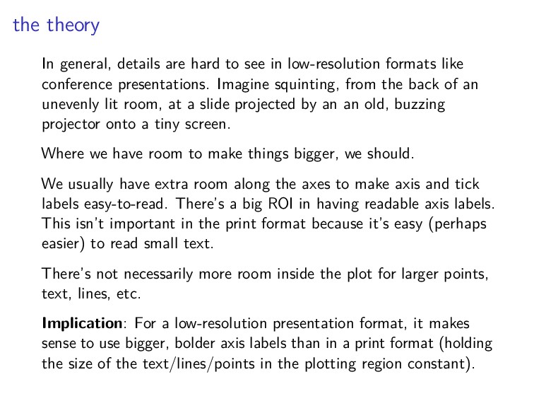
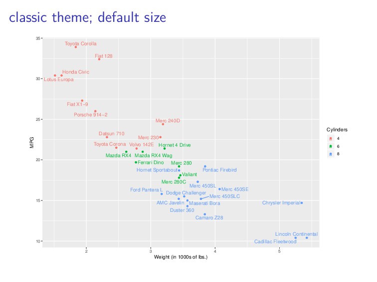
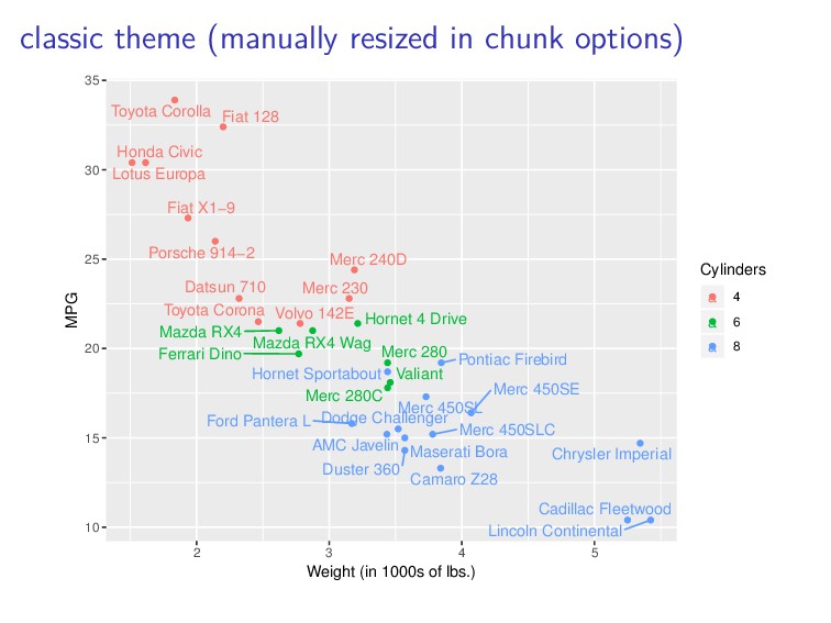
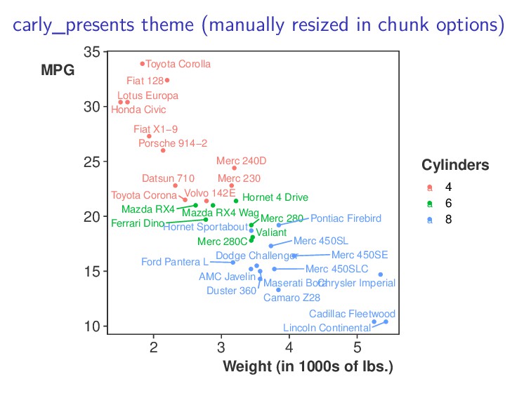
low-resolution formats like conference presentations. Imagine squinting, from the back of an unevenly lit room, at a slide projected by an an old, buzzing projector onto a tiny screen. Where we have room to make things bigger, we should. We usually have extra room along the axes to make axis and tick labels easy-to-read. There’s a big ROI in having readable axis labels. This isn’t important in the print format because it’s easy (perhaps easier) to read small text. There’s not necessarily more room inside the plot for larger points, text, lines, etc. Implication: For a low-resolution presentation format, it makes sense to use bigger, bolder axis labels than in a print format (holding the size of the text/lines/points in the plotting region constant).