Upgrade to Pro — share decks privately, control downloads, hide ads and more …

Information Design for an Instrumented World

Hannah Donovan
October 12, 2011

Information Design for an Instrumented World

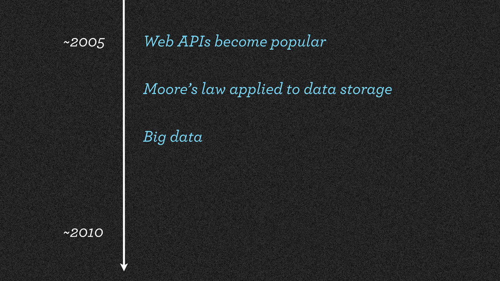
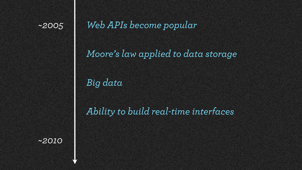
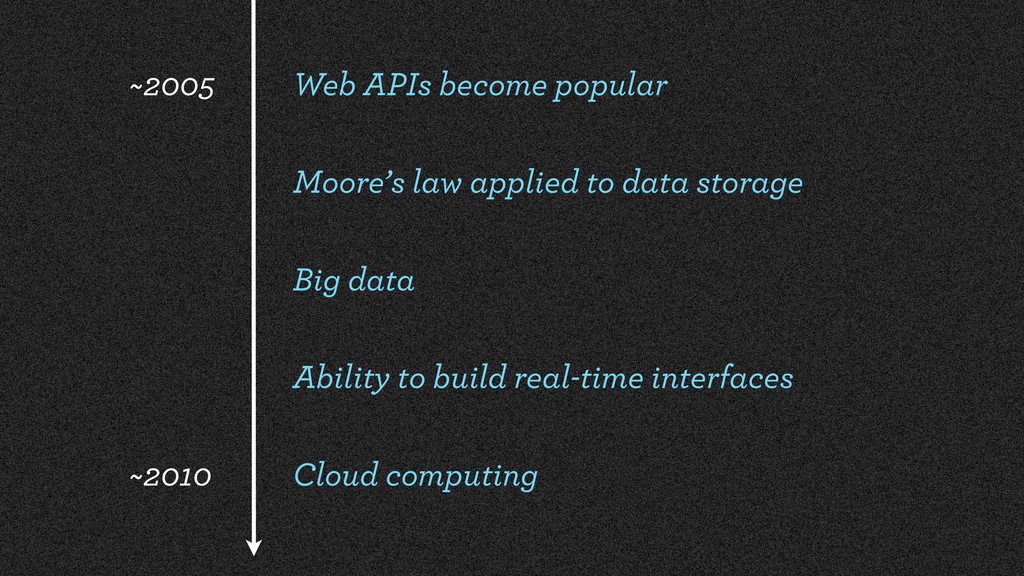
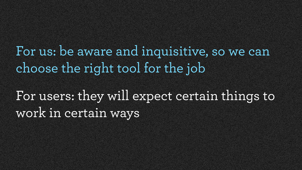
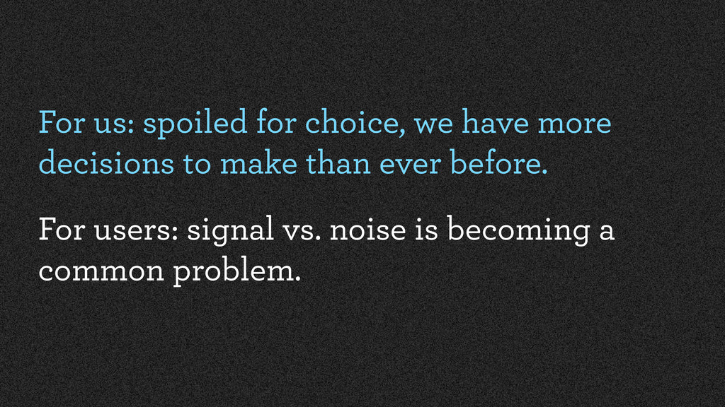
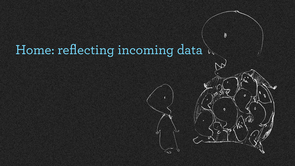
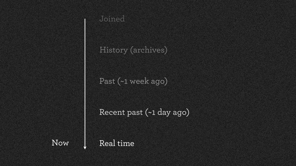
In a world where all our online interactions – and increasingly offline ones too – are logged and measured, how do designers integrate and present this information in a meaningful way?

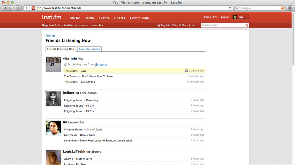
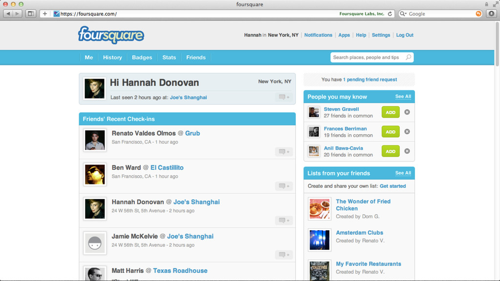
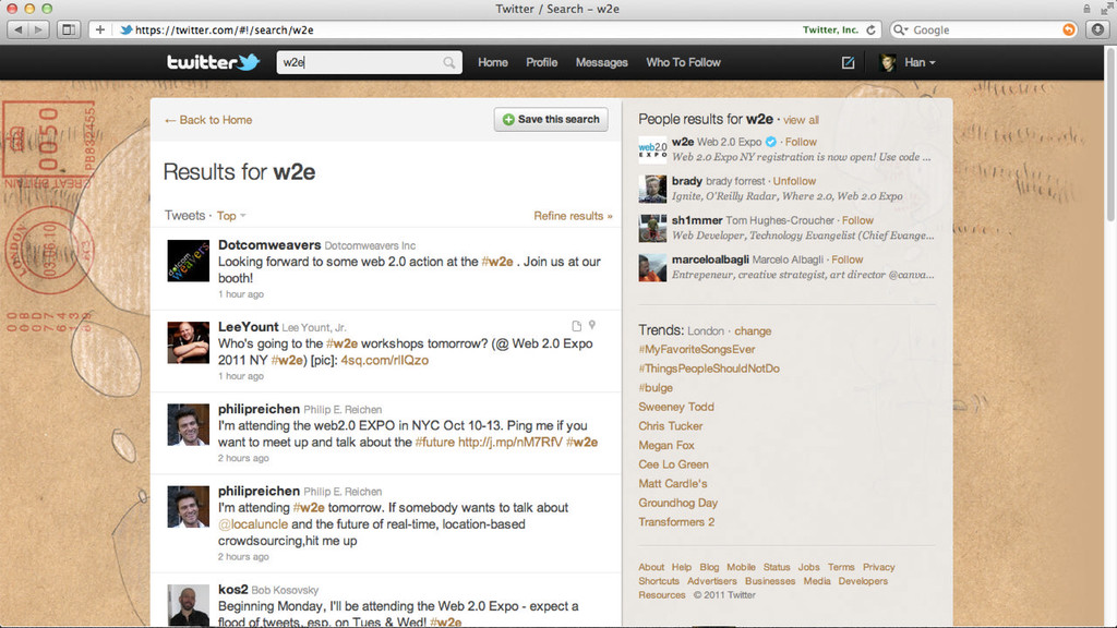
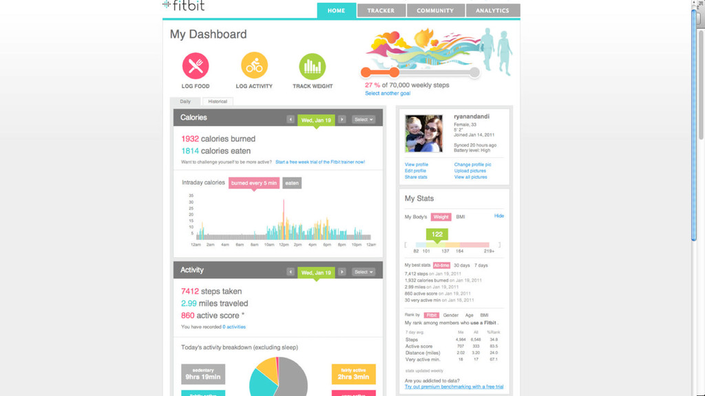
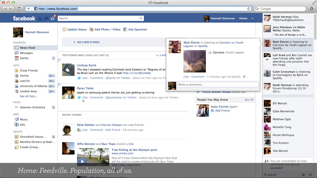
Whether it be real-time Twitter search results, Last.fm listening history or personal Fitbit stats, we now expect services to serve up, compare and contextualize the most interesting bits of our behaviour from the scores of data they collect about us.

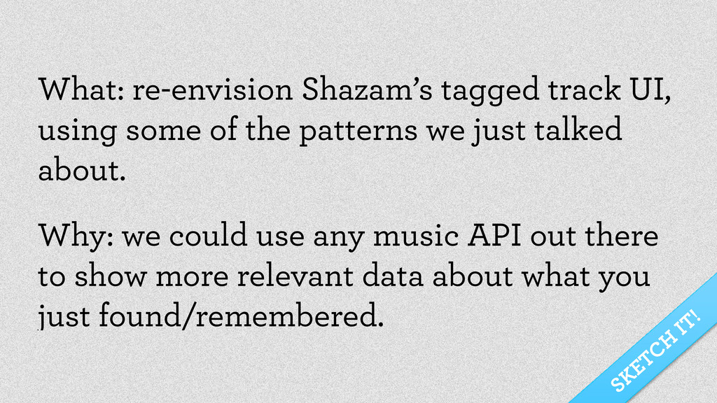
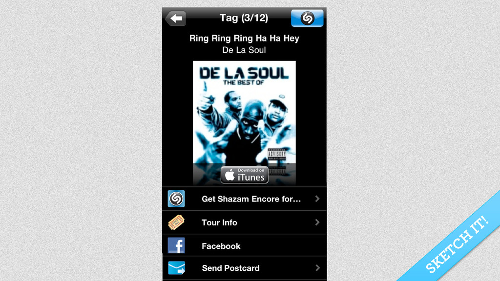
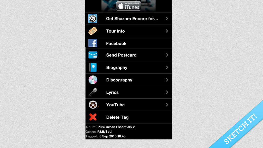
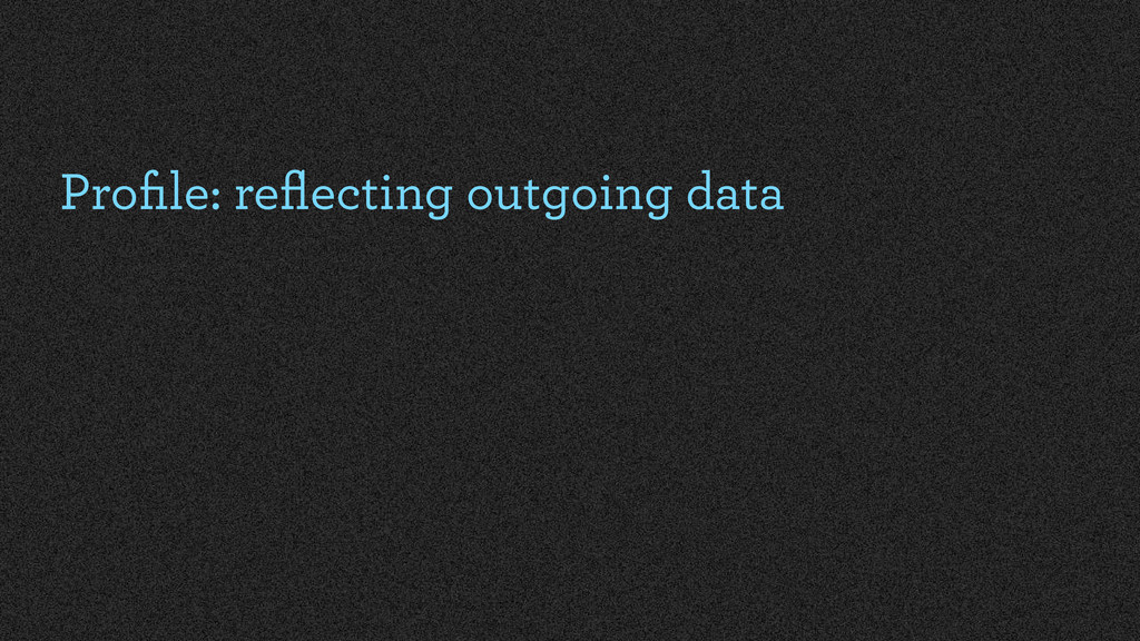
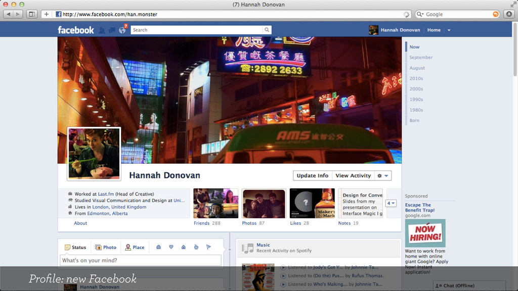
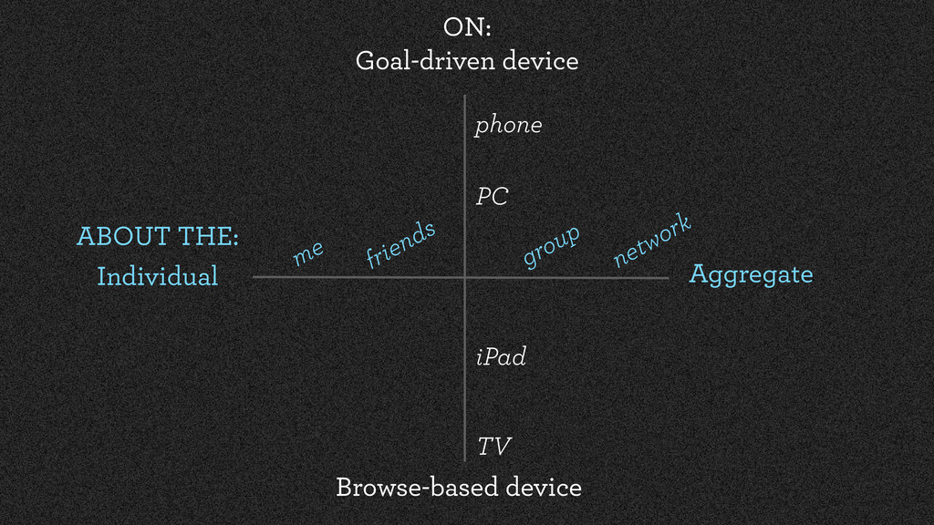
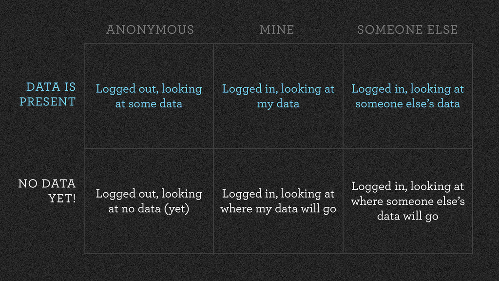
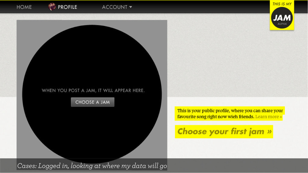
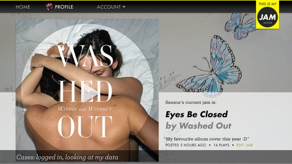
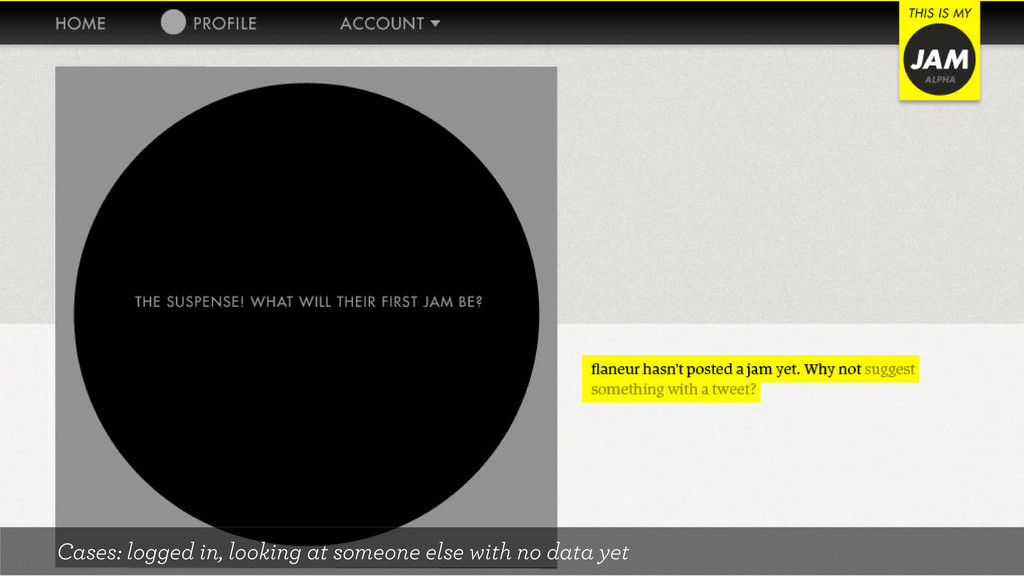
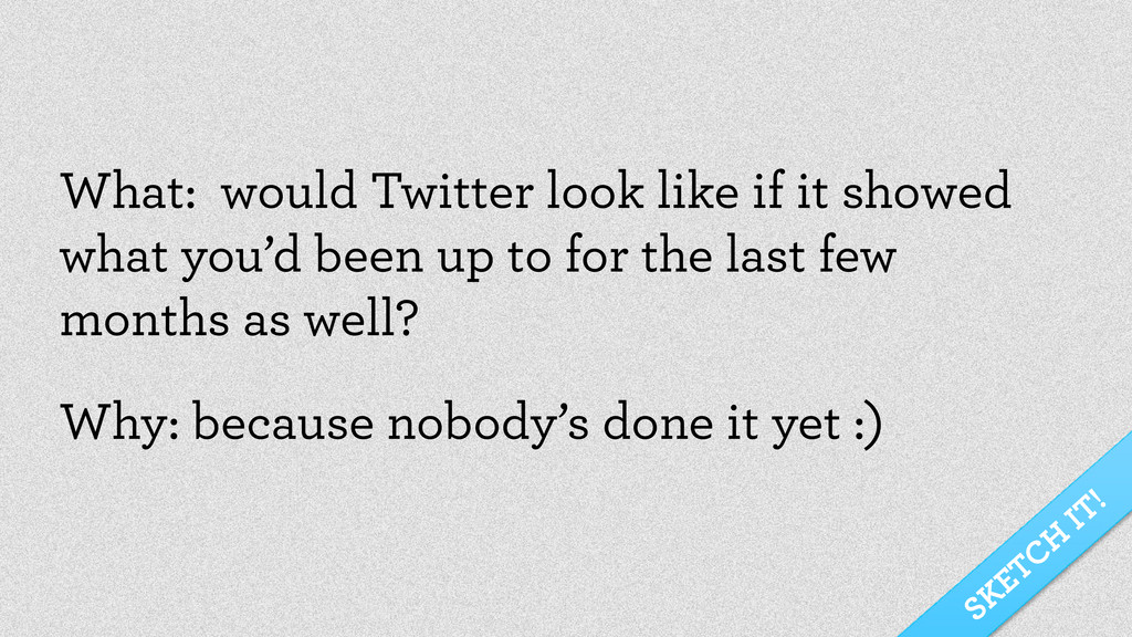
If you want to add stats, graphs and other bits of lifestream data to your web app, this workshop is for you. Leave with an understanding of how to wrestle with interaction design challenges such as: dealing with too much/too little user-generated data; what to show different user types (e.g. logged in/out users); when to show aggregate vs. individual datasets and more.

Hannah Donovan

October 12, 2011
Tweet

More Decks by Hannah Donovan

Other Decks in Design

Transcript

  1. We need to stop grasping for the perfect visualization and

    return to the basic language of charts and graphs. Only then can we begin to uncover the relationships the data has to offer. – Brian Suda Photo credit: andré.luís on Flickr
  2. We people, we have a lot of details now. We

    live in an instrumented world
  3. New conceptual breakthroughs are invariably driven by the development of

    new technologies. – Don Norman Photo credit: Piemont Share on Flickr
  4. Web APIs become popular Moore’s law applied to data storage

    Big data Ability to build real-time interfaces ~2005 ~2010
  5. Web APIs become popular Moore’s law applied to data storage

    Big data Ability to build real-time interfaces Cloud computing ~2005 ~2010
  6. For us: be aware and inquisitive, so we can choose

    the right tool for the job For users: they will expect certain things to work in certain ways
  7. For us: spoiled for choice, we have more decisions to

    make than ever before. For users: signal vs. noise is becoming a common problem.
  8. For us: we need to have sharp presentation skills for

    conveying the speed of the data For users: they care, and will often expect things to be in real-time.
  9. For us: we’re faced with a new challenge of how

    to reflect this meaningfully to users For users: they are becoming increasingly aware of their history
  10. Use the WW brief: What do you want, and why

    do you want it? (It’s your job to figure out how to do it).
  11. Is it a data dump or is it live? If

    it is live, then you are probably relying on an API (your own or external).
  12. An API: Collectively, an API is a bit like a

    “styleguide” — it defines vocabularies and conventions
  13. Getting the stuff you want out: An API allows you

    to call methods. A method is a structured way for asking for a particular bit of information from an online service.
  14. Something like, “Hey, I want some info about this thing”

    “How many?” “10, and be sure to include the picture bits”
  15. If the service is currently being worked on by your

    team, establish a dialogue with them about this.
  16. Types of questions I like to ask: What parameters can

    it have? How expensive is this? What can we compare this against?
  17. If the answer is “no”… Explain what you want and

    why you want it. Let them figure out how ;-)
  18. 1. Sketch UI with pen & paper 2. Get the

    data in-page 3. Design the UI in-page
  19. Counters Good for showing less than three key statistics about

    a user, and answers the question “How am I doing?” at a glance.
  20. Sparklines Good for showing a huge amount of data in

    small space, and can answer questions about trends within a sentence.
  21. Line Graphs Good for showing continuous data and visualising trends.

    Line graphs are good for answering questions like “How did it look during ____?”
  22. Bar Charts Good for visually comparing discreet data and very

    versatile as the data in a bar chart can be ordered however you want. Great for answering questions like, “which one is___?”
  23. Sentence (yes, the sentence!) Good for contextualising data in a

    conversational tone. Great for answering questions that could use a bit of personality.
  24. Realtime Search Good for filtering out signal in vast amounts

    of real-time noise. Answers the question “what is happening with x right now?”
  25. Favlikelovestar+1 Good for services that have lifestream data that people

    want to hug; use these for that visceral “I want to keep this! I love this!” response.
  26. Reblah Good for services that want to cater to lazy

    usage. Responds to the impulse “I want to make this part of my identity too”
  27. Thumbs & Stars Good for services that depend on ratings

    for good content to bubble to the top. Answers the question “what do people think is best”?
  28. Notifications Good for important bits of real-time activity people don’t

    want to miss out on. Often fosters serendipity.
  29. And remember to layer: At first sight, reveal the bare

    minimum With contextual UI, reveal more For the discerning, link to the source
  30. What: re-envision Shazam’s tagged track UI, using some of the

    patterns we just talked about. Why: we could use any music API out there to show more relevant data about what you just found/remembered. SKETCH IT!
  31. Logged out, looking at some data Logged in, looking at

    my data Logged in, looking at someone else’s data Logged out, looking at no data (yet) Logged in, looking at where my data will go Logged in, looking at where someone else’s data will go DATA IS PRESENT NO DATA YET! ANONYMOUS MINE SOMEONE ELSE
  32. SKETCH IT! What: re-envision an eBay seller profile screen, for

    at least 2 cases. Why: There’s a ton of data at hand, and very little revealed about this person you’re about to fork over cash money to.
  33. Real time Recent past (~1 day ago) Past (~1 week

    ago) History (archives) Now Joined
  34. SKETCH IT! What: would Twitter look like if it showed

    what you’d been up to for the last few months as well? Why: because nobody’s done it yet :)
  35. We’ve all been so distracted by The Now that we’ve

    hardly noticed the beautiful comet tails of personal history trailing in our wake. – Matthew Ogle