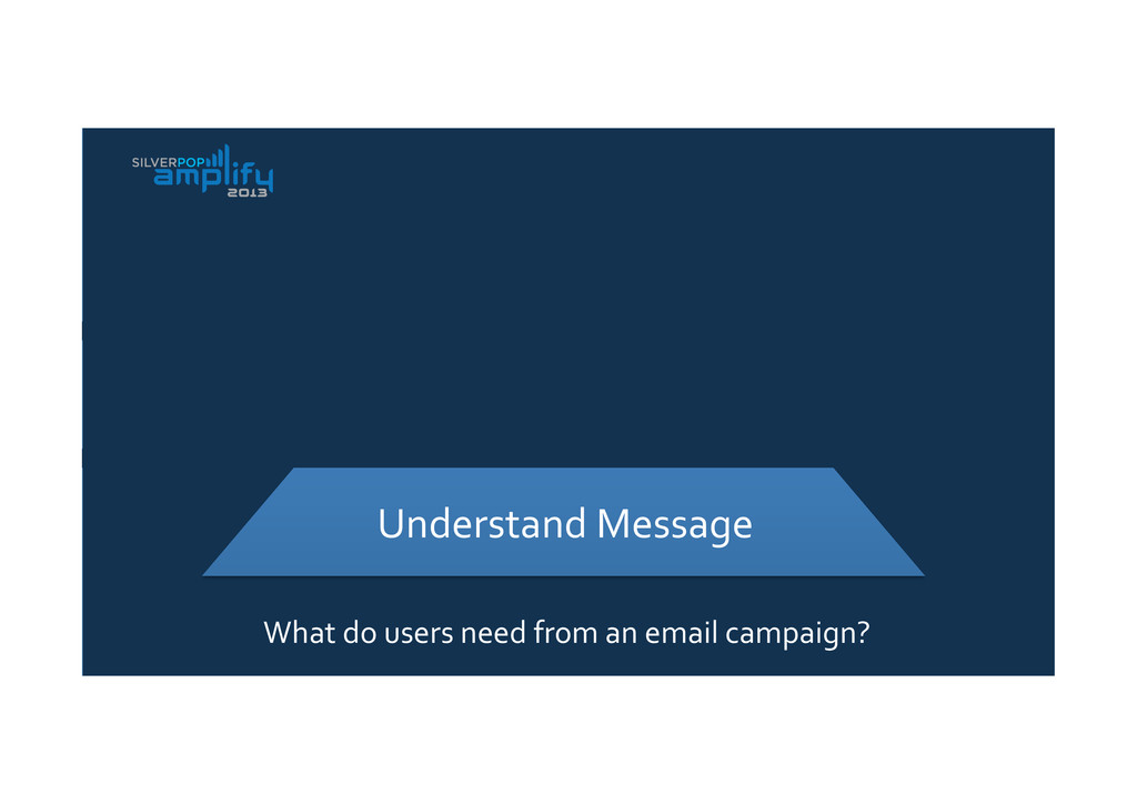
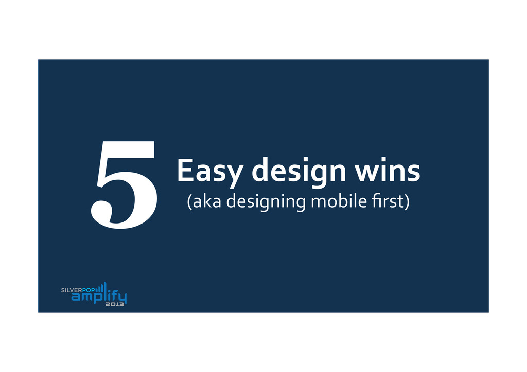
From my talk at Silverpop Amplify 2013 conference in London - a quick look at the different options and opportunities for mobile email design, from some easy wins to completely re-thinking how we approach design.
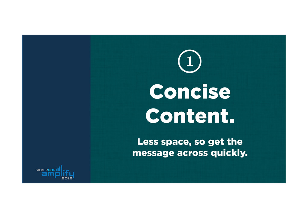
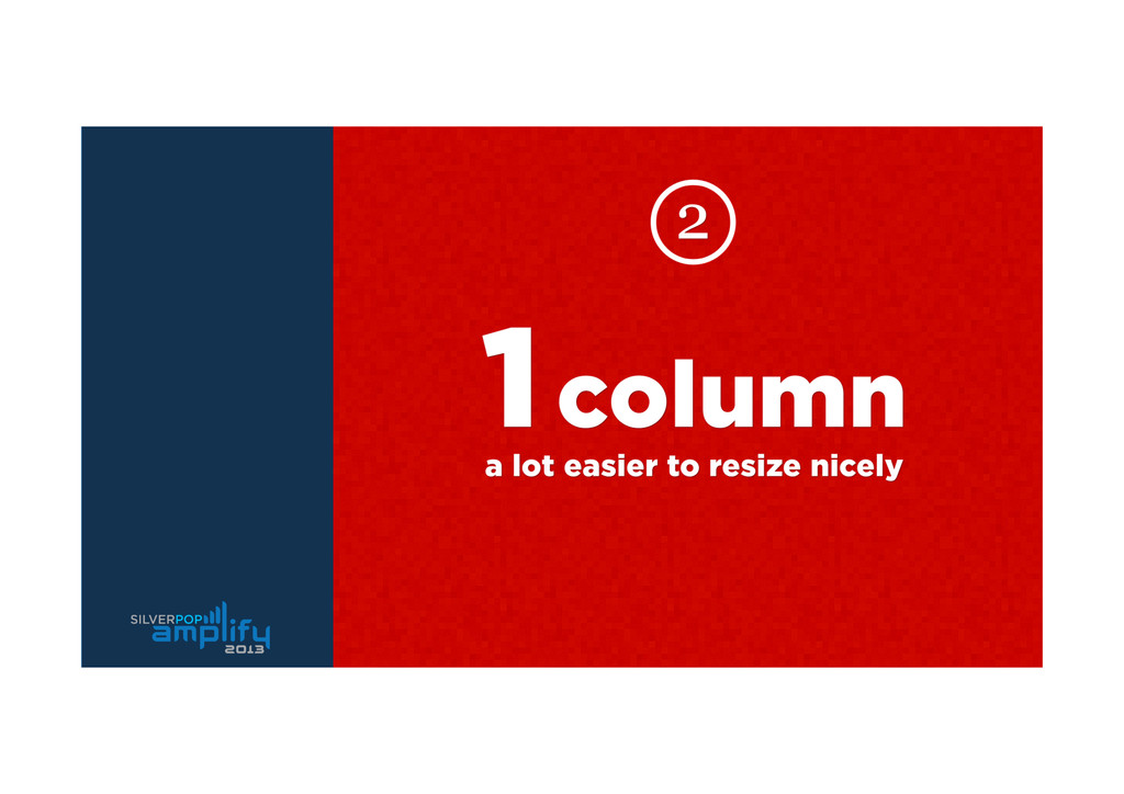
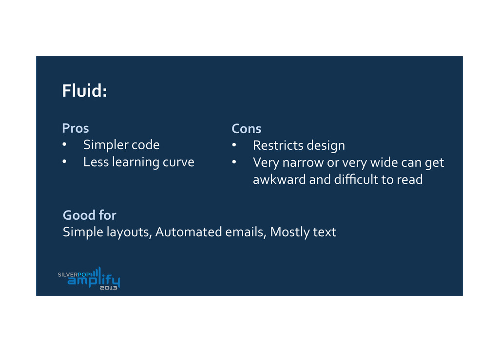
learning curve Cons • Restricts design • Very narrow or very wide can get awkward and difficult to read Good for Simple layouts, Automated emails, Mostly text
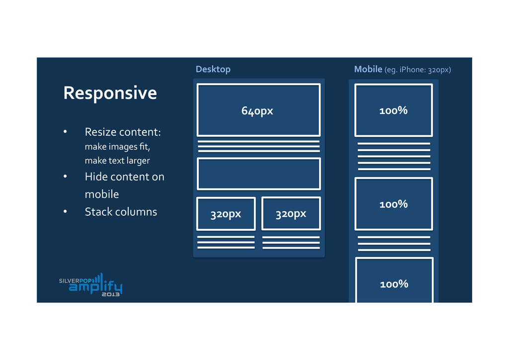
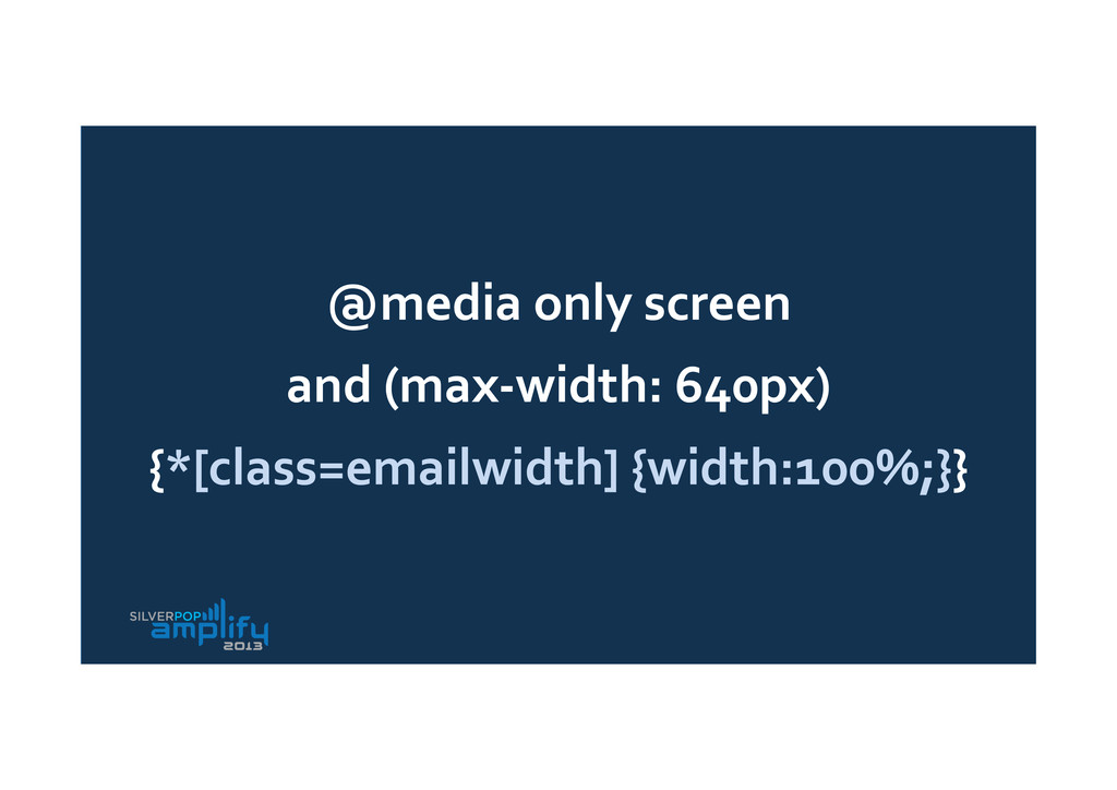
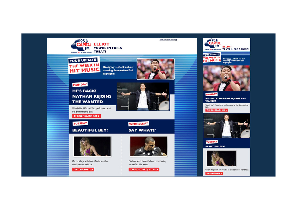
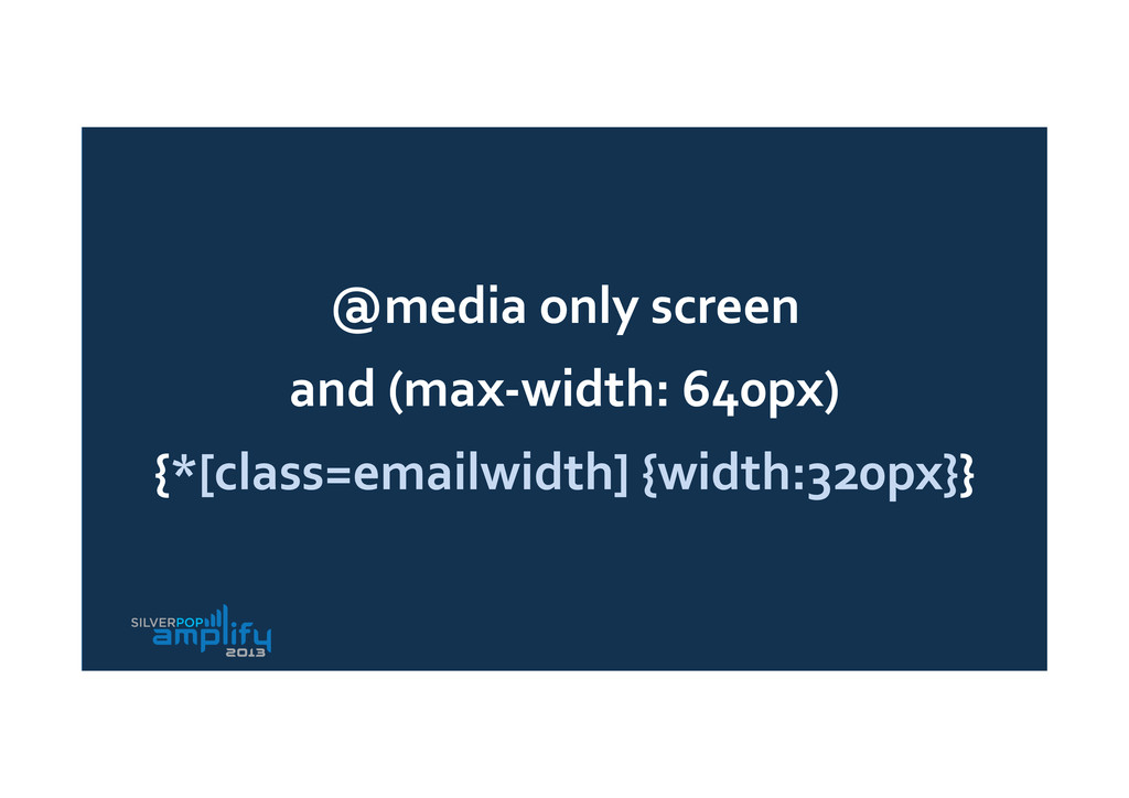
100% 100% 100% Responsive • Resize content: make images fit, make text larger • Hide content on mobile • Stack columns Desktop Mobile (eg. iPhone: 320px)
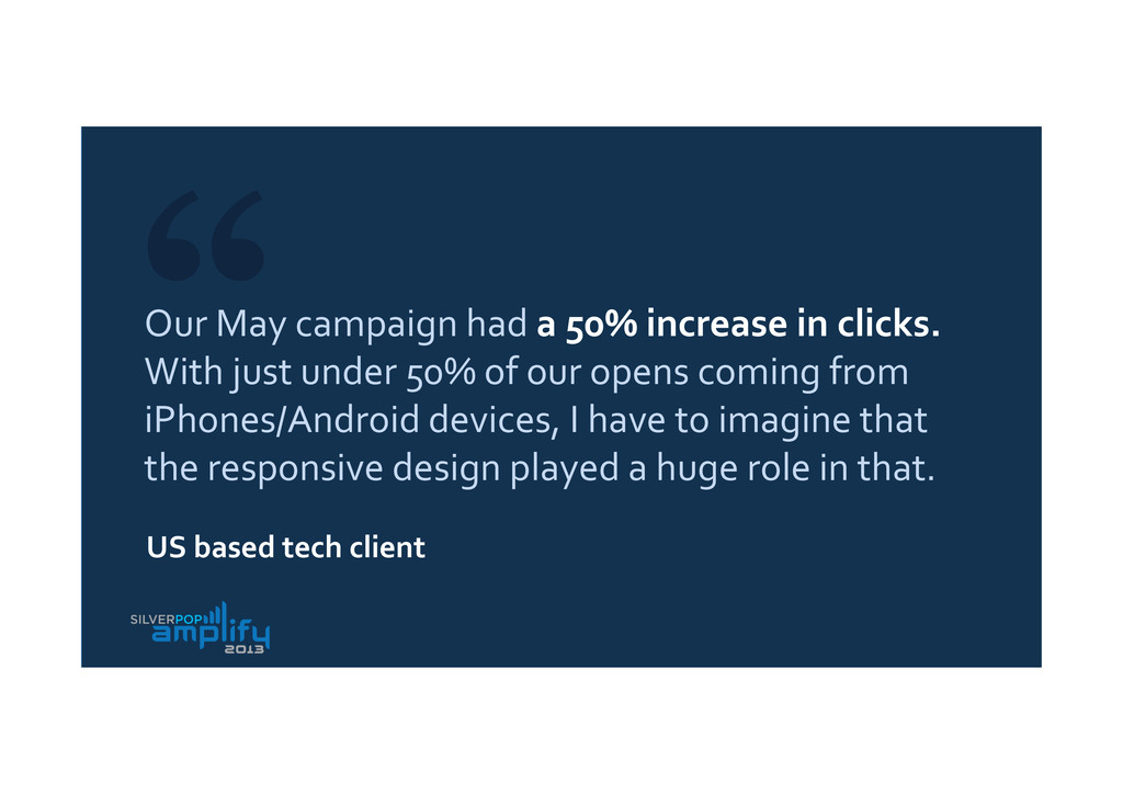
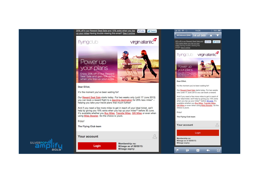
With just under 50% of our opens coming from iPhones/Android devices, I have to imagine that the responsive design played a huge role in that. US based tech client
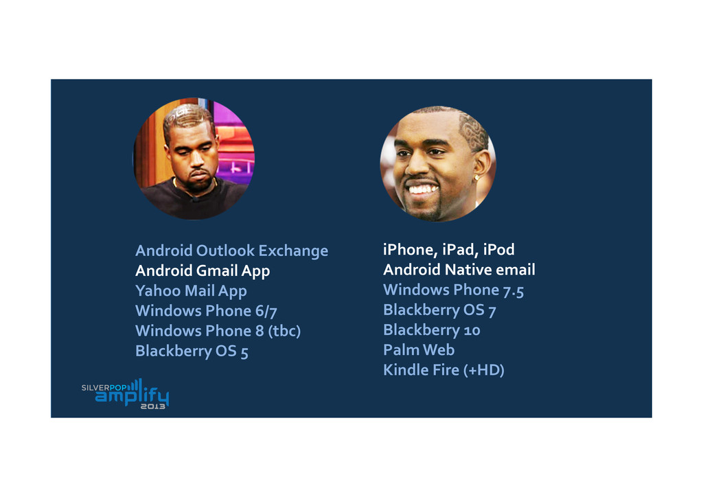
App Windows Phone 6/7 Windows Phone 8 (tbc) Blackberry OS 5 iPhone, iPad, iPod Android Native email Windows Phone 7.5 Blackberry OS 7 Blackberry 10 Palm Web Kindle Fire (+HD) Android Outlook Exchange Android Gmail App Yahoo Mail App Windows Phone 6/7 Windows Phone 8 (tbc) Blackberry OS 5 iPhone, iPad, iPod Android Native email Windows Phone 7.5 Blackberry OS 7 Blackberry 10 Palm Web Kindle Fire (+HD)
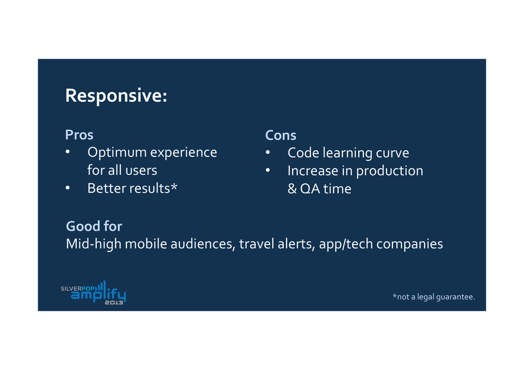
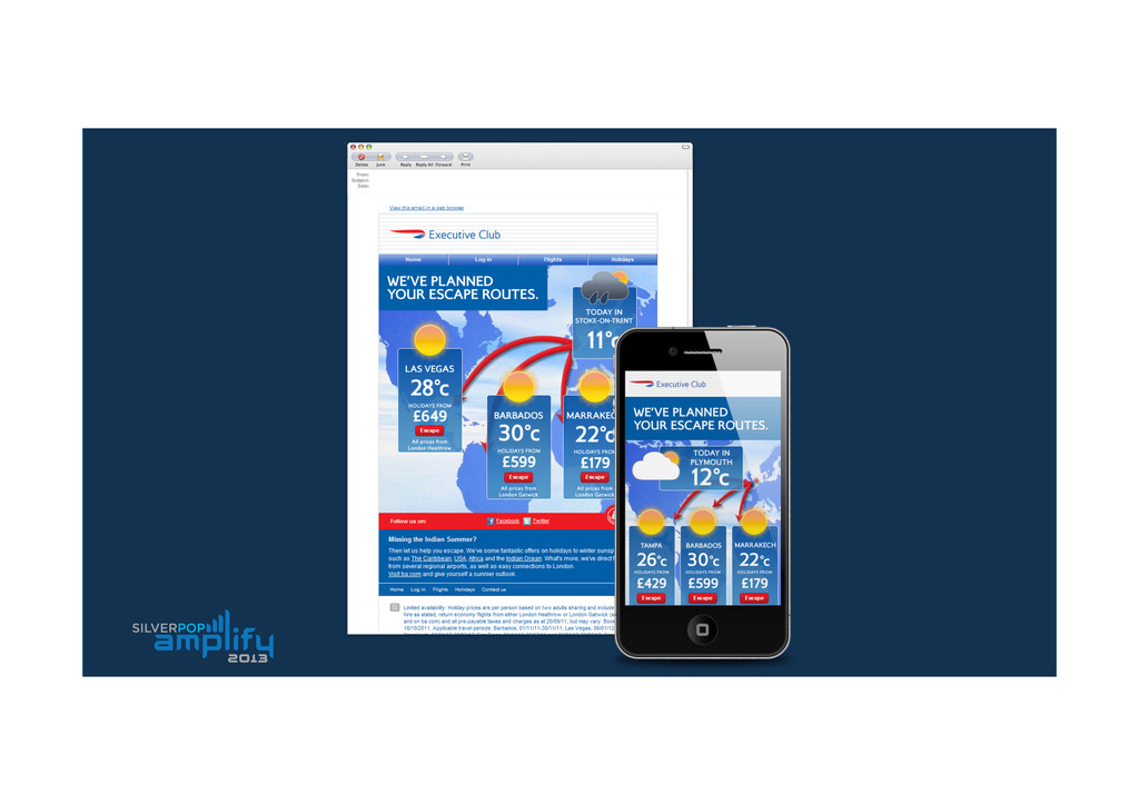
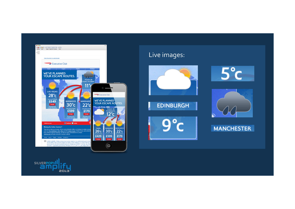
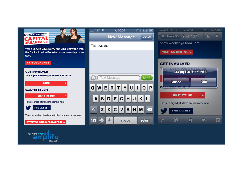
users • Better results* Cons • Code learning curve • Increase in production & QA time Good for Mid-‐high mobile audiences, travel alerts, app/tech companies *not a legal guarantee.
 iamelliot
 lynteo
 hiranotomoki
 kenichiota0711
 webnaut
 a2k
a2k
 hiro0218
 terencebasart
 videlvequio
 bebe
bebe
 kaikou
 tomoyanonymous
 honzajavorek
 sergeychernyshev
 afnizarnur
 mraible
 erikaheidi
 inesmontani
 aarron
 ianozsvald
 lauravandoore
 signer
 thirion