Upgrade to Pro
— share decks privately, control downloads, hide ads and more …
Speaker Deck
Features
Speaker Deck
PRO
Sign in
Sign up for free
Search
Search
The CSS of Tomorrow
Search
Peter Gasston
September 07, 2012
Technology
2.6k
8
Share
Embed
Copy iframe code
Copy JS code
Copy link
Start on current slide
The CSS of Tomorrow
Canvas conference, 7 September 2012. #canvasconf
Peter Gasston
September 07, 2012
More Decks by Peter Gasston
See All by Peter Gasston
People Don’t Change
stopsatgreen
0
230
Your Reality Here
stopsatgreen
0
140
Growing Up, Getting Serious - #SotB6
stopsatgreen
1
390
Growing Up, Getting Serious
stopsatgreen
0
130
Surveying the Landscape — November 2016
stopsatgreen
1
210
Surveying the Landscape - Fronteers
stopsatgreen
2
530
The Web vs. The Browser
stopsatgreen
0
240
Surveying the Landscape Sept. 2016
stopsatgreen
1
470
Surveying the Landscape
stopsatgreen
4
920
Other Decks in Technology
See All in Technology
企業でAWS Organizationsを動かすための組織設計の考え方
nrinetcom
PRO
1
100
AI、CDK と協働する Full TypeScript アプリケーション開発 / Full TypeScript Application with AI and CDK
geekplus_tech
2
240
CIで使うClaude
iwatatomoya
0
280
壊して学ぶAWS CDK: そのcdk deployで消えるもの、残るもの
k_adachi_01
1
270
しくみを学んで使いこなそう GitHub Copilot app
torumakabe
2
260
第67回コンピュータビジョン勉強会CVPR2026読会前編
tsukamotokenji
0
140
ソニー銀行におけるビジネスアジリティ向上のためのクラウドシフト戦略
srenext
0
330
貴方はどのエンジニアリングを磨くのか
hatyibei
0
130
End-to-Endで考える信頼性 — LINEアプリにおける クライアント開発×SRE連携の実践
maruloop
4
4.3k
Gen3R: 3D Scene Generation Meets Feed-Forward Reconstruction
spatial_ai_network
0
130
[2026-07-15] AI Ready なはずだったアーキテクチャと、見えてきた課題・次に目指す状態
wxyzzz
9
3.8k
SRE本の知られざる名シーン / The Hidden Gems of Google SRE Book
nari_ex
1
410
Featured
See All Featured
Max Prin - Stacking Signals: How International SEO Comes Together (And Falls Apart)
techseoconnect
PRO
0
200
Abbi's Birthday
coloredviolet
3
8.6k
Getting science done with accelerated Python computing platforms
jacobtomlinson
2
290
Learning to Love Humans: Emotional Interface Design
aarron
275
41k
Organizational Design Perspectives: An Ontology of Organizational Design Elements
kimpetersen
PRO
1
760
実際に使うSQLの書き方 徹底解説 / pgcon21j-tutorial
soudai
PRO
201
75k
The #1 spot is gone: here's how to win anyway
tamaranovitovic
3
1.1k
Testing 201, or: Great Expectations
jmmastey
46
8.2k
"I'm Feeling Lucky" - Building Great Search Experiences for Today's Users (#IAC19)
danielanewman
230
23k
Typedesign – Prime Four
hannesfritz
42
3.1k
StorybookのUI Testing Handbookを読んだ
zakiyama
31
6.8k
The Impact of AI in SEO - AI Overviews June 2024 Edition
aleyda
5
1.1k
Transcript
Peter Gasston @stopsatgreen http://broken-links.com
The CSS of Tomorrow
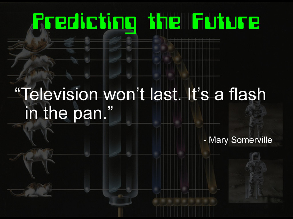
Predicting the Future “Television won’t last. It’s a flash in
the pan.” - Mary Somerville
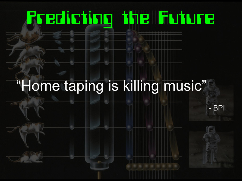
Predicting the Future “Home taping is killing music” - BPI
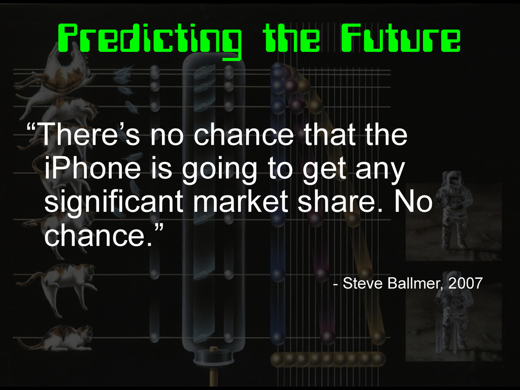
Predicting the Future “There’s no chance that the iPhone is
going to get any significant market share. No chance.” - Steve Ballmer, 2007
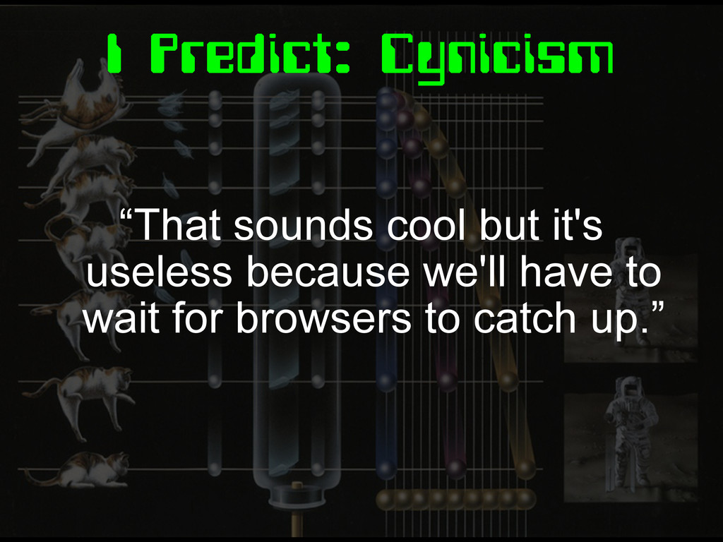
I Predict: Cynicism “That sounds cool but it's useless because
we'll have to wait for browsers to catch up.”
The CSS of Tomorrow
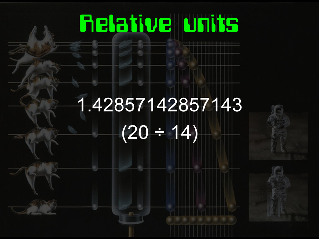
1.42857142857143 (20 ÷ 14) Relative units
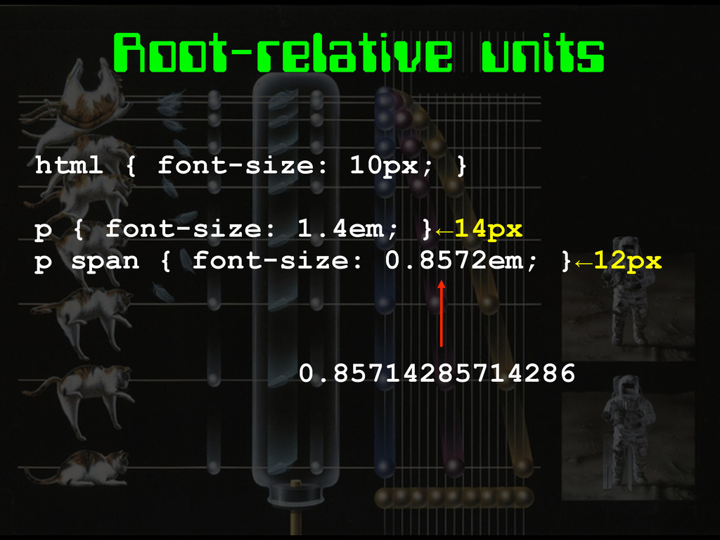
Root-relative units html { font-size: 10px; } p { font-size:
1.4em; }←14px p span { font-size: 0.8572em; }←12px 0.85714285714286
None
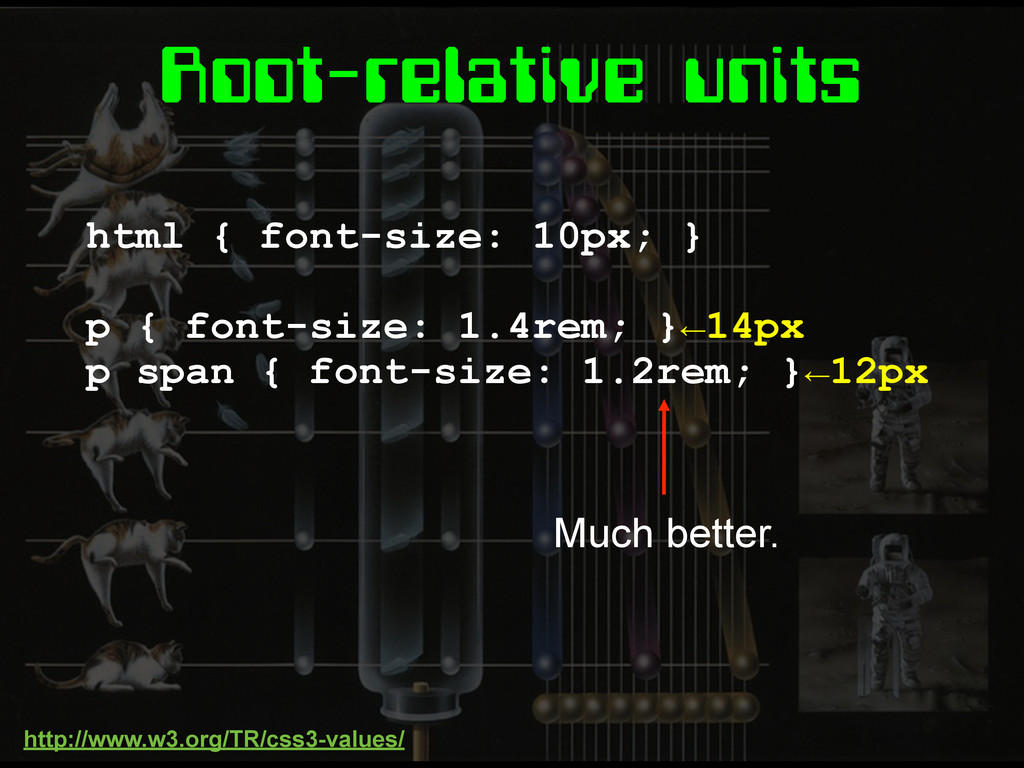
Root-relative units html { font-size: 10px; } p { font-size:
1.4rem; }←14px p span { font-size: 1.2rem; }←12px Much better. http://www.w3.org/TR/css3-values/
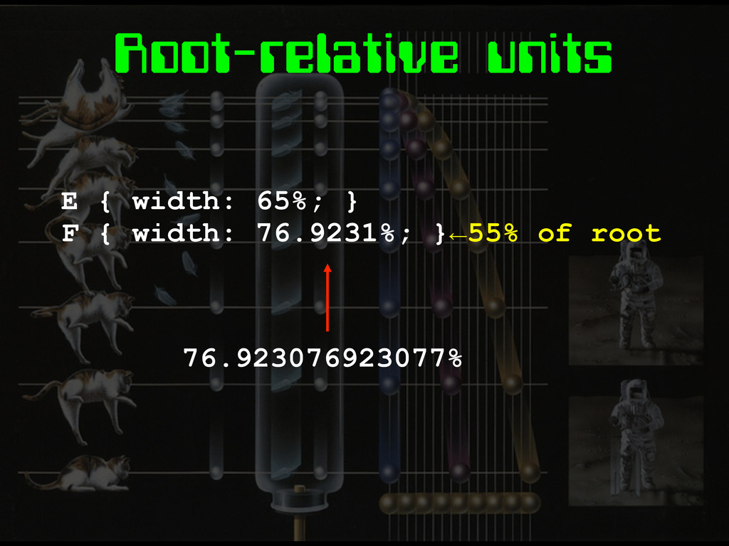
Root-relative units E { width: 65%; } F { width:
76.9231%; }←55% of root 76.923076923077%
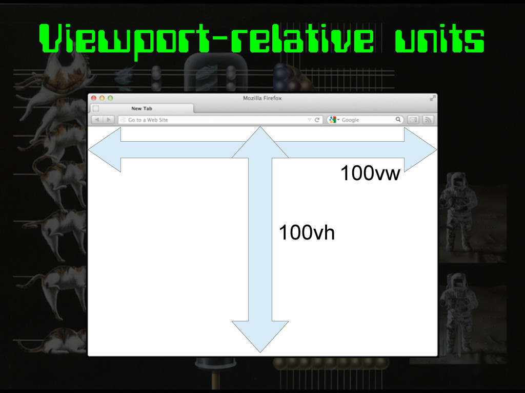
Viewport-relative units 100vw 100vh
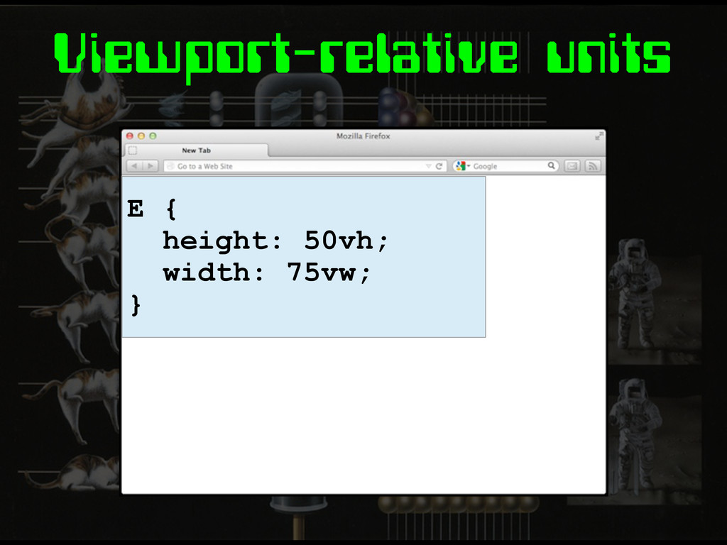
Viewport-relative units E { height: 50vh; width: 75vw; }
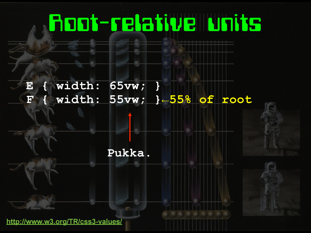
Root-relative units E { width: 65vw; } F { width:
55vw; }←55% of root Pukka. http://www.w3.org/TR/css3-values/
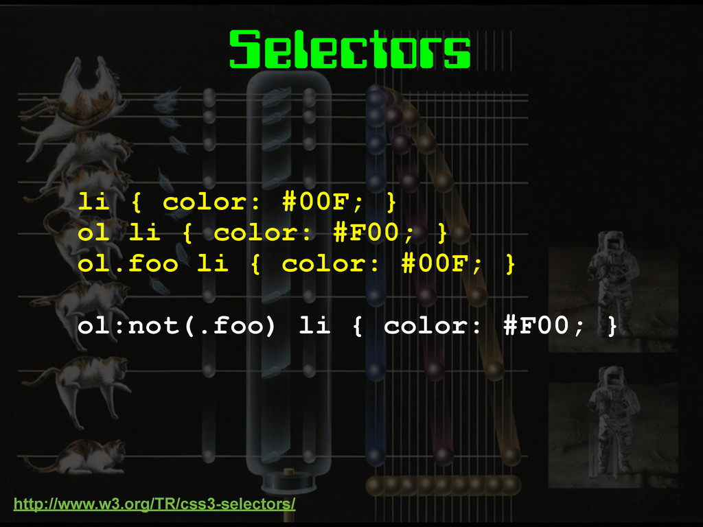
Selectors li { color: #00F; } ol li { color:
#F00; } ol.foo li { color: #00F; } ol:not(.foo) li { color: #F00; } http://www.w3.org/TR/css3-selectors/
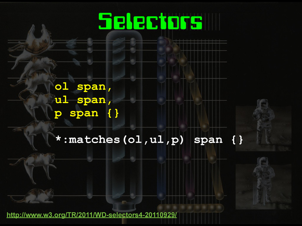
Selectors ol span, ul span, p span {} *:matches(ol,ul,p) span
{} http://www.w3.org/TR/2011/WD-selectors4-20110929/
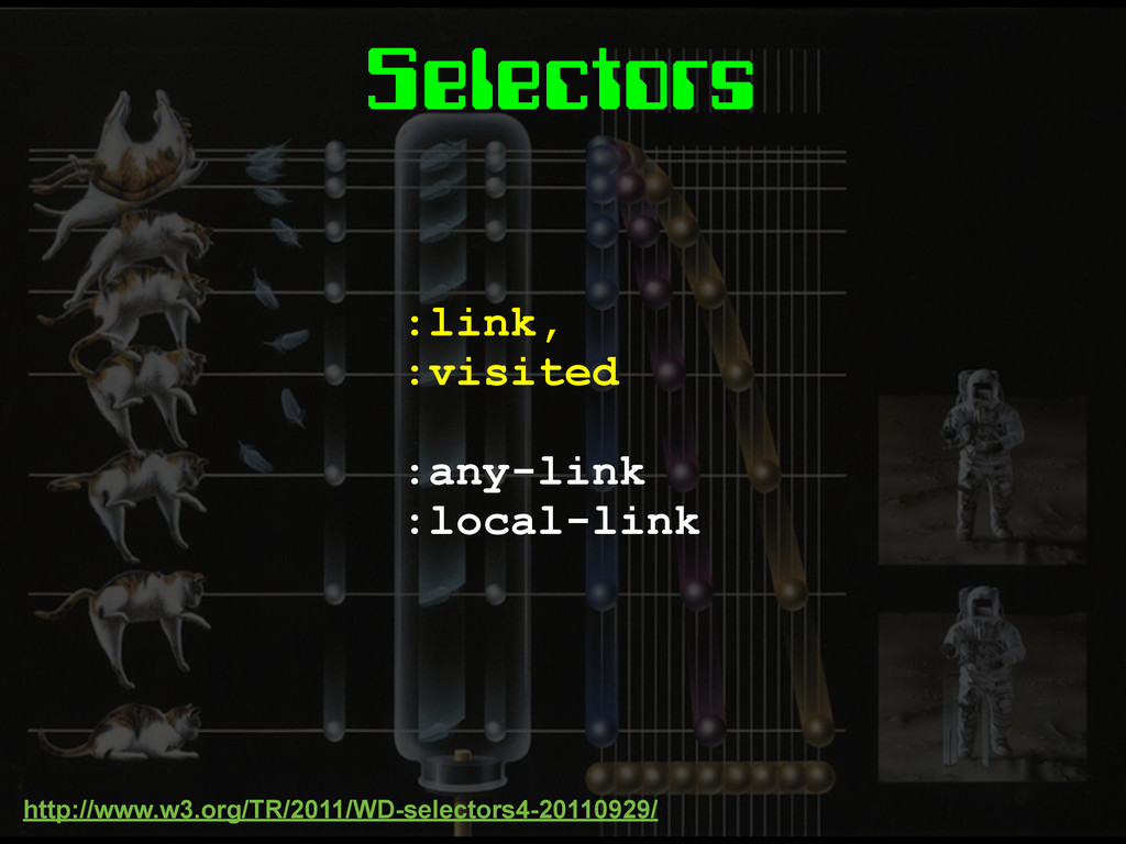
Selectors :link, :visited :any-link :local-link http://www.w3.org/TR/2011/WD-selectors4-20110929/
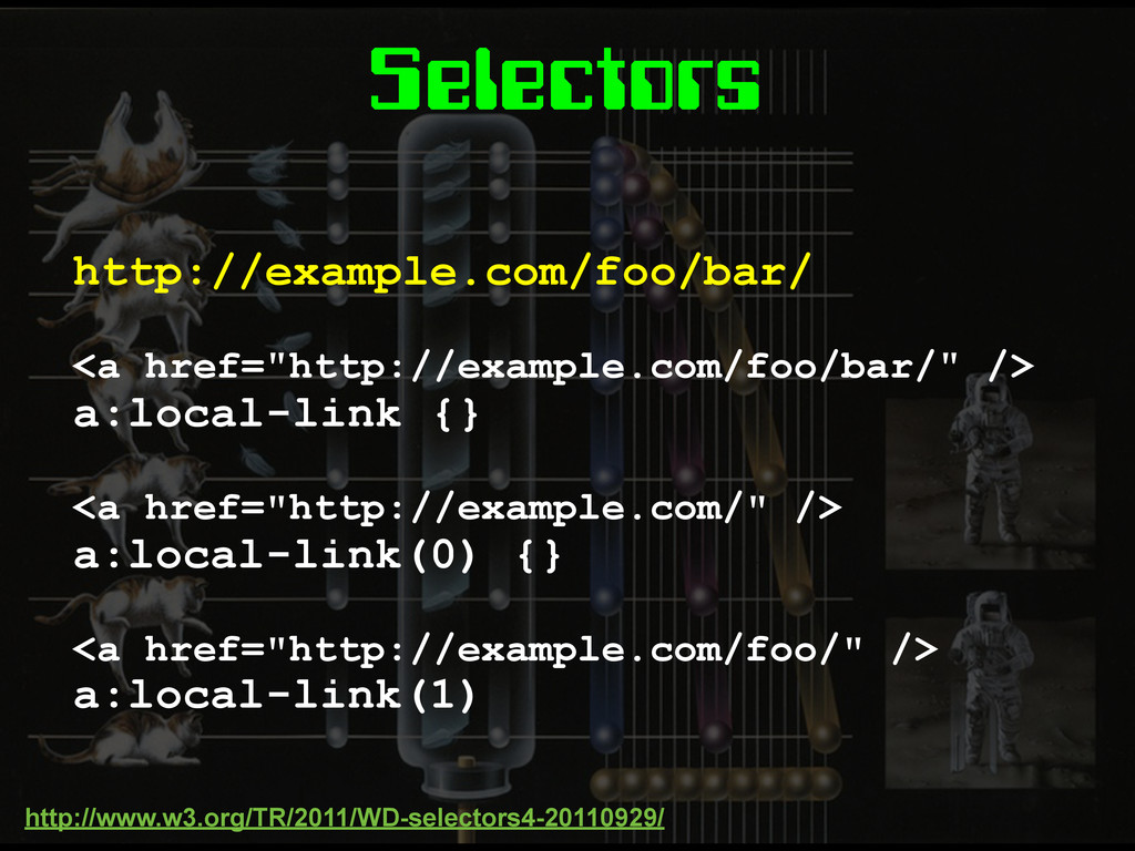
Selectors http://example.com/foo/bar/ <a href="http://example.com/foo/bar/" /> a:local-link {} <a href="http://example.com/" />
a:local-link(0) {} <a href="http://example.com/foo/" /> a:local-link(1) http://www.w3.org/TR/2011/WD-selectors4-20110929/
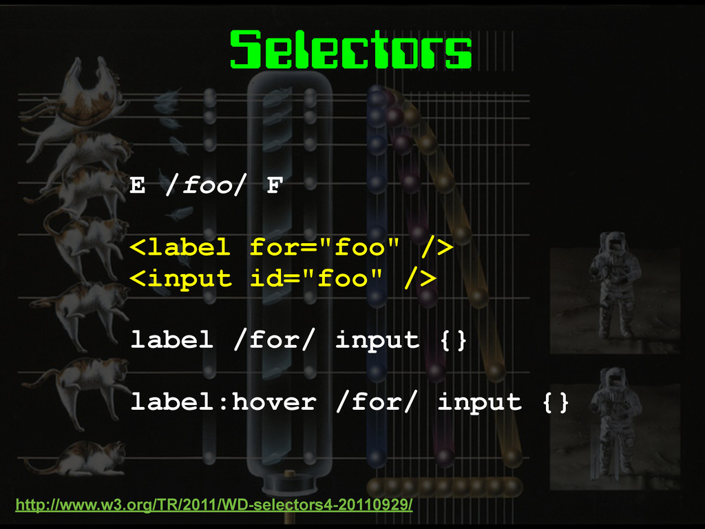
Selectors E /foo/ F <label for="foo" /> <input id="foo" />
label /for/ input {} label:hover /for/ input {} http://www.w3.org/TR/2011/WD-selectors4-20110929/
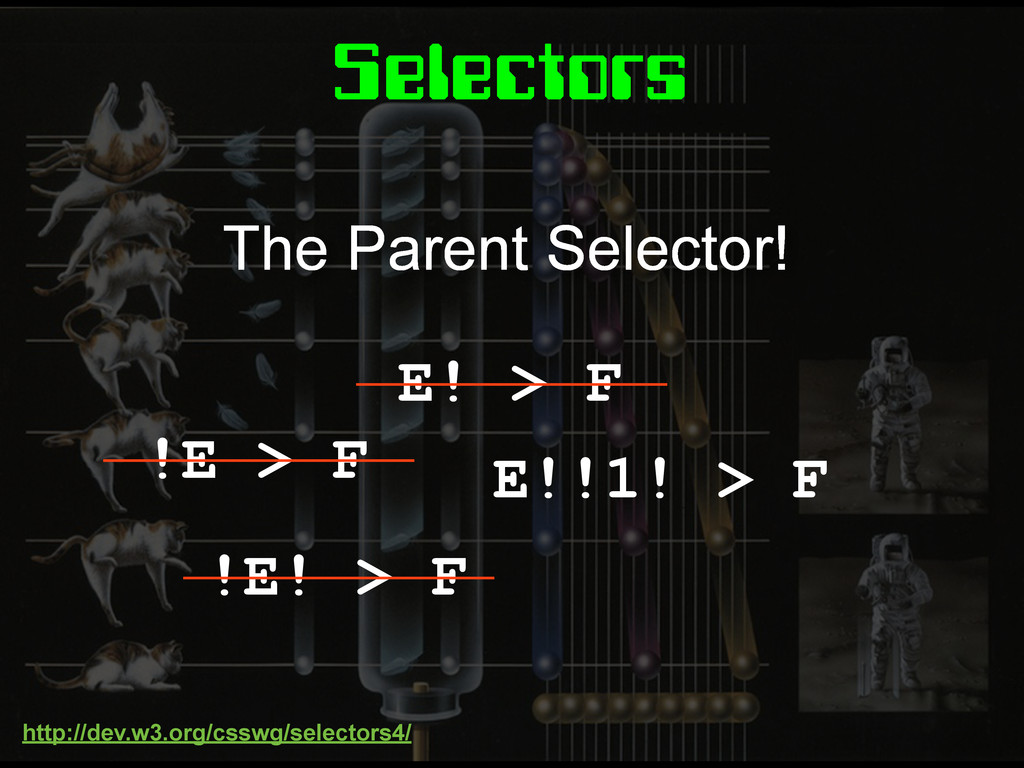
Selectors E! > F !E > F !E! > F
E!!1! > F The Parent Selector! http://dev.w3.org/csswg/selectors4/
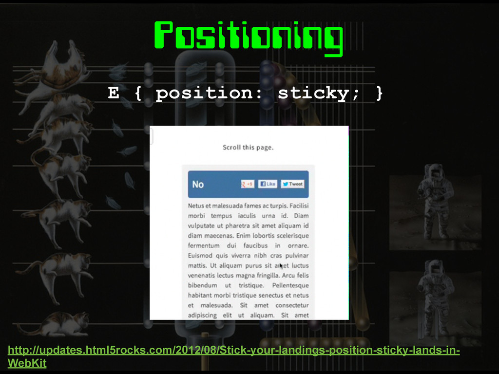
Positioning E { position: sticky; } http://updates.html5rocks.com/2012/08/Stick-your-landings-position-sticky-lands-in- WebKit
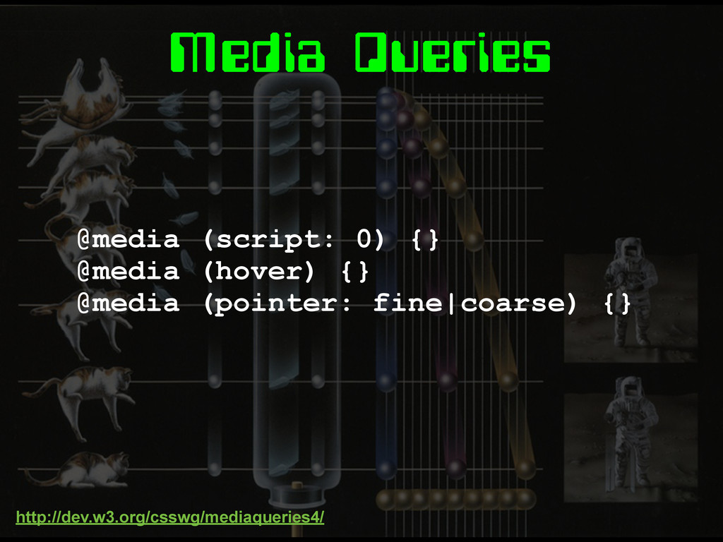
Media Queries
Media Queries @media (script: 0) {} @media (hover) {} @media
(pointer: fine|coarse) {} http://dev.w3.org/csswg/mediaqueries4/
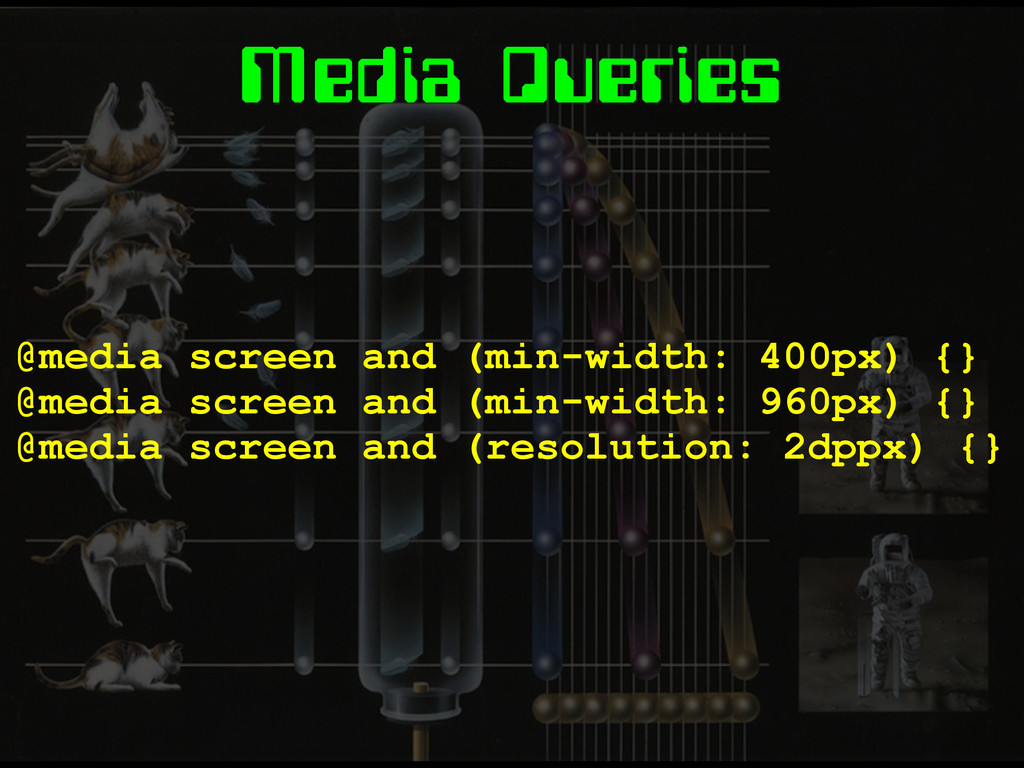
Media Queries @media screen and (min-width: 400px) {} @media screen
and (min-width: 960px) {} @media screen and (resolution: 2dppx) {}
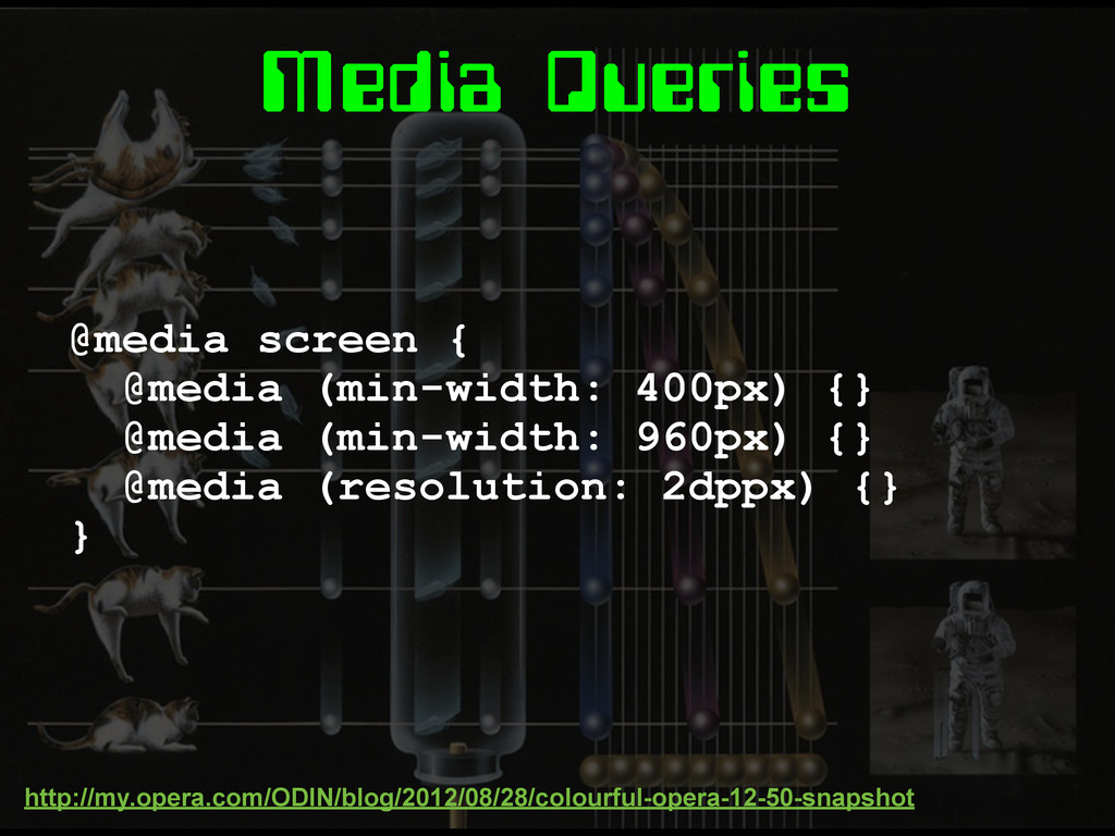
Media Queries @media screen { @media (min-width: 400px) {} @media
(min-width: 960px) {} @media (resolution: 2dppx) {} } http://my.opera.com/ODIN/blog/2012/08/28/colourful-opera-12-50-snapshot
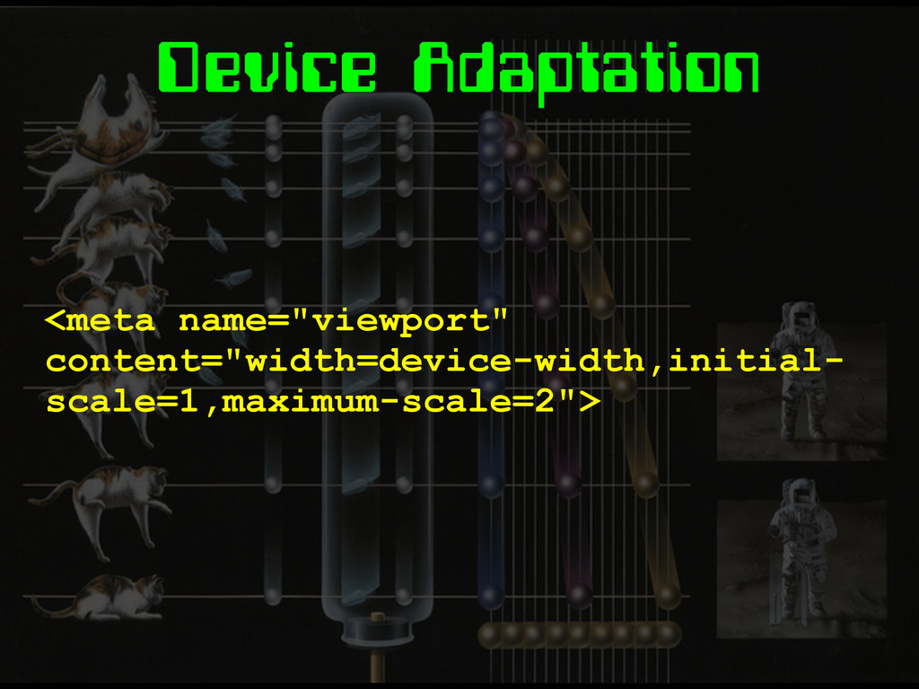
Device Adaptation <meta name="viewport" content="width=device-width,initial- scale=1,maximum-scale=2">
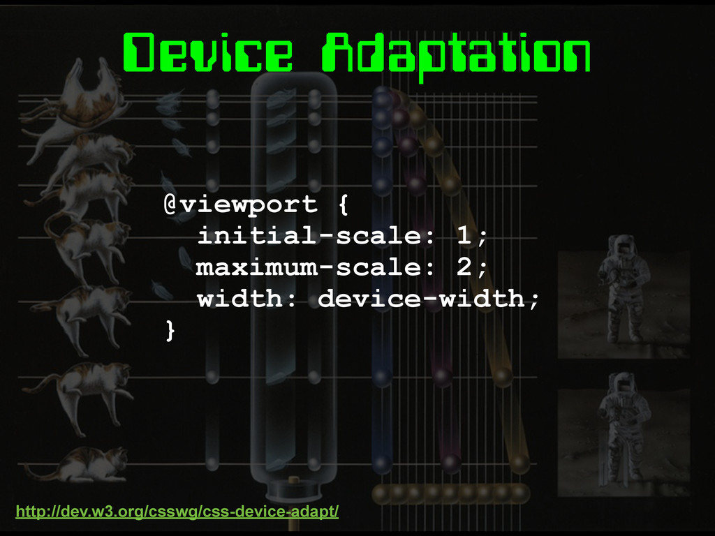
Device Adaptation @viewport { initial-scale: 1; maximum-scale: 2; width: device-width;
} http://dev.w3.org/csswg/css-device-adapt/
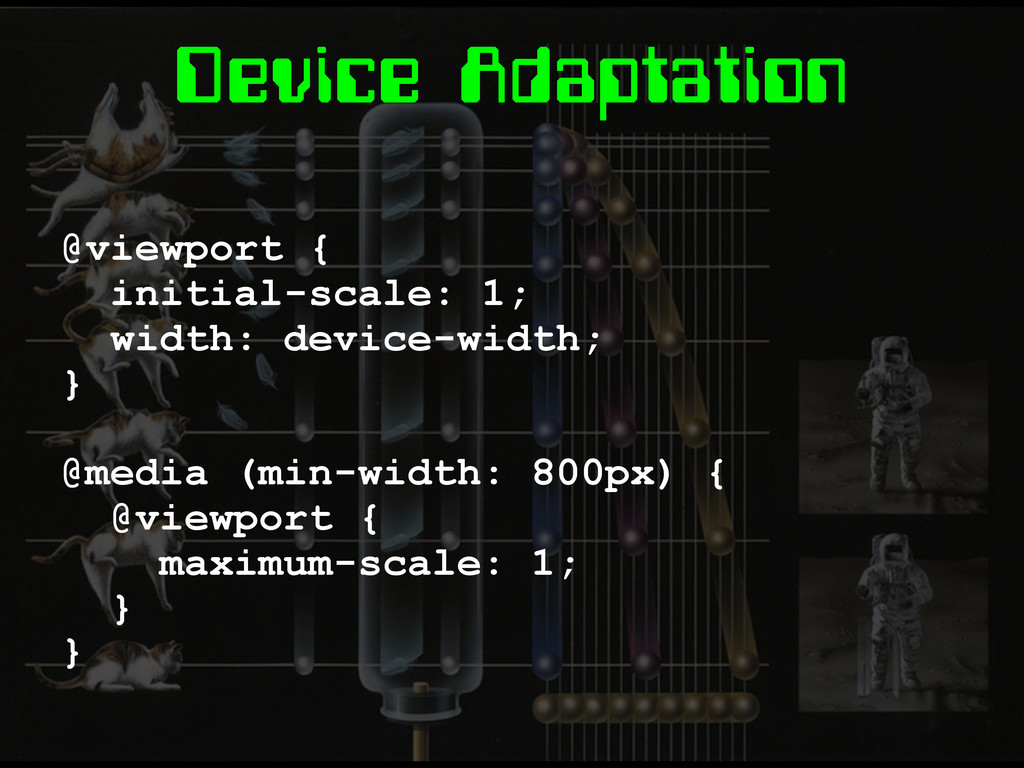
Device Adaptation @viewport { initial-scale: 1; width: device-width; } @media
(min-width: 800px) { @viewport { maximum-scale: 1; } }
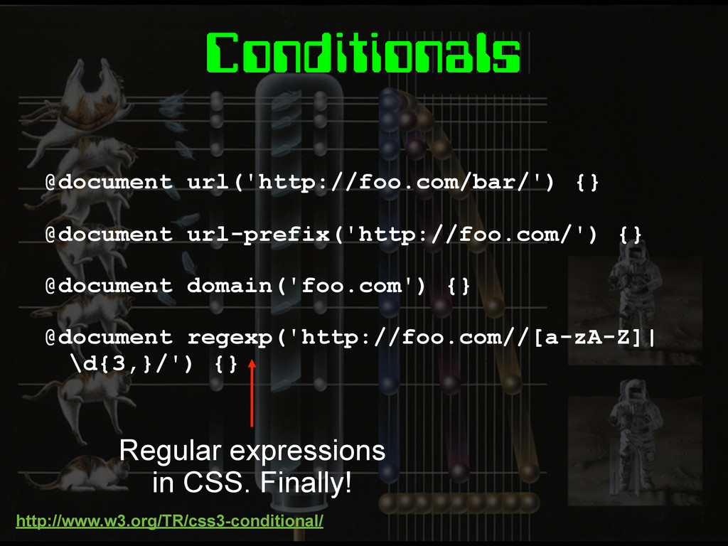
Conditionals @document url('http://foo.com/bar/') {} @document url-prefix('http://foo.com/') {} @document domain('foo.com') {}
@document regexp('http://foo.com//[a-zA-Z]| \d{3,}/') {} Regular expressions in CSS. Finally! http://www.w3.org/TR/css3-conditional/
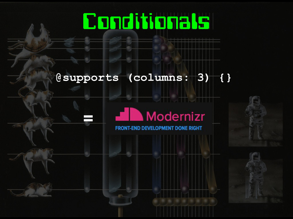
Conditionals @supports (columns: 3) {} =
Images
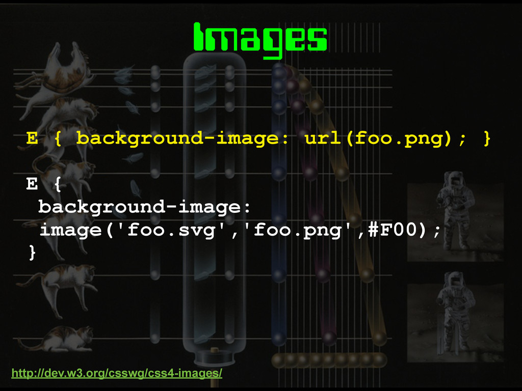
Images E { background-image: image('foo.svg','foo.png',#F00); } E { background-image: url(foo.png);
} http://dev.w3.org/csswg/css4-images/
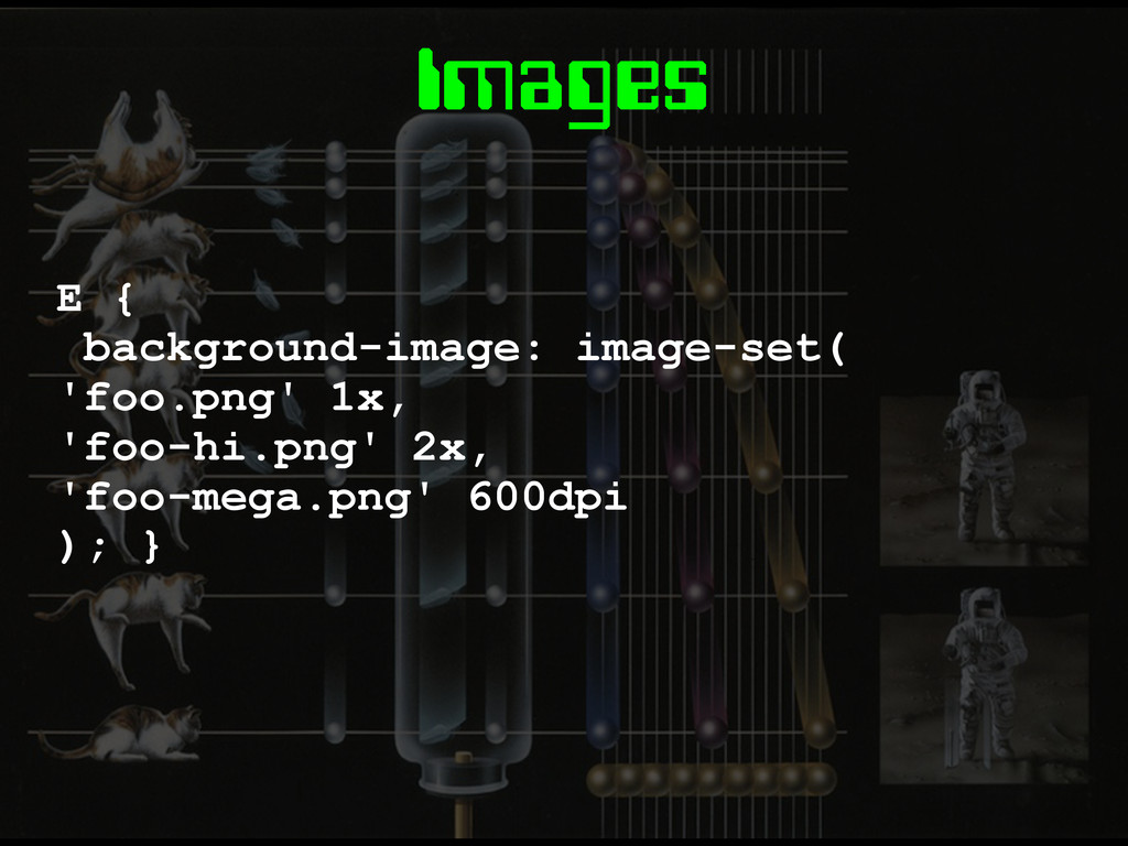
Images E { background-image: image-set( 'foo.png' 1x, 'foo-hi.png' 2x, 'foo-mega.png'
600dpi ); }
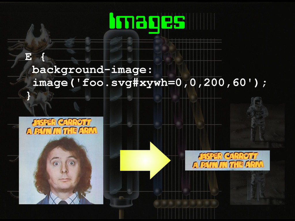
Images E { background-image: image('foo.svg#xywh=0,0,200,60'); }
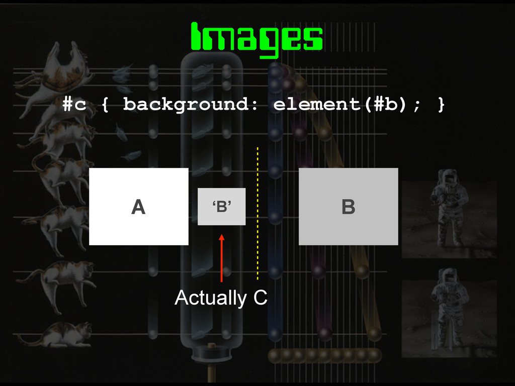
Images #c { background: element(#b); } ‘B’ Actually C A
B
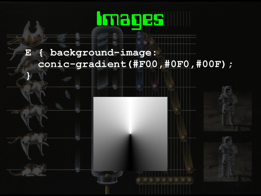
Images E { background-image: conic-gradient(#F00,#0F0,#00F); }
Layout
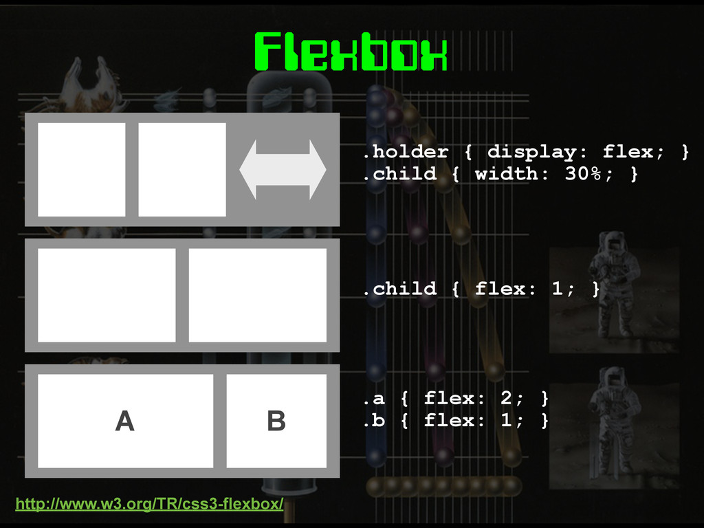
Flexbox
.holder { display: flex; } .child { width: 30%; }
.child { flex: 1; } A B .a { flex: 2; } .b { flex: 1; } Flexbox http://www.w3.org/TR/css3-flexbox/
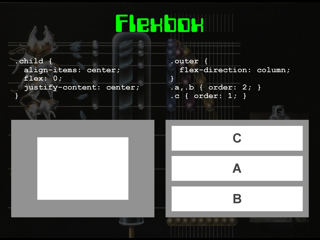
Flexbox .child { align-items: center; flex: 0; justify-content: center; }
C A B .outer { flex-direction: column; } .a,.b { order: 2; } .c { order: 1; }
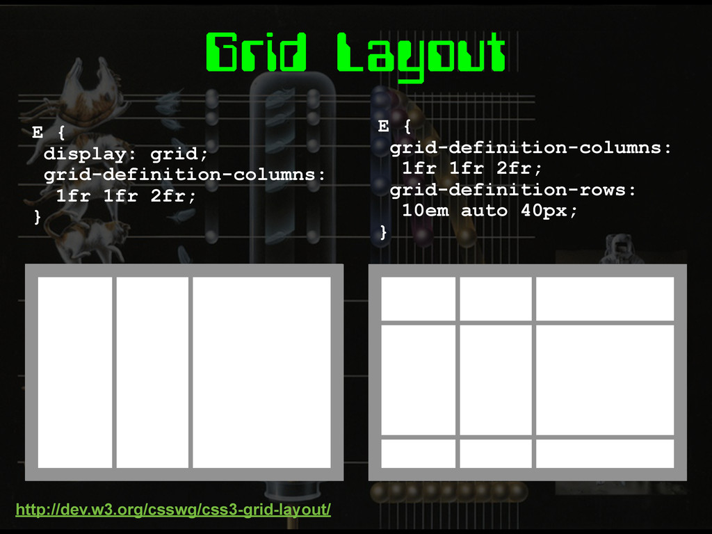
Grid Layout
Grid Layout E { display: grid; grid-definition-columns: 1fr 1fr 2fr;
} E { grid-definition-columns: 1fr 1fr 2fr; grid-definition-rows: 10em auto 40px; } http://dev.w3.org/csswg/css3-grid-layout/
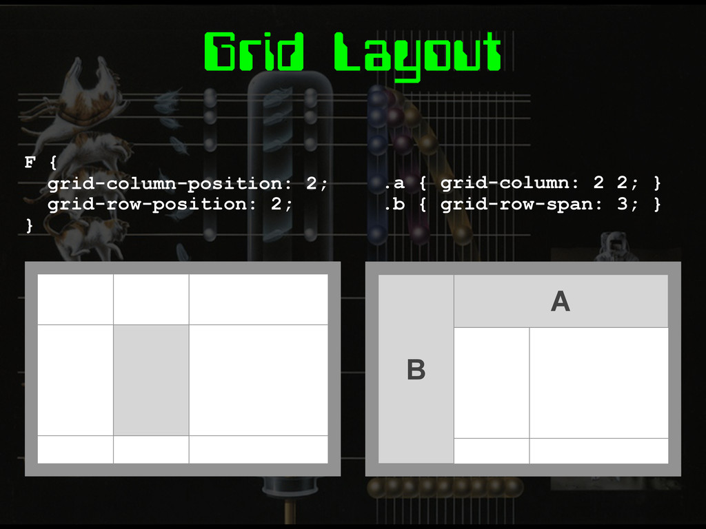
Grid Layout F { grid-column-position: 2; grid-row-position: 2; } A
B .a { grid-column: 2 2; } .b { grid-row-span: 3; }
Grid Templates E { grid-template: 'head head head' 'nav main
main' 'foot foot foot'; } .a { grid-area: 'head'; } .b { grid-area: 'main'; } A B
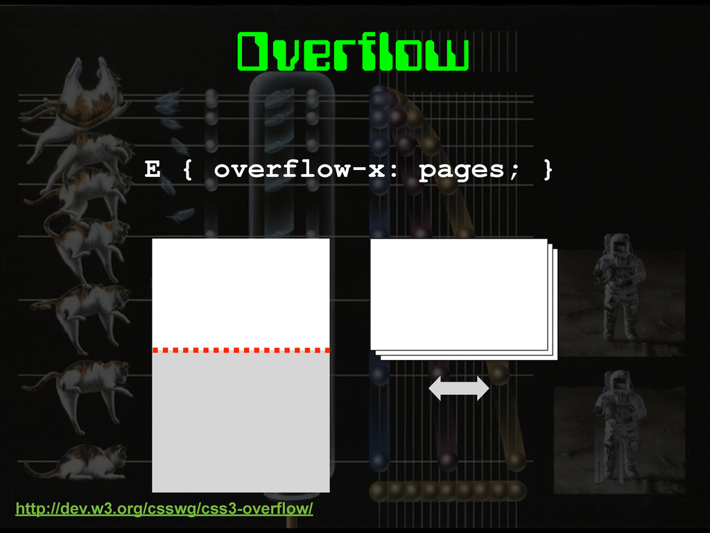
Overflow E { overflow-x: pages; } http://dev.w3.org/csswg/css3-overflow/
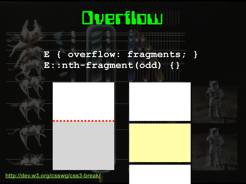
Overflow E { overflow: fragments; } E::nth-fragment(odd) {} http://dev.w3.org/csswg/css3-break/
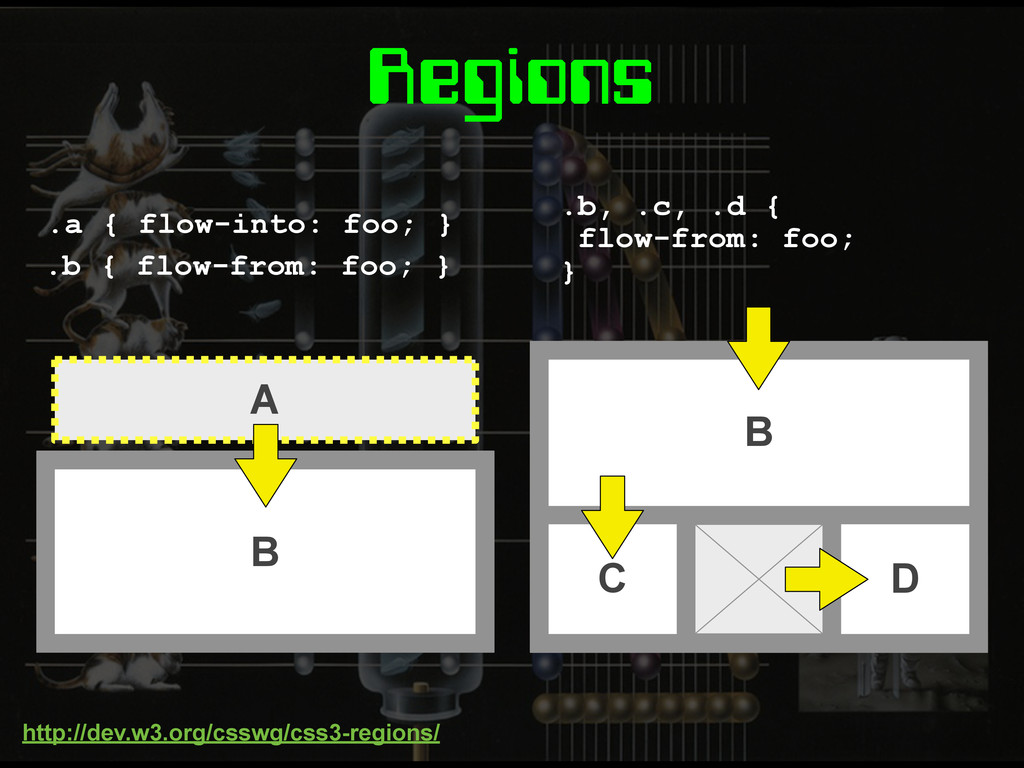
Regions A .a { flow-into: foo; } B C D
.b, .c, .d { flow-from: foo; } B .b { flow-from: foo; } http://dev.w3.org/csswg/css3-regions/
None
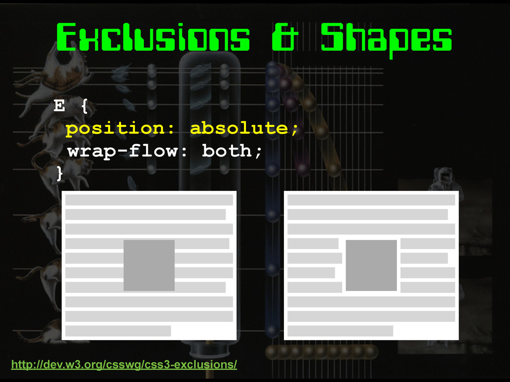
Exclusions & Shapes E { position: absolute; } wrap-flow: both;
http://dev.w3.org/csswg/css3-exclusions/
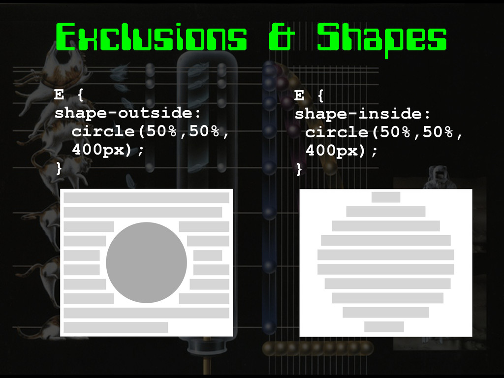
Exclusions & Shapes E { shape-outside: circle(50%,50%, 400px); } E
{ shape-inside: circle(50%,50%, 400px); }
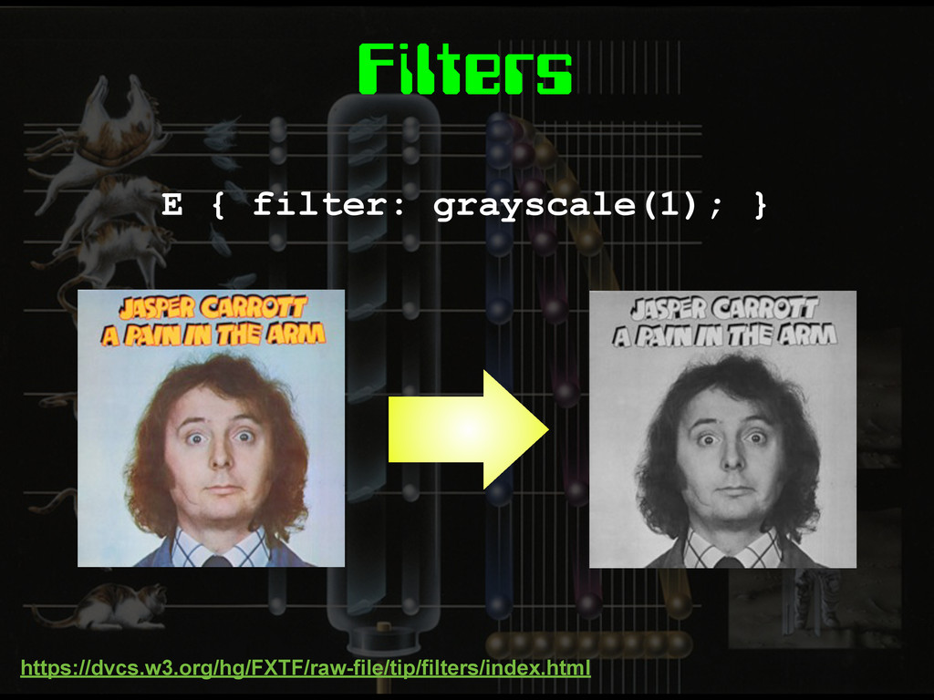
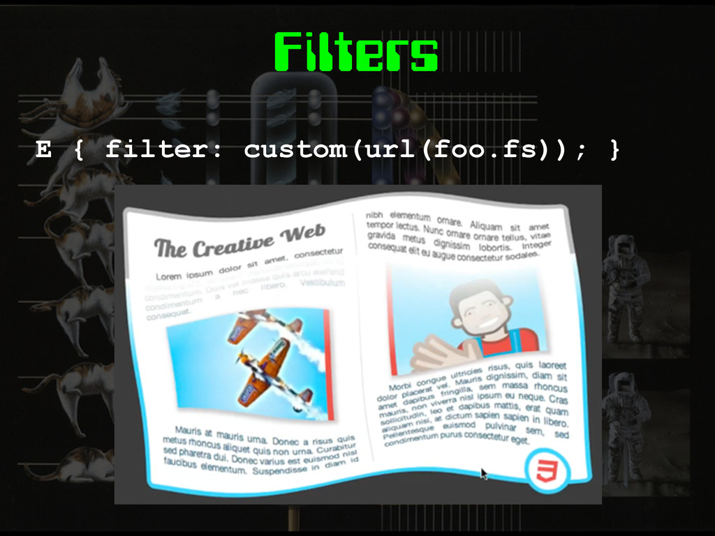
Filters E { filter: grayscale(1); } https://dvcs.w3.org/hg/FXTF/raw-file/tip/filters/index.html
Filters E { filter: custom(url(foo.fs)); }
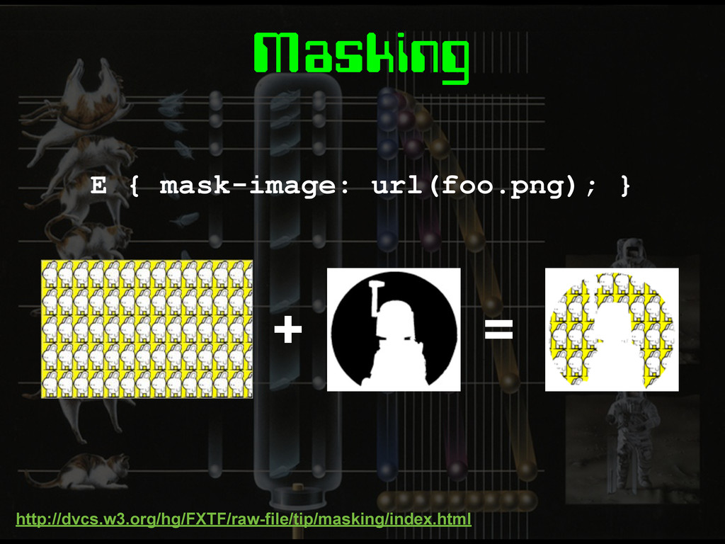
Masking E { mask-image: url(foo.png); } + = http://dvcs.w3.org/hg/FXTF/raw-file/tip/masking/index.html
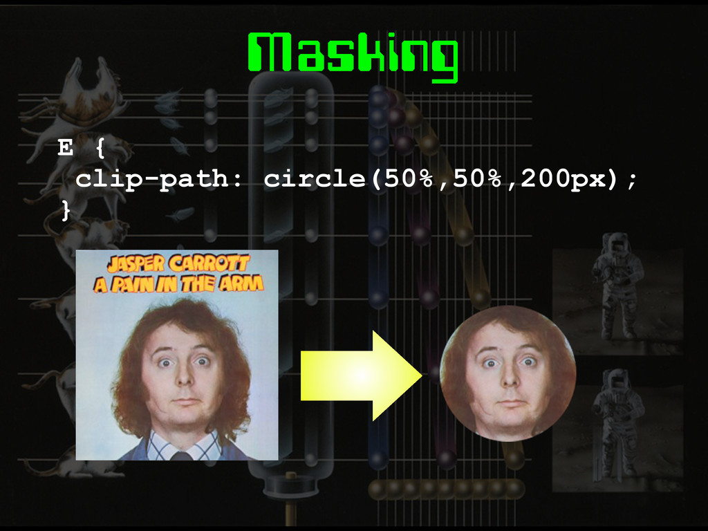
Masking E { clip-path: circle(50%,50%,200px); }
Pre-processors
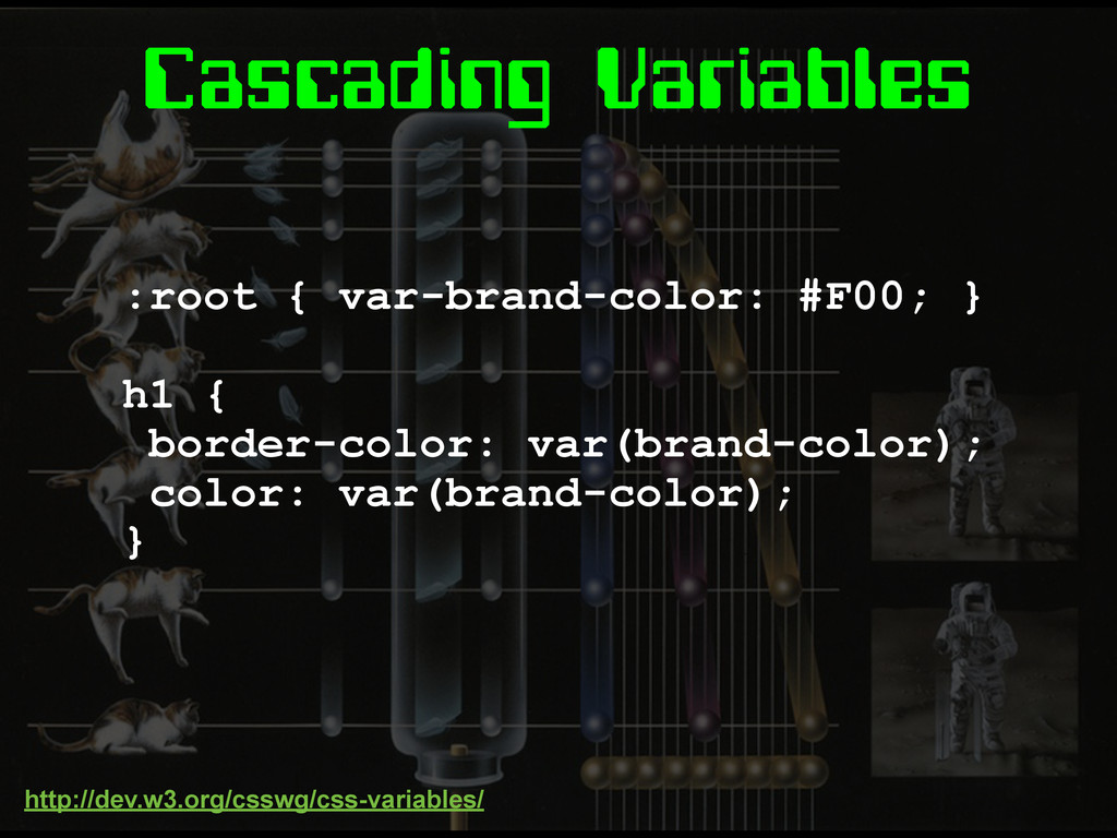
Cascading Variables :root { var-brand-color: #F00; } h1 { border-color:
var(brand-color); color: var(brand-color); } http://dev.w3.org/csswg/css-variables/
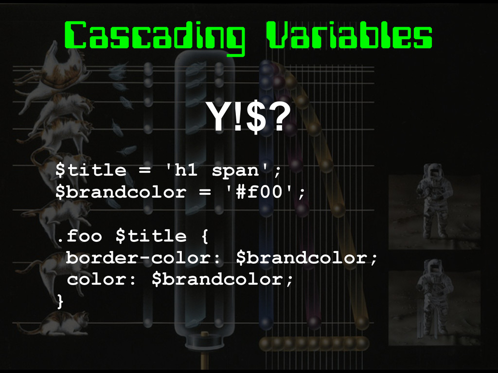
Cascading Variables Y!$? $title = 'h1 span'; $brandcolor = '#f00';
.foo $title { border-color: $brandcolor; color: $brandcolor; }
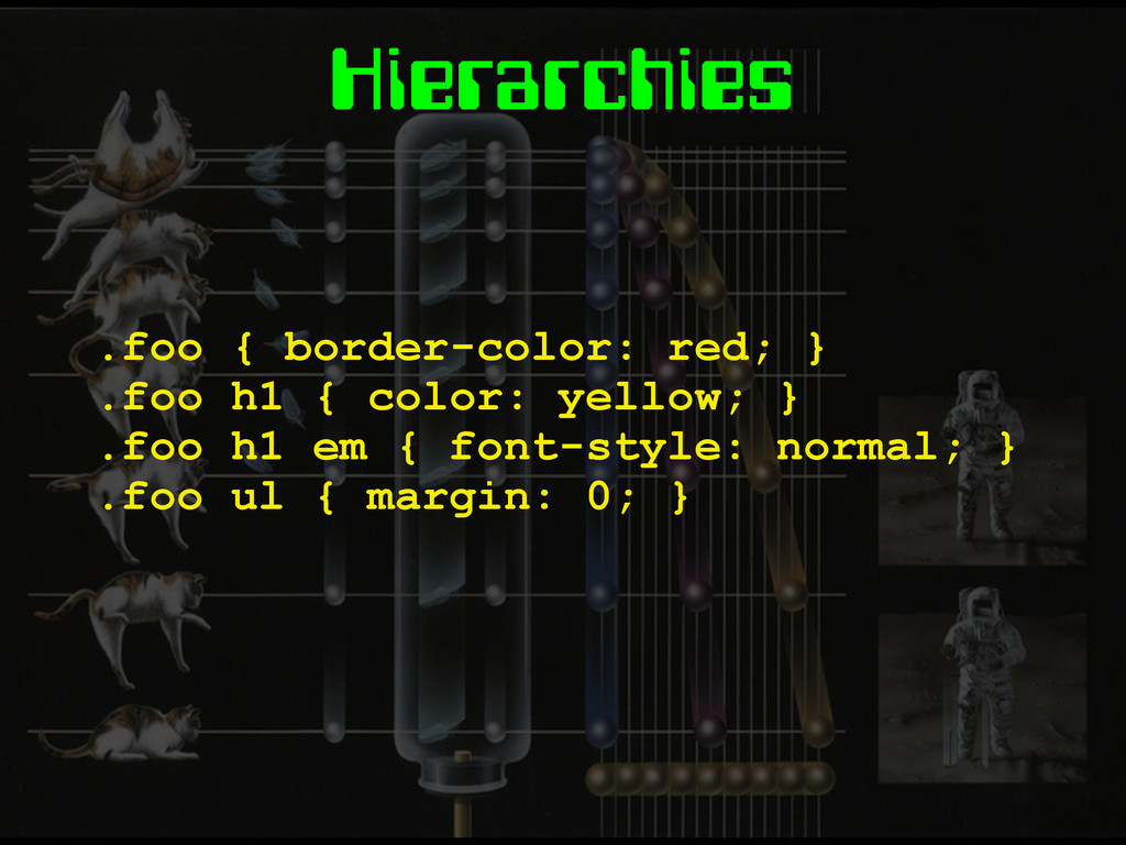
Hierarchies .foo { border-color: red; } .foo h1 { color:
yellow; } .foo h1 em { font-style: normal; } .foo ul { margin: 0; }
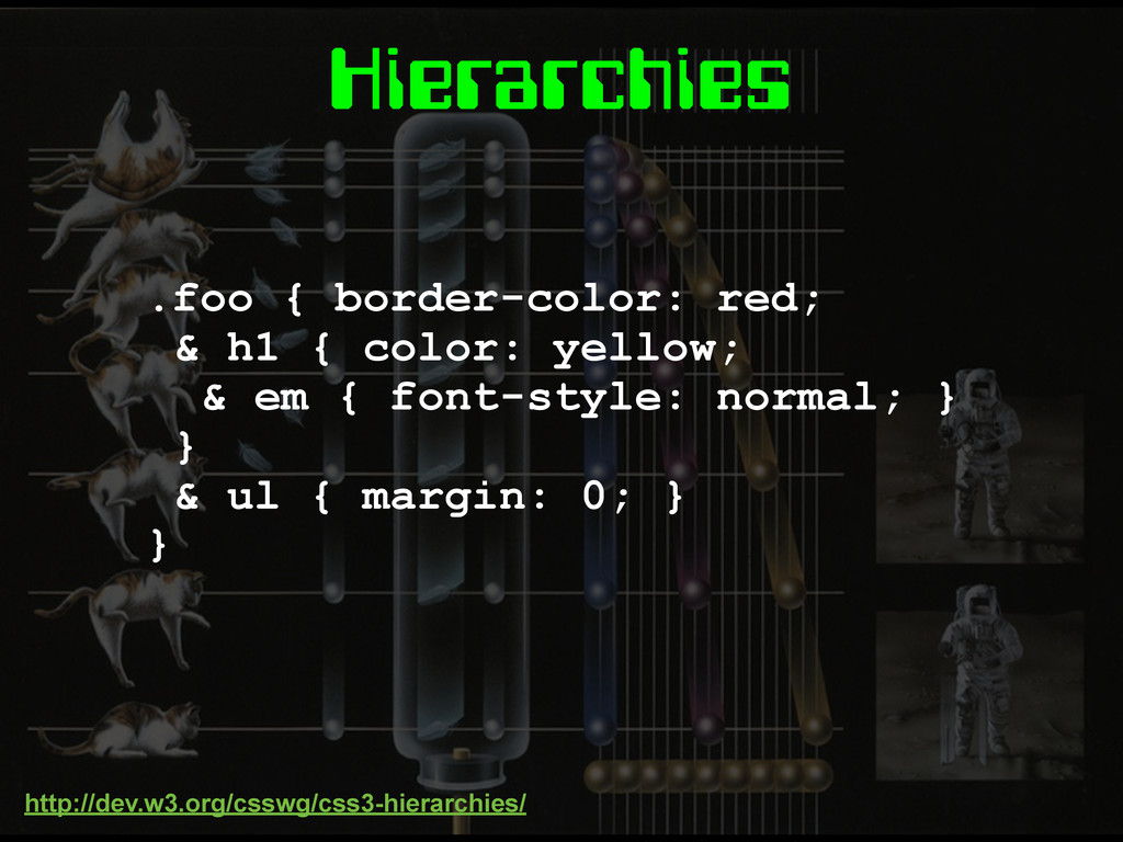
Hierarchies .foo { border-color: red; & h1 { color: yellow;
& em { font-style: normal; } } & ul { margin: 0; } } http://dev.w3.org/csswg/css3-hierarchies/
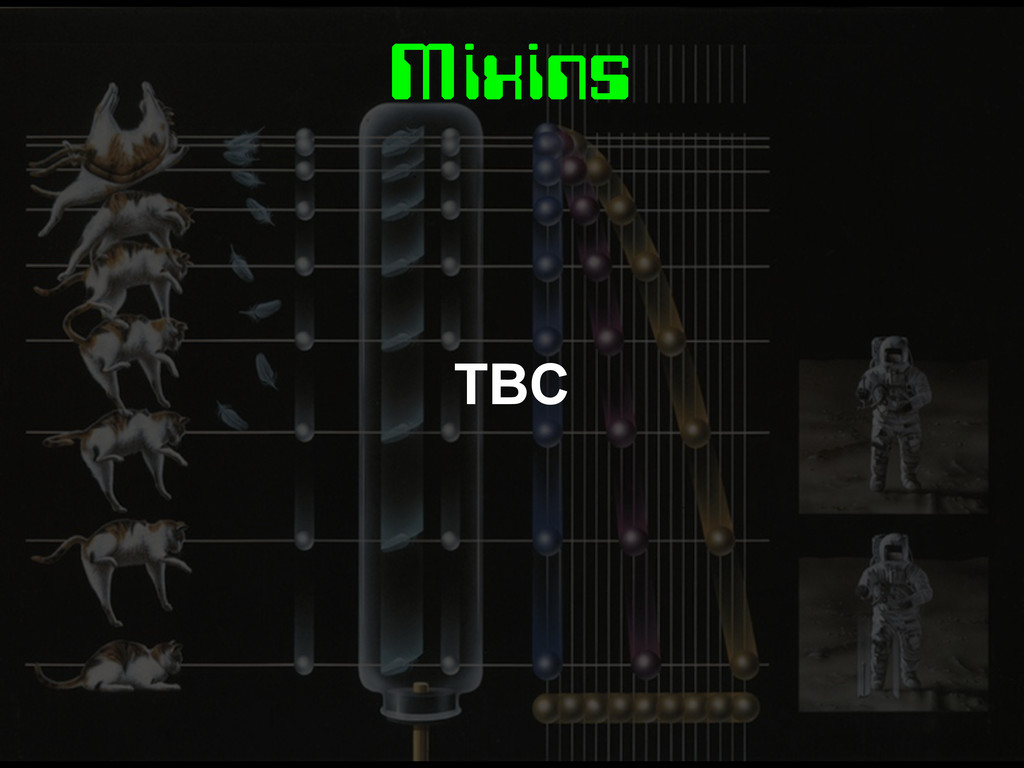
Mixins TBC
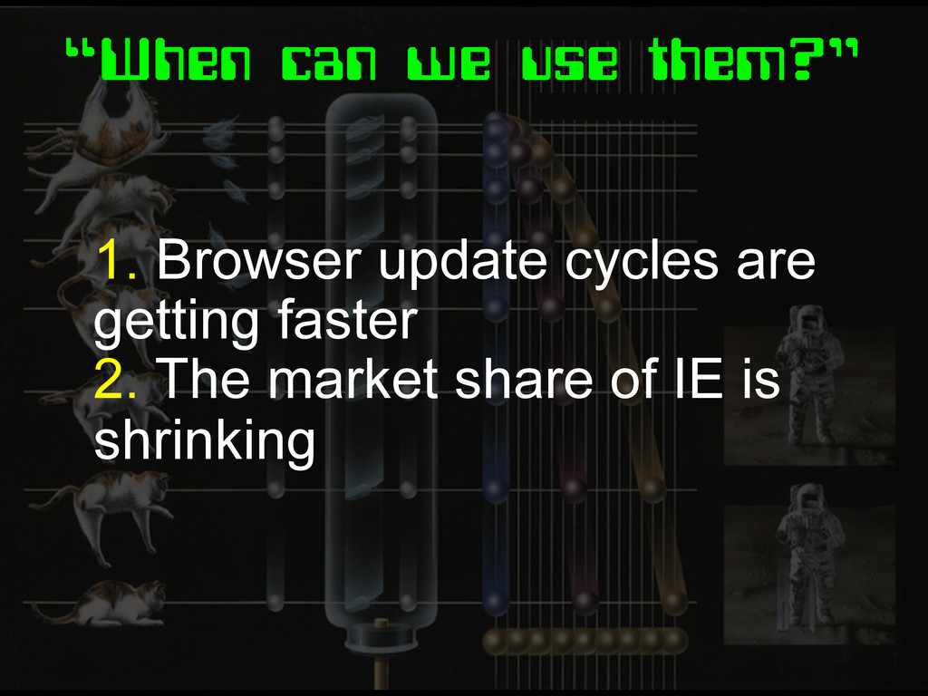
“When can we use them?” 1. Browser update cycles are
getting faster 2. The market share of IE is shrinking
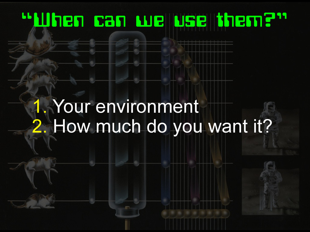
“When can we use them?” 1. Your environment 2. How
much do you want it?
Fin.
Image Credits http://www.buzzfeed.com/peggy/22-reasons-why-design-was- more-awesome-in-the-80s http://80s-touch.tumblr.com/ http://theyank.tumblr.com/
 stopsatgreen
 nrinetcom
 geekplus_tech
 iwatatomoya
 k_adachi_01
 torumakabe
 tsukamotokenji
 srenext
 hatyibei
 maruloop
 spatial_ai_network
 wxyzzz
 nari_ex
 techseoconnect
 coloredviolet
 jacobtomlinson
 aarron
 kimpetersen
 soudai
 tamaranovitovic
 jmmastey
 danielanewman
 hannesfritz
 zakiyama
 aleyda