Upgrade to Pro
— share decks privately, control downloads, hide ads and more …
Speaker Deck
Features
Speaker Deck
PRO
Sign in
Sign up for free
Search
Search
The CSS of Tomorrow (revised)
Search
Sponsored
·
SiteGround - Reliable hosting with speed, security, and support you can count on.
→
Peter Gasston
October 22, 2012
Programming
116
31k
The CSS of Tomorrow (revised)
London Web Standards, October 2012
Peter Gasston
October 22, 2012
Tweet
Share
More Decks by Peter Gasston
See All by Peter Gasston
People Don’t Change
stopsatgreen
0
180
Your Reality Here
stopsatgreen
0
120
Growing Up, Getting Serious - #SotB6
stopsatgreen
1
360
Growing Up, Getting Serious
stopsatgreen
0
100
Surveying the Landscape — November 2016
stopsatgreen
1
180
Surveying the Landscape - Fronteers
stopsatgreen
2
500
The Web vs. The Browser
stopsatgreen
0
210
Surveying the Landscape Sept. 2016
stopsatgreen
1
450
Surveying the Landscape
stopsatgreen
4
890
Other Decks in Programming
See All in Programming
Package Management Learnings from Homebrew
mikemcquaid
0
230
SourceGeneratorのススメ
htkym
0
200
The Past, Present, and Future of Enterprise Java
ivargrimstad
0
600
OSSとなったswift-buildで Xcodeのビルドを差し替えられるため 自分でXcodeを直せる時代になっている ダイアモンド問題編
yimajo
3
620
開発者から情シスまで - 多様なユーザー層に届けるAPI提供戦略 / Postman API Night Okinawa 2026 Winter
tasshi
0
210
MDN Web Docs に日本語翻訳でコントリビュート
ohmori_yusuke
0
650
Apache Iceberg V3 and migration to V3
tomtanaka
0
170
CSC307 Lecture 10
javiergs
PRO
1
660
今こそ知るべき耐量子計算機暗号(PQC)入門 / PQC: What You Need to Know Now
mackey0225
3
380
AIと一緒にレガシーに向き合ってみた
nyafunta9858
0
250
HTTPプロトコル正しく理解していますか? 〜かわいい猫と共に学ぼう。ฅ^•ω•^ฅ ニャ〜
hekuchan
2
690
AIエージェント、”どう作るか”で差は出るか? / AI Agents: Does the "How" Make a Difference?
rkaga
4
2k
Featured
See All Featured
Unlocking the hidden potential of vector embeddings in international SEO
frankvandijk
0
170
Fireside Chat
paigeccino
41
3.8k
WCS-LA-2024
lcolladotor
0
450
Optimising Largest Contentful Paint
csswizardry
37
3.6k
Producing Creativity
orderedlist
PRO
348
40k
Speed Design
sergeychernyshev
33
1.5k
How Software Deployment tools have changed in the past 20 years
geshan
0
32k
The SEO identity crisis: Don't let AI make you average
varn
0
330
How to make the Groovebox
asonas
2
1.9k
Discover your Explorer Soul
emna__ayadi
2
1.1k
Taking LLMs out of the black box: A practical guide to human-in-the-loop distillation
inesmontani
PRO
3
2k
Building the Perfect Custom Keyboard
takai
2
690
Transcript
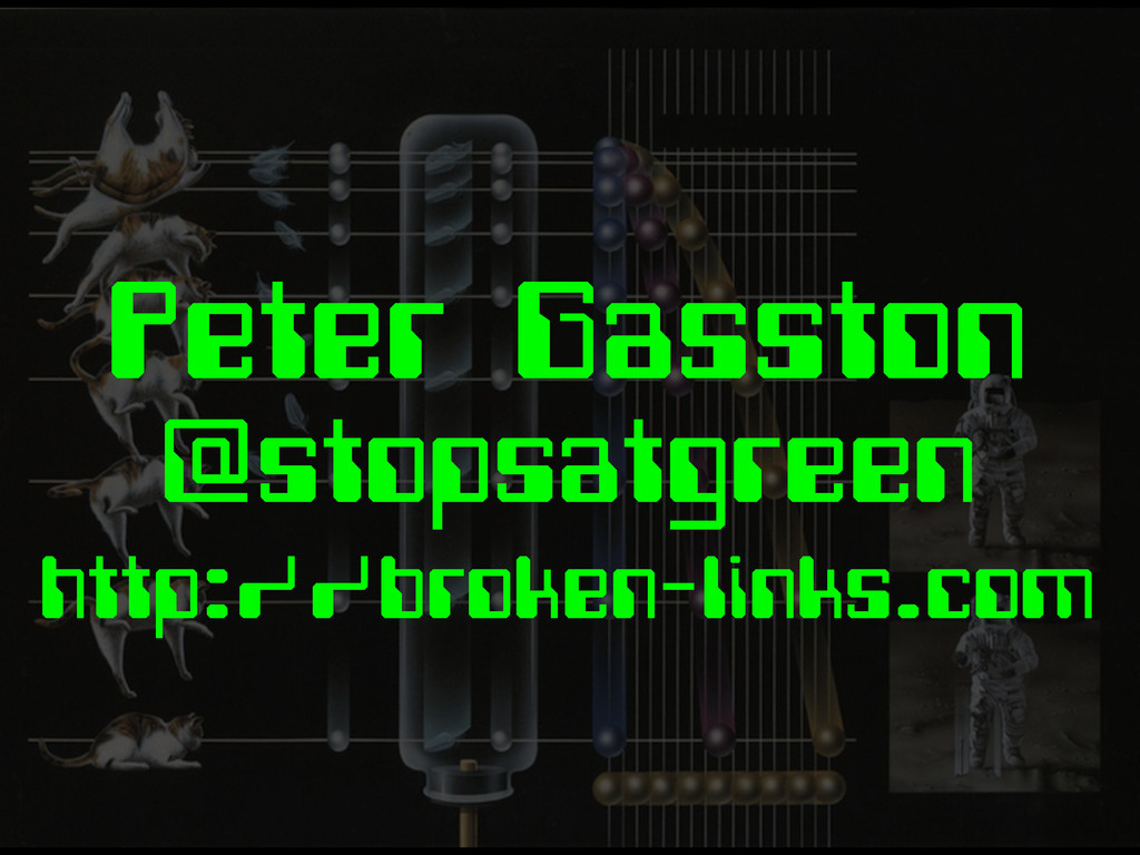
Peter Gasston @stopsatgreen http://broken-links.com
The CSS of Tomorrow
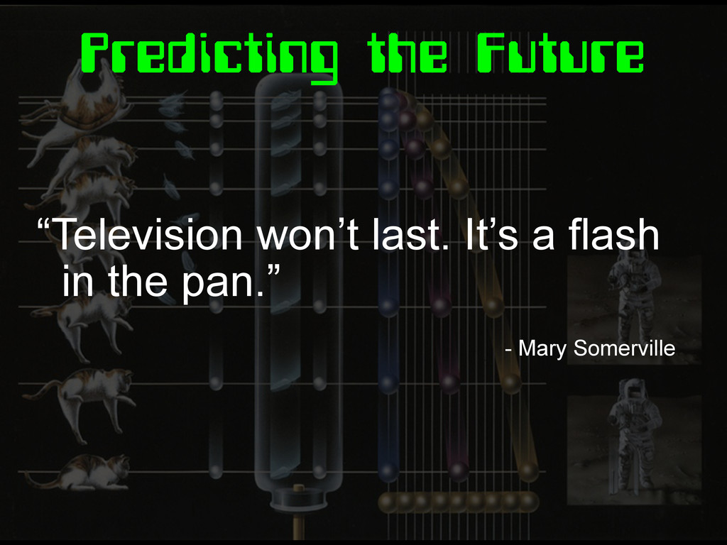
Predicting the Future “Television won’t last. It’s a flash in
the pan.” - Mary Somerville
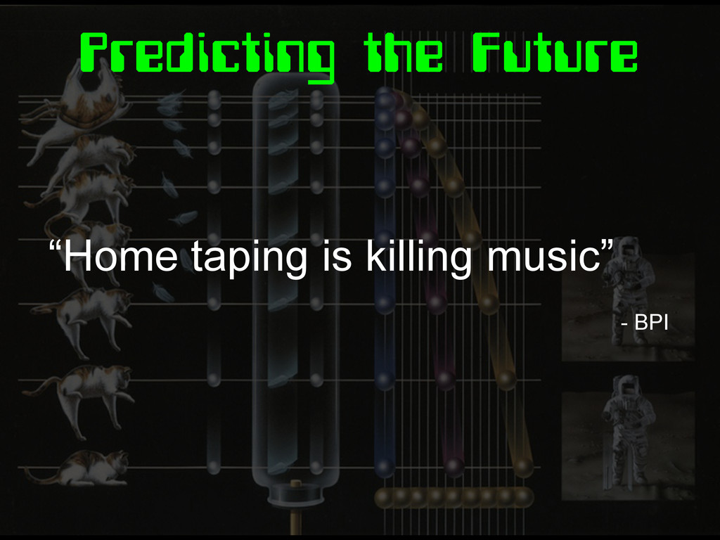
Predicting the Future “Home taping is killing music” - BPI
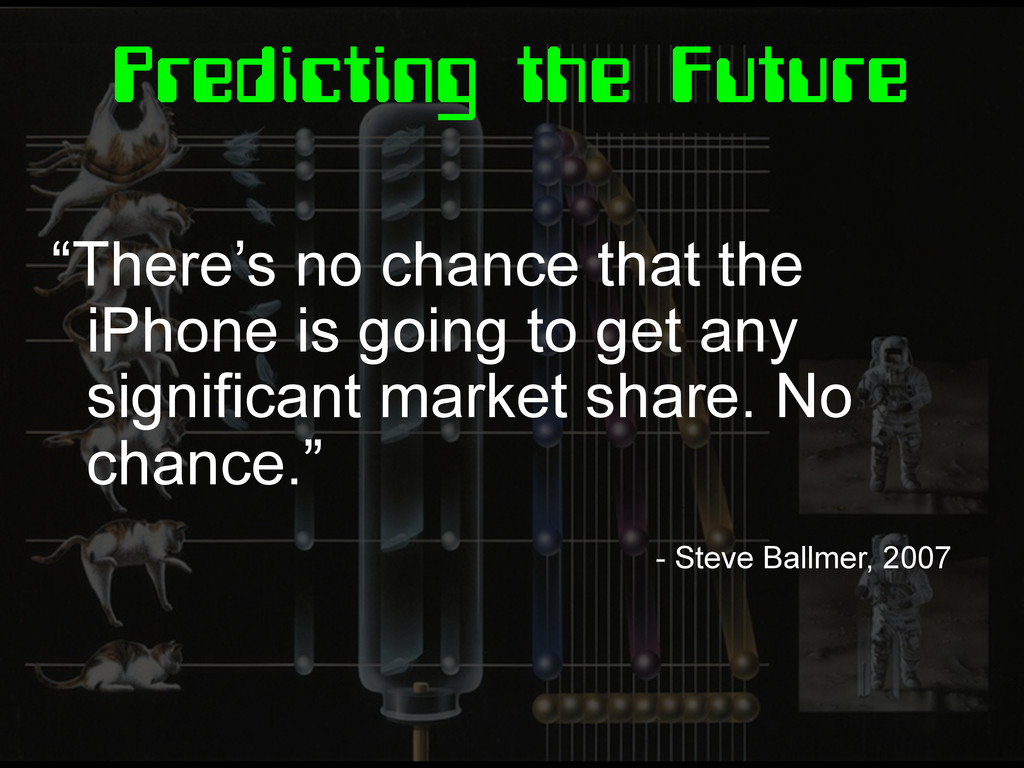
Predicting the Future “There’s no chance that the iPhone is
going to get any significant market share. No chance.” - Steve Ballmer, 2007
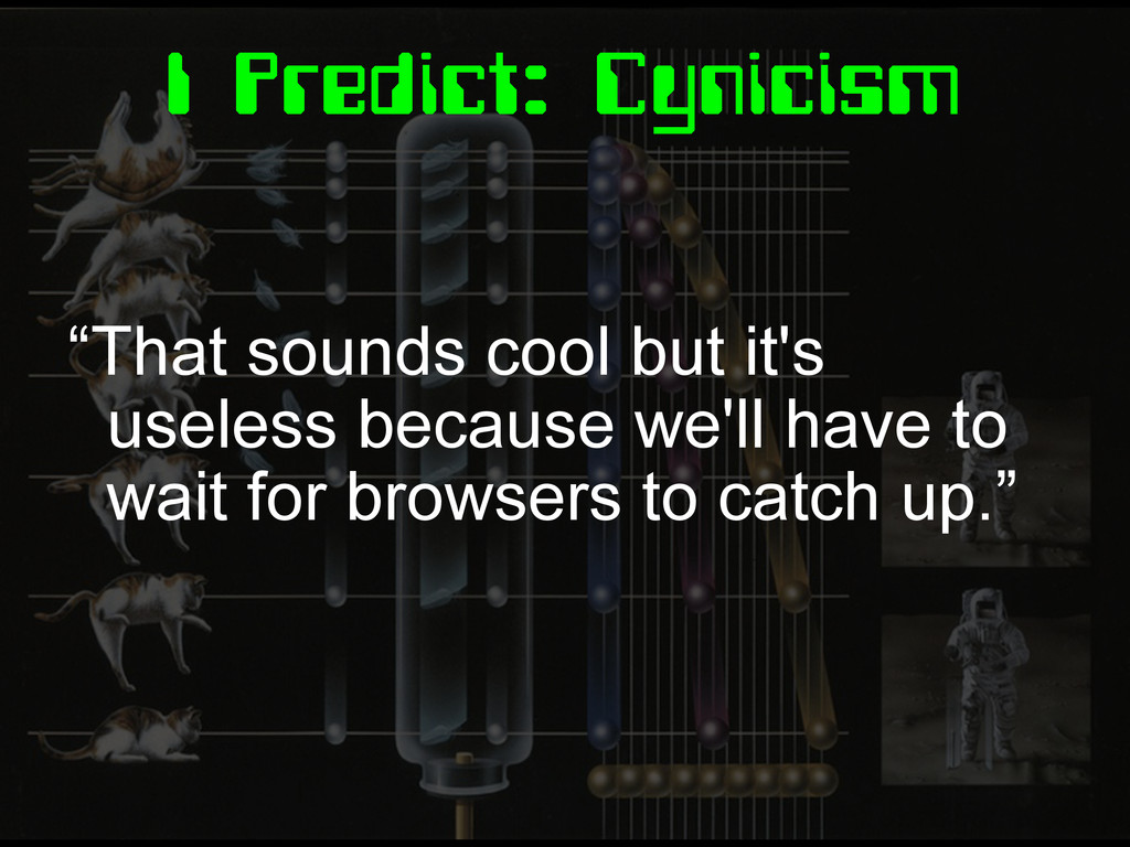
I Predict: Cynicism “That sounds cool but it's useless because
we'll have to wait for browsers to catch up.”
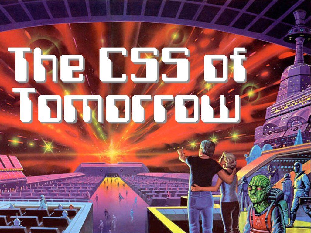
The CSS of Tomorrow
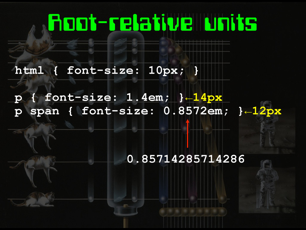
Root-relative units html { font-size: 10px; } p { font-size:
1.4em; }←14px p span { font-size: 0.8572em; }←12px 0.85714285714286
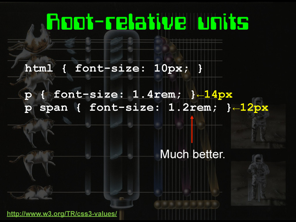
Root-relative units html { font-size: 10px; } p { font-size:
1.4rem; }←14px p span { font-size: 1.2rem; }←12px Much better. http://www.w3.org/TR/css3-values/
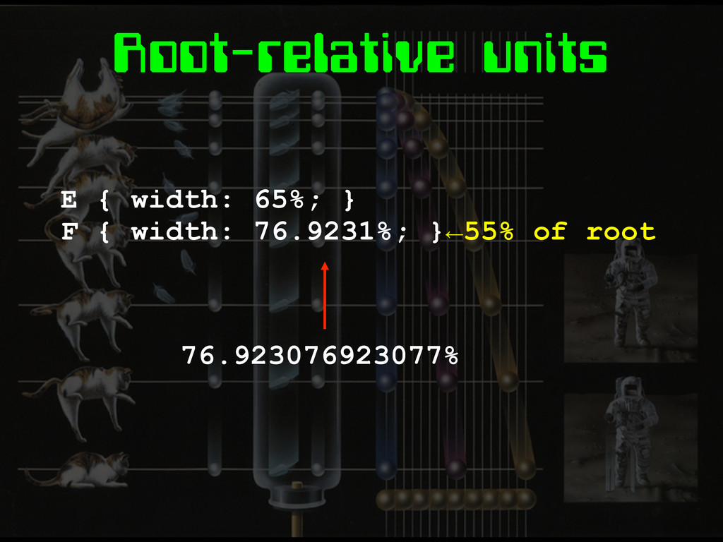
Root-relative units E { width: 65%; } F { width:
76.9231%; }←55% of root 76.923076923077%
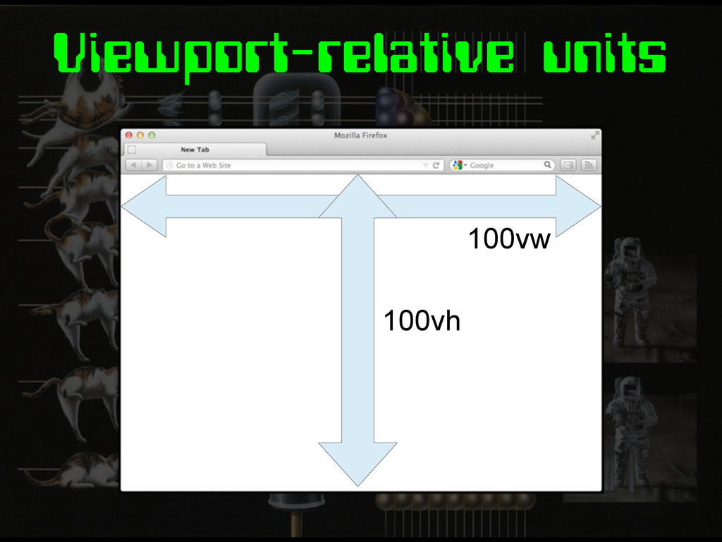
Viewport-relative units 100vw 100vh
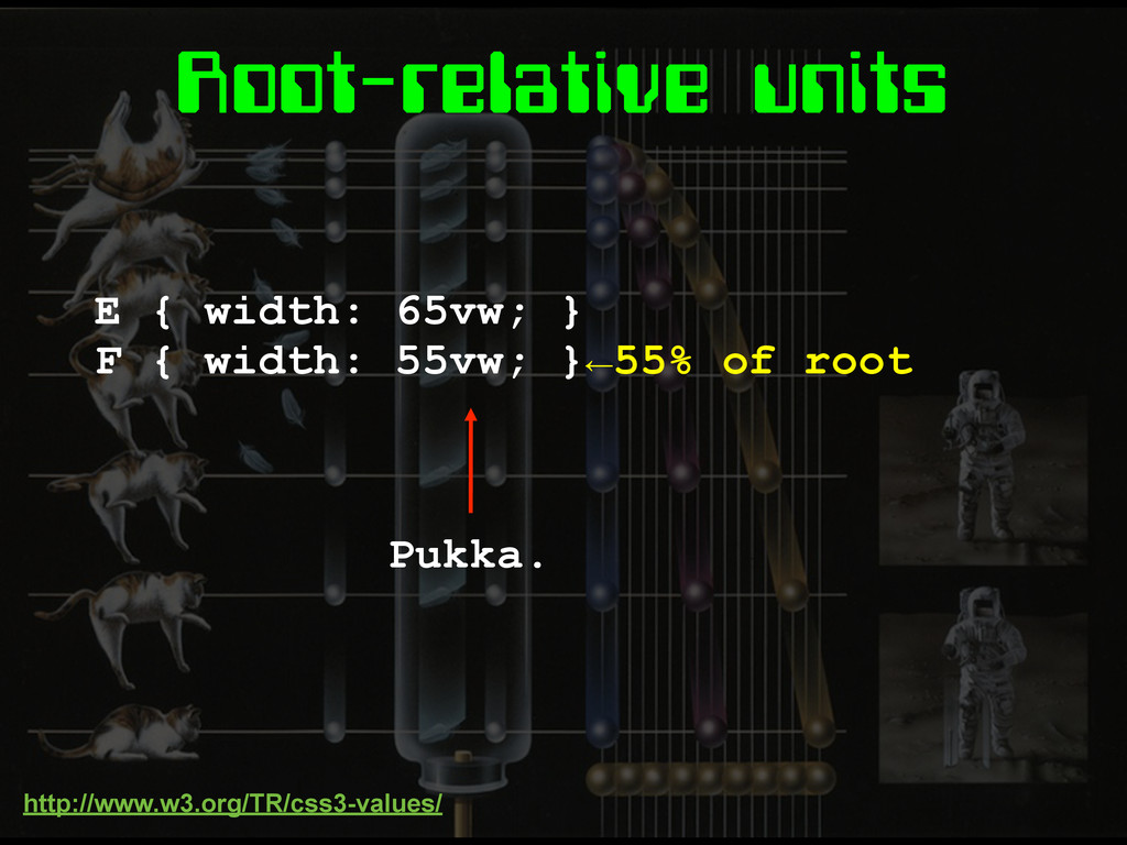
Root-relative units E { width: 65vw; } F { width:
55vw; }←55% of root Pukka. http://www.w3.org/TR/css3-values/
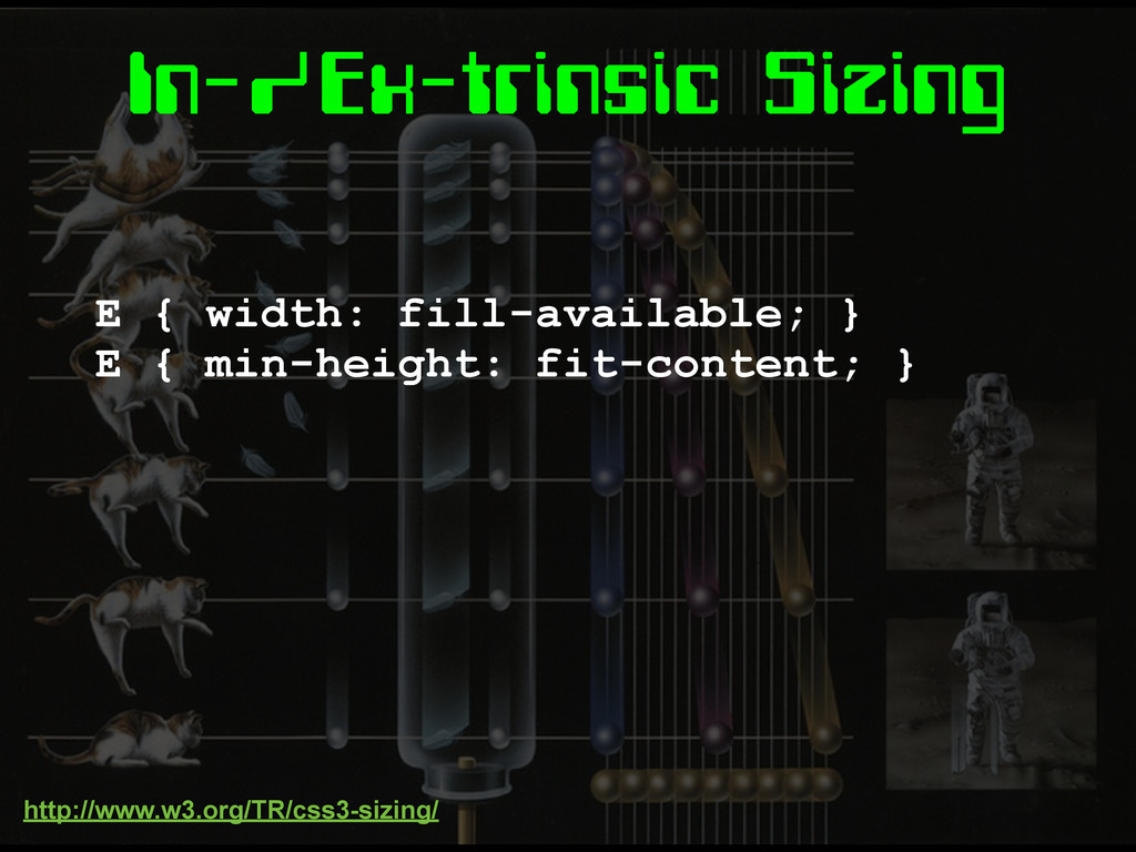
In-/Ex-trinsic Sizing E { width: fill-available; } E { min-height:
fit-content; } http://www.w3.org/TR/css3-sizing/
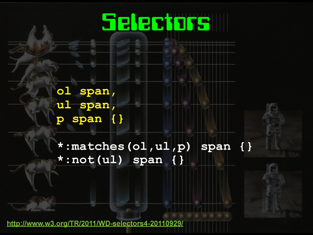
Selectors ol span, ul span, p span {} *:matches(ol,ul,p) span
{} *:not(ul) span {} http://www.w3.org/TR/2011/WD-selectors4-20110929/
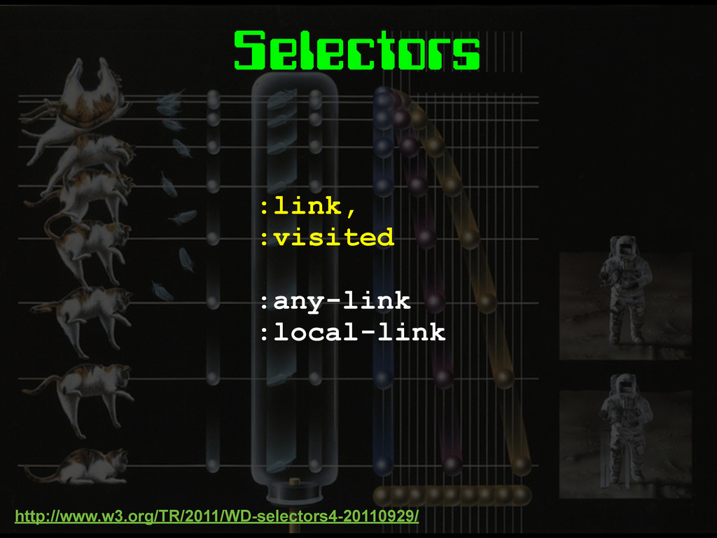
Selectors :link, :visited :any-link :local-link http://www.w3.org/TR/2011/WD-selectors4-20110929/
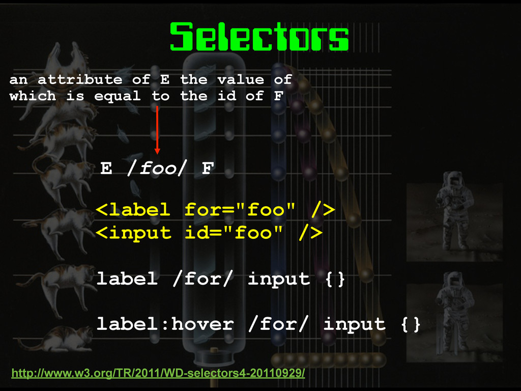
Selectors <label for="foo" /> <input id="foo" /> label /for/ input
{} label:hover /for/ input {} http://www.w3.org/TR/2011/WD-selectors4-20110929/ an attribute of E the value of which is equal to the id of F E /foo/ F
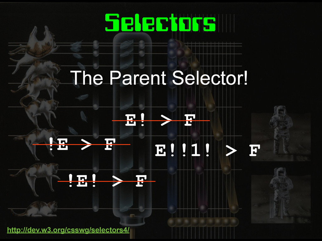
Selectors E! > F !E > F !E! > F
E!!1! > F The Parent Selector! http://dev.w3.org/csswg/selectors4/
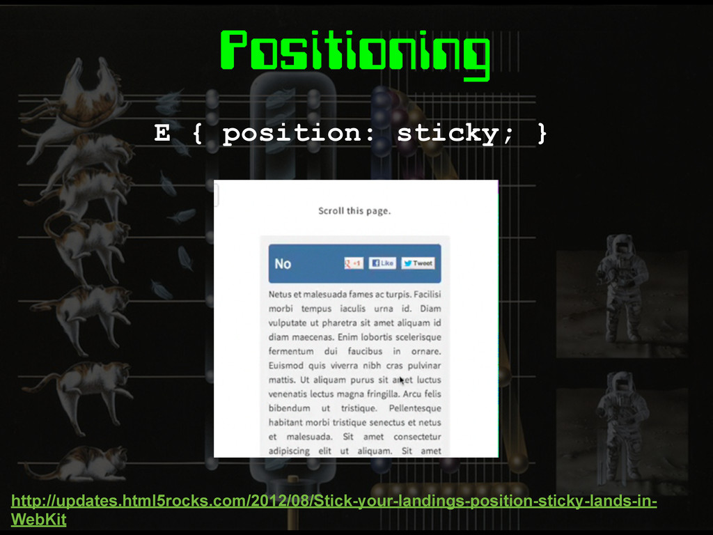
Positioning E { position: sticky; } http://updates.html5rocks.com/2012/08/Stick-your-landings-position-sticky-lands-in- WebKit
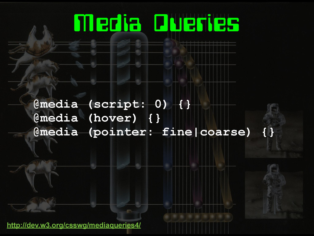
Media Queries
Media Queries @media (script: 0) {} @media (hover) {} @media
(pointer: fine|coarse) {} http://dev.w3.org/csswg/mediaqueries4/
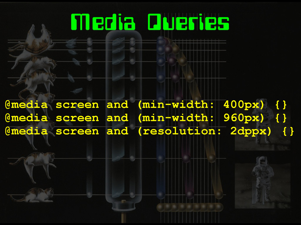
Media Queries @media screen and (min-width: 400px) {} @media screen
and (min-width: 960px) {} @media screen and (resolution: 2dppx) {}
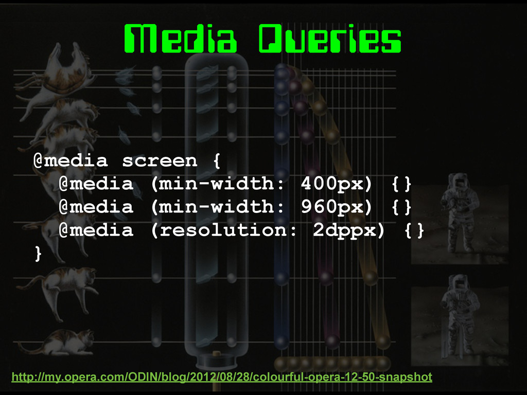
Media Queries @media screen { @media (min-width: 400px) {} @media
(min-width: 960px) {} @media (resolution: 2dppx) {} } http://my.opera.com/ODIN/blog/2012/08/28/colourful-opera-12-50-snapshot
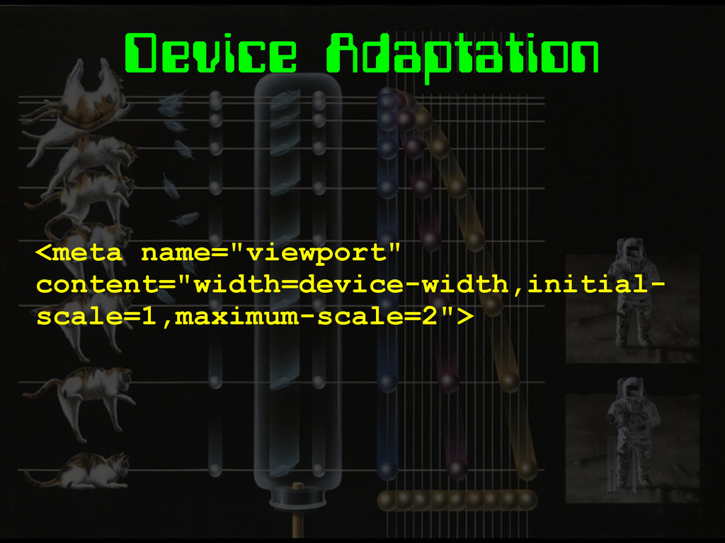
Device Adaptation <meta name="viewport" content="width=device-width,initial- scale=1,maximum-scale=2">
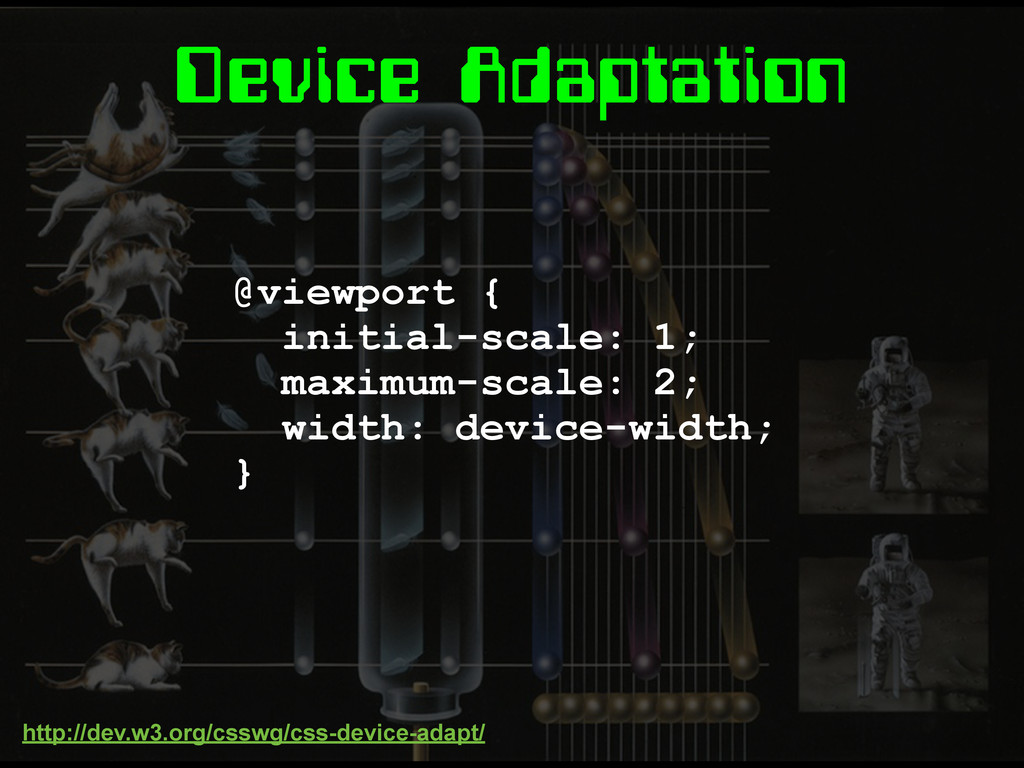
Device Adaptation @viewport { initial-scale: 1; maximum-scale: 2; width: device-width;
} http://dev.w3.org/csswg/css-device-adapt/
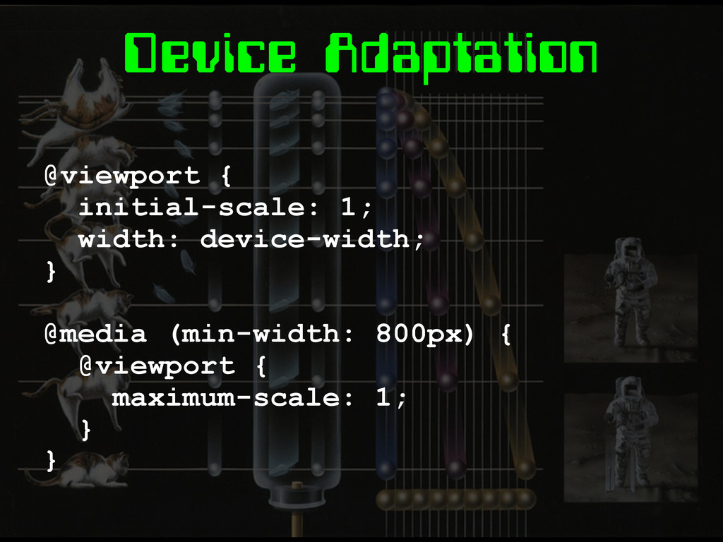
Device Adaptation @viewport { initial-scale: 1; width: device-width; } @media
(min-width: 800px) { @viewport { maximum-scale: 1; } }
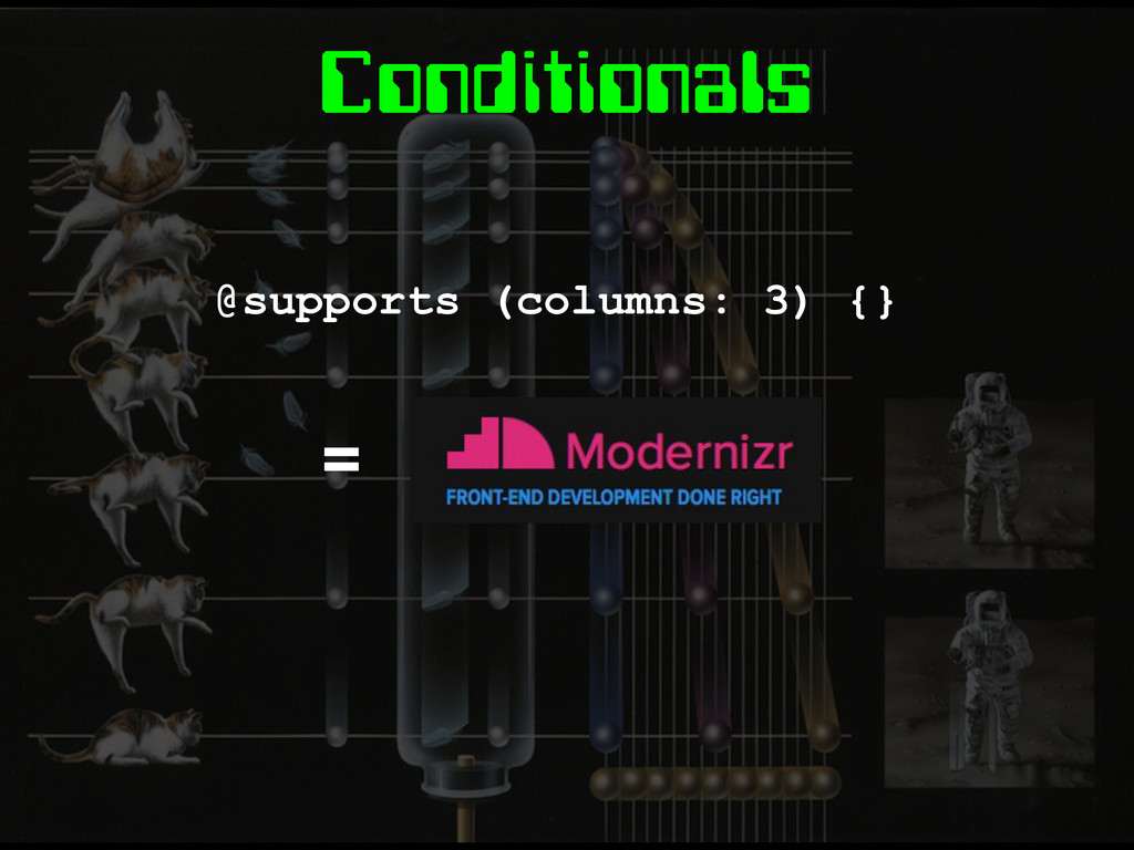
Conditionals @supports (columns: 3) {} =
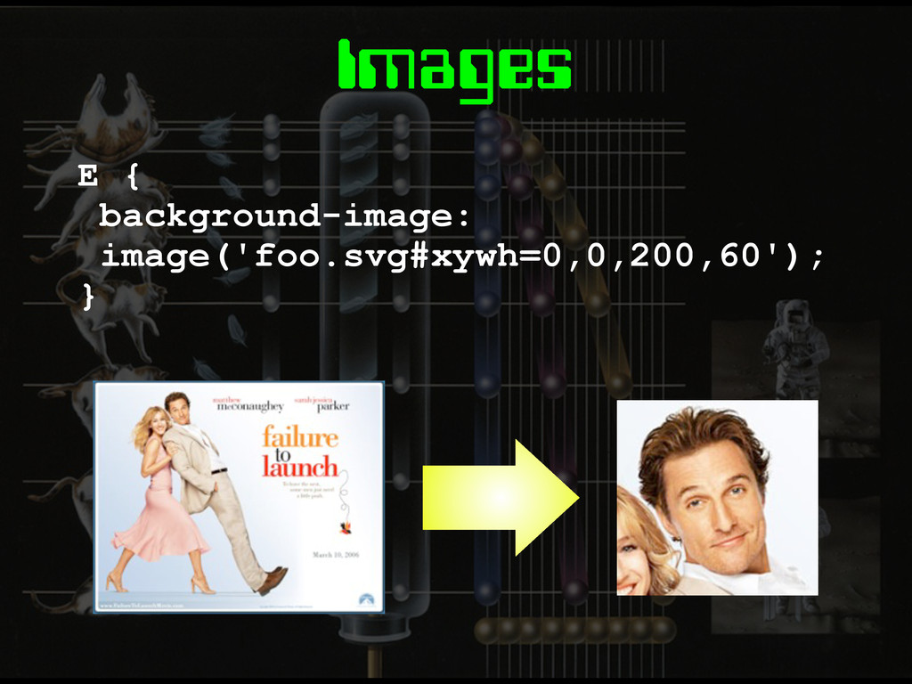
Images
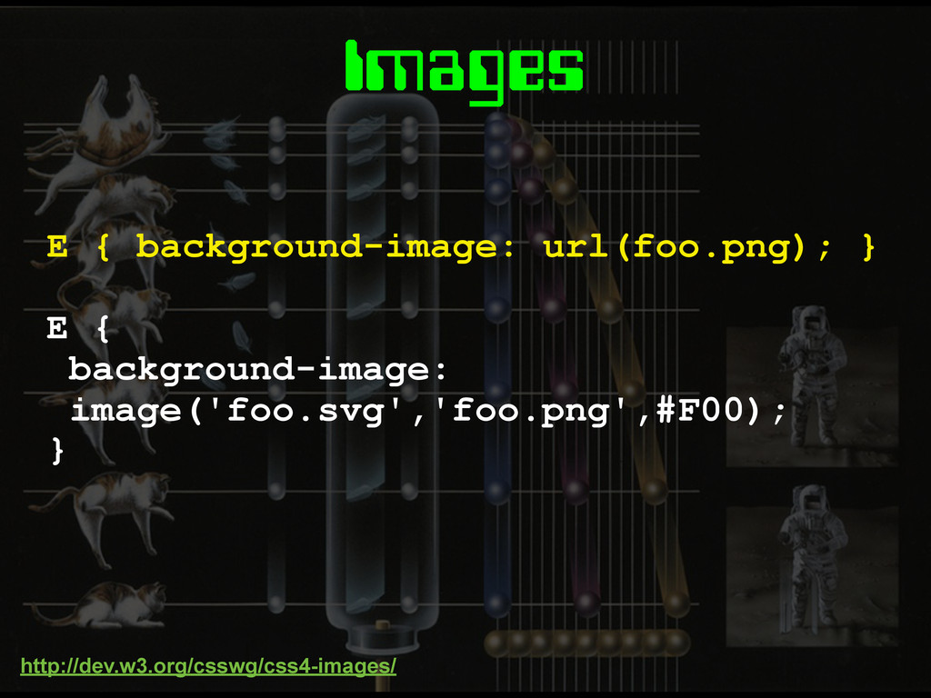
Images E { background-image: image('foo.svg','foo.png',#F00); } E { background-image: url(foo.png);
} http://dev.w3.org/csswg/css4-images/
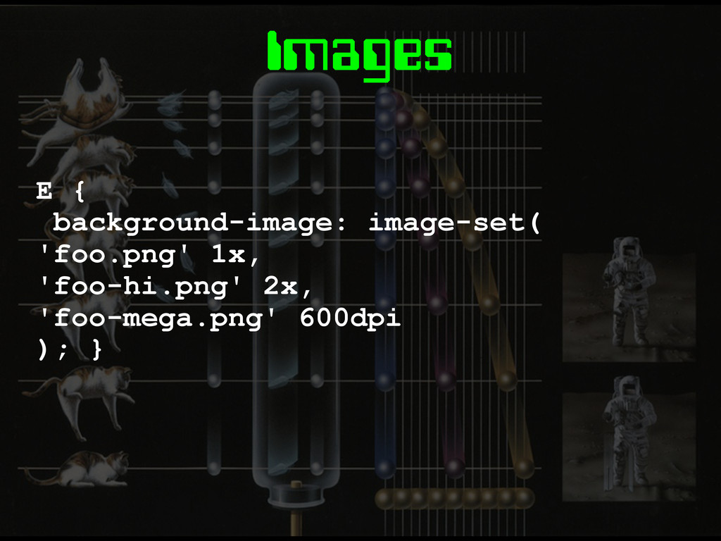
Images E { background-image: image-set( 'foo.png' 1x, 'foo-hi.png' 2x, 'foo-mega.png'
600dpi ); }
Images E { background-image: image('foo.svg#xywh=0,0,200,60'); }
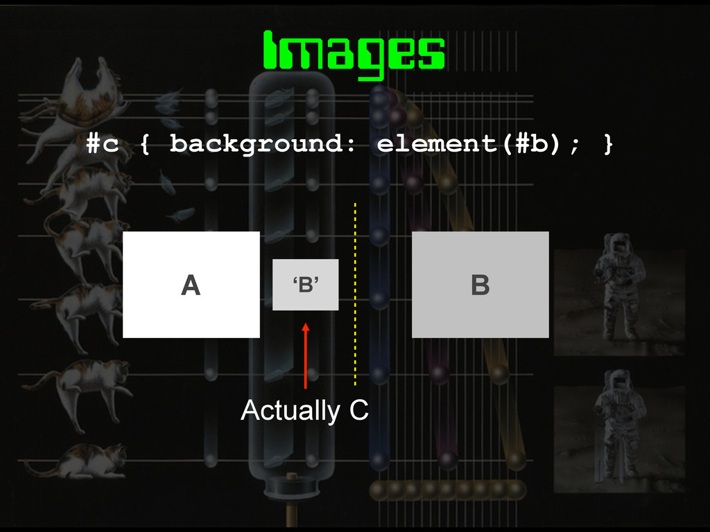
Images #c { background: element(#b); } ‘B’ Actually C A
B
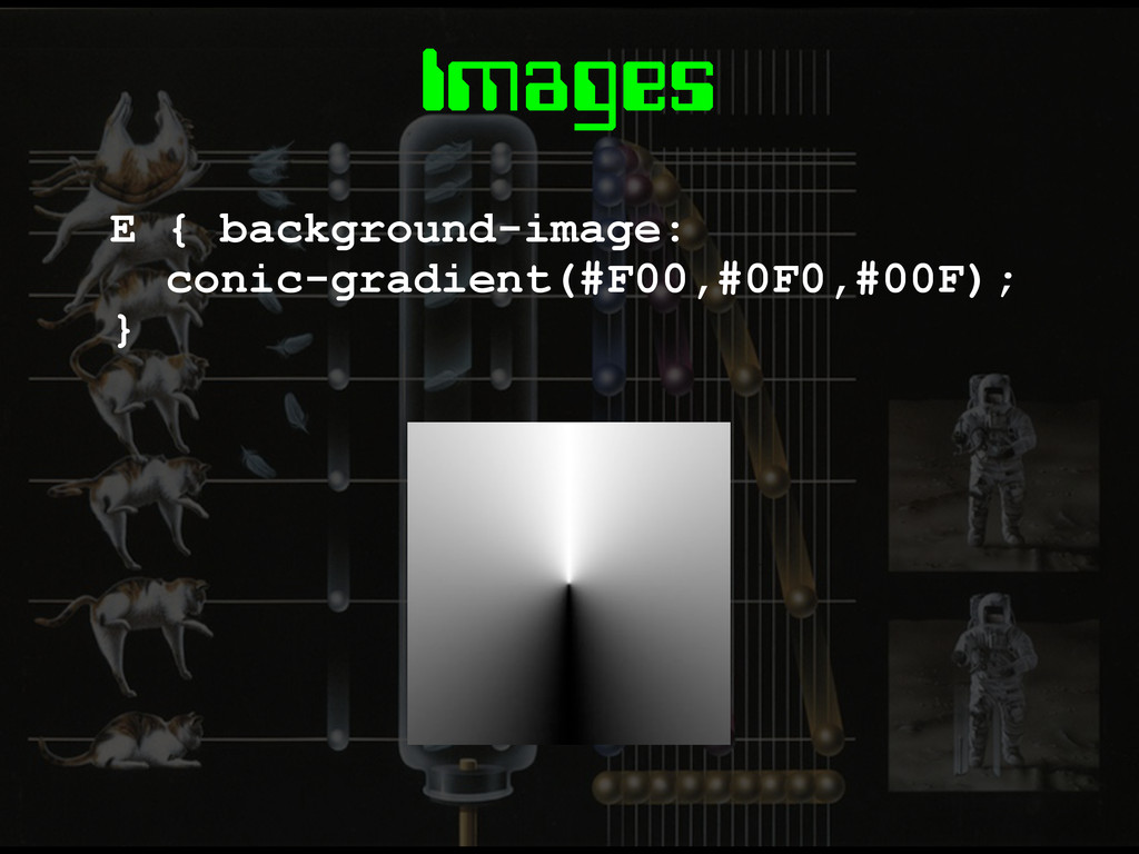
Images E { background-image: conic-gradient(#F00,#0F0,#00F); }
Layout
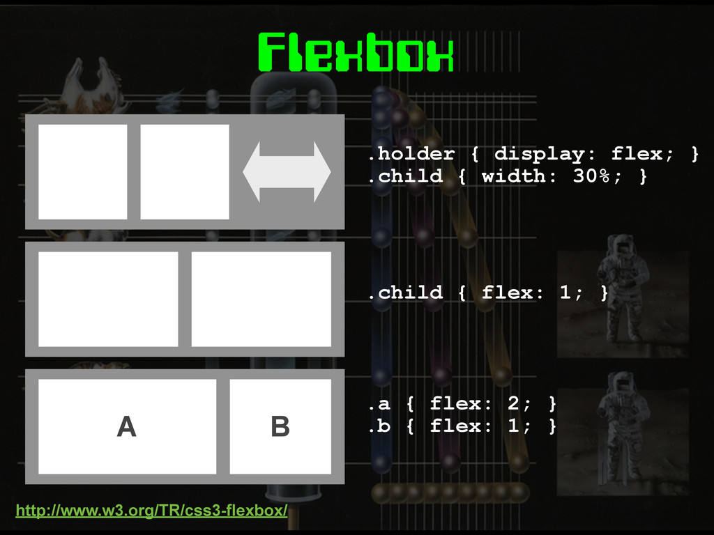
Flexbox
.holder { display: flex; } .child { width: 30%; }
.child { flex: 1; } A B .a { flex: 2; } .b { flex: 1; } Flexbox http://www.w3.org/TR/css3-flexbox/
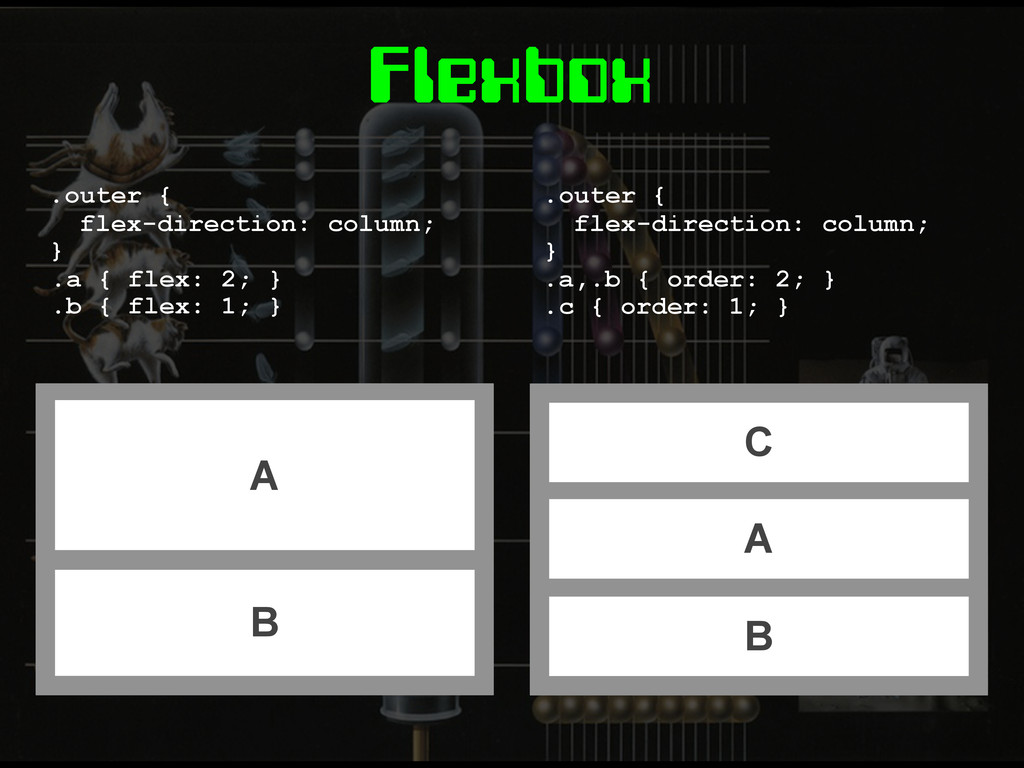
Flexbox C A B .outer { flex-direction: column; } .a,.b
{ order: 2; } .c { order: 1; } A B .outer { flex-direction: column; } .a { flex: 2; } .b { flex: 1; }
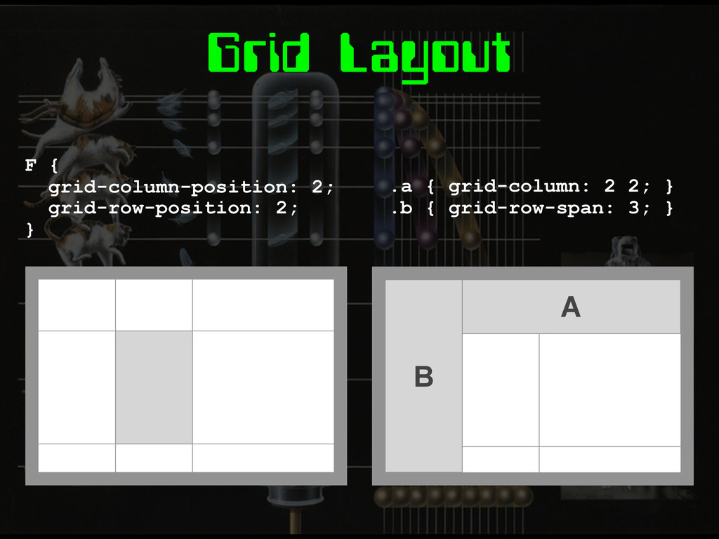
Grid Layout
Grid Layout E { display: grid; grid-definition-columns: 1fr 1fr 2fr;
} E { grid-definition-columns: 1fr 1fr 2fr; grid-definition-rows: 10em auto 40px; } http://dev.w3.org/csswg/css3-grid-layout/
Grid Layout F { grid-column-position: 2; grid-row-position: 2; } A
B .a { grid-column: 2 2; } .b { grid-row-span: 3; }
Grid Templates E { grid-template: 'head head head' 'nav main
main' 'foot foot foot'; } .a { grid-area: 'head'; } .b { grid-area: 'main'; } A B
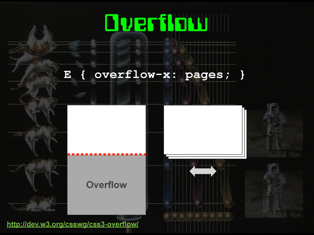
Overflow E { overflow-x: pages; } Overflow http://dev.w3.org/csswg/css3-overflow/
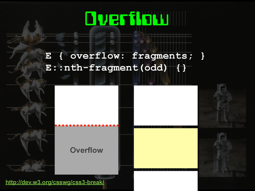
Overflow E { overflow: fragments; } E::nth-fragment(odd) {} http://dev.w3.org/csswg/css3-break/ Overflow
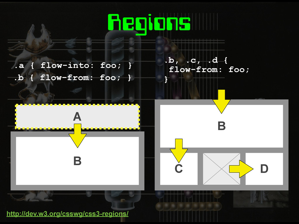
Regions A .a { flow-into: foo; } B C D
.b, .c, .d { flow-from: foo; } B .b { flow-from: foo; } http://dev.w3.org/csswg/css3-regions/
None
Exclusions & Shapes E { position: absolute; } wrap-flow: both;
http://dev.w3.org/csswg/css3-exclusions/
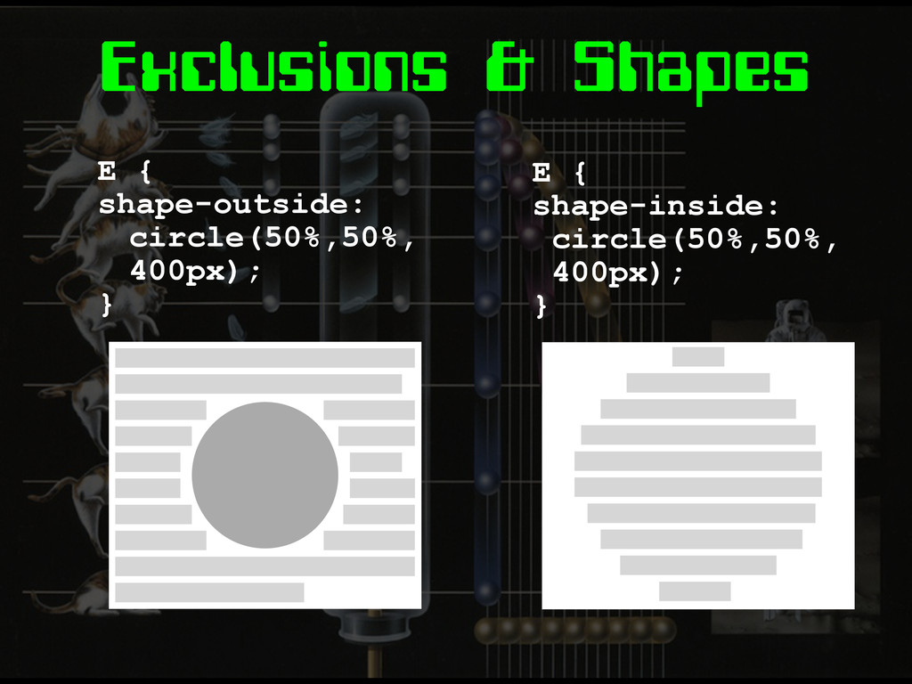
Exclusions & Shapes E { shape-outside: circle(50%,50%, 400px); } E
{ shape-inside: circle(50%,50%, 400px); }
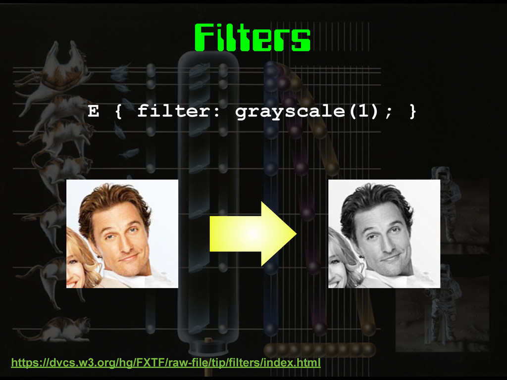
Filters E { filter: grayscale(1); } https://dvcs.w3.org/hg/FXTF/raw-file/tip/filters/index.html
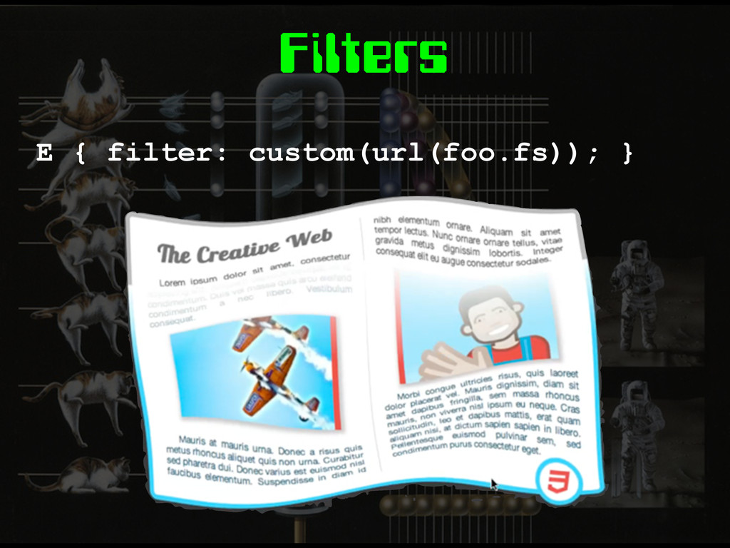
Filters E { filter: custom(url(foo.fs)); }
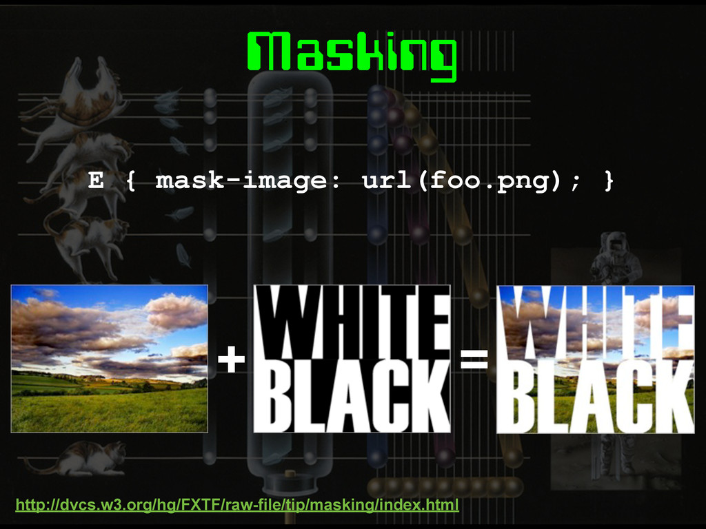
Masking E { mask-image: url(foo.png); } http://dvcs.w3.org/hg/FXTF/raw-file/tip/masking/index.html + =
Masking E { clip-path: circle(50%,50%,200px); }
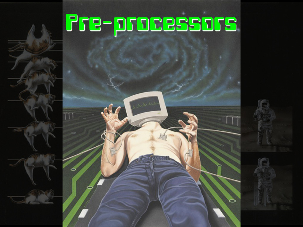
Pre-processors
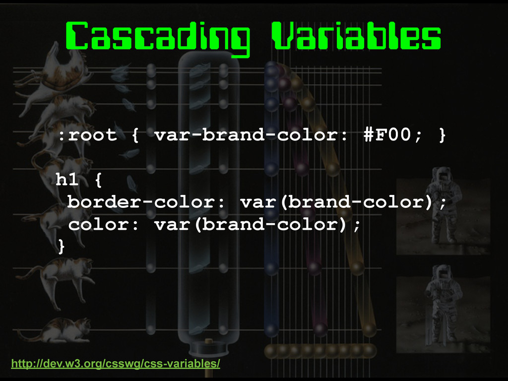
Cascading Variables :root { var-brand-color: #F00; } h1 { border-color:
var(brand-color); color: var(brand-color); } http://dev.w3.org/csswg/css-variables/
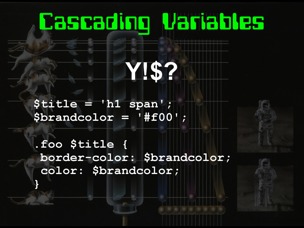
Cascading Variables Y!$? $title = 'h1 span'; $brandcolor = '#f00';
.foo $title { border-color: $brandcolor; color: $brandcolor; }
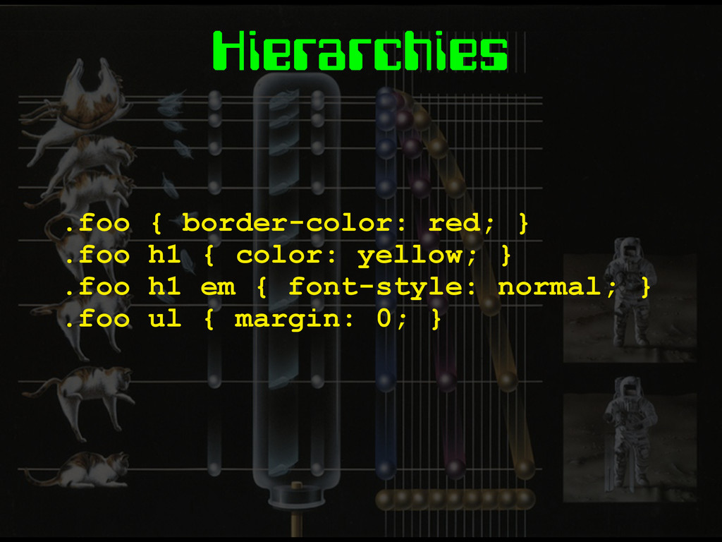
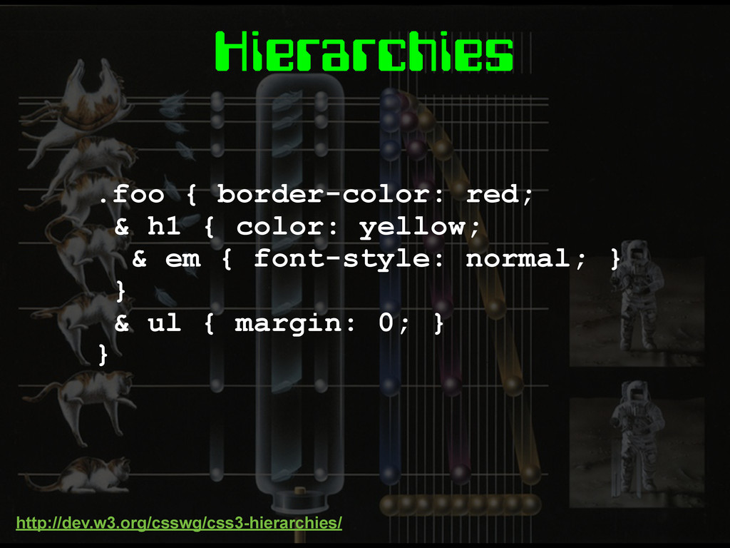
Hierarchies .foo { border-color: red; } .foo h1 { color:
yellow; } .foo h1 em { font-style: normal; } .foo ul { margin: 0; }
Hierarchies .foo { border-color: red; & h1 { color: yellow;
& em { font-style: normal; } } & ul { margin: 0; } } http://dev.w3.org/csswg/css3-hierarchies/
Mixins TBC
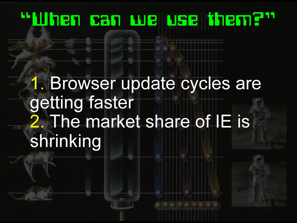
“When can we use them?” 1. Browser update cycles are
getting faster 2. The market share of IE is shrinking
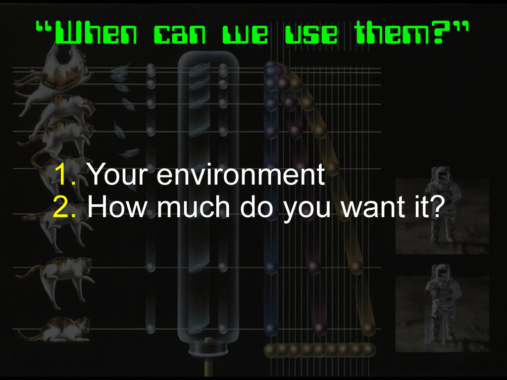
“When can we use them?” 1. Your environment 2. How
much do you want it?
Fin.
None
Image Credits http://www.buzzfeed.com/peggy/22-reasons-why-design-was- more-awesome-in-the-80s http://80s-touch.tumblr.com/ http://theyank.tumblr.com/
 SiteGround - Reliable hosting with speed, security, and support you can count on.
 stopsatgreen
 mikemcquaid
 htkym
htkym
 ivargrimstad
 yimajo
 tasshi
 ohmori_yusuke
 tomtanaka
 javiergs
 mackey0225
 nyafunta9858
 hekuchan
 rkaga
rkaga
 frankvandijk
 paigeccino
 lcolladotor
 csswizardry
 orderedlist
 sergeychernyshev
 geshan
 varn
varn
 asonas
 emna__ayadi
 inesmontani
 takai
takai