Globe project •Ethan Marcotte - “The Map is Not the Territory” •Jordan Moore - Smashing Magazine Responsive design is the second coming. Now, we need to make sure it works on phones that are 6 years old in Bangladesh. But f*ck IE8. Thursday, June 27, 13
and youth users are rapidly dropping PCs, many don’t have one today •By far, most Americans use iPhones or Android devices to access the web when on mobile •90% of new mobile penetration in developing countries such as India, African nations Thursday, June 27, 13
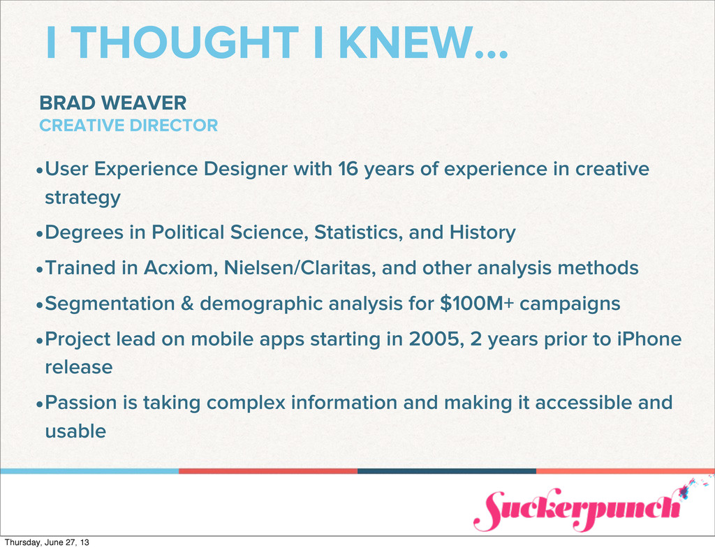
Designer with 16 years of experience in creative strategy •Degrees in Political Science, Statistics, and History •Trained in Acxiom, Nielsen/Claritas, and other analysis methods •Segmentation & demographic analysis for $100M+ campaigns •Project lead on mobile apps starting in 2005, 2 years prior to iPhone release •Passion is taking complex information and making it accessible and usable Thursday, June 27, 13
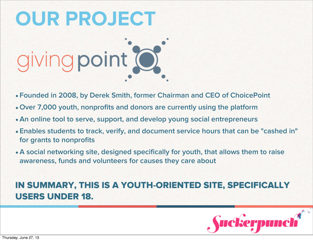
and CEO of ChoicePoint •Over 7,000 youth, nonprofits and donors are currently using the platform •An online tool to serve, support, and develop young social entrepreneurs •Enables students to track, verify, and document service hours that can be "cashed in" for grants to nonprofits •A social networking site, designed specifically for youth, that allows them to raise awareness, funds and volunteers for causes they care about IN SUMMARY, THIS IS A YOUTH-ORIENTED SITE, SPECIFICALLY USERS UNDER 18. Thursday, June 27, 13
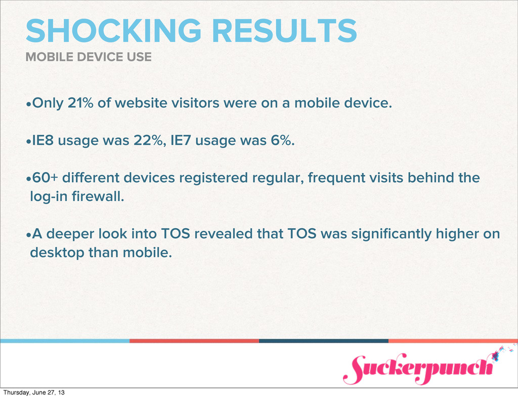
mobile device. •IE8 usage was 22%, IE7 usage was 6%. •60+ different devices registered regular, frequent visits behind the log-in firewall. •A deeper look into TOS revealed that TOS was significantly higher on desktop than mobile. MOBILE DEVICE USE Thursday, June 27, 13
out why mobile usage was so low. •The site has problems (which is why we’re working on it now), but most did not cite usability as the problem. •Many just didn’t want to manage their accounts on a mobile device, it was easier to do on a desktop and they felt most sites had the same problem. •More importantly, we found that the 60+ devices accessing the site regularly were on every carrier, connection speed, and user knowledge level imaginable. •For many users, mobile was their only personal connection, yet they still chose public computers over mobile when managing accounts without apps. WAS IT US OR THEM? THIS IS A UX COMPLETE REBUILD, SO IS THE SITE THE ISSUE? Thursday, June 27, 13
at many after school activities, they address “open” or “approved” website tasks on school computers. •The digital divide, when it comes to both connection speed and device quality/ age, is even more pronounced among youth. •Less than 50% of AA & Hispanic homes have broadband. •AA & Hispanic youth account for ~40% of <18 population. •While many students have high-end mobile devices, they often don’t have enough of a data plan to browse indefinitely as carriers remove unlimited plans. YOUTH ≠ MOBILE & FAST MOBILE IS BIG AMONG YOUTH, BUT MONEY ISN’T Thursday, June 27, 13
time focusing on older browsers or feature phone devices. This almost blew up in our face. •We learned to spend significant time and budgeted hours getting an experience that gracefully degrades well when dealing with students, even at the expense of mobile features. •Content-first is even more critical with youth-oriented applications, despite the tendency to think that design and interaction matters more. RESPONSIBLE IS CRITICAL WE WERE BARKING UP THE WRONG TREE, WITH A DISASTER AHEAD Thursday, June 27, 13
applications, despite the tendency to think that design and interaction matters more •Non-broadband users complete 58% less tasks online in the same amount of time than broadband users •By pushing important actions, rather than important information, to the forefront you make it easier on slow connection users •It is irresponsible to build pages that are larger than 2MB, and I am guilty of doing it time and again to “wow” site visitors RESPONSIBLE IS CRITICAL WE WERE BARKING UP THE WRONG TREE, WITH A DISASTER AHEAD Thursday, June 27, 13
the context and content relative to your users. •Analytics can only tell so much of the story. •Focus groups, even guerrilla ones, are critical to getting the responsive design process right. •Don’t make assumptions based on what society tells you a particular demographic does. •Just because the web community is saying it’s true doesn’t mean it’s true for your particular project. Find out for yourself by taking a look at the numbers and, more importantly, talking to your users. KNOW YOUR CONTEXT YOU CAN’T PREDICT WHO OR HOW PEOPLE WILL USE YOUR SITE Thursday, June 27, 13
 bradweaver
 csswizardry
 securecat
 kgsi
kgsi
 ashapiro
 spacemarket
 satosio
 aonomasahiro
 payatsusan213
 lw
lw
 lynteo
 hypebeans
 saki822
 aarron
 eileencodes
.png) helenjbeal
helenjbeal
 notwaldorf
 bluesmoon
 tammyeverts
 garrettdimon
 morganepeng
 inesmontani
 elsirapls
 addyosmani
 reverentgeek