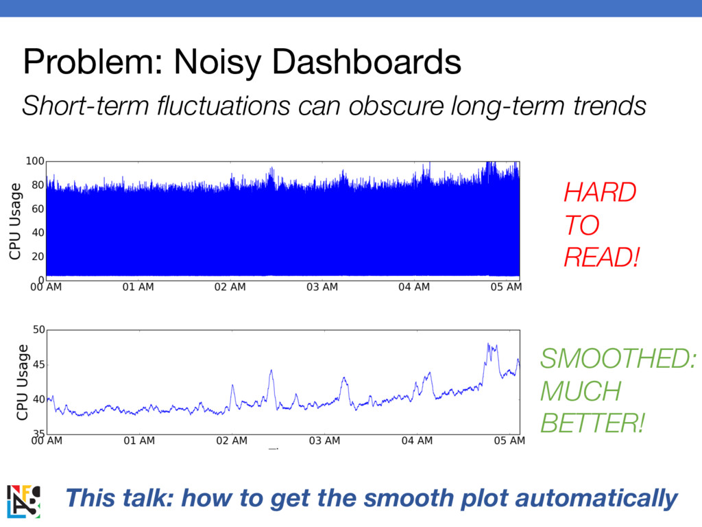
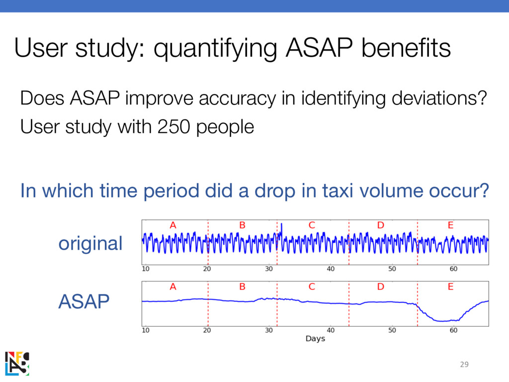
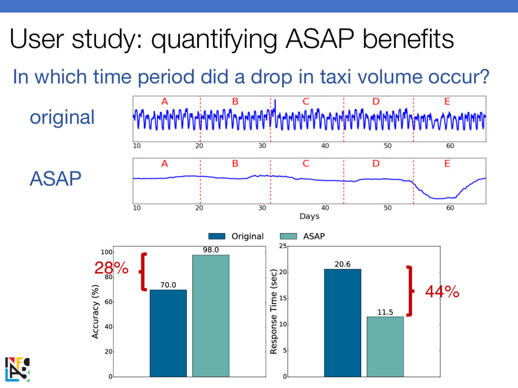
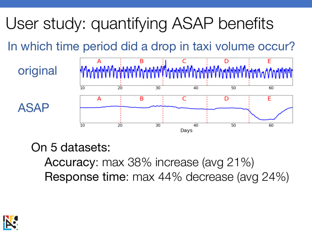
informative dashboard visualization Big idea: smooth your dashboards! this talk: how much to smooth? Why smooth? 38% more accurate + 44% faster responses Try it yourself: JavaScript library ASAP.js
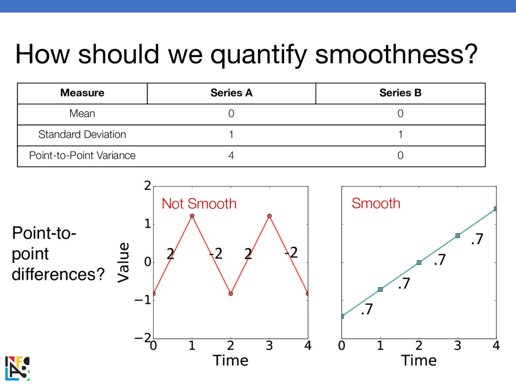
Mean 0 0 Standard Deviation 1 1 Point-to-Point Variance 4 0 diffs = [] for i in range(0, len(x)-1): diffs.append(x[i+1]-x[i]) return variance(diffs) How to compute point-to-point variance? Iterate through points Calculate differences Calculate variance of differences
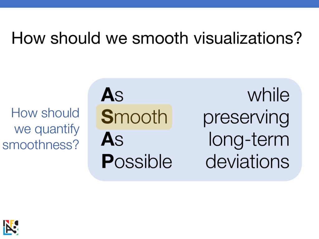
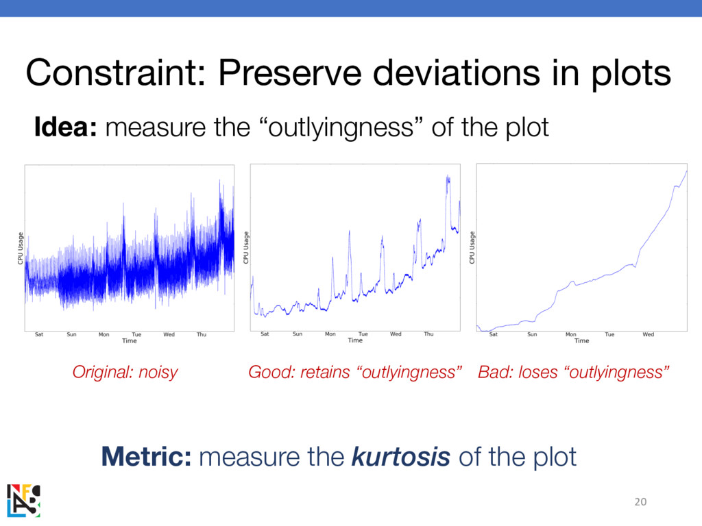
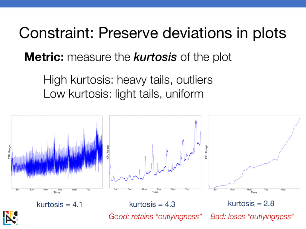
range(0, len(x)): tmp += (x[i] – m)4 return tmp / (len(x) * variance(x)2) How to compute kurtosis? Iterate through points Difference to the fourth power Divide by variance squared from scipy.stats import kurtosis Or, do it yourself Metric: measure the kurtosis of the plot Constraint: Preserve deviations in plots
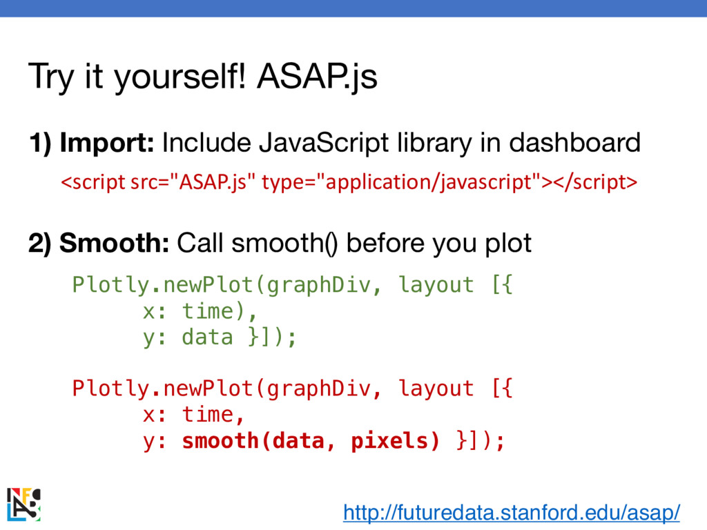
data }]); Plotly.newPlot(graphDiv, layout [{ x: time, y: smooth(data, pixels) }]); <script src="ASAP.js" type="application/javascript"></script> http://futuredata.stanford.edu/asap/ 1) Import: Include JavaScript library in dashboard 2) Smooth: Call smooth() before you plot before after
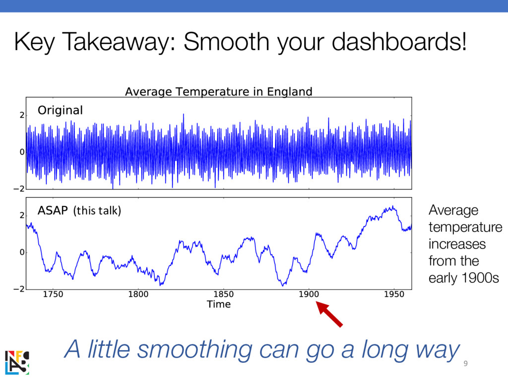
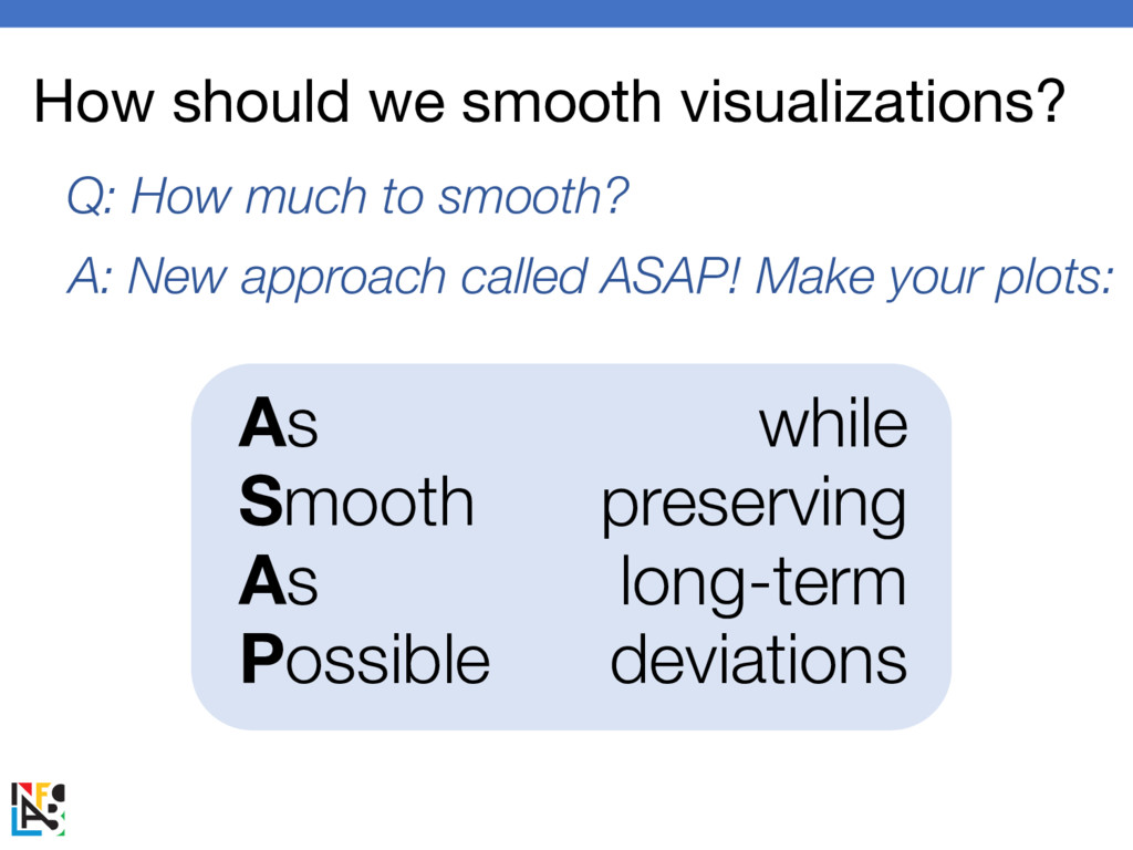
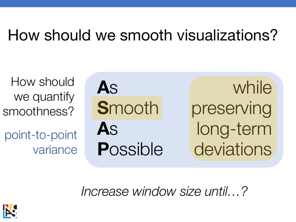
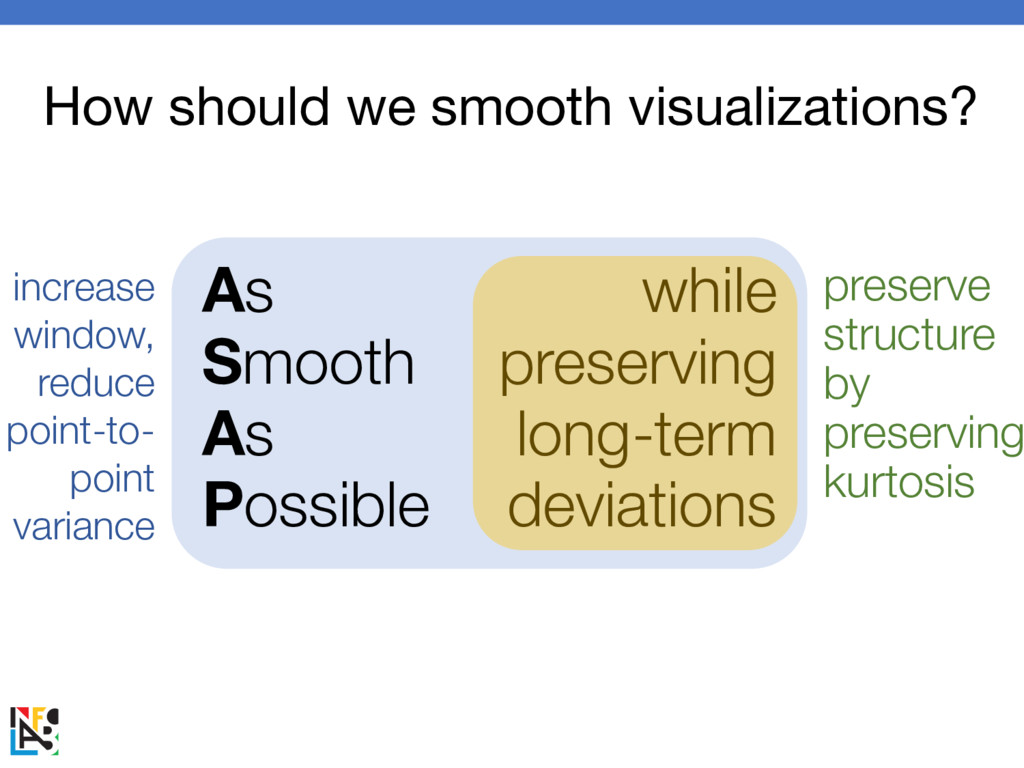
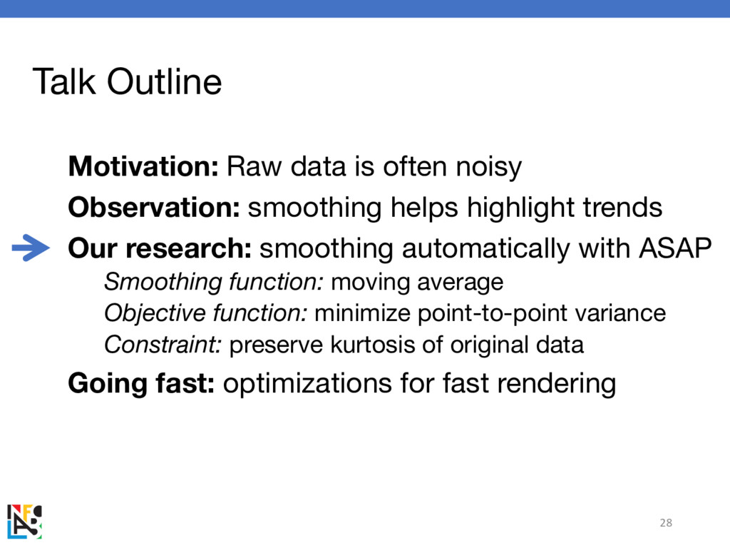
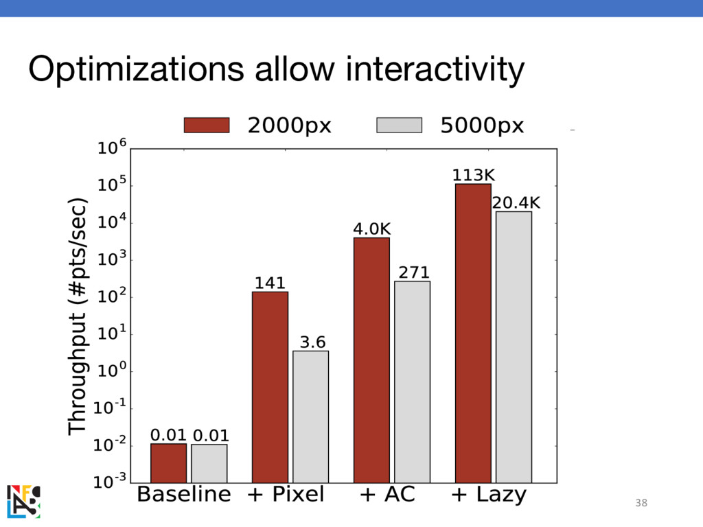
helps highlight trends Our research: smoothing automatically with ASAP Smoothing function: moving average Objective function: minimize point-to-point variance Constraint: preserve kurtosis of original data Going fast: optimizations for fast rendering 28
helps highlight trends Our research: smoothing automatically with ASAP Smoothing function: moving average Objective function: minimize point-to-point variance Constraint: preserve kurtosis of original data Going fast: optimizations for fast rendering 32
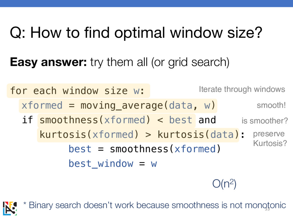
them all (or grid search) 33 for each window size w: xformed = moving_average(data, w) if smoothness(xformed) < best and kurtosis(xformed) > kurtosis(data): best = smoothness(xformed) best_window = w Iterate through windows smooth! preserve Kurtosis? is smoother? * Binary search doesn’t work because smoothness is not monotonic O(n2)
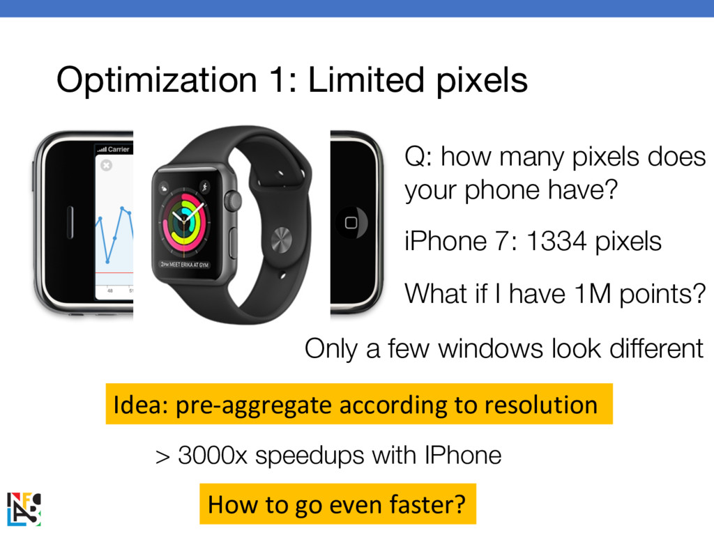
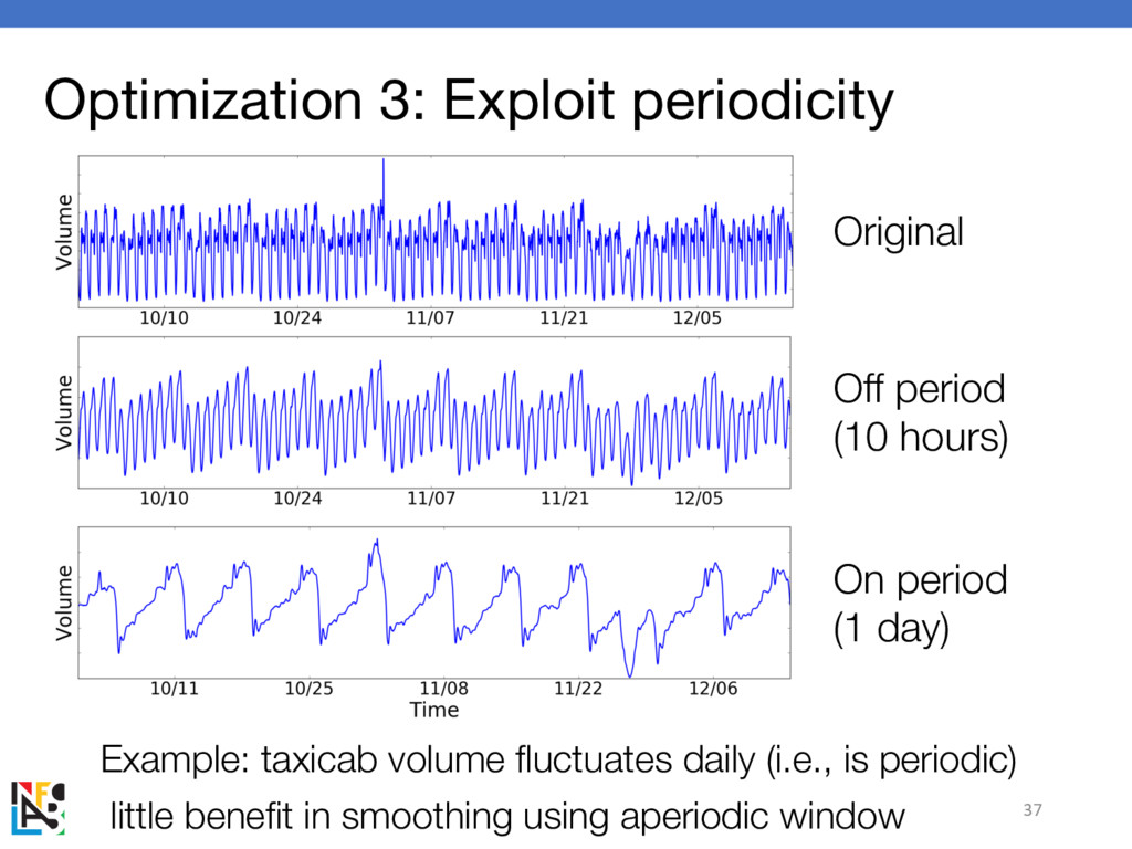
phone have? iPhone 7: 1334 pixels What if I have 1M points? Only a few windows look different Idea: pre-aggregate according to resolution How to go even faster? > 3000x speedups with IPhone
informative dashboard visualization Big idea: smooth your dashboards! this talk: how much to smooth? Why smooth? 38% more accurate + 44% faster responses Try it yourself: JavaScript library ASAP.js Demo, code and paper: http://futuredata.stanford.edu/asap/ Kexin Rong, kexinrong.github.io