you as an analyst – True for you as a communicator • You should make dozens, maybe even hundreds, of graphics for each dataset – Most of these are for your eyes only – A small subset are for others A picture is worth 1000 words
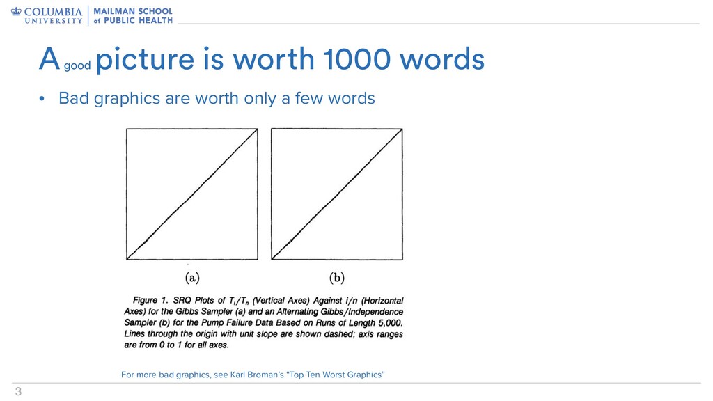
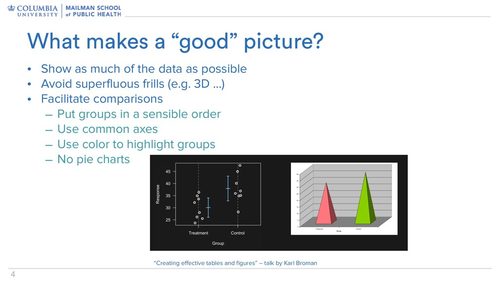
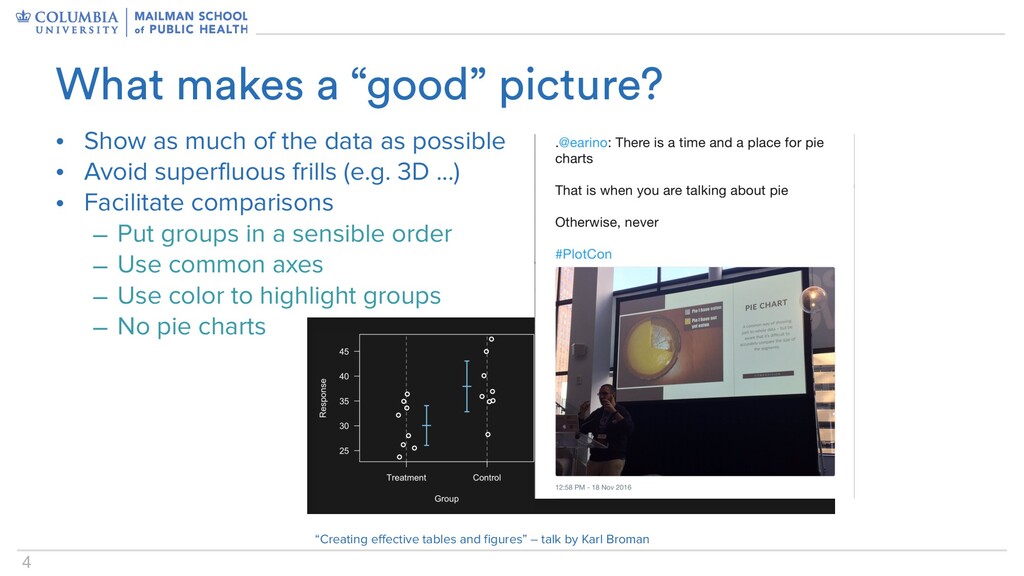
• Avoid superfluous frills (e.g. 3D ...) • Facilitate comparisons – Put groups in a sensible order – Use common axes – Use color to highlight groups – No pie charts What makes a “good” picture? “Creating effective tables and figures” – talk by Karl Broman
• Avoid superfluous frills (e.g. 3D ...) • Facilitate comparisons – Put groups in a sensible order – Use common axes – Use color to highlight groups – No pie charts What makes a “good” picture? “Creating effective tables and figures” – talk by Karl Broman
Most figures are for you, and even these should be good – Graphics for others require more fiddly detailing than is necessary for graphics for you What makes a “good” picture?
• Advanced graph components – facets, scales, statistics • A graph is built by combining these components • Graphics can be further customized, depending on the goals – Axis labels, axis tick locations / labels, font sizes, graphs themes, color scales, combining panels Using ggplot