Share
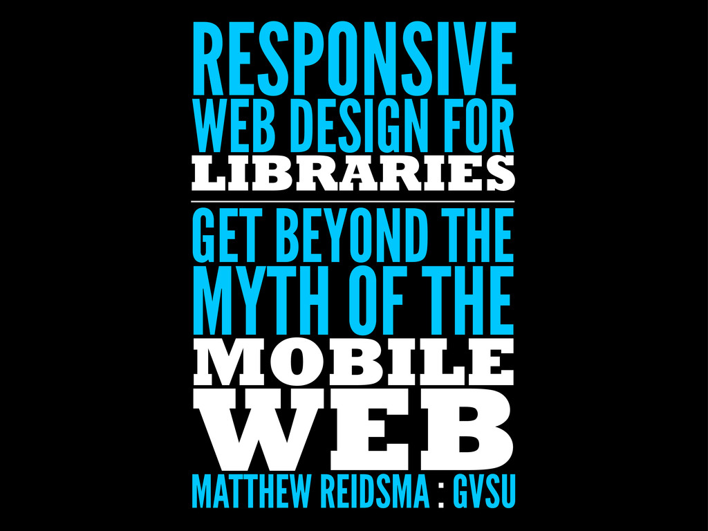
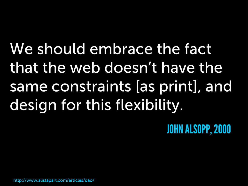
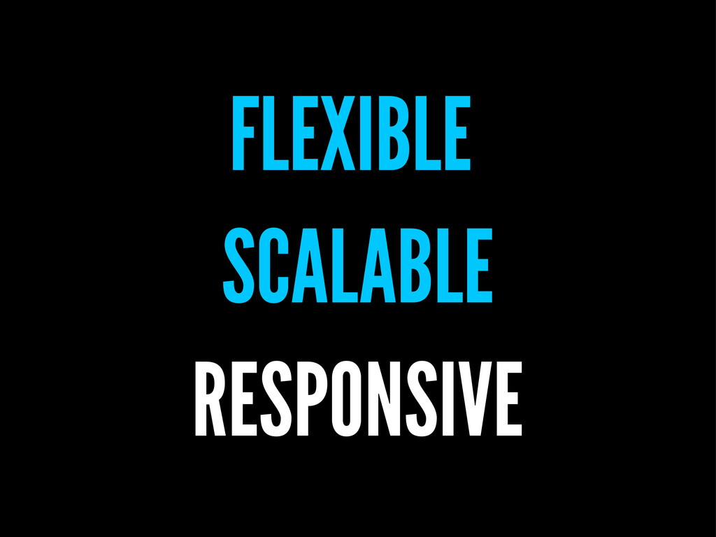
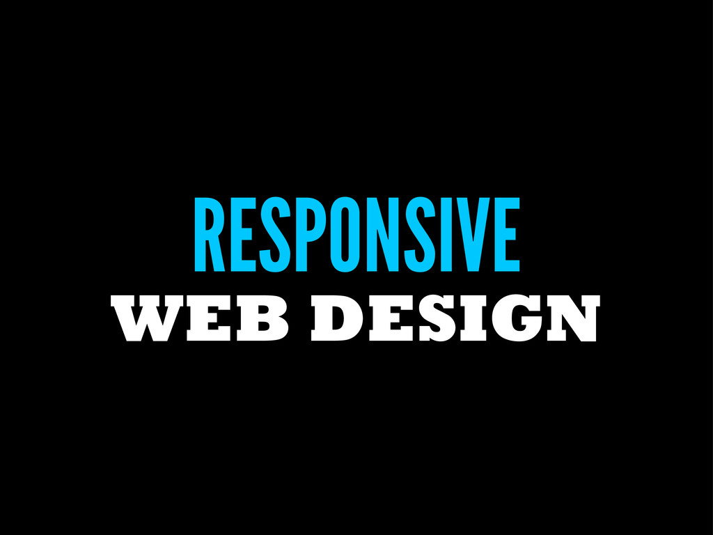
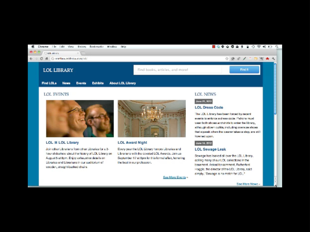
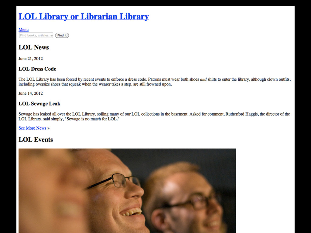
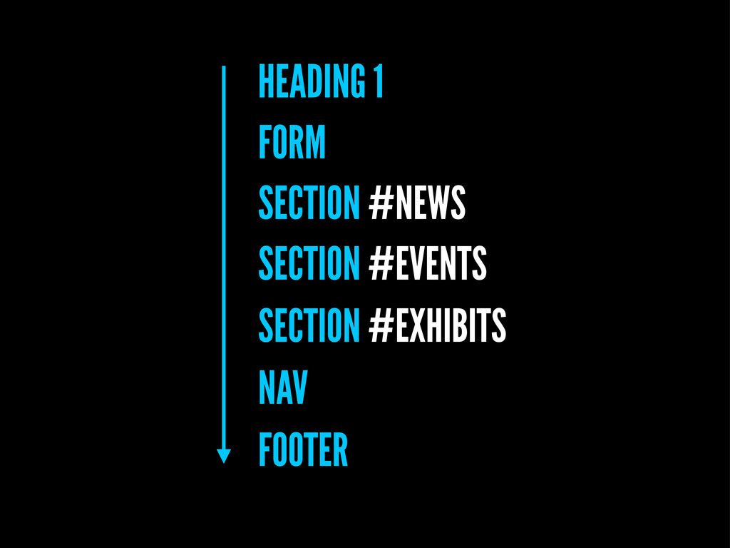
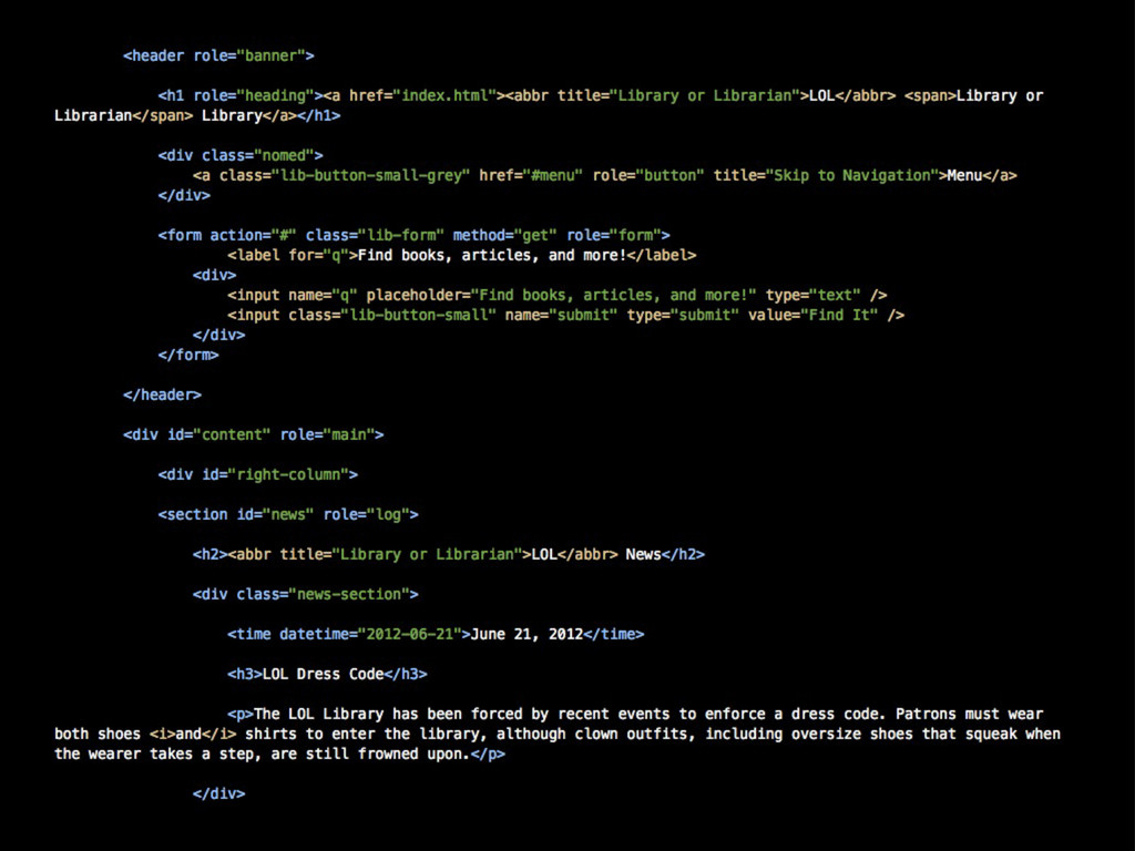
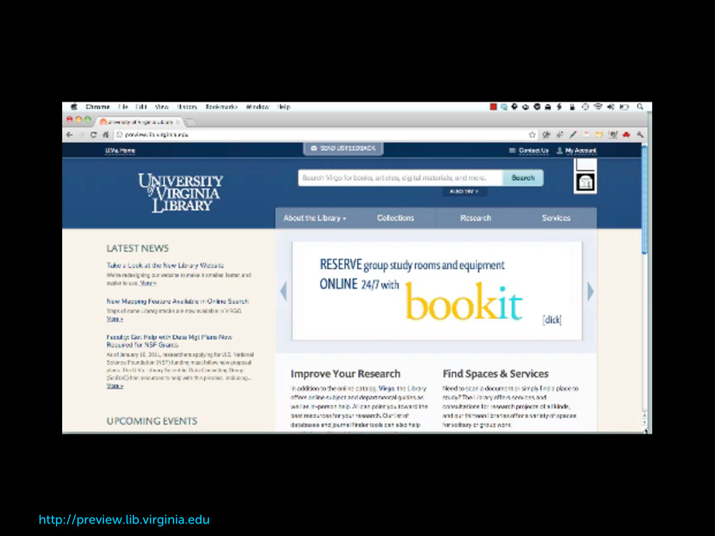
An introduction to Responsive Web Design with a basic code walkthrough to get you started making your library website responsive.
 matthewreidsma
 coco_se
 itsukiisamu
 bobfromjapan
 scrummasudar
 awsjcpm
 subroh0508
 runrunsan
 horihiro
 n0bisuke2
 akkiesoft
 yeseniaperezcruz
 skoyamalab
.png) helenjbeal
helenjbeal
 schlessera
 nikkihalliwell
 katiecoart
 techseoconnect
 moore
moore
 reverentgeek
 tmiket
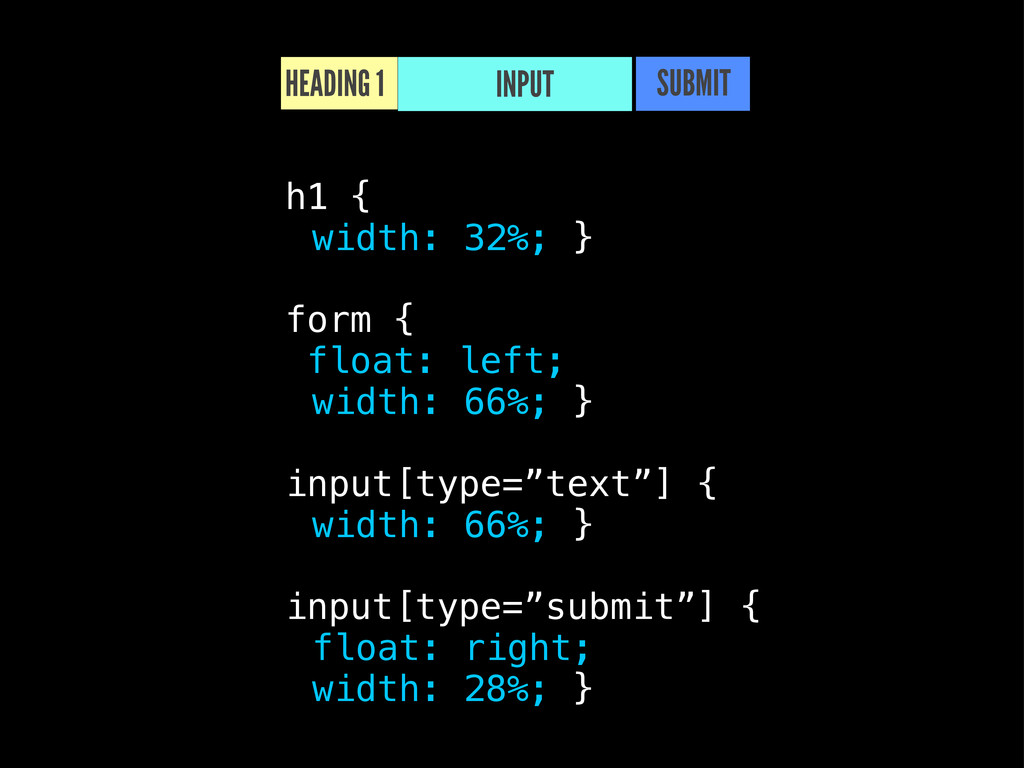
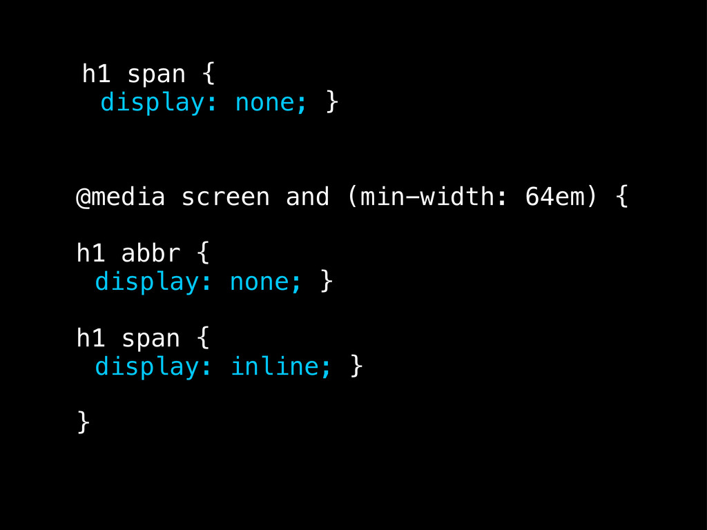
![INPUT TYPE=”TEXT” INPUT TYPE=”SUBMIT” input[type=”text”] { display: block; margin: 0](https://files.speakerdeck.com/presentations/4fe7fa63558e2d001f020d47/slide_57.jpg)
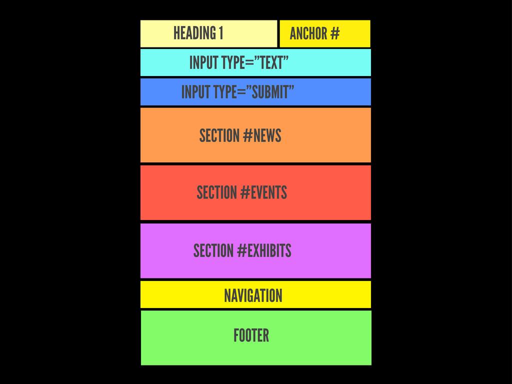
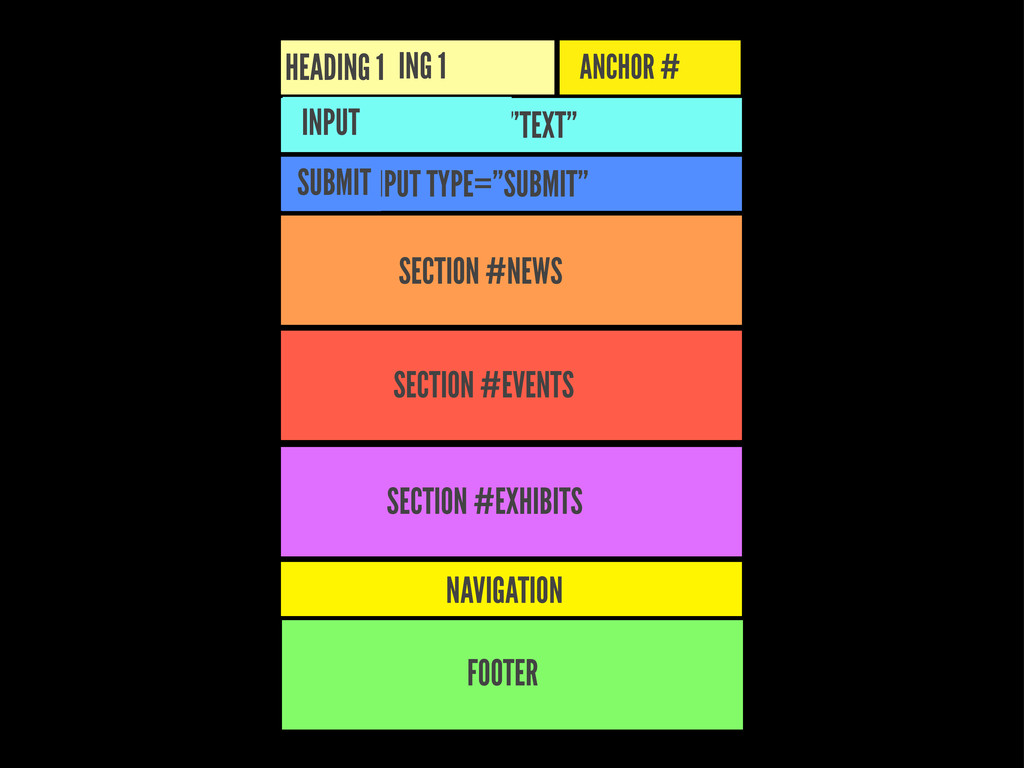
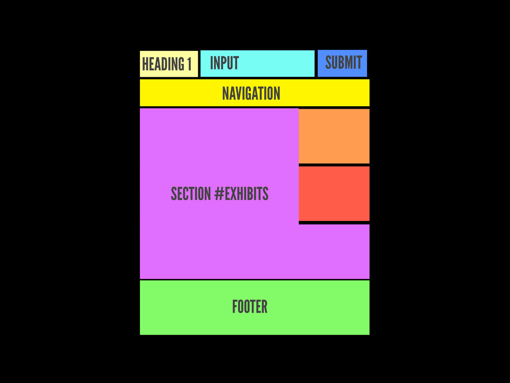
![body { display: table; caption-side: top; } nav[role="navigation"] { display:](https://files.speakerdeck.com/presentations/4fe7fa63558e2d001f020d47/slide_74.jpg)
![[email protected] :: @mreidsma matthewreidsma.com :: gvsu.edu/library/labs YOU THANK](https://files.speakerdeck.com/presentations/4fe7fa63558e2d001f020d47/slide_94.jpg)