Upgrade to Pro
— share decks privately, control downloads, hide ads and more …
Speaker Deck
Features
Speaker Deck
PRO
Sign in
Sign up for free
Search
Search
Make it Responsive! the logic, the code & trick...
Search
King Sidharth
February 23, 2013
Design
6.8k
6
Share
Embed
Copy iframe code
Copy JS code
Copy link
Start on current slide
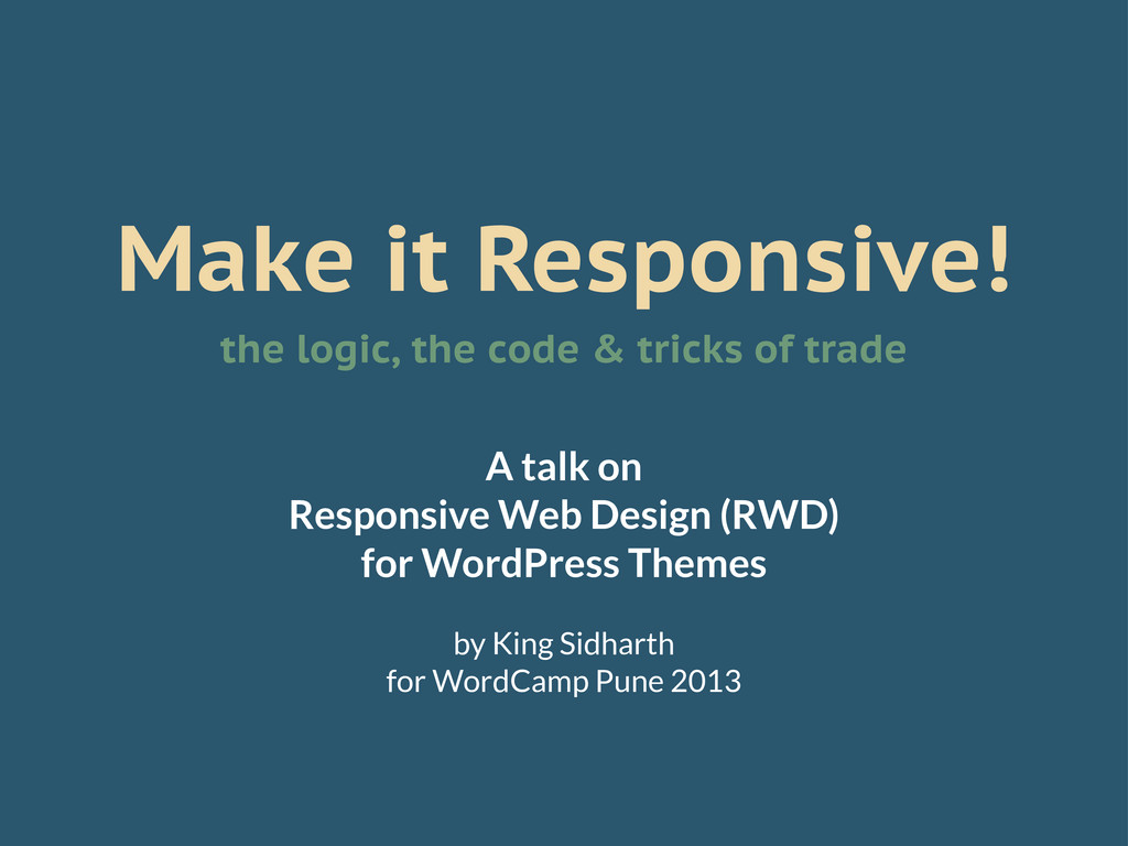
Make it Responsive! the logic, the code & tricks of trade
A talk on Responsive Web Design (RWD) for WordPress Themes for WordCamp Pune 2013.
King Sidharth
February 23, 2013
More Decks by King Sidharth
See All by King Sidharth
Designing for Many Worlds
kingsidharth
0
260
Design Portfolio Masterclass
kingsidharth
0
530
History & Future of Money, Currency, & Capitalism
kingsidharth
0
250
Accountability for Personal Growth
kingsidharth
0
360
Don't be Biased
kingsidharth
0
540
Know Shit About Design @ Startup Saturday Mumbai
kingsidharth
0
860
A Crash Course in Typography — WordCamp Baroda 2014
kingsidharth
2
850
User Experience Design Lessons from Pornography
kingsidharth
0
920
What to do with your life - TEDxTirupati 2013
kingsidharth
2
710
Other Decks in Design
See All in Design
Claudeもくもく会、はじめませんか?
yusukeiyoda
0
120
CULTURE DECK/Frontend Engineer
mhand01
0
1.4k
Drawing_for_Anim_Final_PDF.pdf
lynteo
2
170
全員がアウトプットを出せる時代、 誰を採用する?
nishame
0
610
怖くないアクセシビリティ -カウンターカルチャーとしてのアッカン東京-
securecat
1
220
CULTURE DECK/Creative Director
mhand01
0
1.3k
UI生成の鍵は要件整理 -デザインプロセスのエッセンスを プロンプト作成に取り入れよう-
abokadotyann
4
970
図面資産×AI 眠れる資産を起こす挑戦
aonomasahiro
0
170
TUNAG BOOK 2024
stmn
PRO
0
1.6k
工房としてのAI ── デザイナー、作家、ビルダー
hiranotomoki
0
340
空間アプリ開発のフィードバックをCodexにするための抽象的なデザインツールの模索
karad
0
160
Design dependencies
teba_eleven
0
140
Featured
See All Featured
What’s in a name? Adding method to the madness
productmarketing
PRO
24
4.1k
End of SEO as We Know It (SMX Advanced Version)
ipullrank
3
4.3k
Mind Mapping
helmedeiros
PRO
1
280
What Being in a Rock Band Can Teach Us About Real World SEO
427marketing
0
1k
Leadership Guide Workshop - DevTernity 2021
reverentgeek
1
320
New Earth Scene 8
popppiees
3
2.4k
Crafting Experiences
bethany
1
210
Building Adaptive Systems
keathley
44
3.1k
GraphQLとの向き合い方2022年版
quramy
50
15k
Into the Great Unknown - MozCon
thekraken
41
2.6k
Writing Fast Ruby
sferik
630
63k
Tell your own story through comics
letsgokoyo
1
990
Transcript
Make it Responsive! the logic, the code & tricks of
trade A talk on Responsive Web Design (RWD) for WordPress Themes by King Sidharth for WordCamp Pune 2013
#WCPune2013 @kingsidharth Tweet Away!
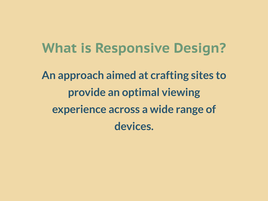
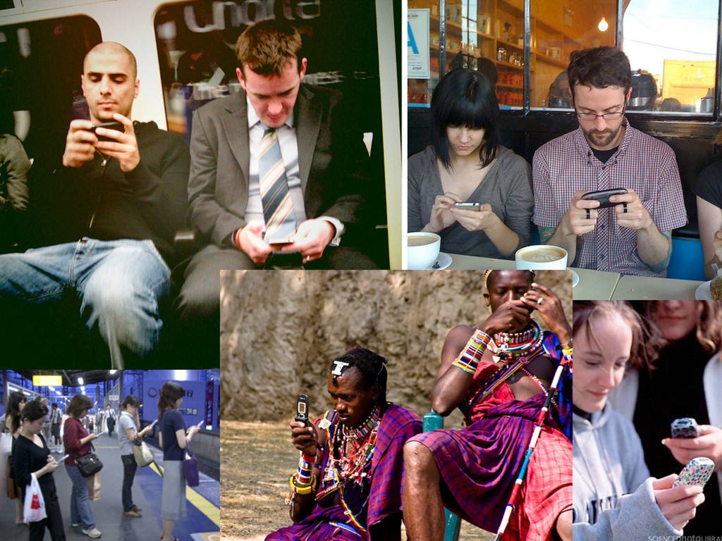
What is Responsive Design? An approach aimed at crafting sites
to provide an optimal viewing experience across a wide range of devices.
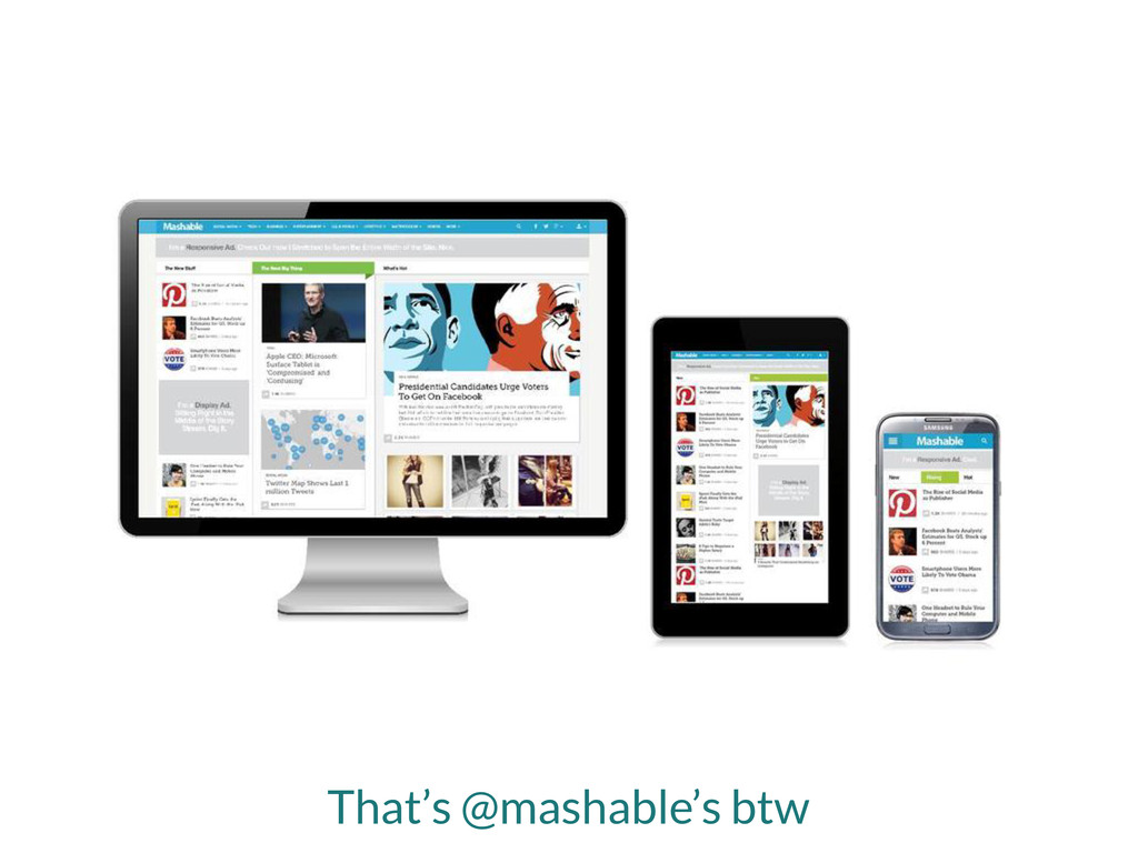
That’s @mashable’s btw
Why Responsive Design?
None
Make it Responsive the Logic
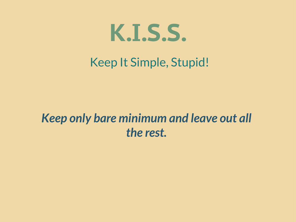
K.I.S.S. Keep It Simple, Stupid! Keep only bare minimum and
leave out all the rest.
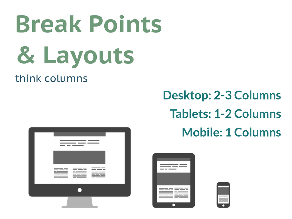
Desktop: 2-3 Columns Tablets: 1-2 Columns Mobile: 1 Columns Break
Points & Layouts think columns
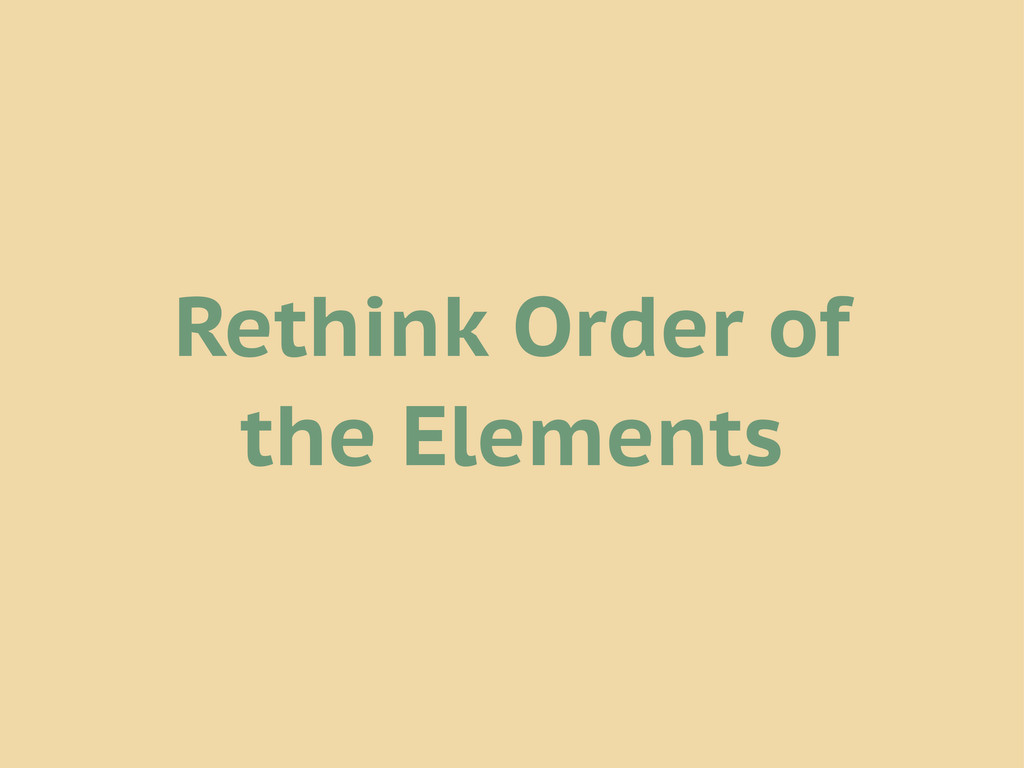
Rethink Order of the Elements
None
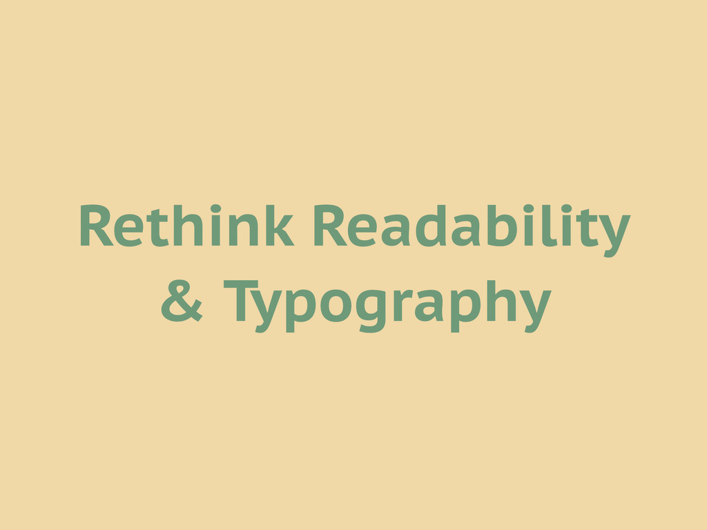
Rethink Readability & Typography
None
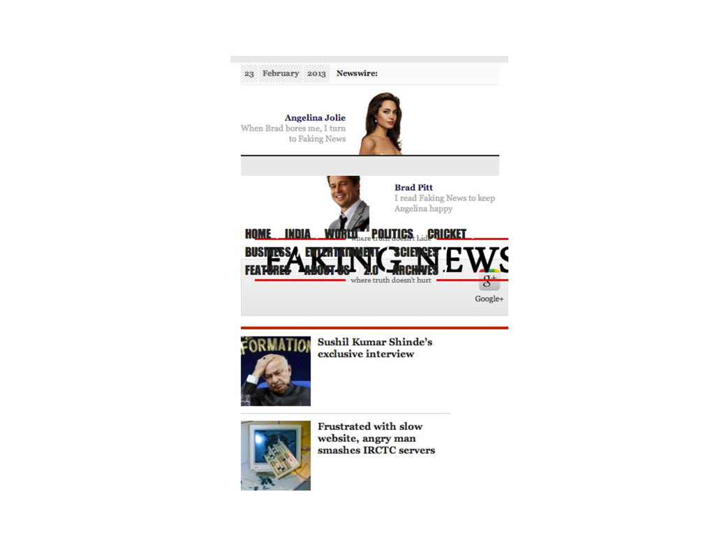
Rethink Images
http://www.fuelyourcreativity.com
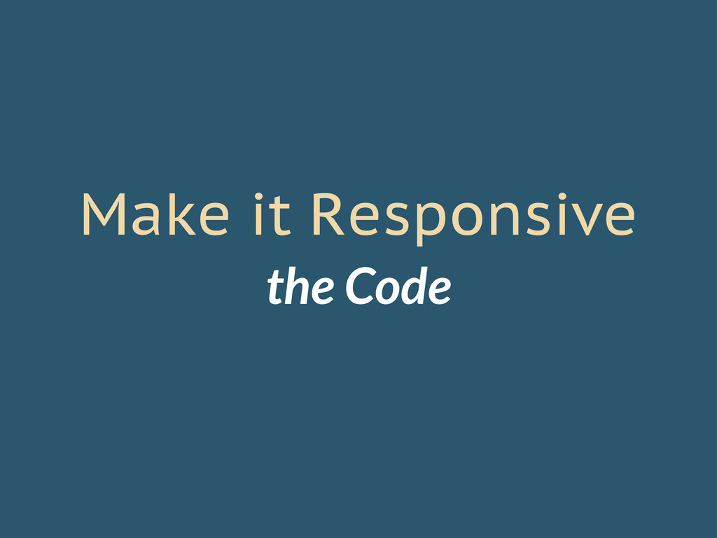
Make it Responsive the Code
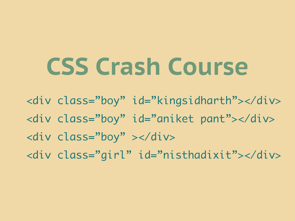
CSS Crash Course <div class=”boy” id=”kingsidharth”></div> <div class=”boy” id=”aniket pant”></div>
<div class=”boy” ></div> <div class=”girl” id=”nisthadixit”></div>
<div class=”boy” id=”kingsidharth”></div> <div class=”boy” id=”aniket pant”></div> <div class=”boy” ></div>
<div class=”girl” id=”nisthadixit”></div> div { flirt: yes; } All Humans { are flirt } Elements
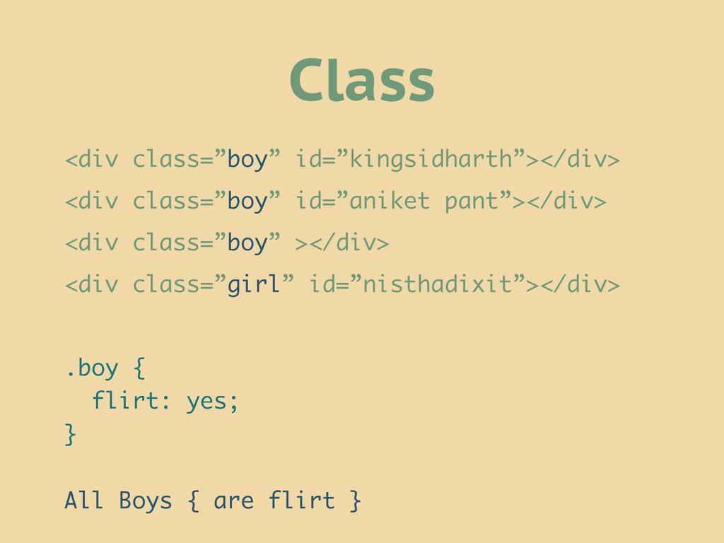
<div class=”boy” id=”kingsidharth”></div> <div class=”boy” id=”aniket pant”></div> <div class=”boy” ></div>
<div class=”girl” id=”nisthadixit”></div> .boy { flirt: yes; } All Boys { are flirt } Class
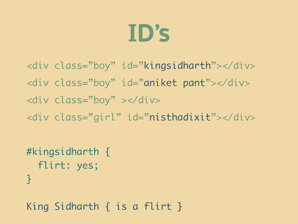
<div class=”boy” id=”kingsidharth”></div> <div class=”boy” id=”aniket pant”></div> <div class=”boy” ></div>
<div class=”girl” id=”nisthadixit”></div> #kingsidharth { flirt: yes; } King Sidharth { is a flirt } ID’s
@media queries @media all and (min-width:500px) { … } @media
(min-width:500px) { … } @media (orientation: portrait) { … } @media all and (orientation: portrait) { … } Remember Break Points?
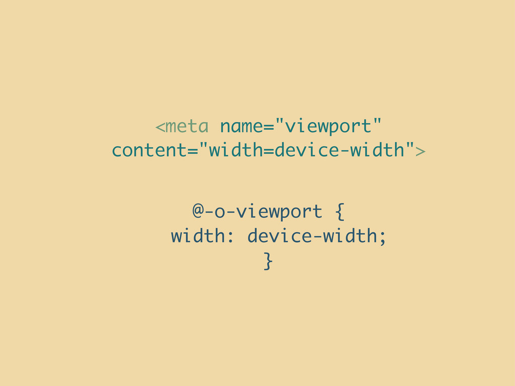
View Port Setting
None
<meta name="viewport" content="width=device-width"> @-o-viewport { width: device-width; }
None
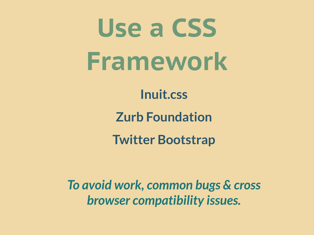
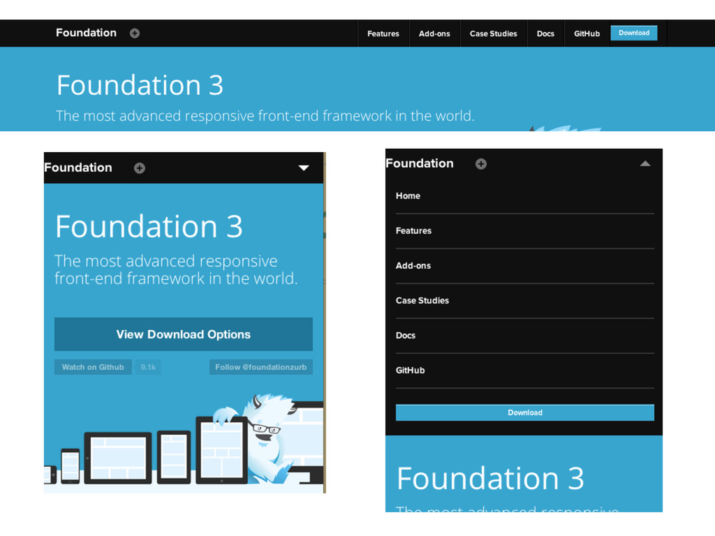
Use a CSS Framework Inuit.css Zurb Foundation Twitter Bootstrap To
avoid work, common bugs & cross browser compatibility issues.
Make it Responsive Tricks of the Trade
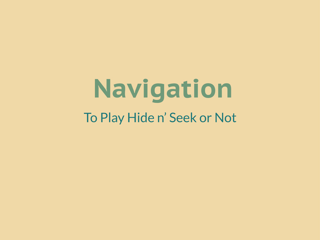
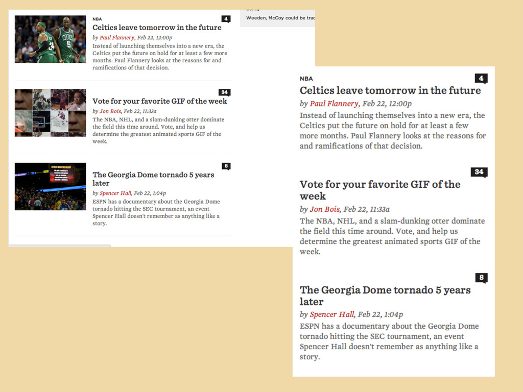
Navigation To Play Hide n’ Seek or Not
None
None
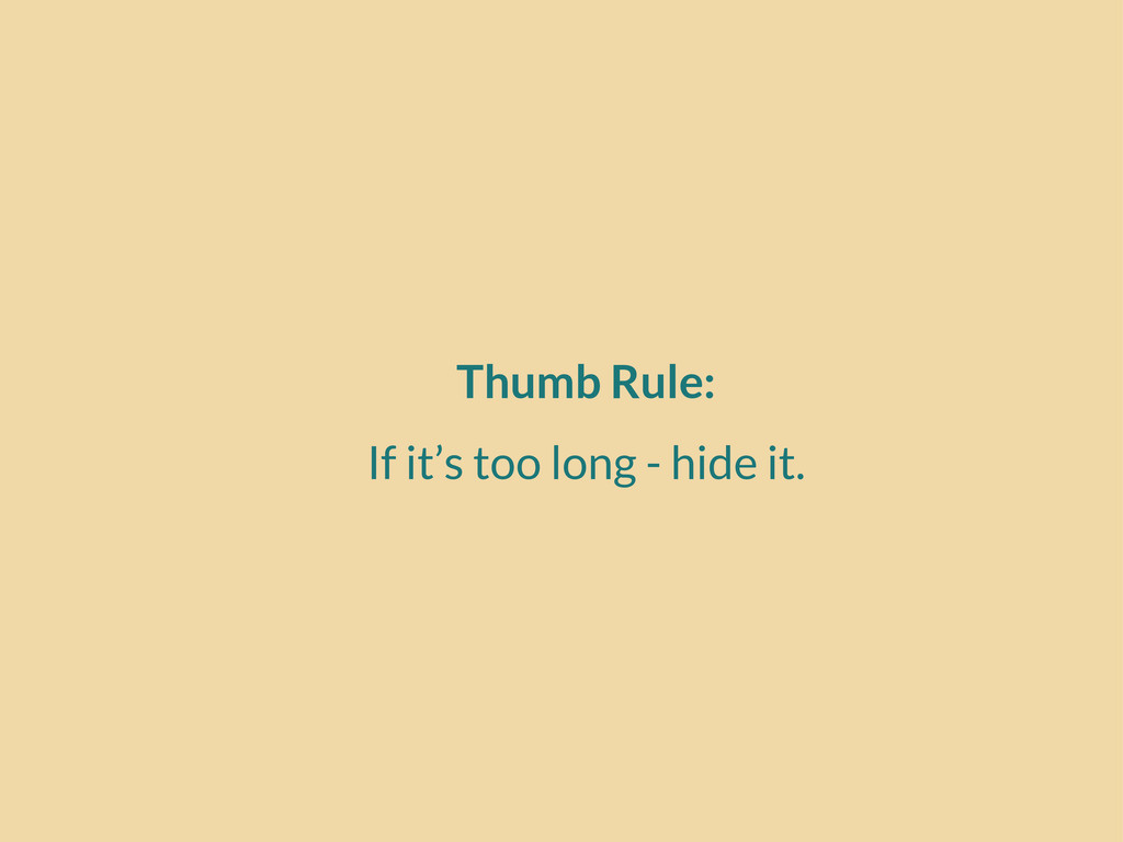
Thumb Rule: If it’s too long - hide it.
Kill Images on Mobile Coz it’s loading...
None
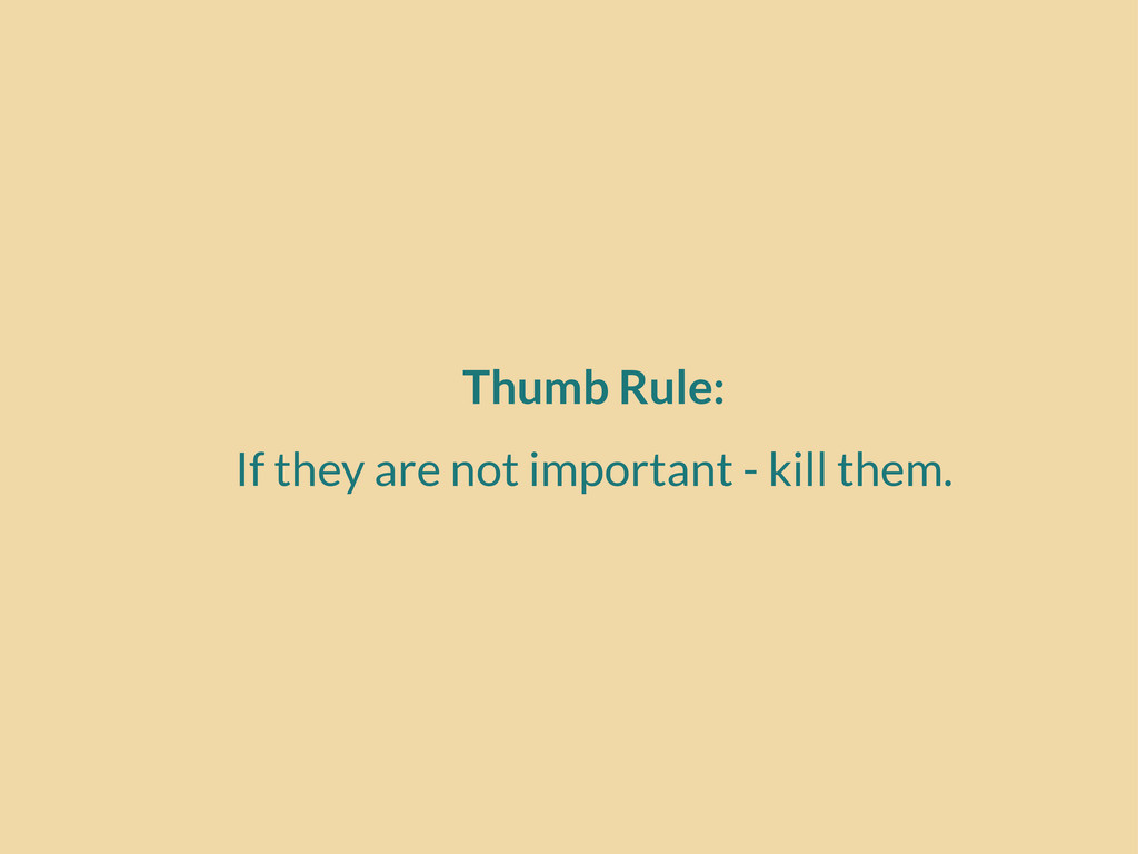
Thumb Rule: If they are not important - kill them.
Don’t Resize Test it for Real on Real Devices
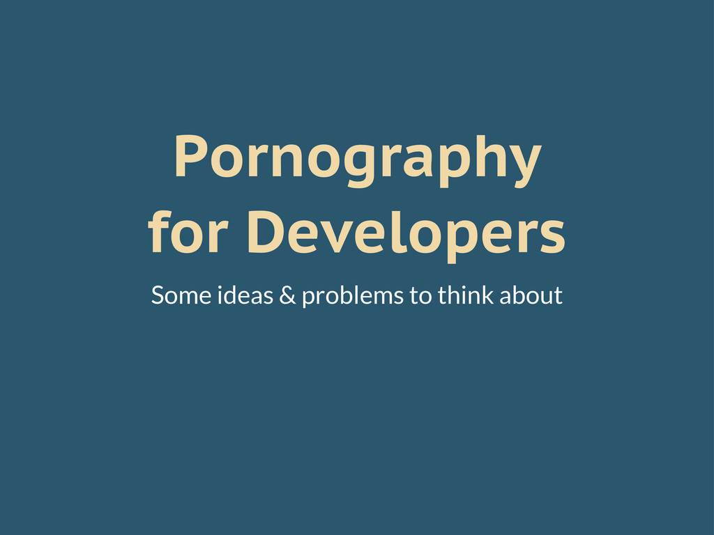
Pornography for Developers Some ideas & problems to think about
Social Media Buttons They don’t work on mobiles and some
tablets
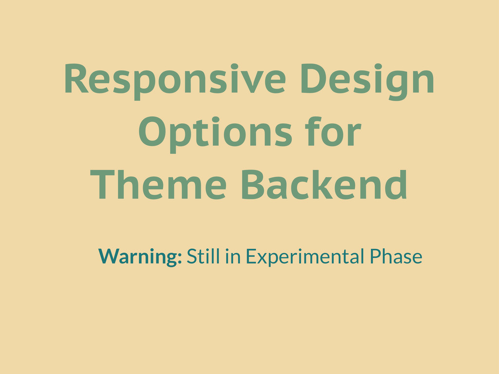
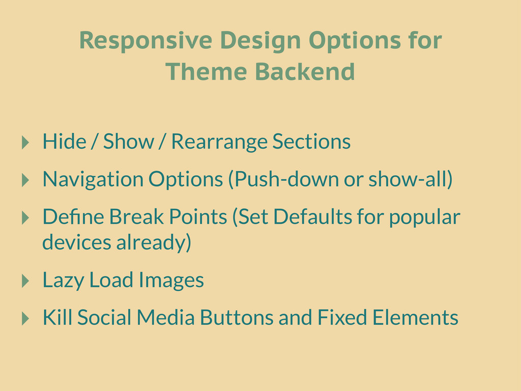
Responsive Design Options for Theme Backend Warning: Still in Experimental
Phase
‣ Hide / Show / Rearrange Sections ‣ Navigation Options
(Push-down or show-all) ‣ Define Break Points (Set Defaults for popular devices already) ‣ Lazy Load Images ‣ Kill Social Media Buttons and Fixed Elements Responsive Design Options for Theme Backend
Want to improve UX of your blog? My talk from
WordCamp Baroda: www.64notes.com/speaking/wcbrd-2013
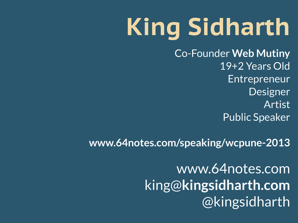
King Sidharth Co-Founder Web Mutiny 19+2 Years Old Entrepreneur Designer
Artist Public Speaker www.64notes.com/speaking/wcpune-2013 www.64notes.com
[email protected]
@kingsidharth
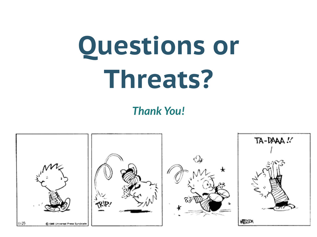
Questions or Threats? Thank You!
 kingsidharth
 yusukeiyoda
 mhand01
 lynteo
 nishame
 securecat
 abokadotyann
 aonomasahiro
 stmn
stmn
 hiranotomoki
 karad
karad
 teba_eleven
 productmarketing
 ipullrank
 helmedeiros
 427marketing
 reverentgeek
 popppiees
 bethany
 keathley
 quramy
 thekraken
 sferik
 letsgokoyo